
A classy wedding cake should feel like it belongs in a gallery: intentional, balanced, and timeless from every angle. The goal isn’t to chase every new cake trend—it’s to choose design details that look elevated now and still gorgeous in your album years from today.
Below are designer-art cake ideas that read refined, photograph beautifully, and work with modern venues, classic ballrooms, and everything in between.
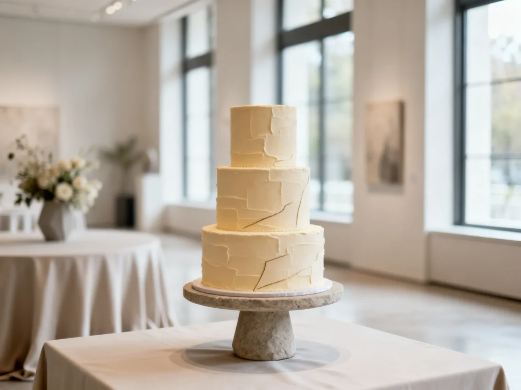
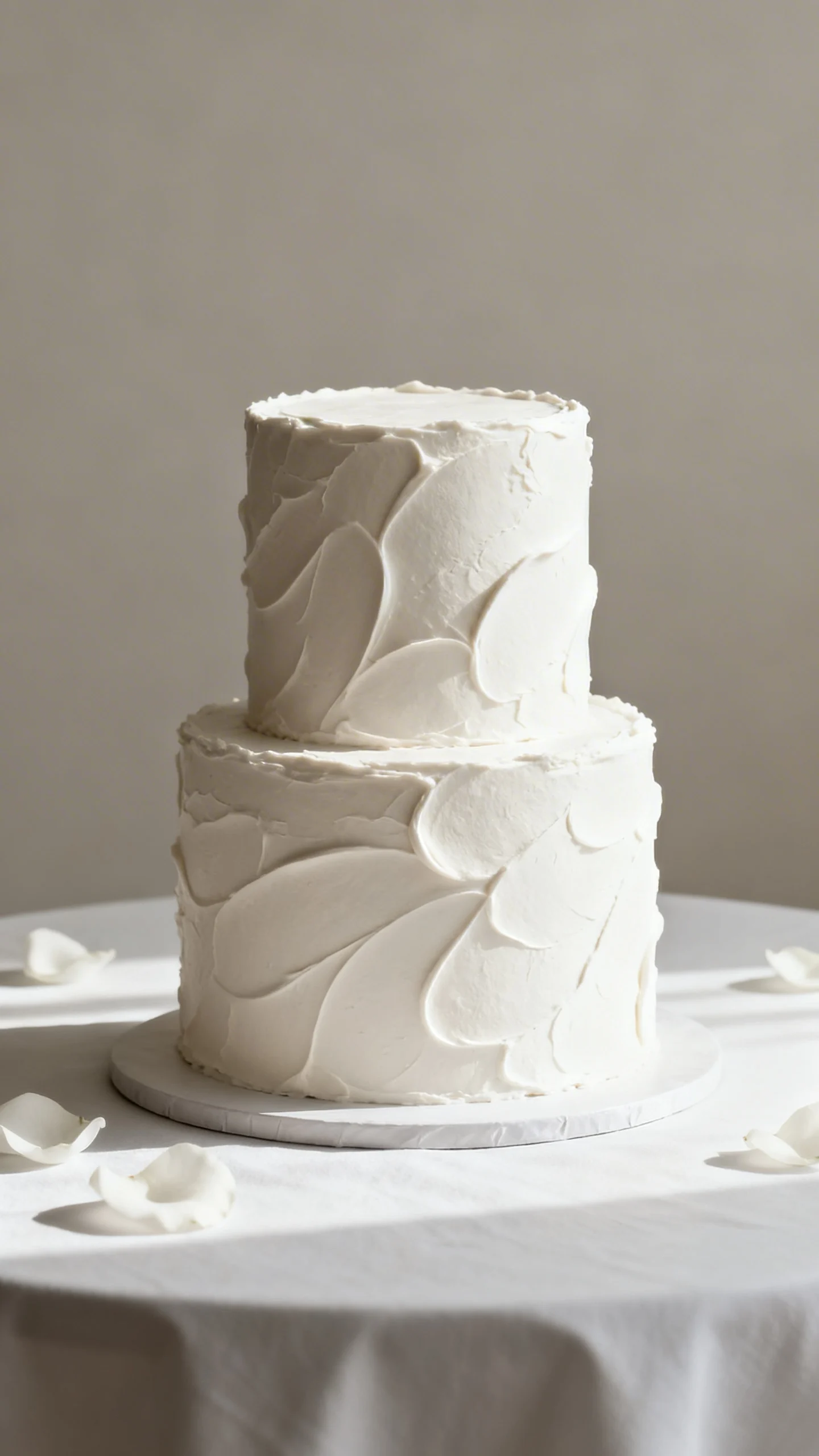
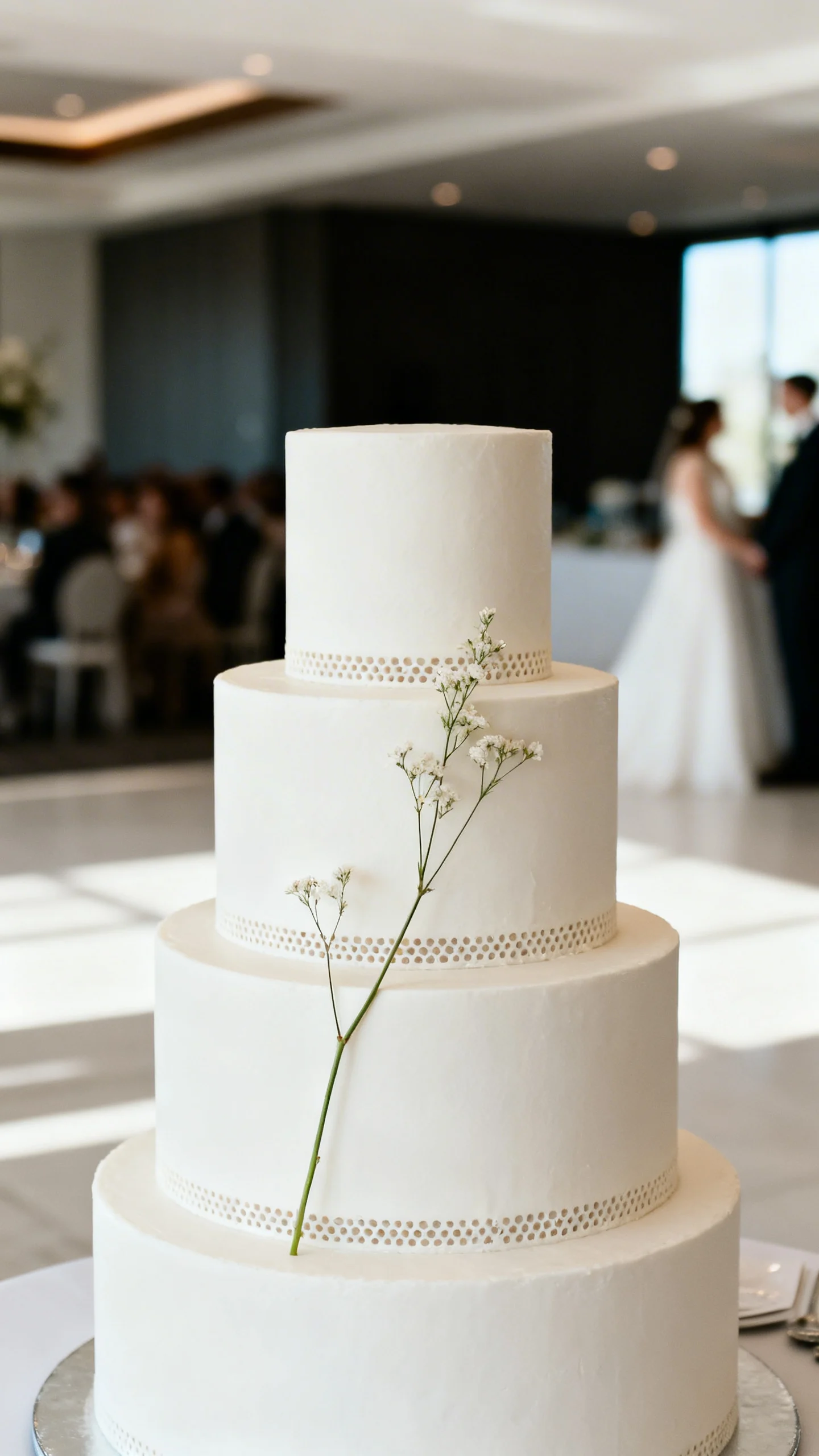
Monochrome buttercream with sculptural texture
Choose one color—ivory, soft blush, warm white, or dove gray—and let texture do the talking. Ask for subtle palette-knife strokes, vertical ribbing, or a smooth finish with intentional curves. This keeps the cake “quiet-luxury” and avoids anything that feels overly themed. Pair it with minimal décor so the surface work reads like art.
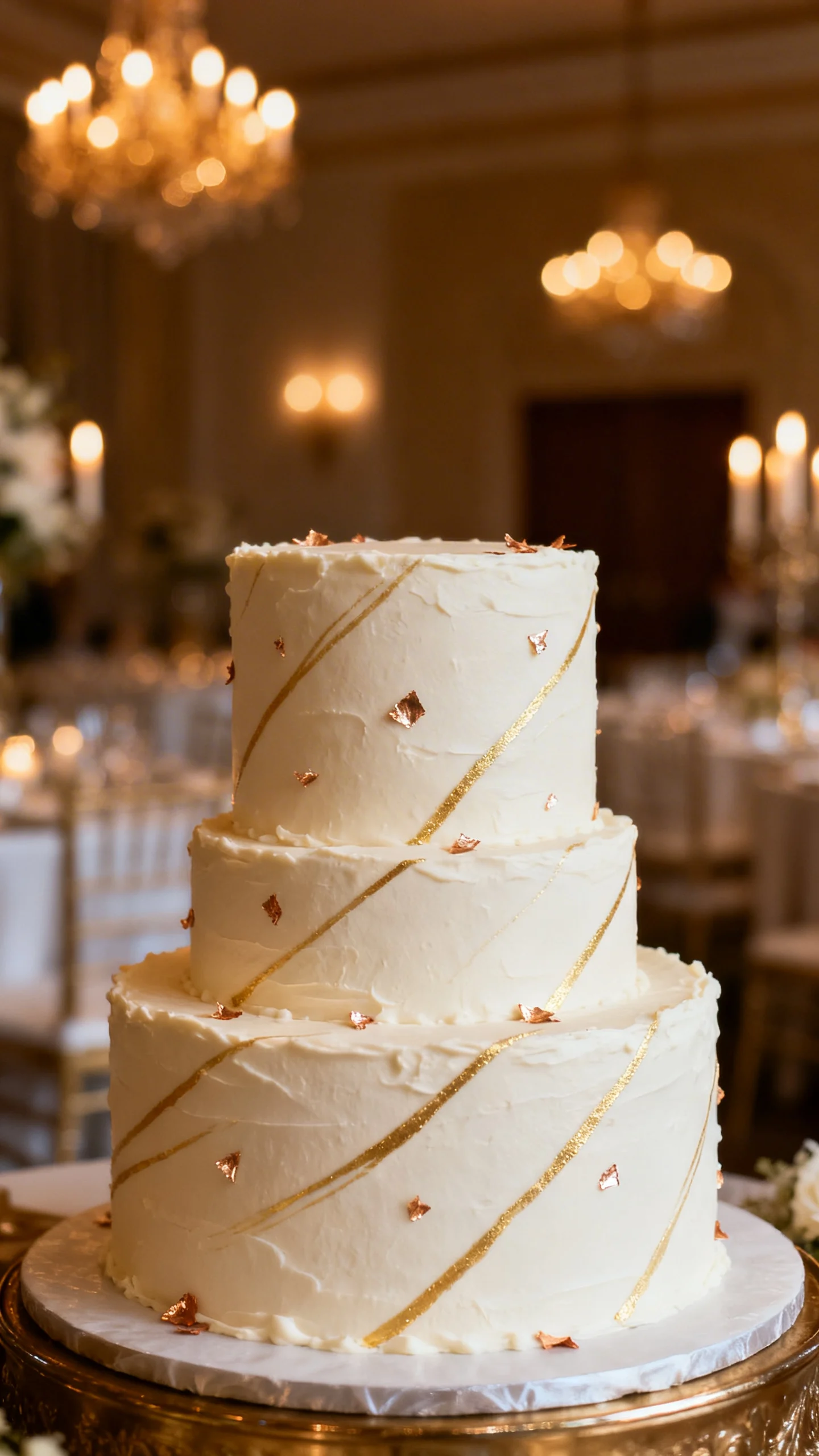
Fine-line metallic accents (not heavy glam)
Instead of full gold drip, request thin hand-painted lines or tiny flecks of edible metallic leaf placed with restraint. The effect is like jewelry: delicate, intentional, and high-end. This style shines in candlelight and photographs beautifully without stealing the spotlight. Keep metals consistent with your flatware or invitations for a cohesive look.
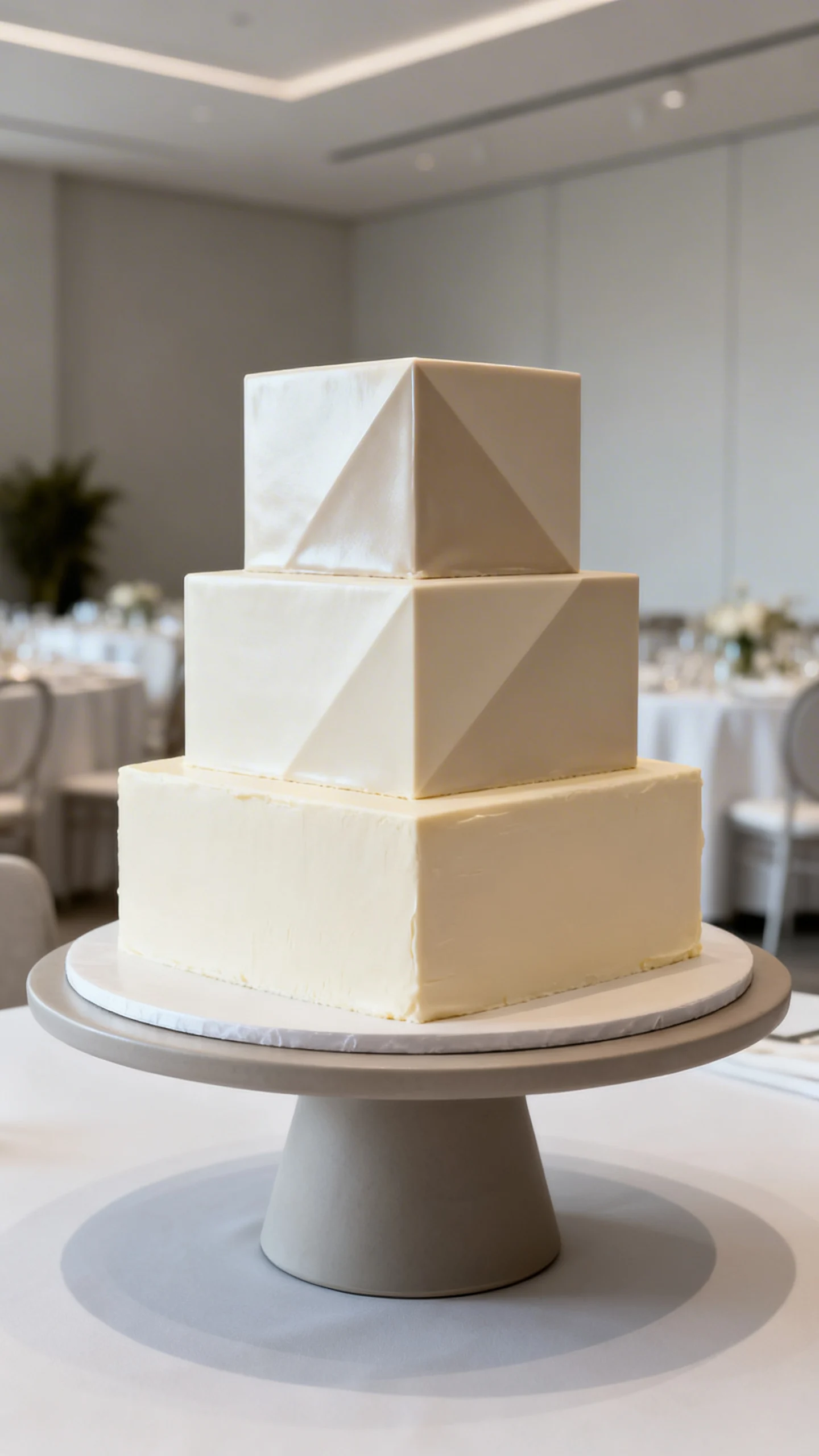
Architectural tiers with sharp edges and clean seams
Crisp tiers feel modern and “designed,” especially when the edges are sharp and the spacing is proportioned well. A minimalist cake can still look expensive if the craftsmanship is flawless. Consider a subtle contrast like matte buttercream on the bottom and a slightly satiny finish on top. Ask your baker to keep seams invisible for that designer-level polish.
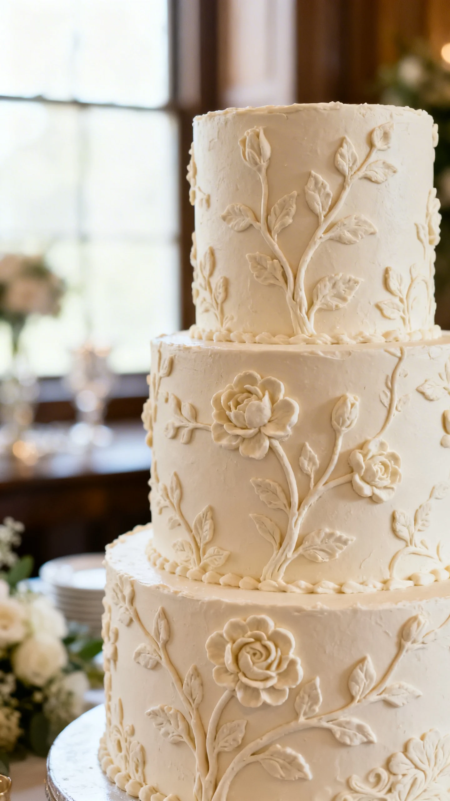
Soft bas-relief florals in the same color family
Bas-relief piping creates raised floral or vine patterns that look like carved plasterwork. Keeping the design tone-on-tone makes it feel classic rather than fussy. This is a great choice if you love florals but want something more refined than bright sugar blooms. It pairs well with traditional ceremonies and romantic venues.
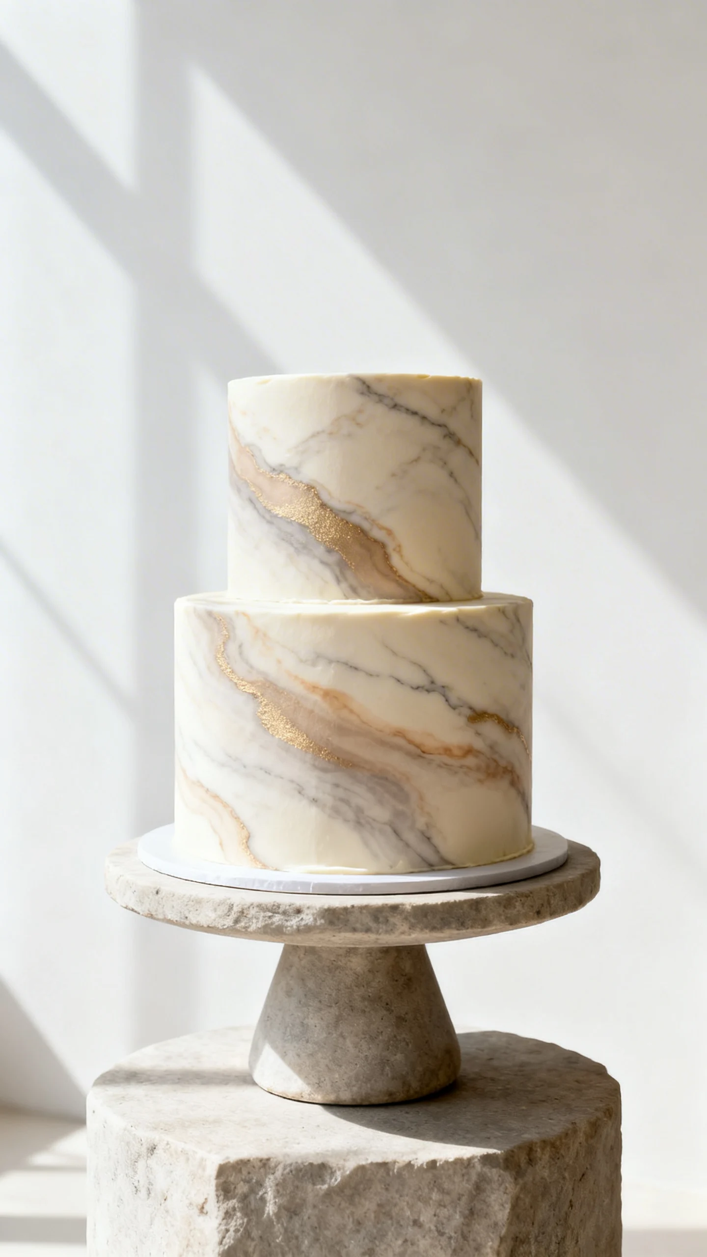
Modern “marble” done subtly, not loud
A gentle marbled effect in creamy neutrals can mimic stone countertops and designer interiors. The key is a soft, blended look—avoid high-contrast swirls that can read overly trendy. Ask for warm veining (taupe, sand, champagne) for a timeless feel. Finish it with clean lines and minimal topper styling.
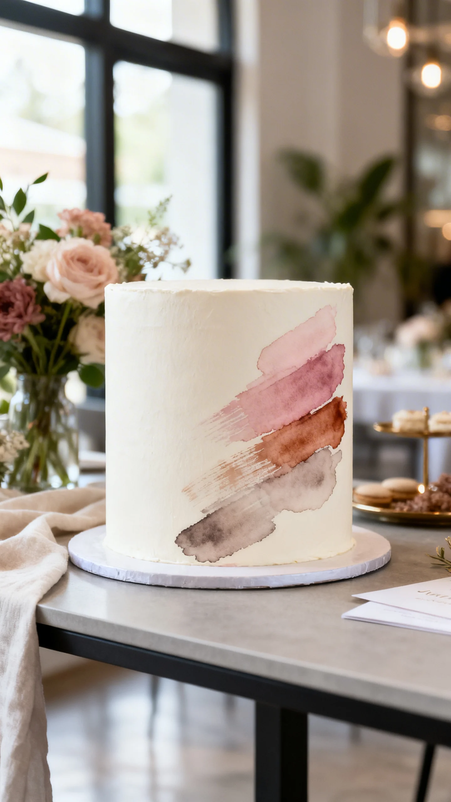
Hand-painted brushwork inspired by fine art
Watercolor-style brushstrokes can look like a contemporary canvas when done with a restrained palette. Choose two to three hues that match your wedding flowers or stationery, then keep the placement intentional—one side, a corner, or a single tier. This feels custom and artistic without turning the cake into a theme piece. It’s especially stunning on smooth fondant or ultra-sleek buttercream.
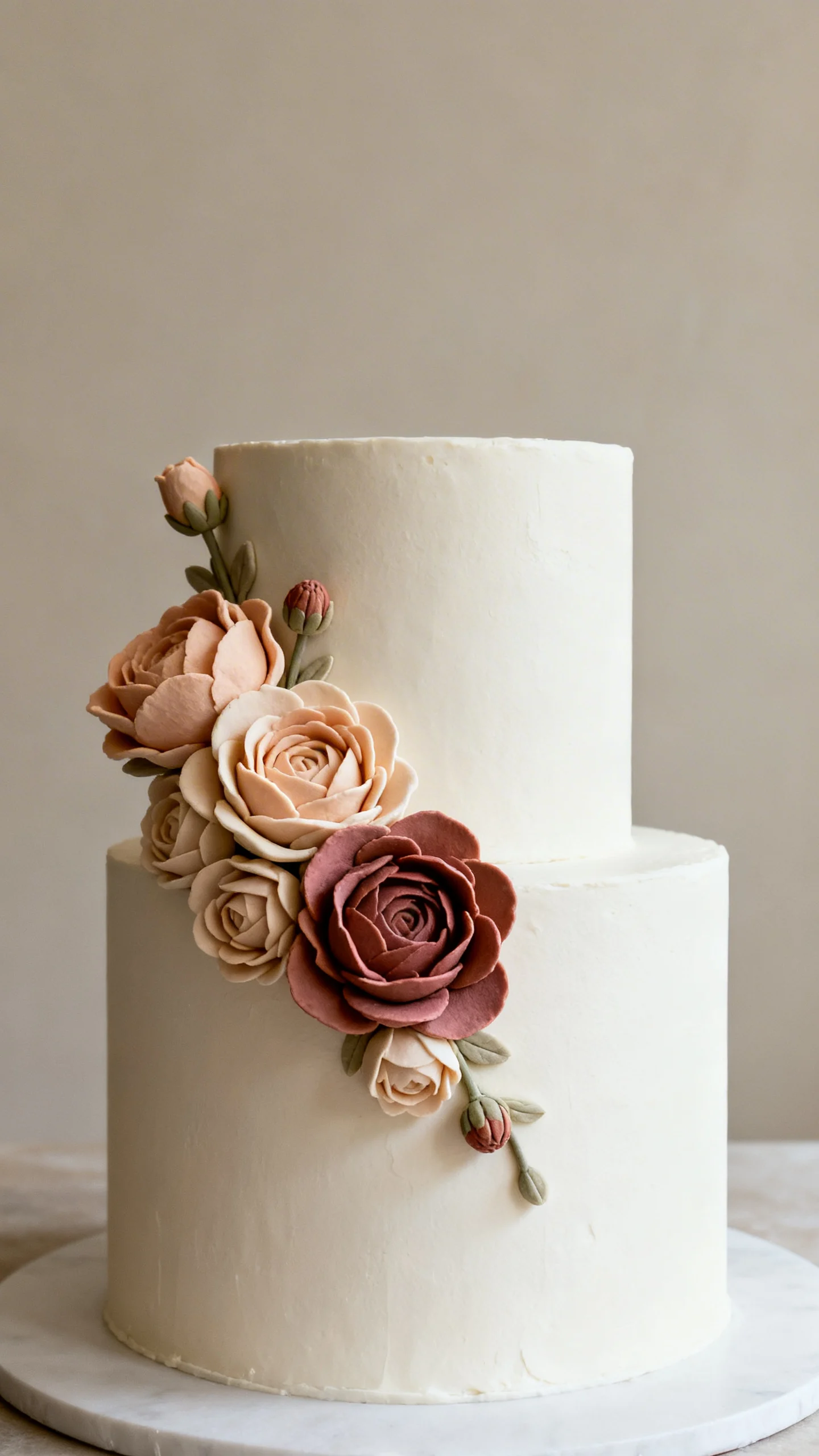
Statement sugar flowers, styled like a designer bouquet
Skip the “cake covered in flowers” look and go for one sculptural arrangement placed asymmetrically. Ask for realistic blooms with varied sizes and a few buds, like a thoughtfully designed bouquet. Neutral or muted tones keep it sophisticated, while a single deeper shade adds depth. Coordinate flower varieties with your bridal bouquet for seamless styling.
Minimalist cake with negative space and intentional gaps
Negative space (small gaps between tiers or floating separators) creates an airy, editorial feel. This looks very designer when the structure is clean and the proportions are right. Keep the décor minimal—maybe a single delicate floral stem or a thin ribbon detail. It’s a great option for modern venues and couples who love a curated, uncluttered aesthetic.
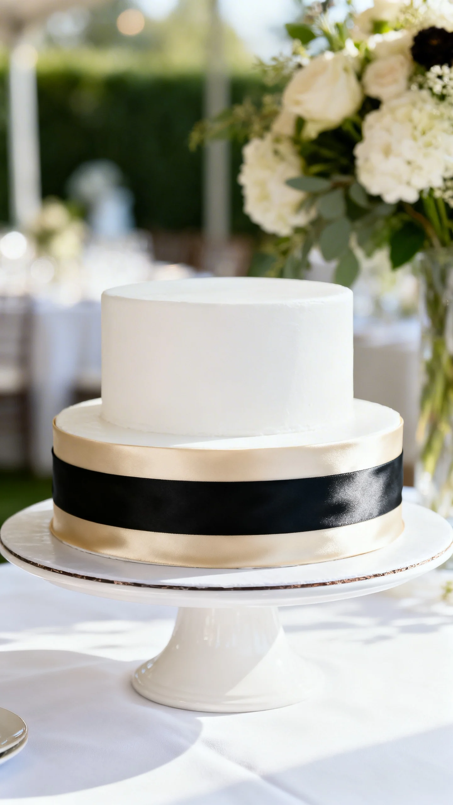
Classic white cake elevated with a couture ribbon detail
A smooth white cake becomes instantly “designed” with a wide silk or satin ribbon wrapped neatly around one or two tiers. Choose a ribbon color pulled from your palette—champagne, black, dusty blue, or soft sage all photograph beautifully. This reads like fashion: simple, tailored, and intentional. Make sure the ribbon is food-safe and removable before cutting.
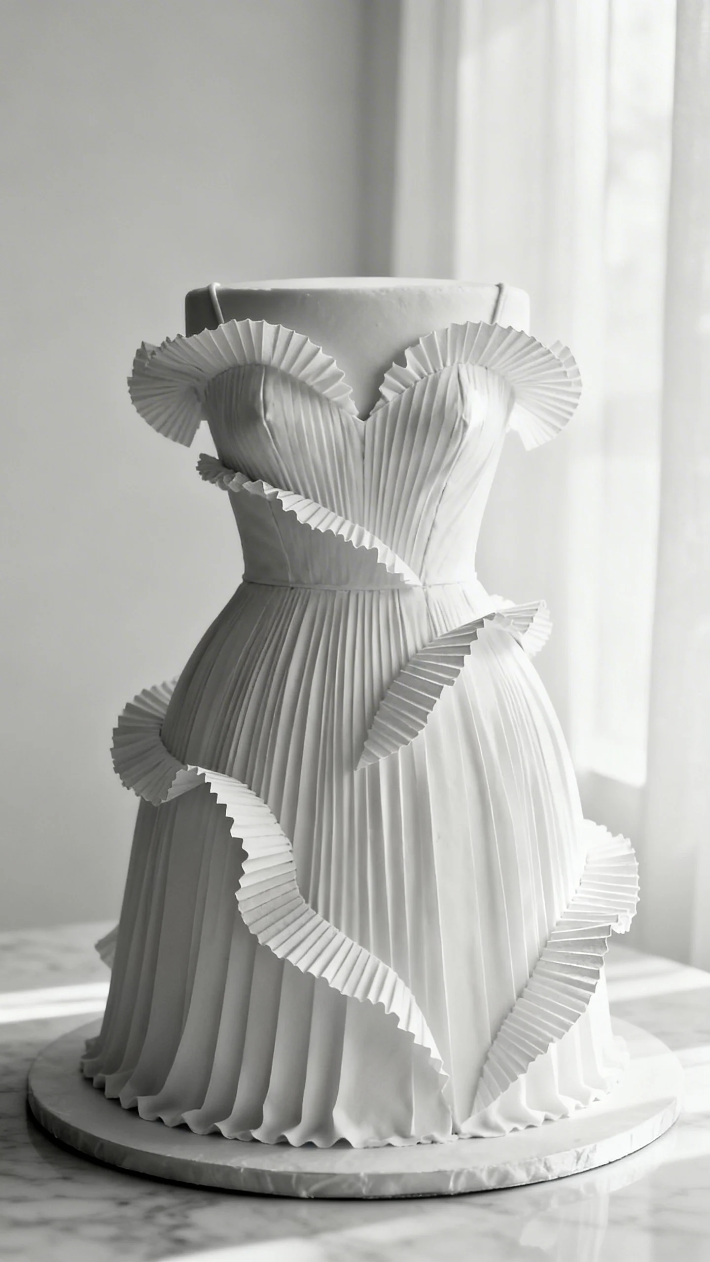
Textural elegance: pleats, ruffles, or wafer-paper waves
Opt for structured pleats or subtle ruffles that mimic couture fabric rather than overly frilly piping. Wafer-paper waves can look like sculpture when kept monochrome and placed strategically. The result is dimensional and artistic without feeling trendy or busy. This style pairs perfectly with modern gowns and sleek bridal styling.
FAQ
How do I make a wedding cake look expensive without going over budget?
Focus on flawless finish work and one standout detail (like fine-line metallic paint, a ribbon, or a small sugar-flower arrangement). A smaller display cake plus a matching sheet cake in the back can also keep costs down while maintaining the designer look.
Is fondant required for a “designer art” cake?
No. Many of these styles can be done in buttercream, especially textured monochrome finishes, bas-relief piping, and subtle metallic accents. Fondant can help achieve ultra-sharp edges and very smooth surfaces, but it’s not the only path to a polished result.
What cake colors feel classy and timeless in photos?
Warm white, ivory, champagne, blush, and soft gray tend to photograph beautifully and match a wide range of palettes. If you want contrast, consider black ribbon accents, deep florals, or a muted marbled effect rather than bright, high-saturation colors.
How do I choose a cake style that won’t feel dated later?
Prioritize classic composition: clean tiers, a limited color palette, and craftsmanship-forward details. Avoid overly specific motifs and heavy novelty elements, and lean into textures and finishes inspired by architecture, fashion, and fine art.
What should I tell my baker to ensure the cake matches my wedding design?
Share your invitation suite, venue photos, floral palette, and a short list of design keywords (like “monochrome,” “sculptural,” “tailored,” or “fine-line metallic”). Ask for a sketch or mockup and confirm the finish type, color tone, and placement of the statement detail before finalizing.