
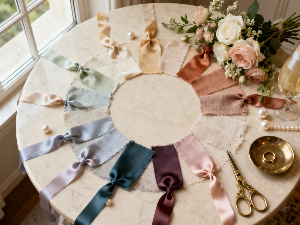
If you love Disney princess movies but still want a wedding that feels elevated (not like a theme park), color is your secret weapon. The right palette can nod to your favorite story while staying modern, romantic, and totally “you.”
Below are Disney wedding aesthetic color palettes inspired by princess films, plus practical ways to use each color story across attire, florals, stationery, and tablescapes.
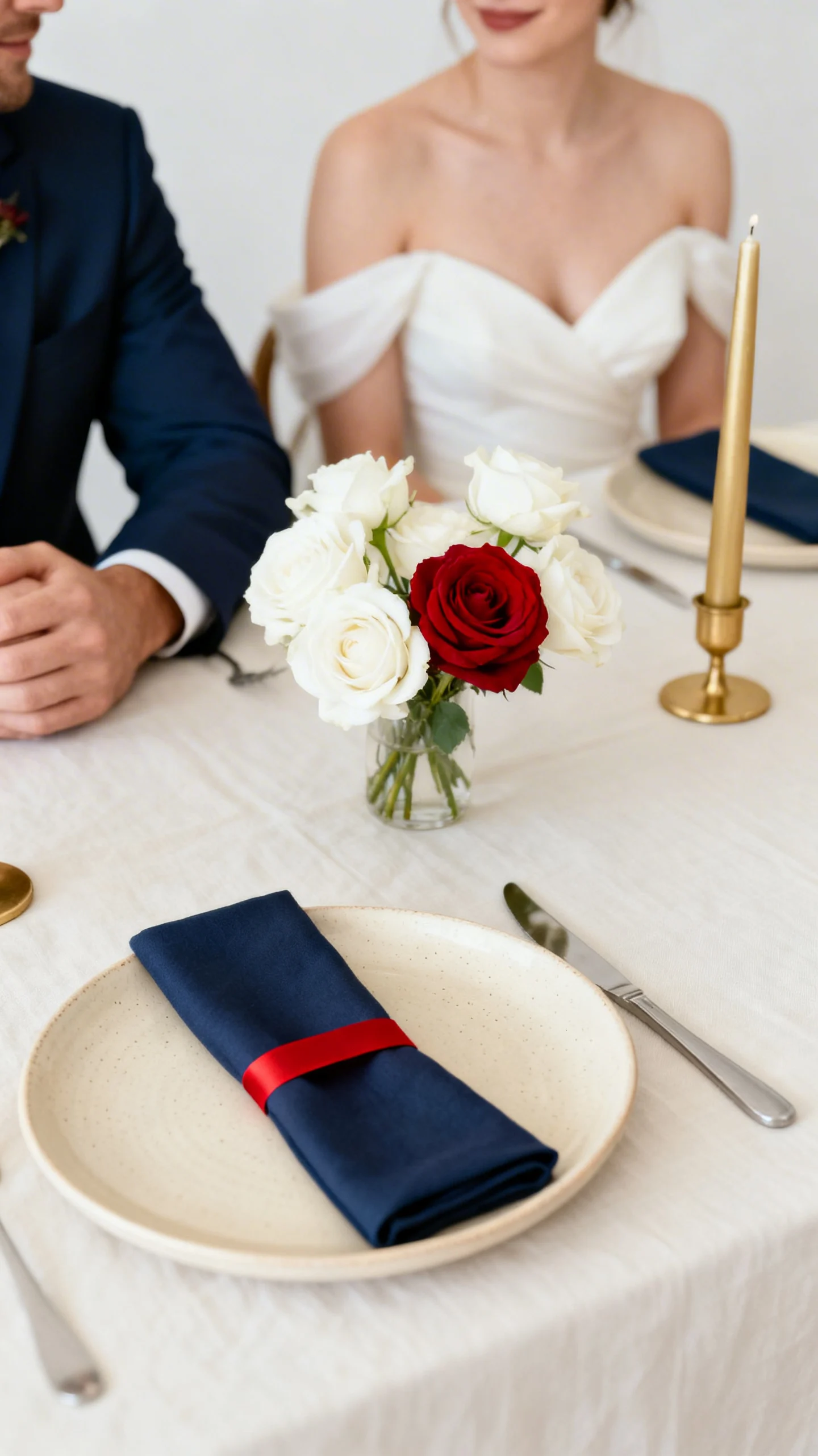
Snow White: Apple Red, Cream, and Soft Navy
This palette is bold, classic, and surprisingly chic when you keep the red as an accent. Use cream or ivory as your base, then add apple red in bouquet ribbons, bridesmaid lip color, or reception napkins. Soft navy works beautifully in suits, place cards, or a midnight-blue invitation liner. Finish with small touches of gold for a subtle fairytale glow.
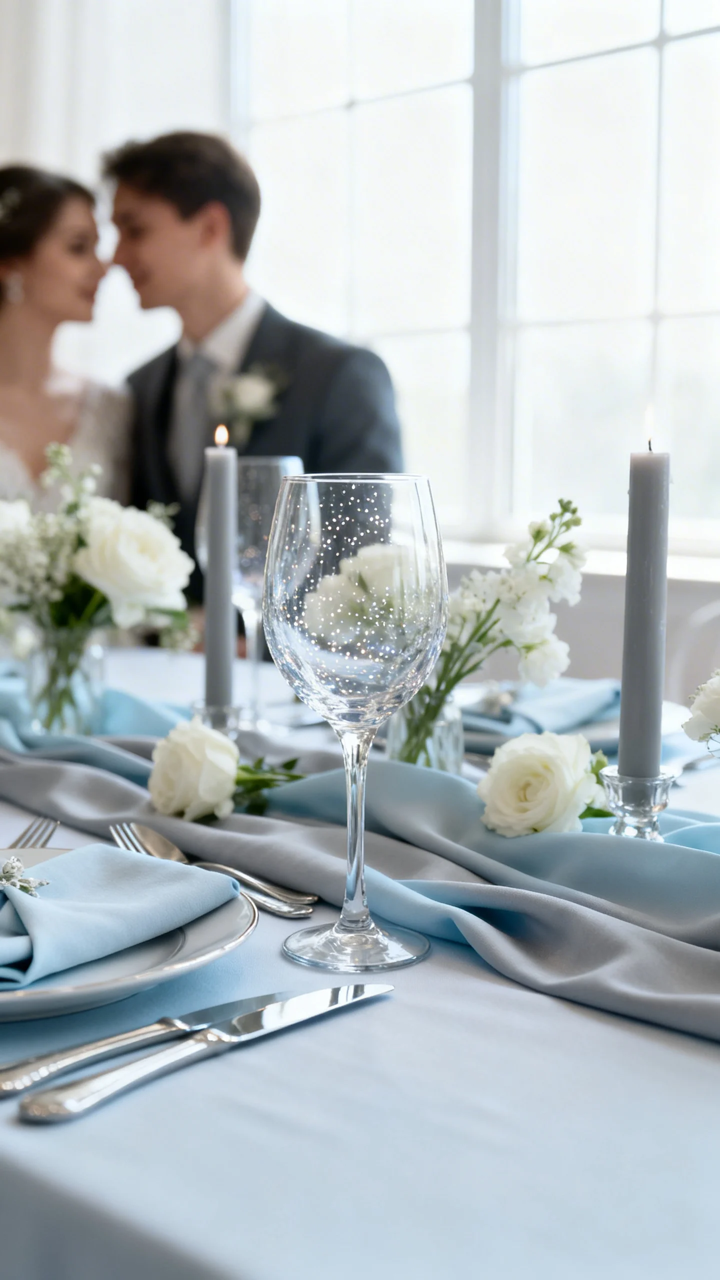
Cinderella: Powder Blue, Silver, and Whisper Gray
For a clean, romantic look, let powder blue lead and keep everything else airy. Think light blue bridesmaid dresses, gray-blue table linens, and silver flatware for that “glass slipper” shine. Add a whisper of gray through candles, stationery ink, or a groom’s tie. This palette is perfect for ballroom, garden, or classic hotel weddings.
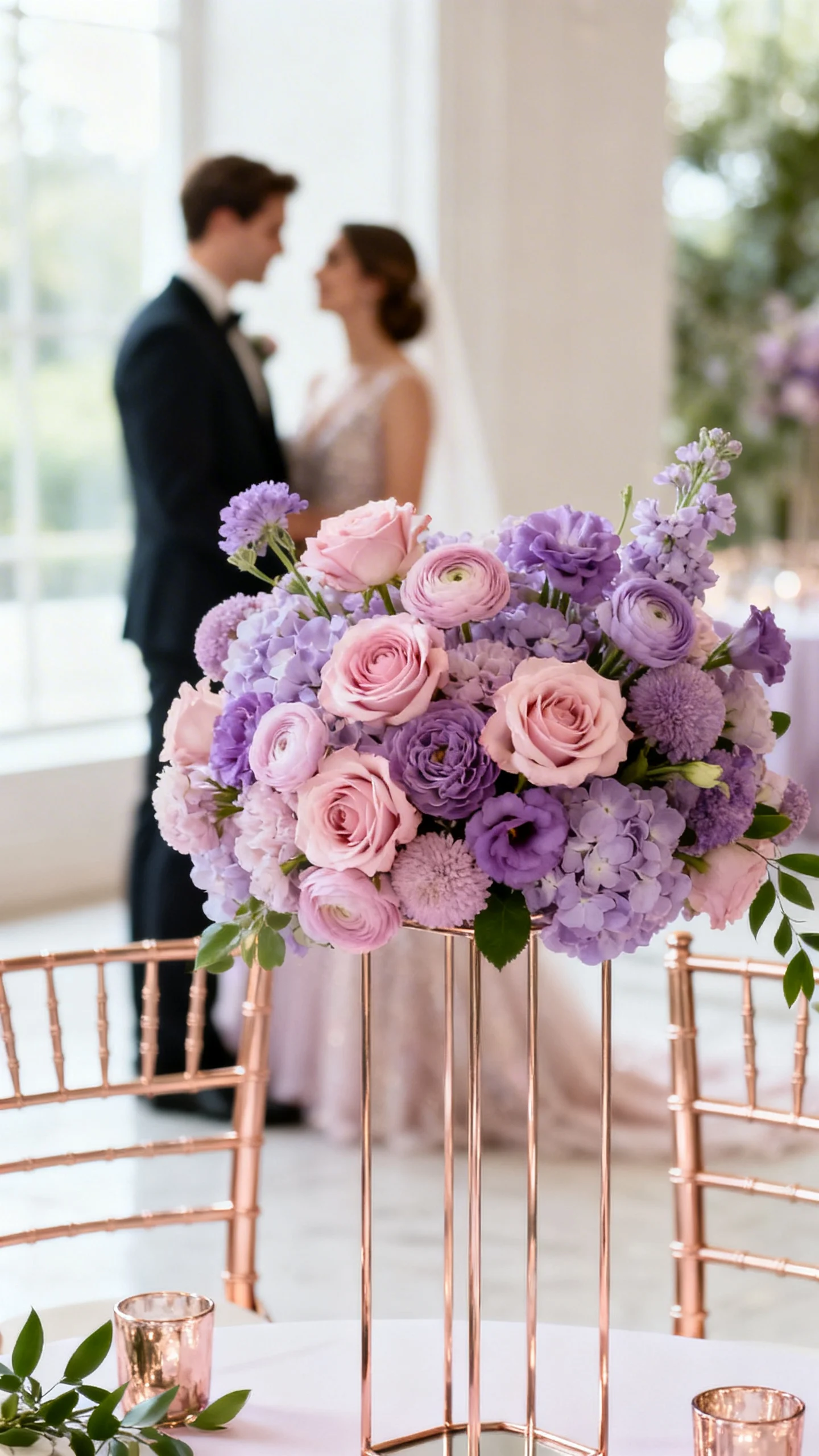
Aurora (Sleeping Beauty): Blush Pink, Lavender, and Champagne
This color story is dreamy and soft, with just enough contrast to feel intentional in photos. Mix blush and lavender in bridesmaid dresses (same fabric, different shades) or create ombré florals with roses, lilac, and ranunculus. Champagne works as your neutral for chairs, cutlery, and signage stands. Keep greenery minimal and lean into romantic blooms for a couture feel.
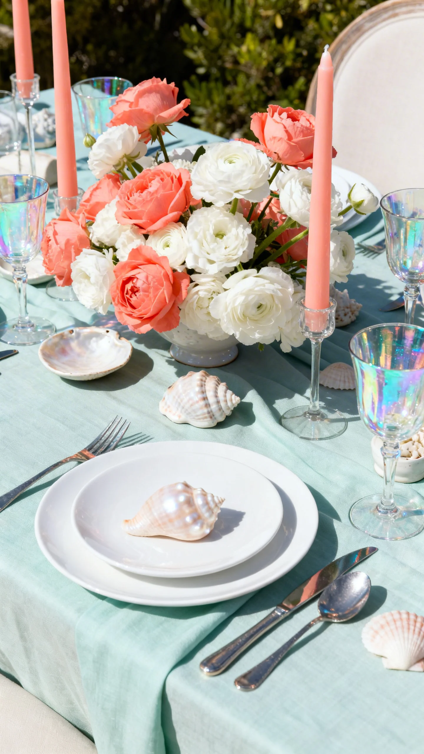
Ariel (The Little Mermaid): Seafoam, Coral, and Pearl White
Seafoam and coral feel playful, but pearl white keeps it wedding-ready and refined. Use seafoam in linens or escort cards, then bring coral in florals, signature cocktails, or taper candles. Pearl white (instead of stark bright white) softens the whole look and pairs beautifully with shell-like textures. Add iridescent details on menus or bar signs to mimic an ocean shimmer.
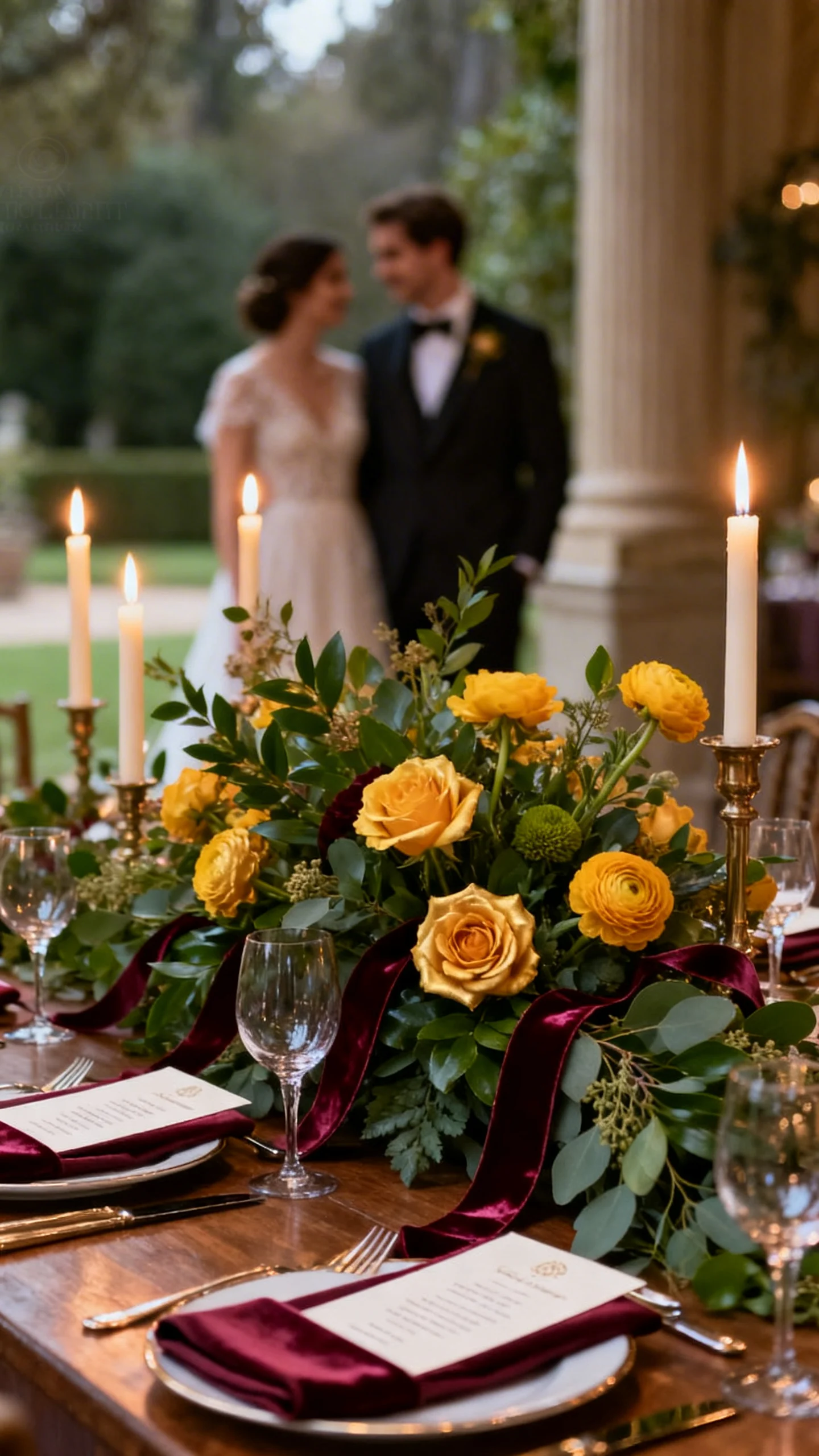
Belle (Beauty and the Beast): Golden Yellow, Bordeaux, and Emerald
This palette is rich and romantic with a slightly moody edge—ideal for estate venues and candlelit receptions. Use golden yellow in florals (garden roses, ranunculus) or as a subtle watercolor wash on stationery rather than large blocks of color. Bordeaux brings drama through bridesmaid dresses, velvet ribbons, or wine-toned napkins. Emerald shows up beautifully in greenery-heavy centerpieces or a groom’s tie.
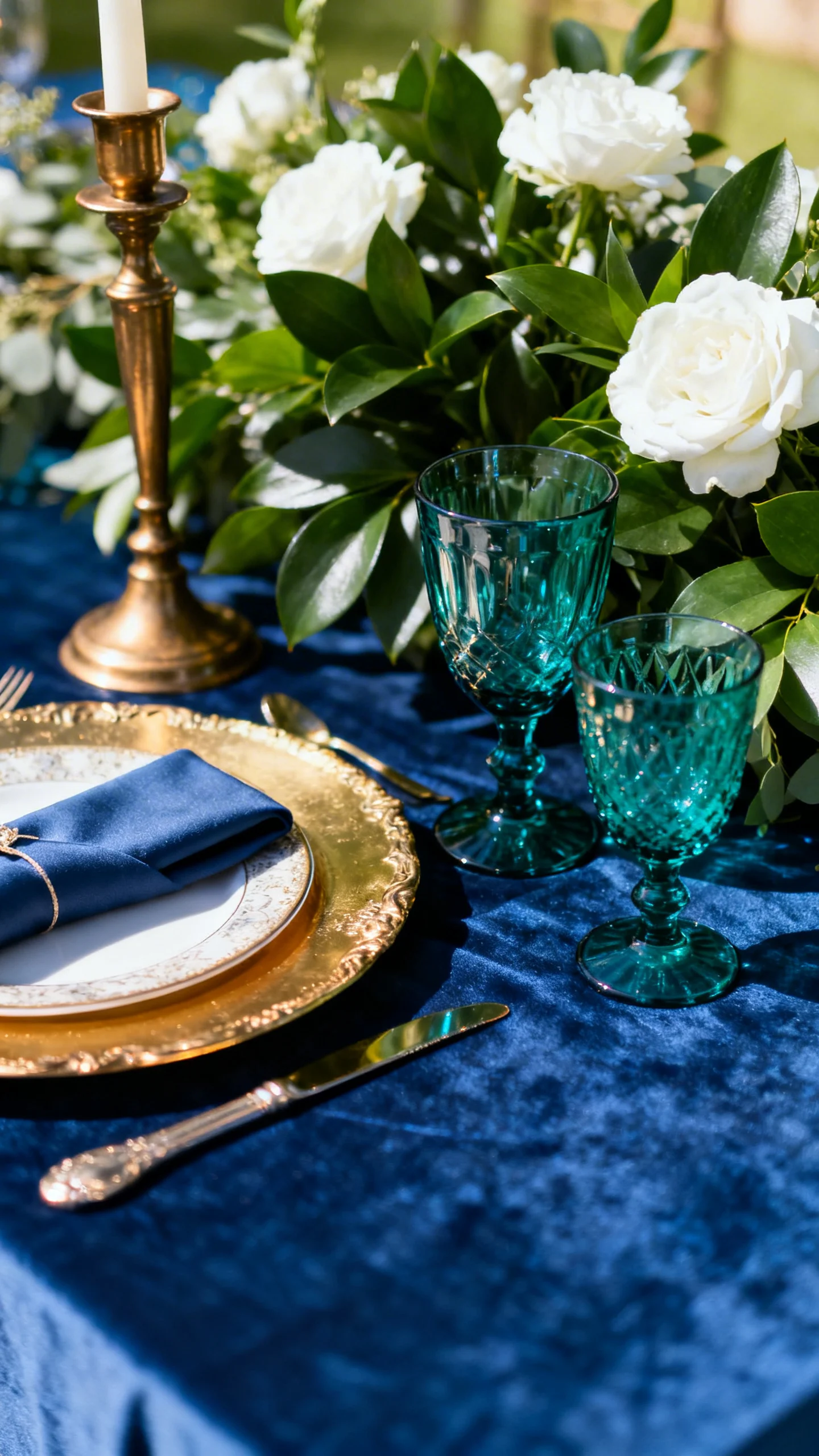
Jasmine (Aladdin): Sapphire, Teal, and Antique Gold
Sapphire and teal create a jewel-toned look that feels glamorous without being too heavy. Choose one shade for large surfaces (like linens) and the other for accents (like candles and glassware) so it doesn’t get busy. Antique gold adds warmth in chargers, frames, and typography on signage. For florals, white blooms with deep green leaves keep everything looking luxe.
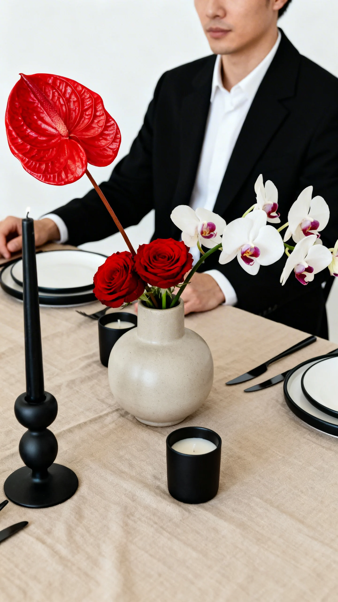
Mulan: Crimson, Ink Black, and Warm Sand
This palette is striking, modern, and perfect for couples who want high contrast with clean lines. Use warm sand or beige as your grounding neutral in paper, linens, or ceremony rugs, then layer in crimson through bouquets and bridesmaid dresses. Ink black works for tuxes, sleek candleholders, or minimalist table numbers. Keep florals structured—think anthurium, orchids, and roses—for a polished finish.
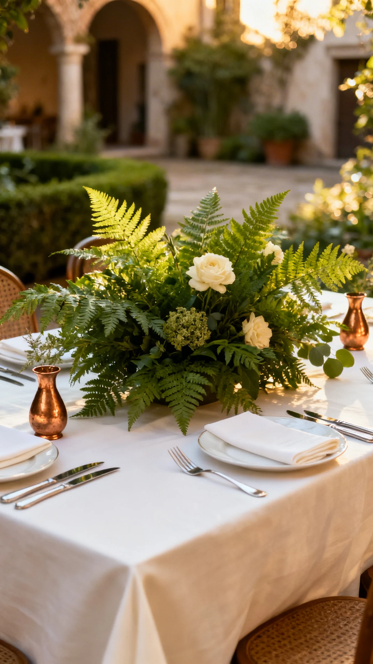
Tiana (The Princess and the Frog): Fern Green, Ivory, and Brass
Fern green feels fresh and timeless, especially when paired with creamy ivory and warm brass. Go monochrome with greens in your florals (different textures of foliage) and add ivory blooms for softness. Brass details—like bud vases, flatware, or signage stands—bring in that New Orleans-inspired glow. This palette looks stunning in garden venues, courtyards, and tented receptions.
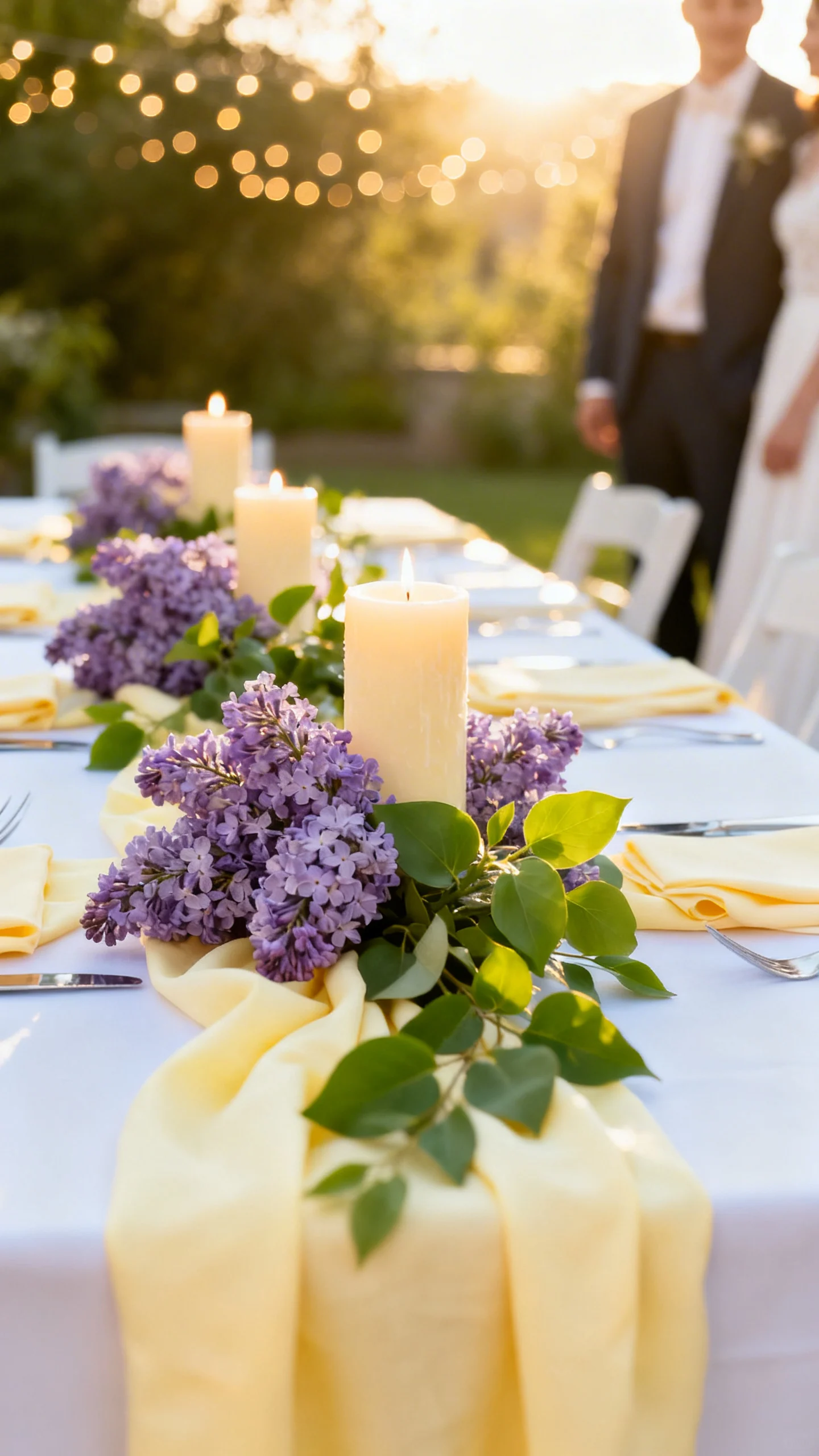
Rapunzel (Tangled): Lilac, Buttercream, and Fresh Green
Light and sunny, this palette balances romantic purple with a cheerful, glowing neutral. Use lilac in bridesmaid dresses or floral clusters, then bring buttercream in candles, linens, or a butter-yellow cake accent. Fresh green keeps it from feeling overly pastel and photographs beautifully outdoors. Add twinkle-light moments and lots of blooms for that lantern-lit vibe.
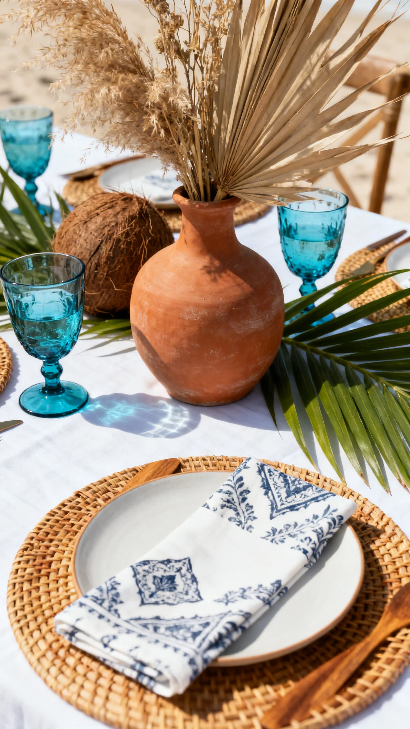
Moana: Terracotta, Ocean Blue, and Coconut White
Terracotta and ocean blue create an earthy-coastal mix that’s bold but still grounded. Coconut white (a warm off-white) keeps the palette soft in dresses, linens, and stationery. Use terracotta in dried accents, ceramic vases, or aisle arrangements, then layer ocean blue through glassware or patterned napkins. Finish with natural textures like rattan, wood, and palm-inspired greenery.
FAQ
How do I keep a Disney-inspired palette from looking like a costume theme?
Use the movie as a color reference, not a prop checklist. Choose elevated materials (linen, silk ribbon, matte paper) and keep character motifs subtle, like a tiny emblem on the invite liner or a signature cocktail name.
What’s the easiest place to show off my color palette?
Bridesmaid attire and tablescapes make the biggest visual impact fast. Linens, napkins, candles, and florals layer color in a way that reads instantly in photos.
How many colors should I include in my wedding palette?
Three main colors is a sweet spot: one base neutral, one dominant hue, and one accent. You can add metallics (gold, silver, brass) as “bonus neutrals” without making it feel busy.
Can I mix two princess palettes if I love more than one movie?
Yes—pick one palette as the foundation, then borrow just one accent from the other. Keeping the same undertone (warm vs. cool) helps the combined look feel intentional.
How do I choose between bright and muted versions of these colors?
Consider your venue and season: bright shades pop in summer outdoor settings, while muted tones look especially elegant in indoor, candlelit, or fall/winter weddings. Ask your florist to show the same palette in both saturated and dusty options before you decide.