
Classy wedding decor isn’t about chasing trends—it’s about choosing details that feel polished now and will still look beautiful decades from today. Think timeless materials, intentional styling, and a few “signature” moments that make your day feel elevated without feeling fussy.
Below are decor ideas that photograph like a dream, work across venues, and stay effortlessly elegant no matter your wedding style.
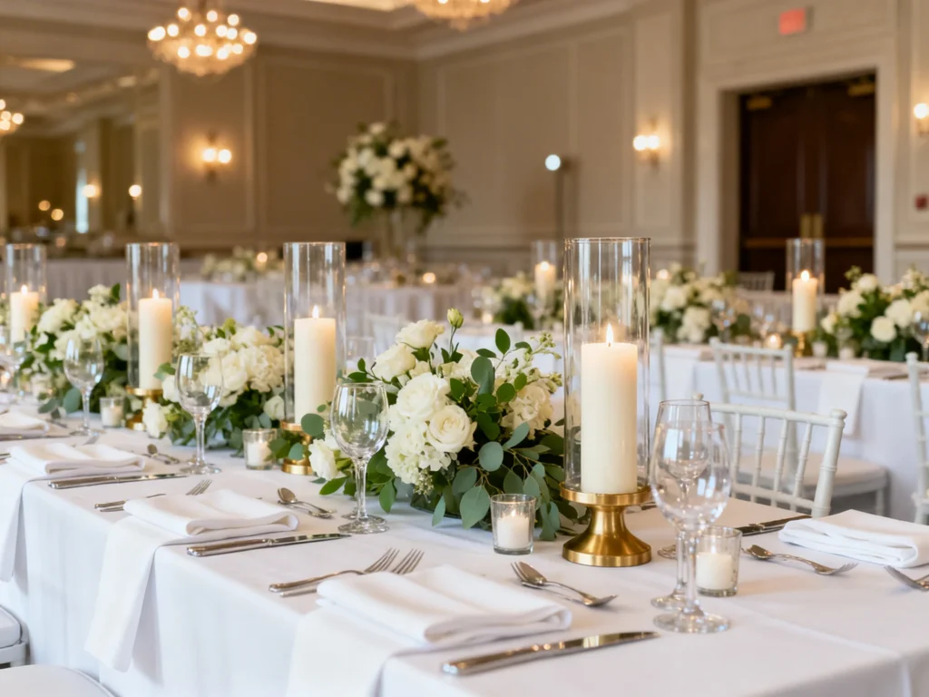
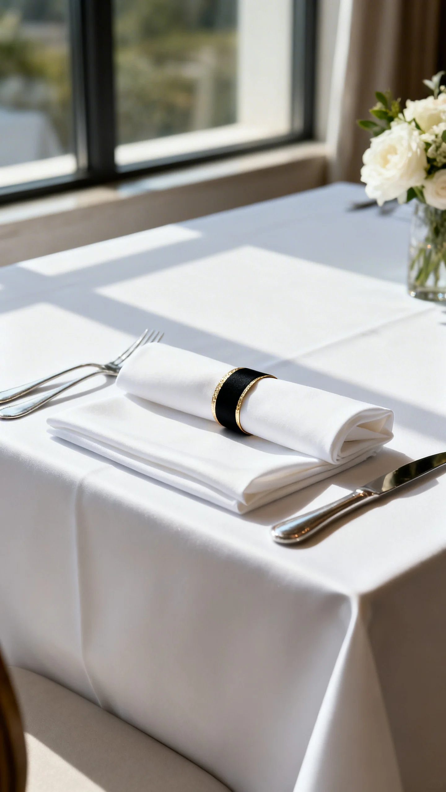
Crisp white linens with tailored napkins
Nothing reads “classic” faster than clean white table linens with a smooth, pressed finish. Pair them with tailored napkins—think simple folds or a neat knot—for a refined look that won’t date your photos. If you want contrast, use a thin black, navy, or champagne napkin ring. This is an easy foundation that makes every centerpiece look more expensive.
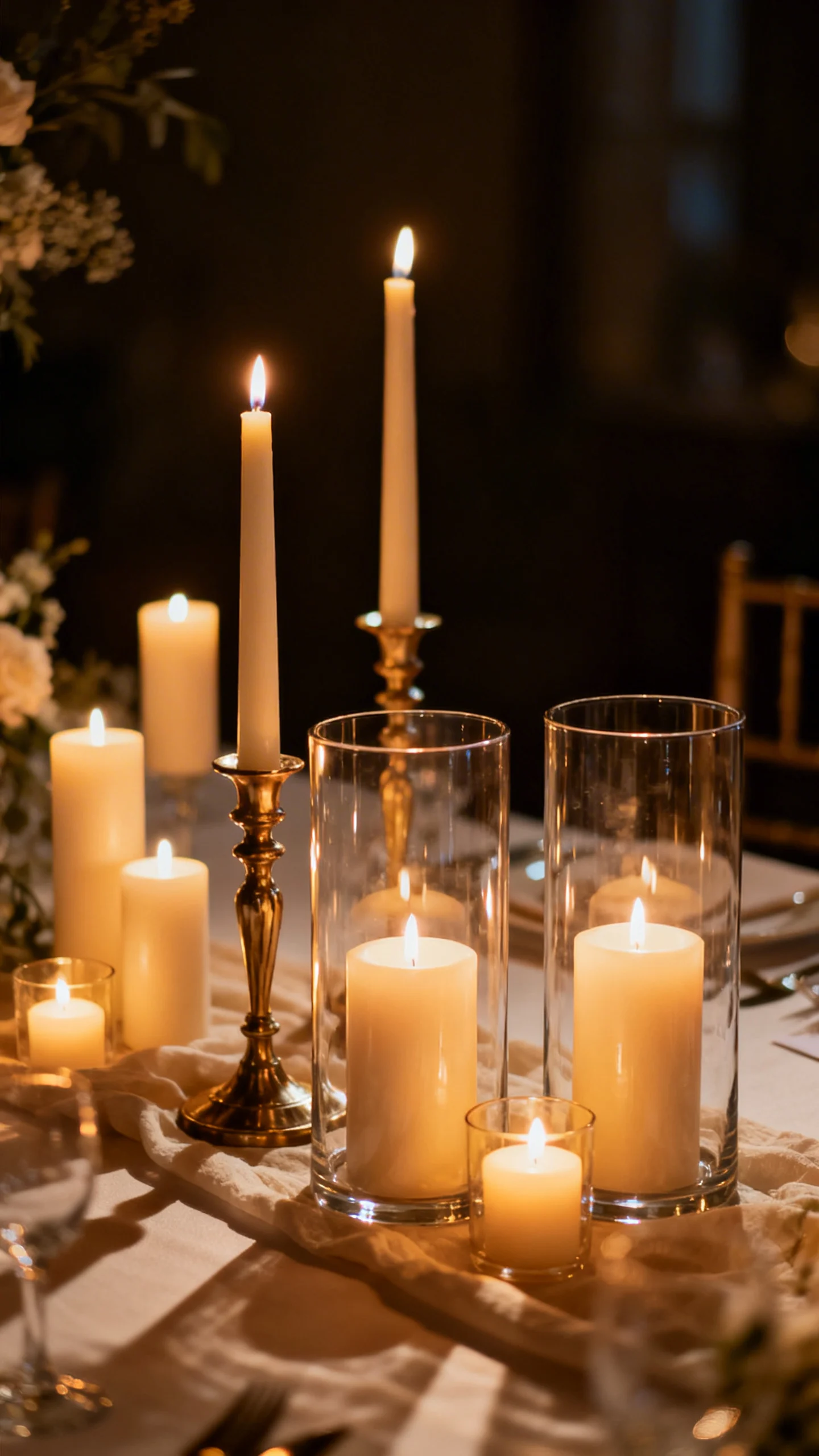
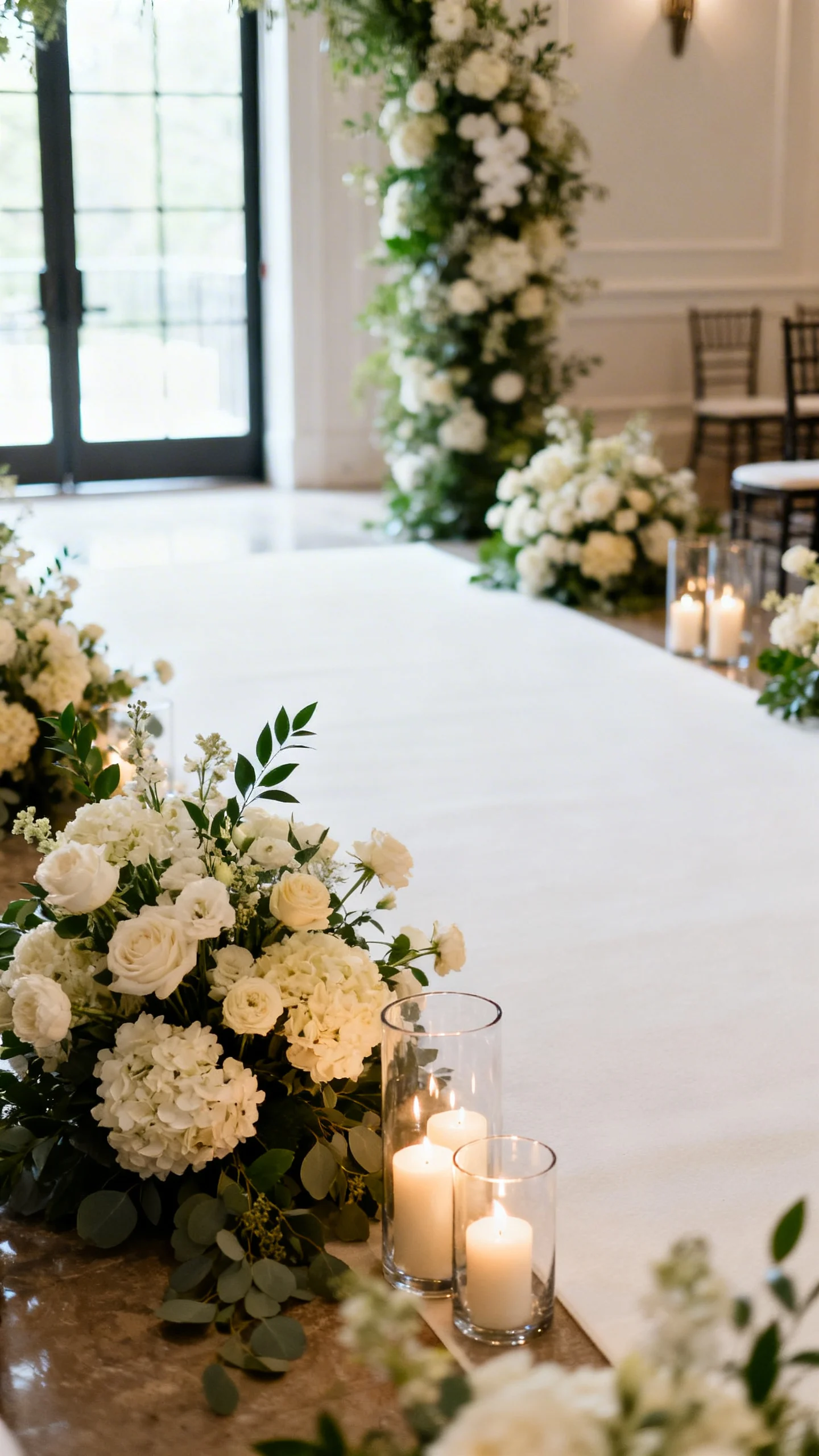
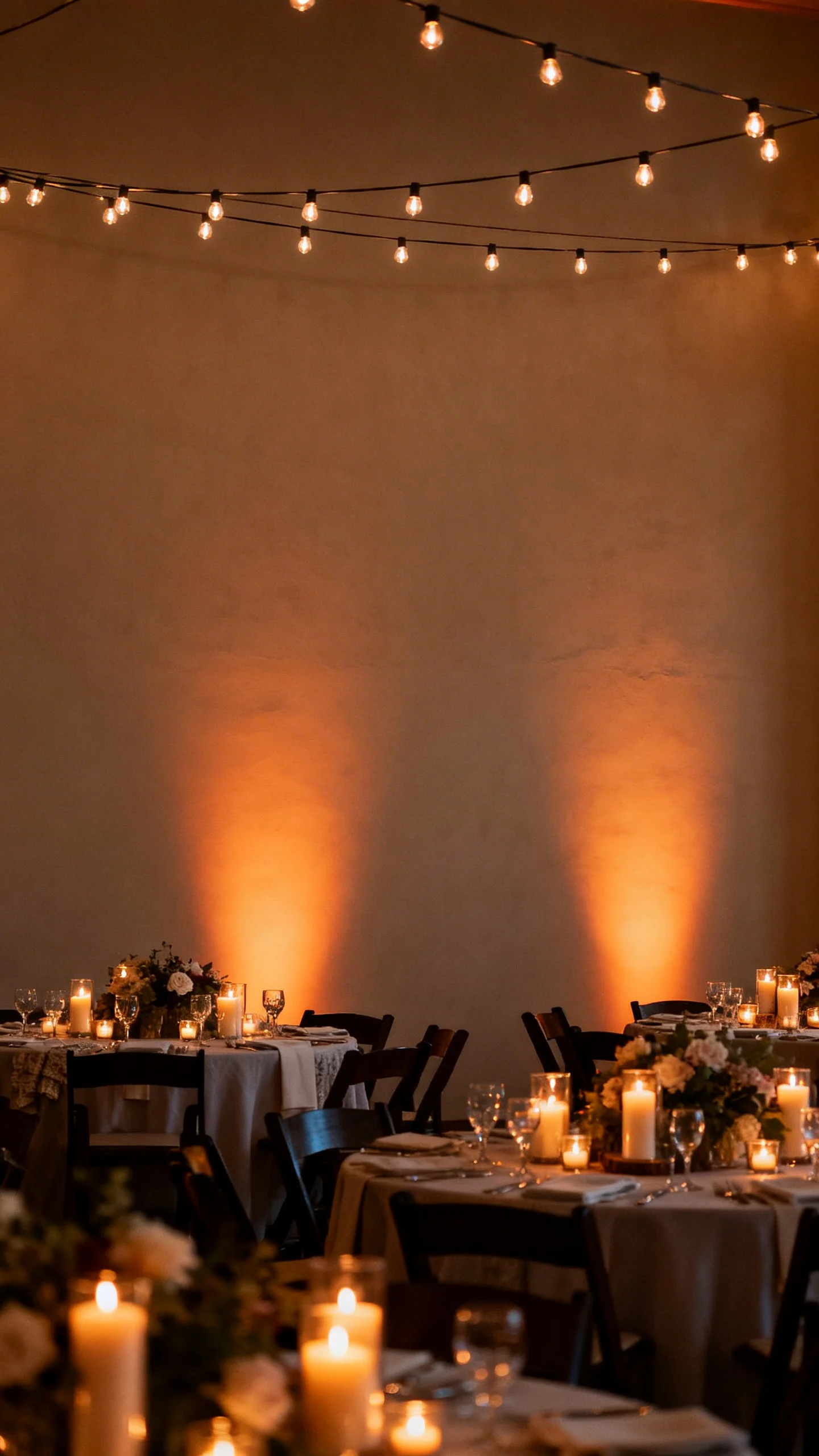
Candlelight in mixed heights
Votives, tapers, and pillar candles together create a warm, romantic glow that feels instantly upscale. Choose one candle color (ivory is always safe) and vary the heights for dimension. Use glass hurricanes where needed for wind and venue rules, and keep the arrangement low enough for conversation. Candlelight flatters every space—from ballrooms to backyard tents.
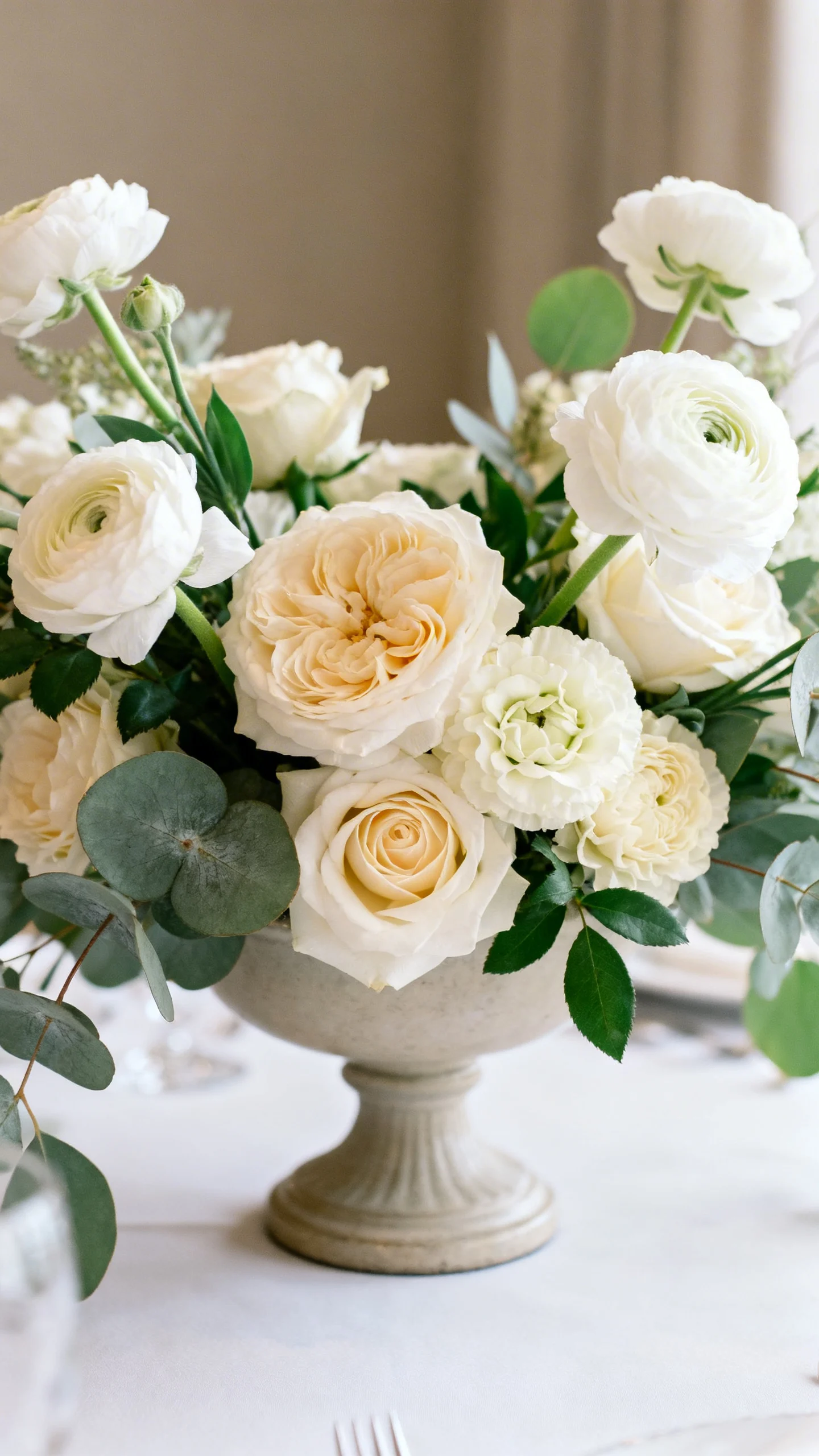
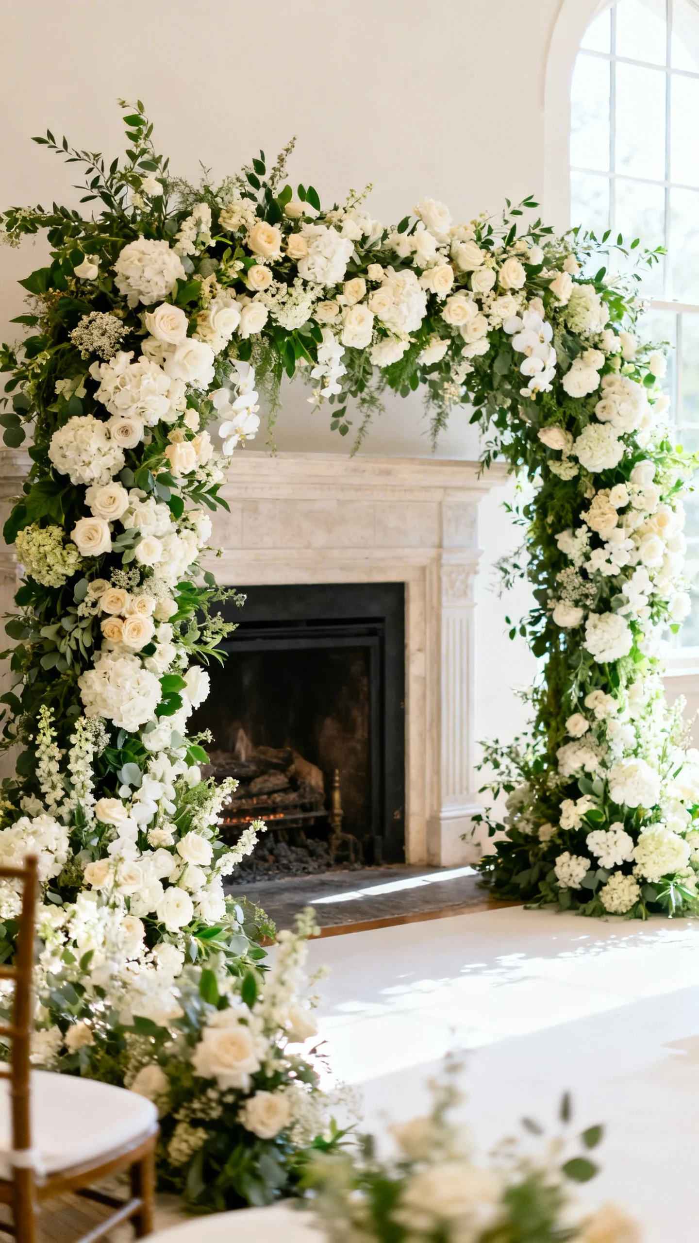
Fresh florals in a restrained palette
Classy florals often come down to color discipline: pick a tight palette and repeat it throughout the day. Whites, creams, blush, and soft greenery are forever, but you can also go timeless with all-white plus a single accent like muted mauve or dusty blue. Ask for a mix of textures (like roses, ranunculus, and seasonal blooms) while keeping the colors consistent. The result is cohesive, not chaotic.
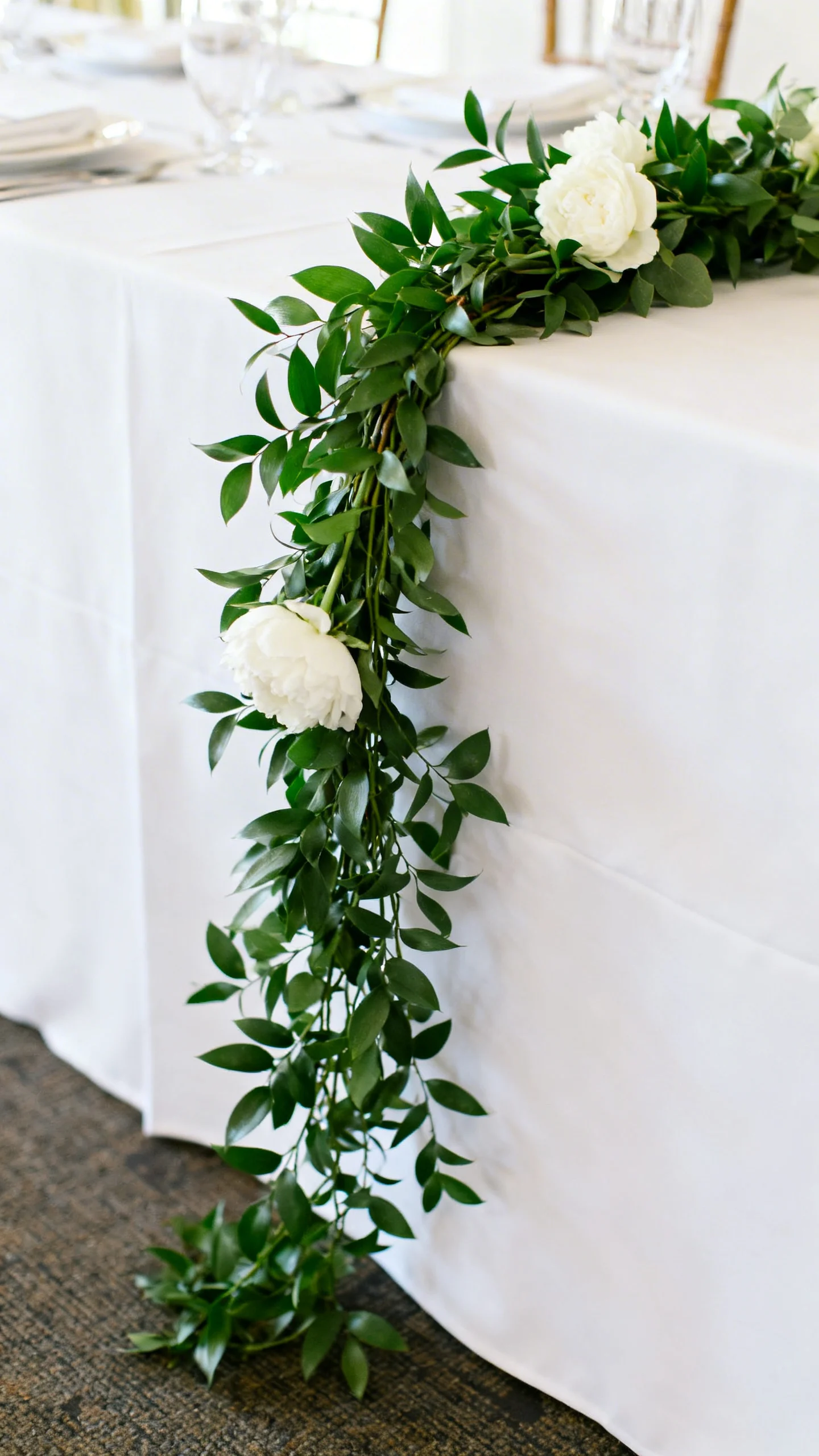
Greenery garlands that look intentional
A well-made garland adds structure to head tables, stair rails, and welcome tables without feeling overdone. Keep it full and natural, and avoid overly “stringy” styles for a cleaner finish. Tuck in a few focal blooms to connect it to your bouquets. It’s classic, photo-friendly, and works in every season.
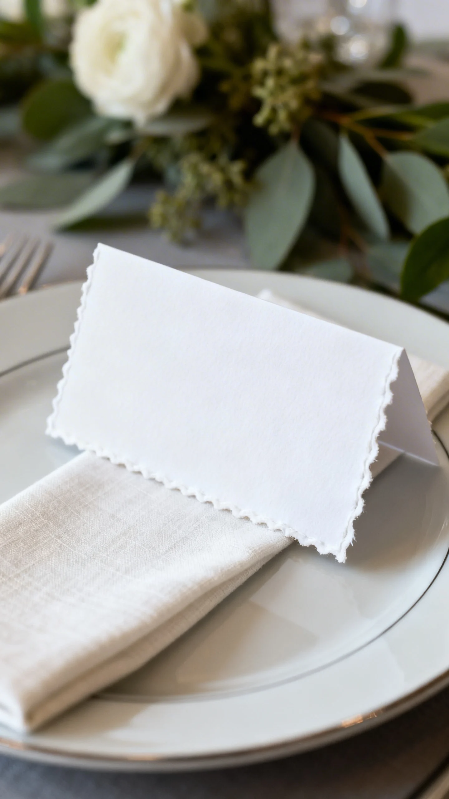
Elegant place cards and simple typography
Timeless weddings favor readable fonts and clean layouts over overly trendy scripts. Choose one or two typefaces max, and let spacing and paper quality do the work. Thick cardstock, deckled edges, or a subtle linen texture feels instantly elevated. Bonus: guests keep beautiful place cards, and your tables look composed from every angle.
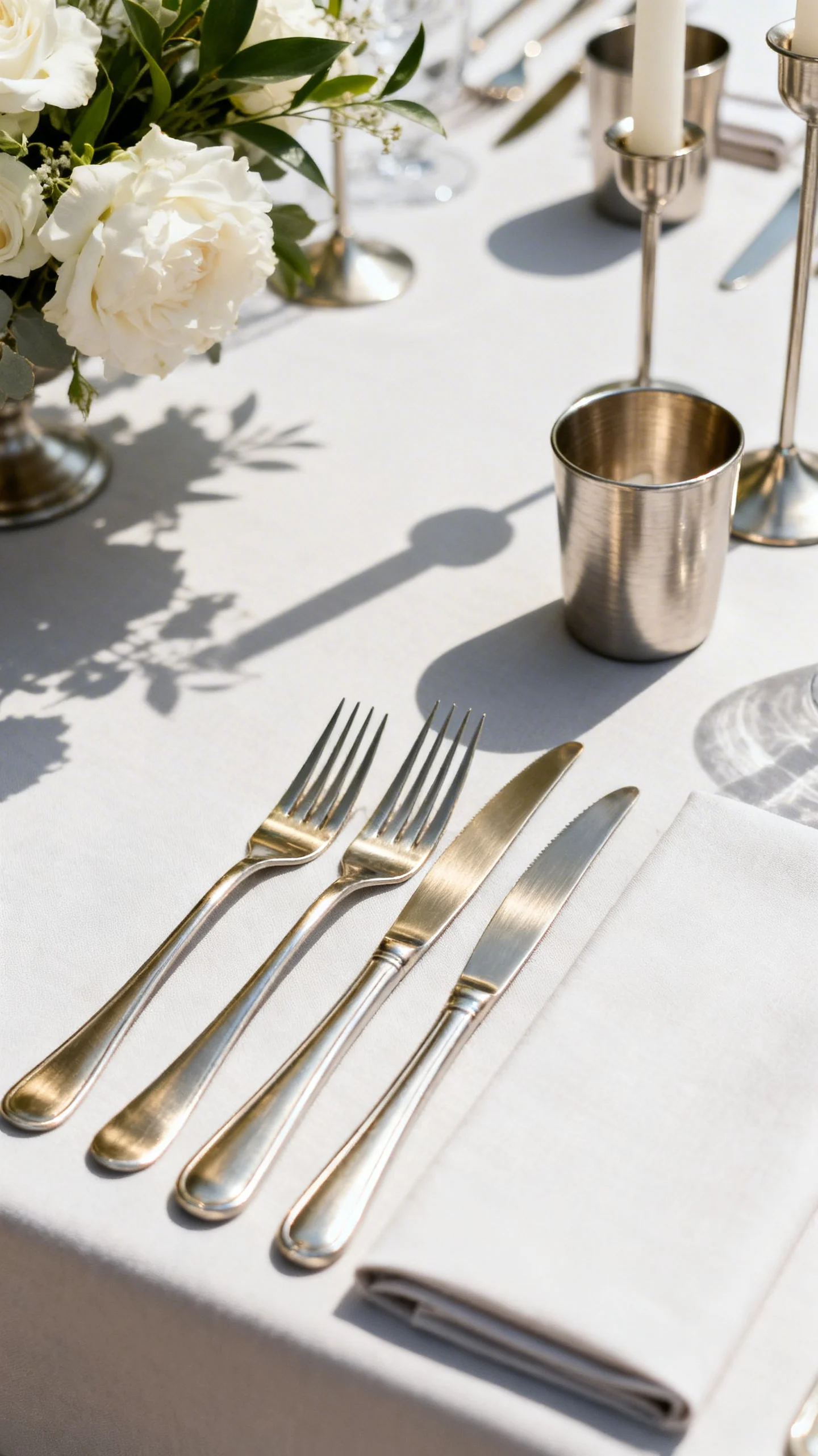
Gold or silver accents (used sparingly)
A touch of metallic instantly adds polish—just keep it consistent and restrained. Pick one metal tone (warm gold, brushed brass, or cool silver) and repeat it in flatware, frames, or candleholders. Avoid mixing too many finishes at once, which can look busy in photos. The goal is “glow,” not “glitter.”
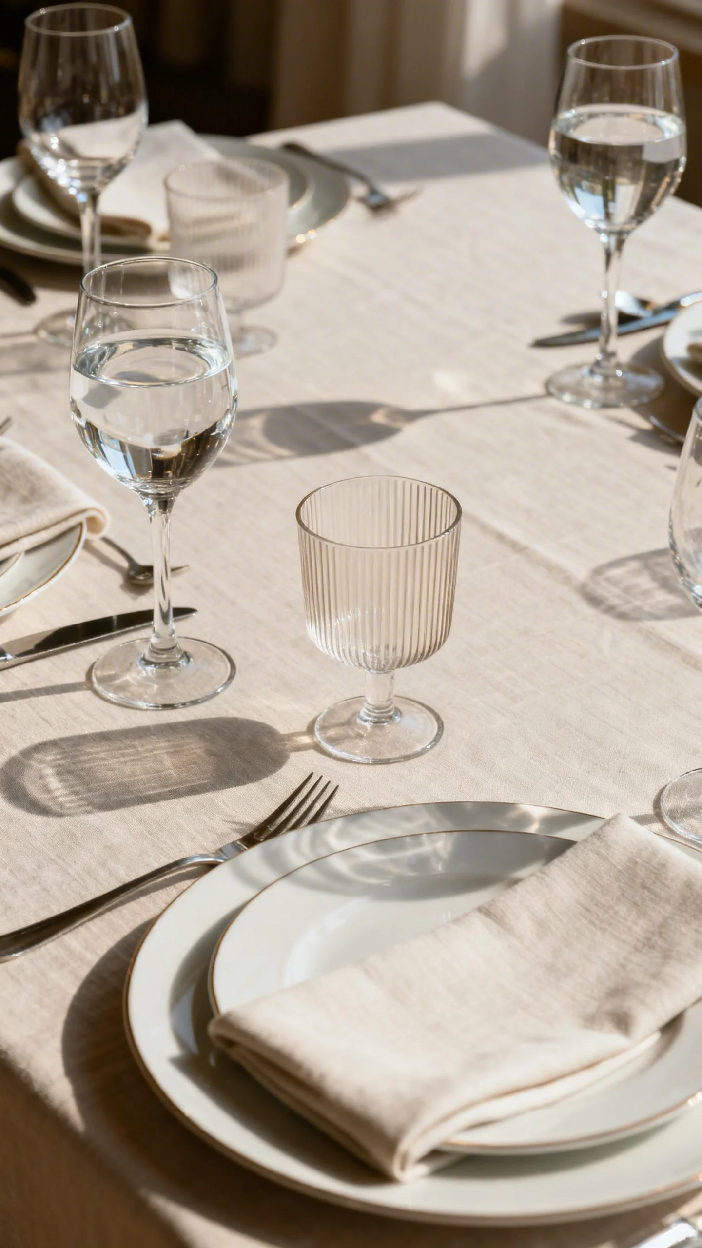
Classic glassware and cohesive rentals
Matching glassware and well-chosen rentals make your reception feel curated, even with minimal decor. Clear, simple stems and water goblets look timeless with any tablescape. If you’re adding a statement, do it in one place—like a subtle ribbed glass or a colored coupe for a signature cocktail. Consistency is what reads as luxury.
Neutral ceremony aisle moments
An aisle lined with understated florals, soft greenery, or candle clusters feels romantic without competing with the couple. Stick to neutral tones and classic shapes so the ceremony photos stay focused on emotion. If you’re working with a tight budget, cluster decor at the aisle entrance and ceremony focal point for maximum impact. A clean aisle is always in style.
A statement floral focal point (and let it carry the room)
One strong focal moment—like a ceremony arch, fireplace installation, or suspended greenery—can replace lots of smaller decor. Choose a design that matches your venue architecture and doesn’t overwhelm it. When you invest in one “wow” piece, you can repurpose it behind the sweetheart table or cake. It’s classic because it’s intentional.
Soft, layered lighting
Classy weddings feel warm, not harsh—so think layers: overhead bistro lights, candles, and uplighting that gently washes the walls. Keep the color temperature warm and avoid overly saturated hues. Dimmers are your best friend for transitioning from dinner to dancing. Great lighting makes every detail look more expensive.
FAQ
What colors look the most timeless for wedding decor?
White, ivory, champagne, soft blush, and greenery are the most enduring, especially when paired with a single metal accent. If you want color, choose muted tones like dusty blue, sage, or mauve rather than neon or overly bright shades.
How do I make my wedding look classy on a budget?
Prioritize a clean base (linens, lighting, and consistent rentals), then add candlelight and a few impactful floral clusters. Put your biggest decor effort into the ceremony focal point and head table, since those show up in the most photos.
Is mixing metals ever okay for a classic look?
Yes, but keep it controlled: one dominant metal and one subtle secondary tone, and repeat them intentionally. For example, mostly brushed brass with a small amount of silver in glass details can look refined if the finishes are cohesive.
What decor details date photos the fastest?
Overly themed signage, too many font styles, and trendy novelty props can feel tied to a specific year. Choosing simple typography, cohesive colors, and natural materials helps your decor stay timeless.
How can I keep decor cohesive from ceremony to reception?
Repeat the same palette, greenery style, and one signature element (like candlelight or a specific floral) across both spaces. Even if the layouts change, those repeated details make the day feel unified and elegant.