
If you love color but you’re tired of the same predictable palettes, this list is for you. These combinations feel fresh, fashion-forward, and surprisingly wearable across seasons and venues.
Think of these as mix-and-match starting points: you can scale them up for full wedding design or keep them subtle through florals, stationery, and attire accents.
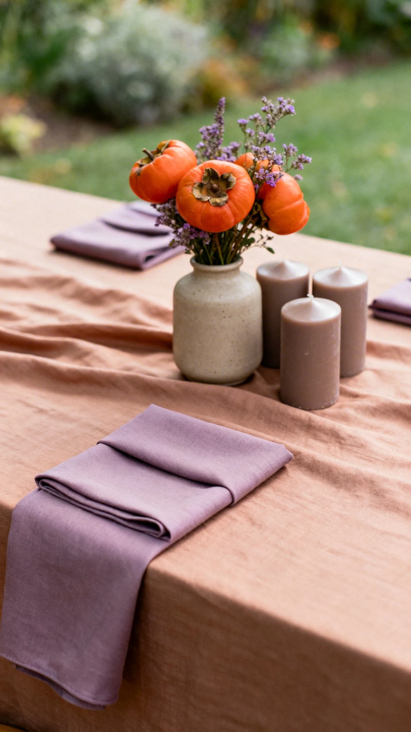
Persimmon + Dusty Lilac + Warm Taupe
This trio balances bright, juicy persimmon with a soft lilac that keeps it romantic, not loud. Warm taupe grounds everything so it still feels wedding-elegant. Use persimmon in bouquets or napkins, lilac in bridesmaid dresses, and taupe in linens or suits. It’s especially pretty in late summer and early fall.
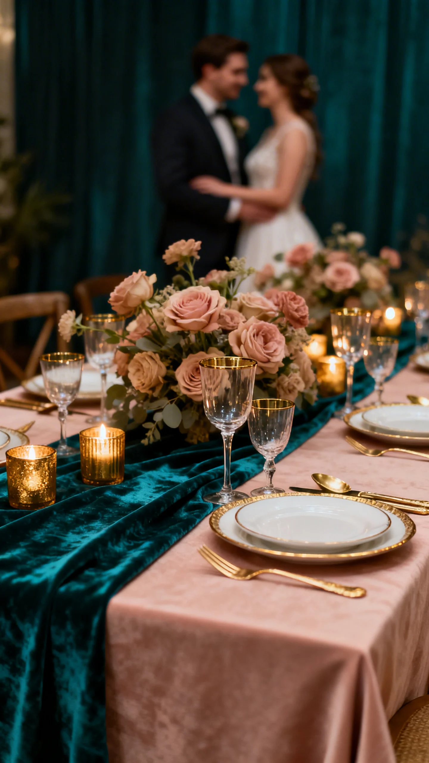
Deep Teal + Antique Gold + Blush Sand
Deep teal brings drama, antique gold adds glow, and blush sand keeps the whole look airy. Try teal for velvet table runners or escort cards, with gold flatware and candlelight. Blush sand works beautifully for linens, neutral florals, and bridesmaid tones. This combo shines in ballrooms and evening receptions.
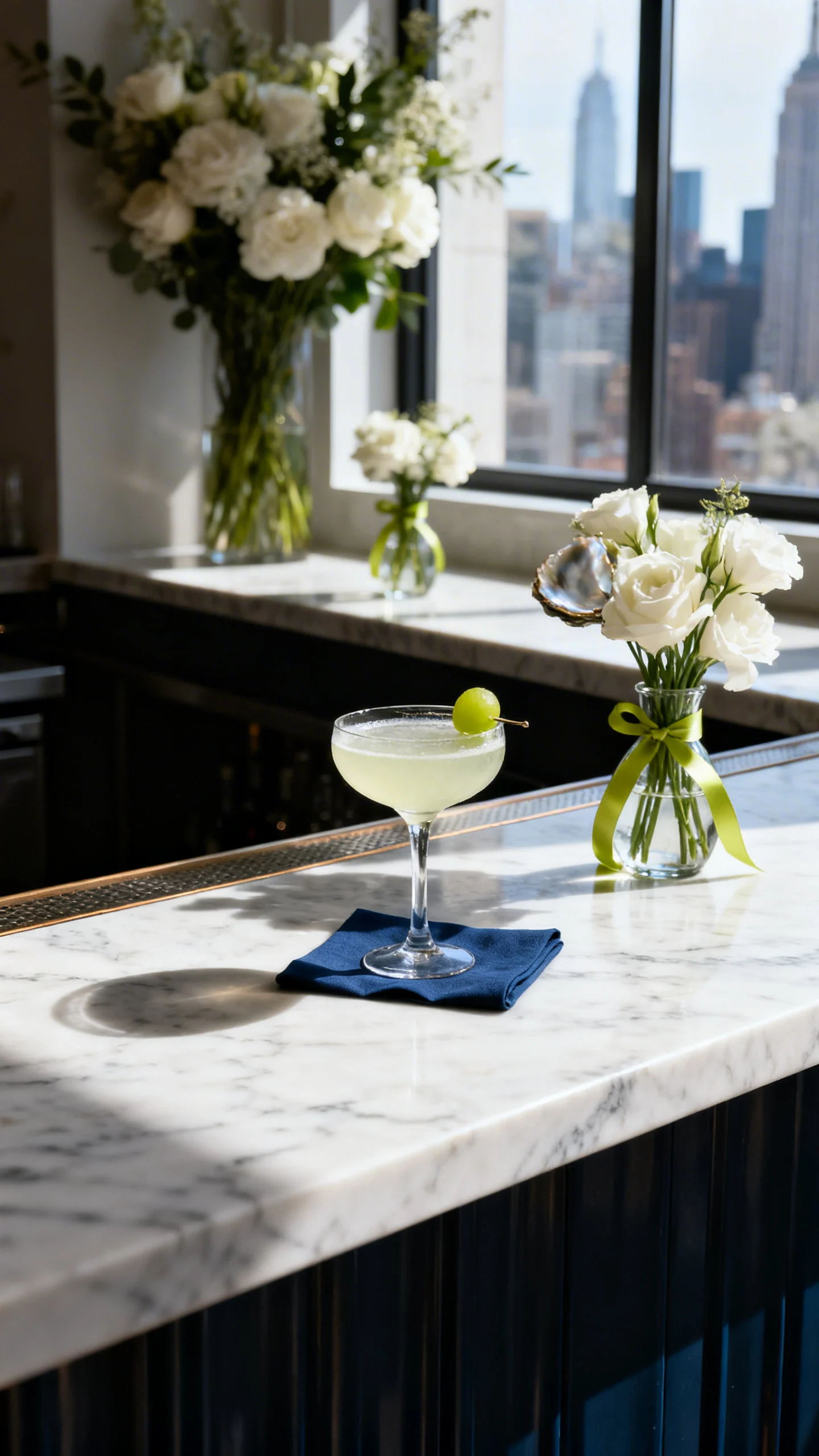
Chartreuse + Stormy Blue + Oyster White
Chartreuse is an unexpected pop that reads modern and editorial when paired with a stormy, denim-like blue. Oyster white softens the contrast and keeps it wedding-ready. Add chartreuse through bud vases, ribbons, or signature cocktails rather than big blocks of color. It’s a fun fit for contemporary venues and city weddings.
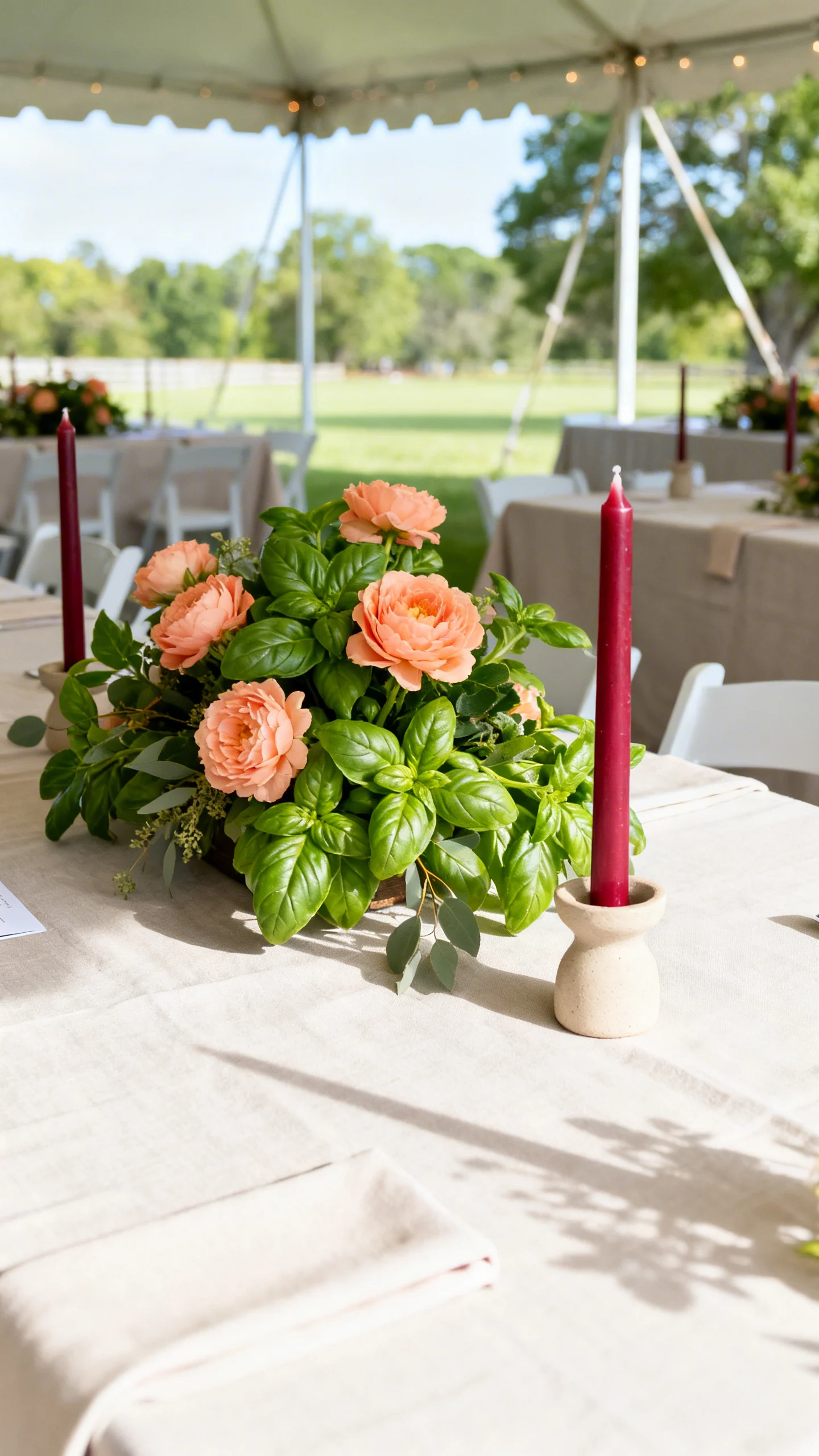
Cranberry + Peach Sorbet + Basil Green
Cranberry and peach sound bold together, but basil green makes them feel garden-fresh. Use cranberry in stationery or taper candles, peach in florals, and basil in greenery-heavy centerpieces. This palette photographs beautifully because it has both depth and glow. It’s a standout choice for outdoor ceremonies and tented receptions.
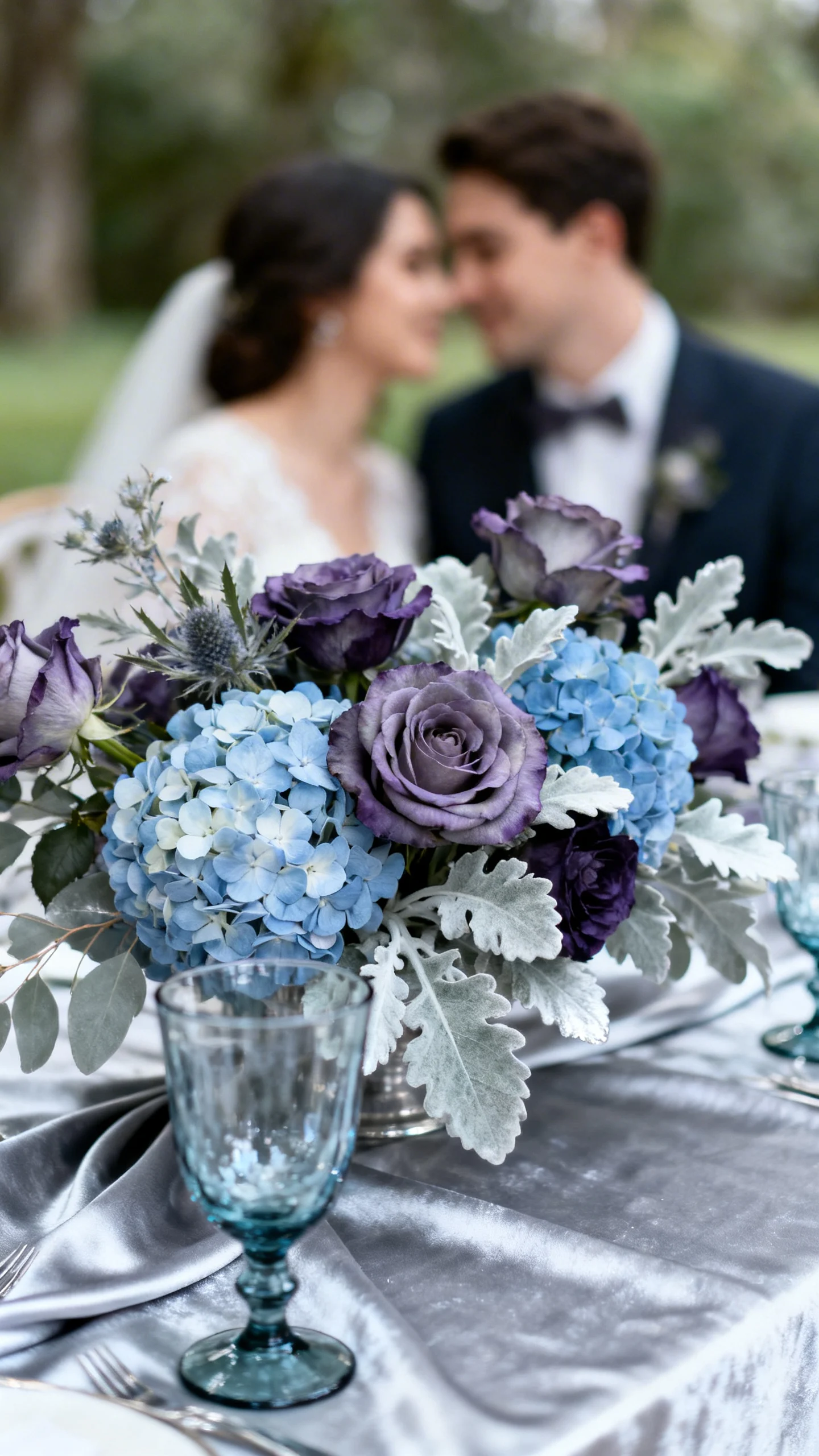
Smoky Plum + Iced Blue + Silver Sage
Smoky plum adds richness without going full “winter jewel tones,” while iced blue brings a cool, luminous highlight. Silver sage ties them together with a soft botanical feel. Consider plum for bridesmaid dresses, iced blue in hydrangeas or paper goods, and sage in linens or foliage. This works across seasons, especially in vineyards and estates.
Terracotta Rose + Seafoam + Buttercream
Terracotta rose feels earthy and romantic, seafoam adds a breezy twist, and buttercream smooths the whole palette into something sweet. Try terracotta rose in ceramic bud vases and florals, with seafoam glassware or signage accents. Buttercream is perfect for linens, cakes, and aisle runners. It’s made for coastal-meets-desert destination vibes.
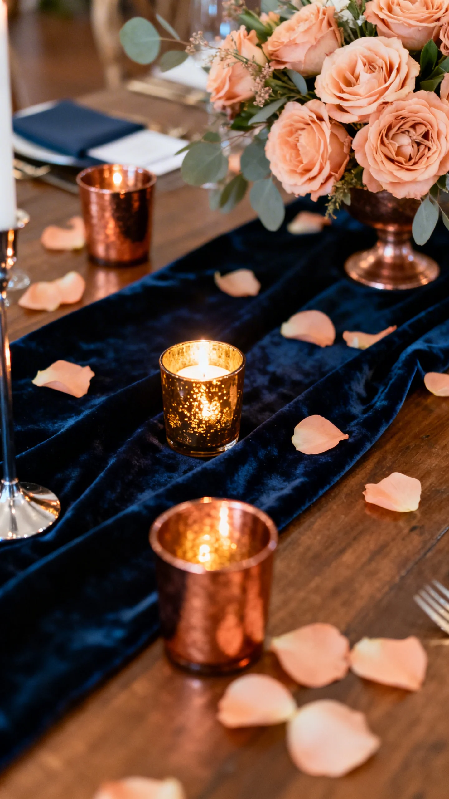
Midnight Navy + Copper + Soft Apricot
Midnight navy keeps everything timeless, copper adds a warm metallic edge, and soft apricot brings a flattering, candlelit glow. Use navy in suits, menus, or velvet details, with copper in votives and chairs or arch accents. Apricot is gorgeous for bouquets and bridesmaid looks. This palette is especially strong for fall and winter celebrations.
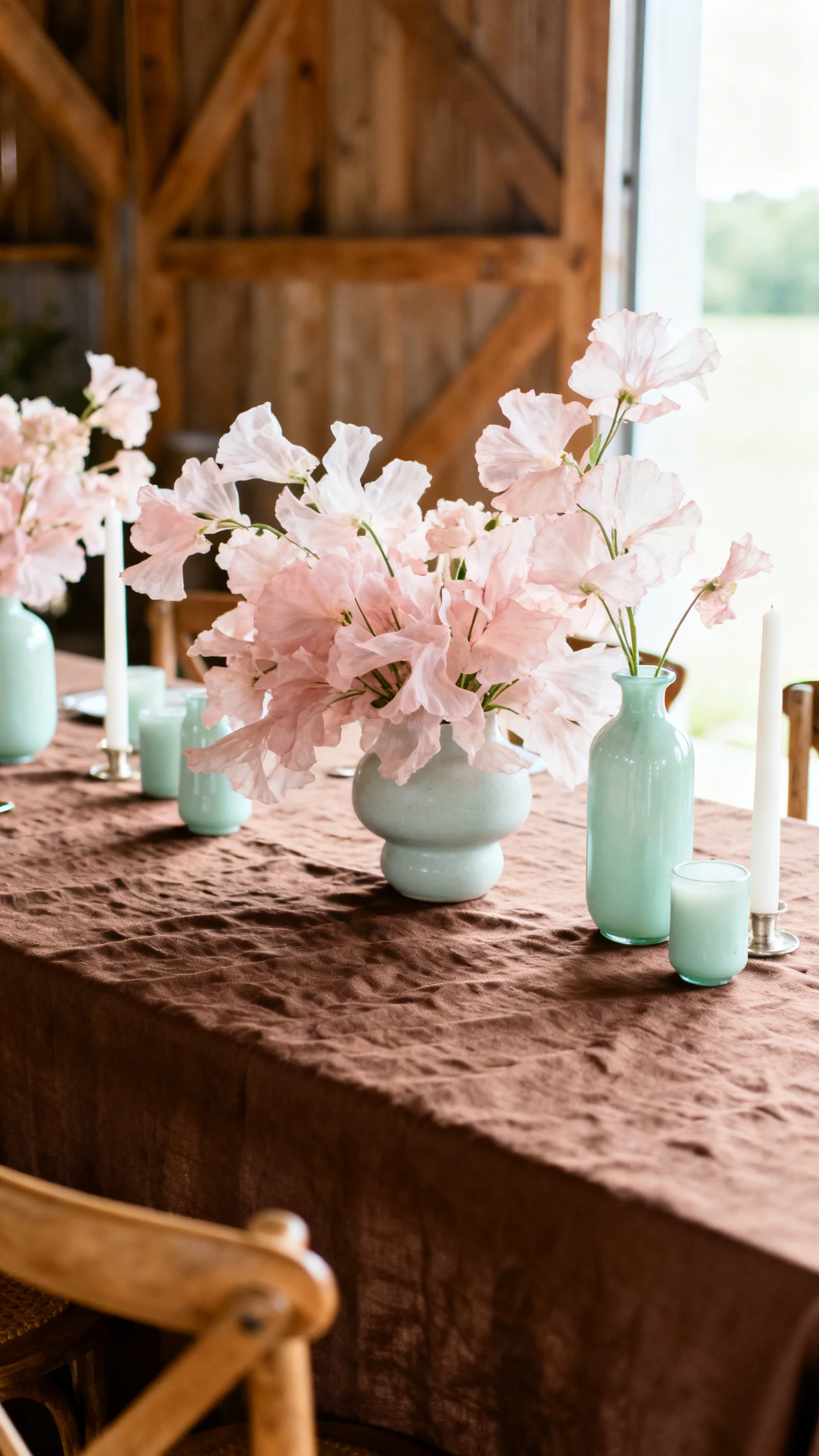
Espresso Brown + Pale Pink + Celadon
Espresso brown is the new neutral when you want warmth and depth without harsh black. Pale pink keeps it romantic, and celadon adds a cool, spa-like freshness. This combination looks amazing in textured linens, wooden chairs, and airy floral designs. It’s an elevated choice for garden weddings and modern barns.
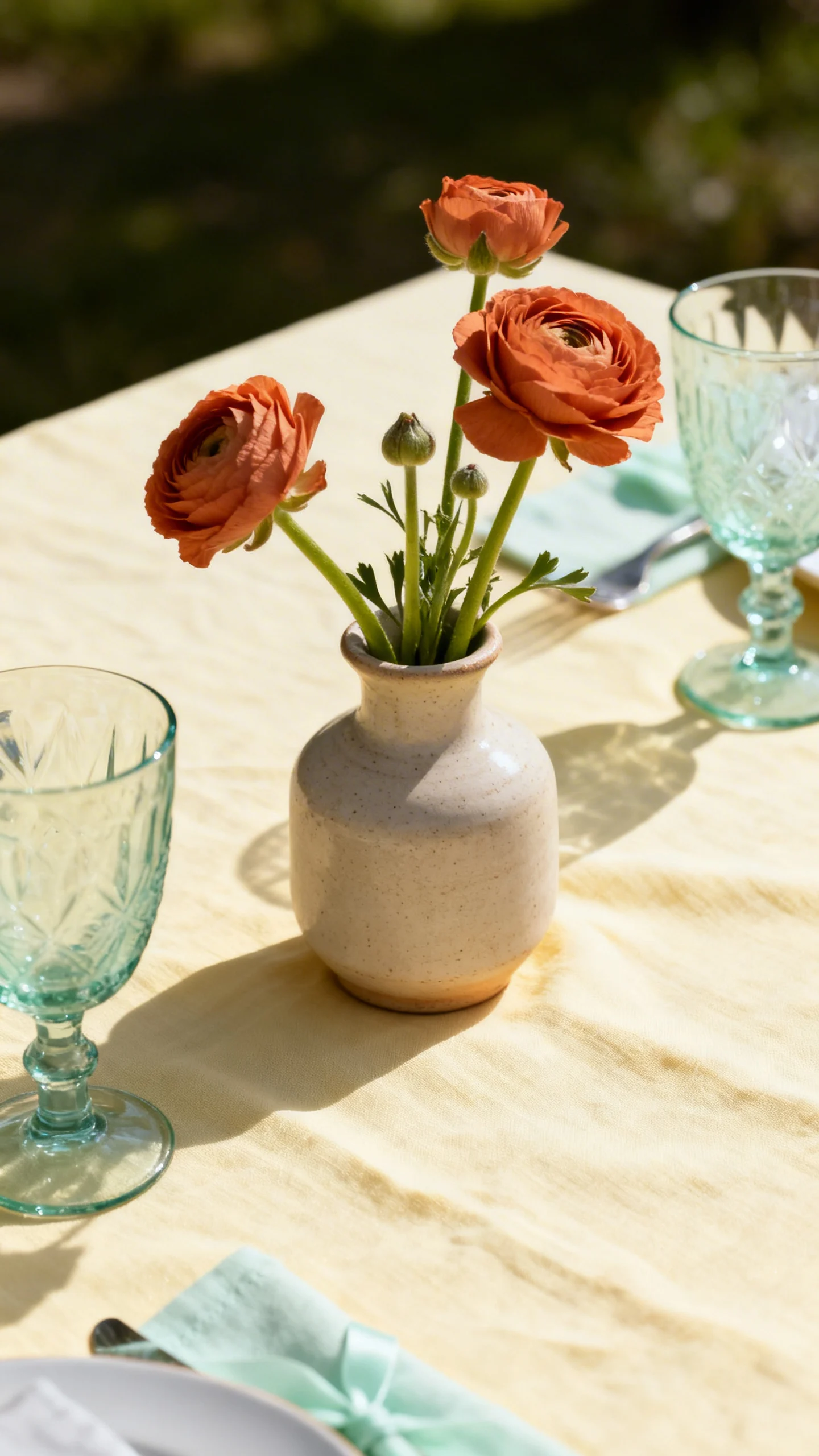
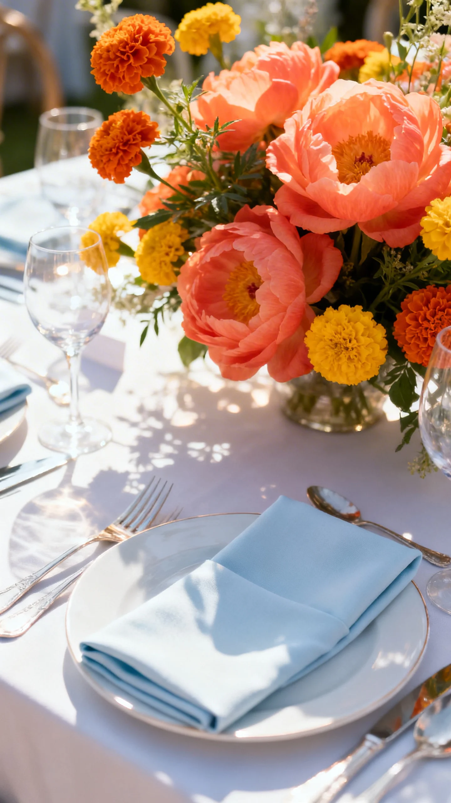
Sunset Coral + Marigold + Soft Periwinkle
Coral and marigold bring joy, but soft periwinkle keeps the palette from feeling too tropical. Use periwinkle as the “quiet color” in paper goods and bridesmaid dresses, with coral in florals and marigold in accents like napkins or favors. The result is playful yet polished. It’s perfect for spring and summer weddings with lots of natural light.
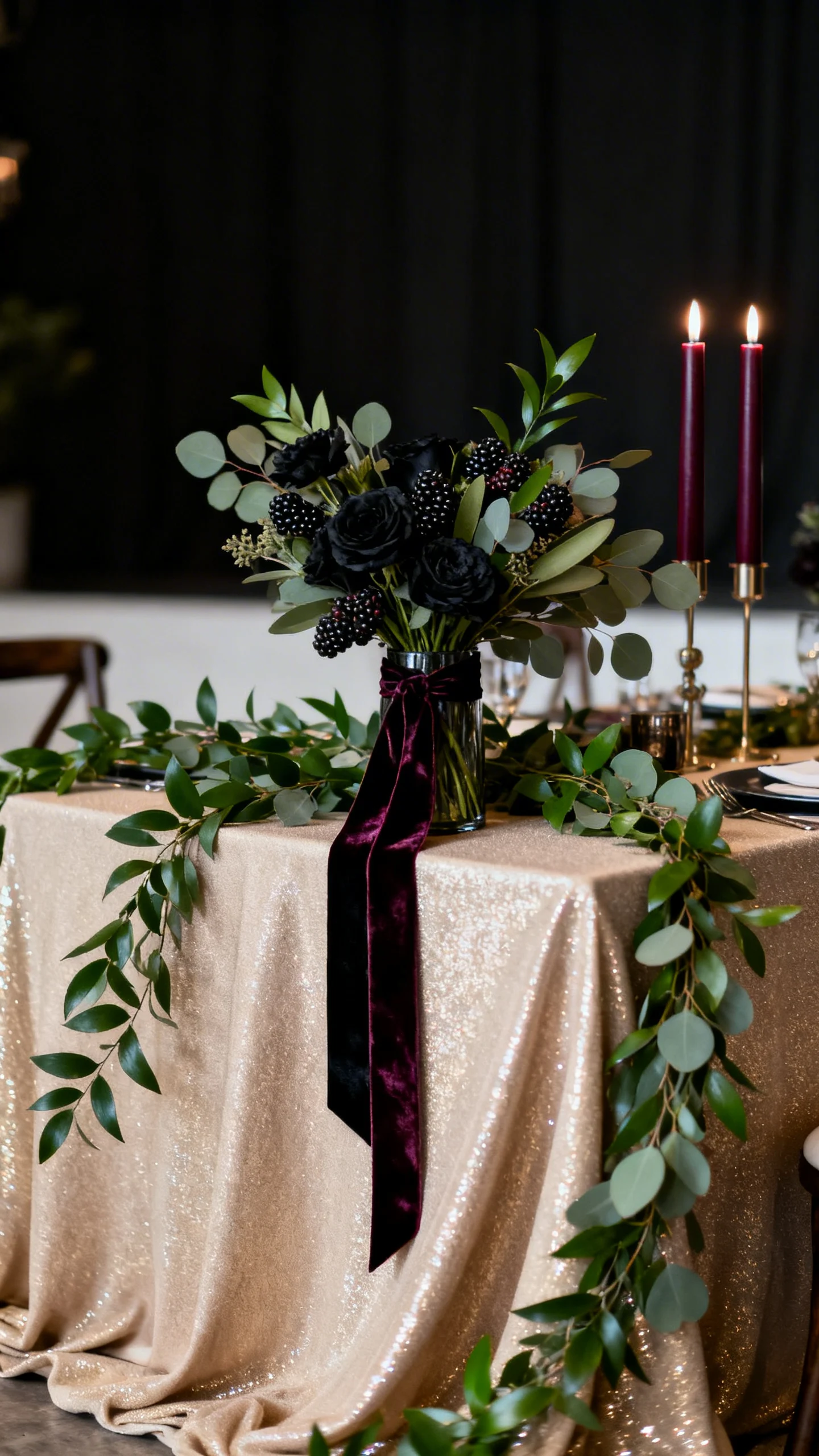
Blackberry + Olive + Champagne Beige
Blackberry feels moody and luxe, olive brings an organic edge, and champagne beige adds softness and shimmer. Try blackberry in taper candles, velvet ribbons, or bold blooms, then weave olive through greenery and linens. Champagne beige is ideal for invitations, draping, and bridesmaid dresses if you want a neutral look with glow. This palette is stunning for candlelit receptions and art-gallery venues.
FAQ
How do I keep a unique color palette from feeling overwhelming?
Pick one “anchor neutral” (like taupe, champagne beige, or oyster white) and use it in the biggest surfaces: linens, draping, and stationery backgrounds. Then use your bolder shades in smaller doses through florals, candles, and accessories.
Which wedding elements should carry the strongest colors?
Florals, napkins, and bridal party attire show color beautifully in photos without taking over the entire space. If you want a lighter touch, keep big decor neutral and add color through paper goods, bar menus, and ribbons.
How many colors should I actually use from a combination?
Most couples use two main colors plus one supporting neutral. You can still start with a three-color combo and adjust: make one shade a tiny accent, or swap in more neutrals if you want a calmer look.
Do unique color combinations work with classic wedding venues?
Yes, and they can look especially elevated when the venue is traditional. Keep the architecture and linens classic, then introduce your modern colors through florals, lighting, and tablescape styling.
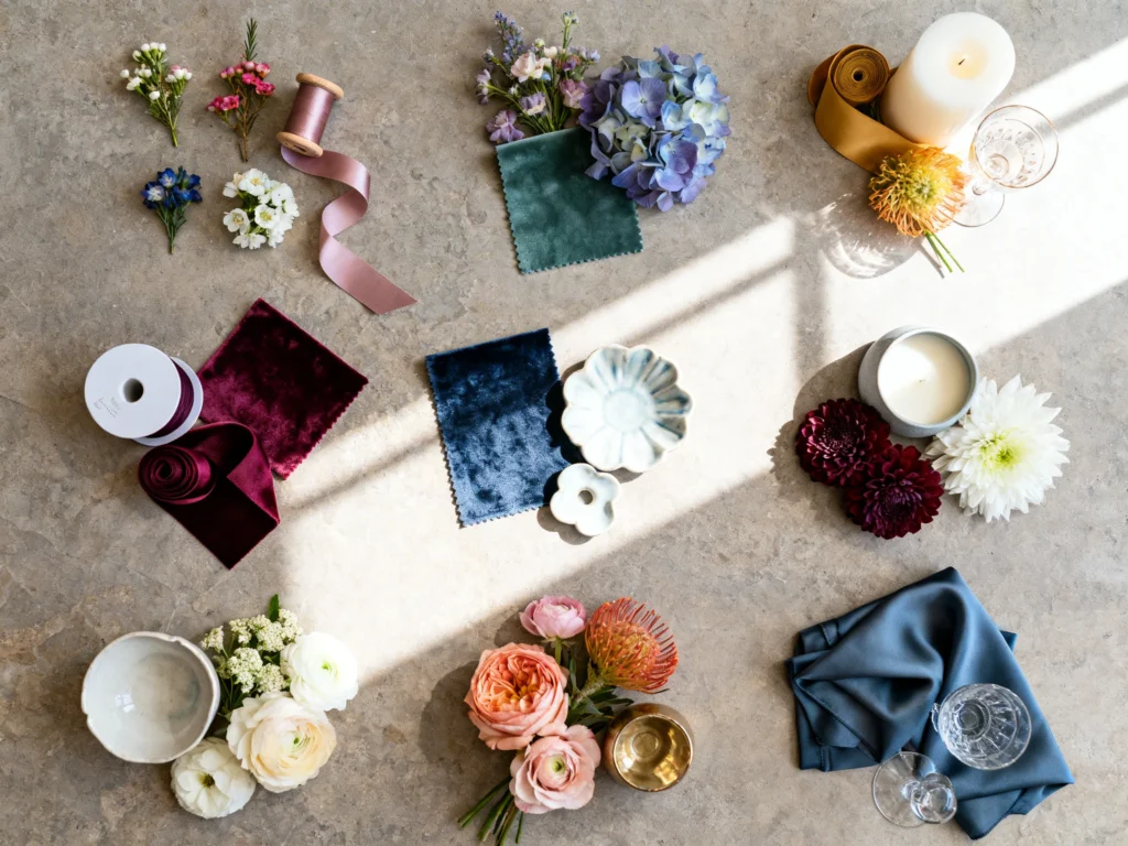
What’s the easiest way to test a palette before committing?
Create a small “sample table” with linen swatches, a napkin, one menu card, and a few flower stems in your shades. Seeing the colors together in the same lighting as your venue makes decisions much easier.