
May weddings are basically spring at her absolute best: fresh blooms, golden-hour light that hits different, and weather that’s usually warm-but-not-melty. The only tricky part? Making it feel “spring” without turning your whole day into a pastel candy shop.
These five May wedding color palettes bring the season in, but with richer tones, modern neutrals, and a little edge where it counts (in the chic way).
Top 5
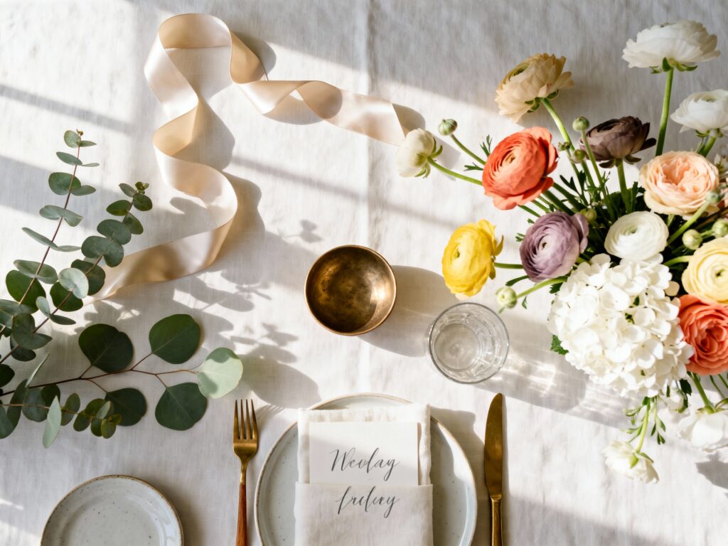
1) Sage + Ivory + Champagne + Soft Black
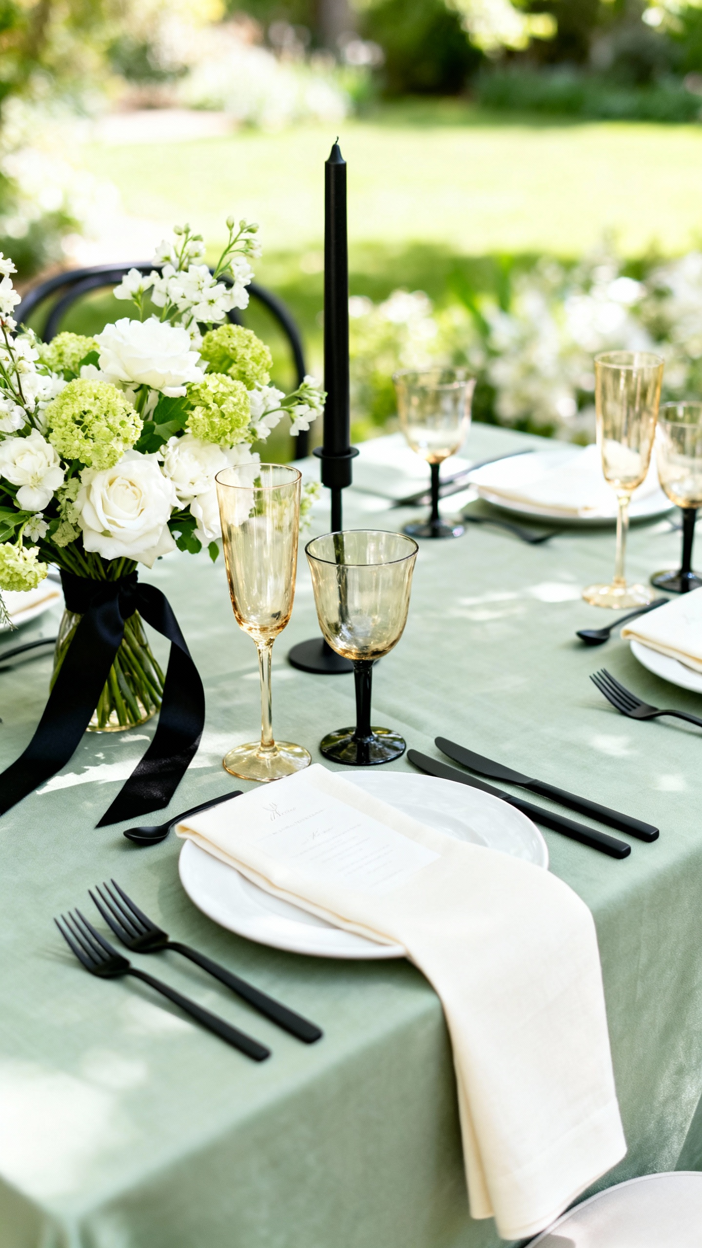
This is the grown-up garden palette that still photographs light and airy. Sage reads seasonal without screaming “mint,” while soft black adds definition in signage, tuxes, and tablescape accents. Use ivory for florals and linens, then champagne for metallic touches like flatware, votives, or a subtle shimmer in bridesmaid dresses.
2) Dusty Blue + Sand + Terracotta + Cream
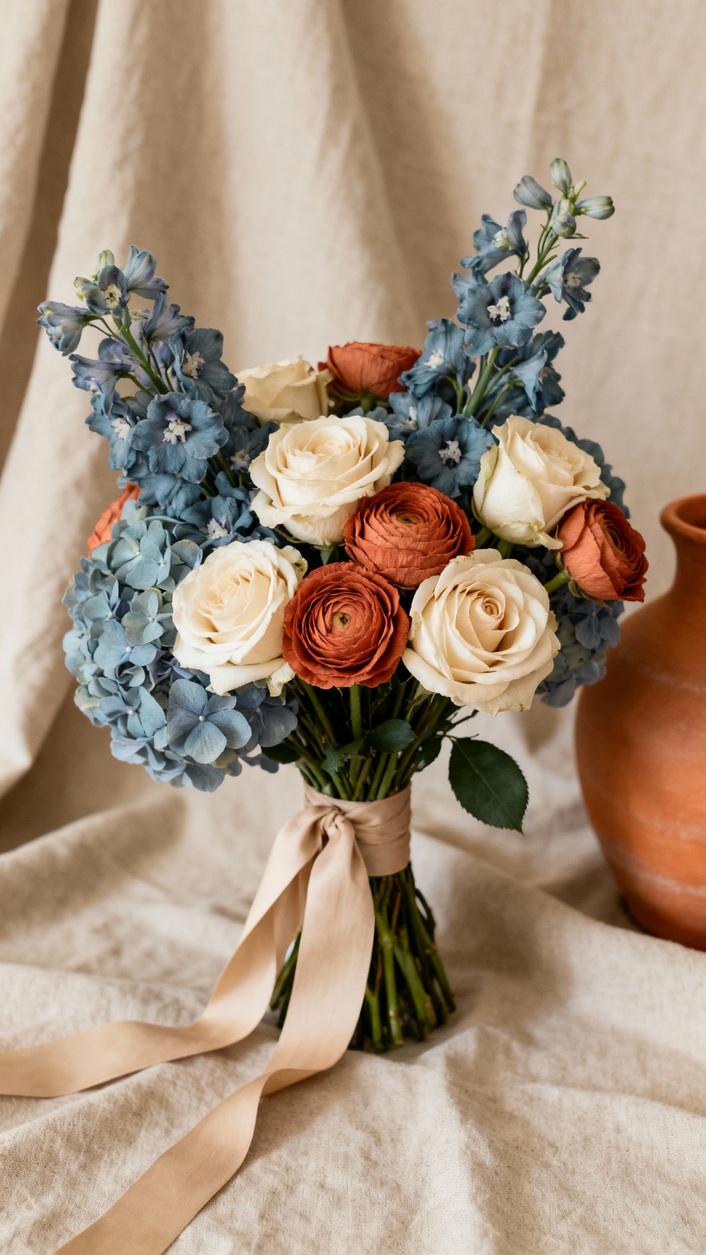
Perfect for May if you want spring vibes with a warm, grounded twist. Dusty blue keeps it breezy (great for bridesmaid dresses), while sand and cream soften everything in photos. Add terracotta through napkins, candles, or floral pops (think ranunculus, garden roses, or even anthurium if you want a modern shape).
3) Butter Yellow + Olive + White + Warm Wood
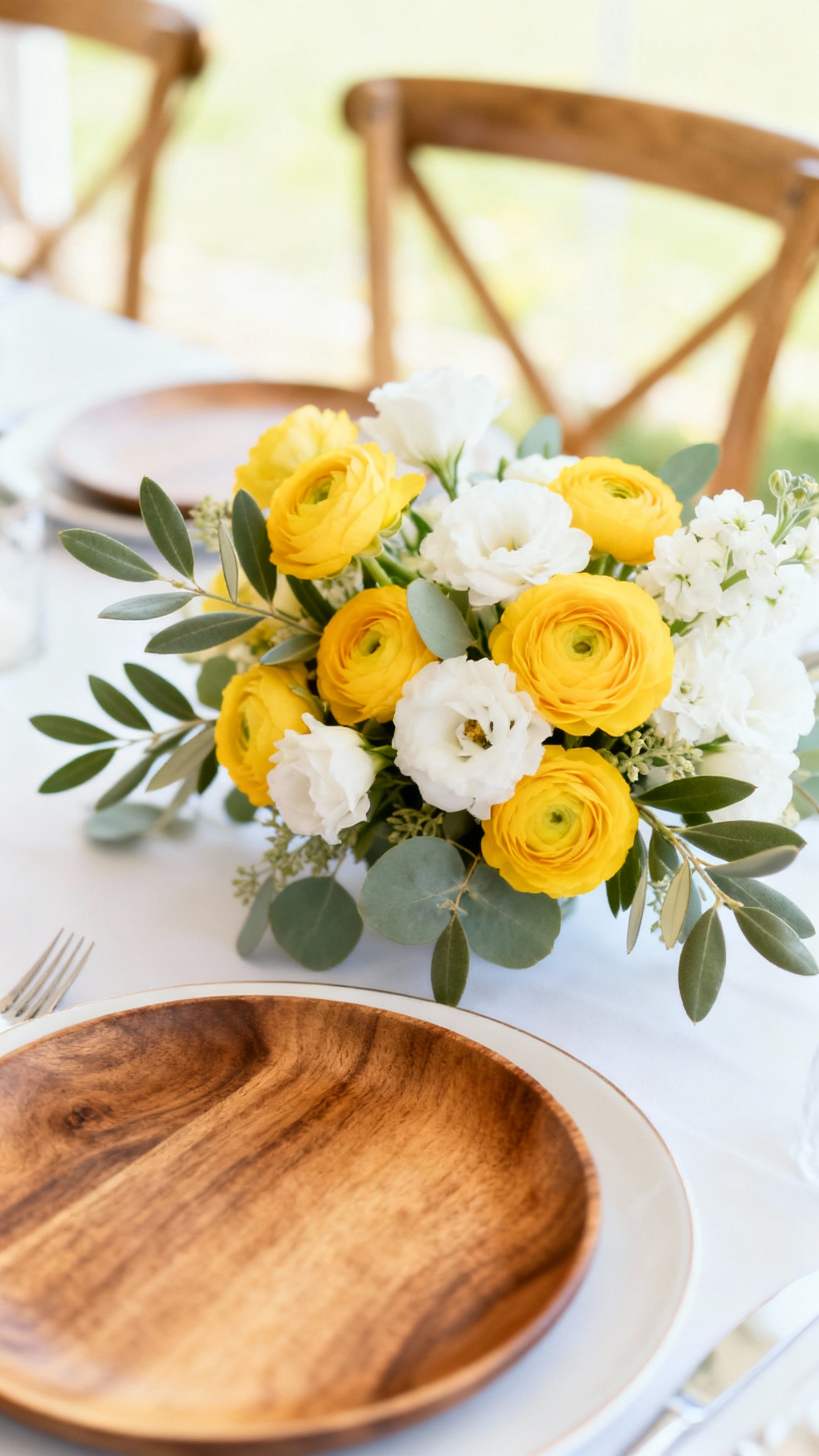
Butter yellow is having a moment, and May is exactly when it looks intentional—not theme-y. Pair it with olive to keep it from going too sweet, and let crisp white handle the “clean” factor in bouquets and stationery. Warm wood (chairs, signage, farm tables) makes it feel naturally elevated and outdoor-friendly.
4) Mauve + Taupe + Plum + Antique Gold
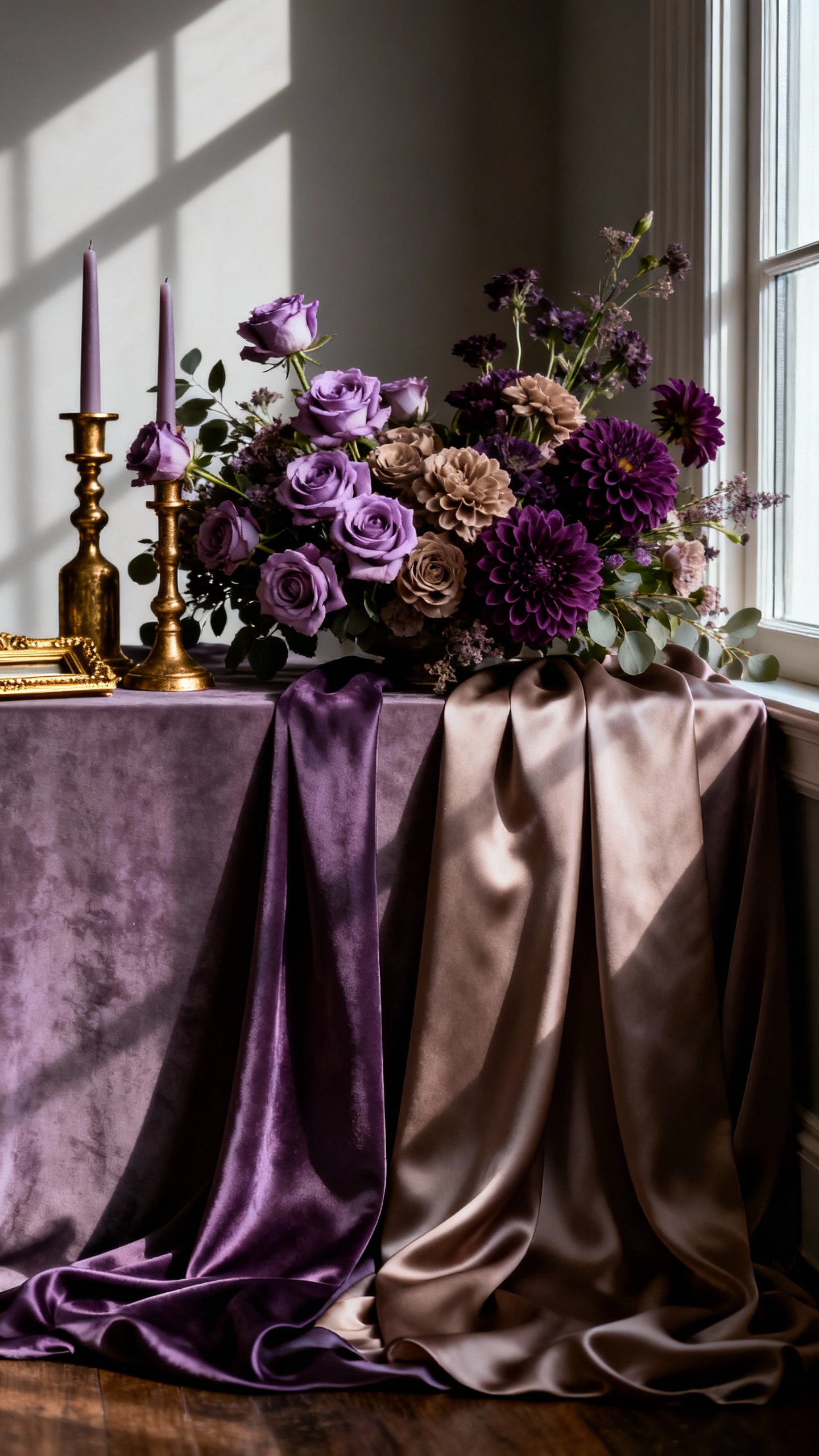
This palette is your answer if you love romance but want depth, not baby pink. Mauve and taupe play nicely as neutrals, while plum adds that dramatic, editorial contrast in florals and bridesmaid looks. Finish with antique gold (frames, candlesticks, or place card holders) to bring in warmth without going full-glitter.
5) Coral + Peach + Eucalyptus + Off-White
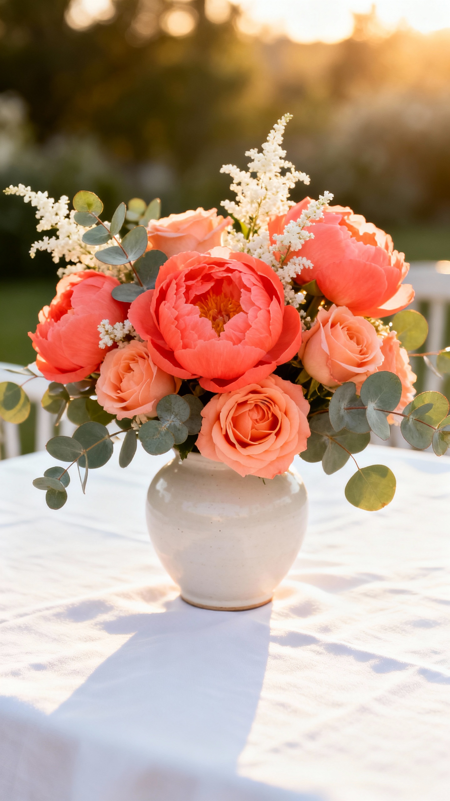
Bright, happy, and totally May—without leaning neon. Coral and peach give that sunset energy for bouquets and bar menus, while eucalyptus cools it down and keeps it modern. Off-white linens and invitations help the whole look feel polished and Pinterest-ready, especially if your venue has lots of greenery.
FAQ
How do I make a spring palette feel modern instead of “Easter”?
Anchor your colors with a neutral (ivory, taupe, sand, or off-white) and add one grounding shade (olive, soft black, plum, or terracotta). Then keep your “pretty” color to one or two moments—like bridesmaid dresses and florals—rather than everywhere at once. Modern also comes from finishes: matte paper, warm metals, and clean typography.
What colors photograph best for May weddings outdoors?
Soft neutrals plus one mid-tone usually photograph the most reliably in bright daylight. Sage, dusty blue, taupe, and eucalyptus won’t fight green backdrops, and they keep skin tones looking natural. If you want a brighter pop (coral or butter yellow), use it in florals and accessories so it reads lively without overpowering portraits.
Can I mix warm and cool tones in one palette?
Yes—and it often looks more designer when you do it on purpose. Try a cool base (dusty blue or sage) with a warm accent (terracotta or antique gold), or a warm base (peach or butter yellow) with a cool green (eucalyptus or olive). The key is repeating each tone at least twice across the day, like in florals + stationery or linens + candles.
How many colors should I commit to for a cohesive wedding aesthetic?
Three to five is the sweet spot: one main color, one supporting color, one neutral, and one metallic or dark accent if you want extra contrast. Too many shades can feel busy on tables and in detail photos. If you’re torn, pick one hero color and let textures (linen, glass, wood, greenery) do the rest of the work.
What’s the easiest way to tie the palette into the whole wedding without overdoing it?
Repeat your colors in a few high-impact places: bridal party attire, florals, tabletop linens or napkins, and paper goods (invites, menus, escort cards). Keep large surfaces (linens, draping) neutral so the palette feels intentional, not loud. Then add small accents—candles, ribbon, signature cocktails—for that “it’s all connected” finish.