
April weddings are basically the sweet spot: fresh blooms, soft light, and that “spring is officially here” energy. The right color palette makes everything feel intentional and also photographs like a dream (because yes, we care about the camera roll).
Below are five April-perfect palettes that stay timeless while still feeling modern—plus quick tips to make the colors show up beautifully in your photos.
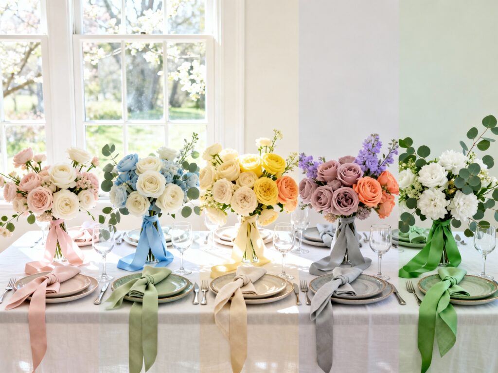
Top 5
1) Blush + Sage + Soft Ivory
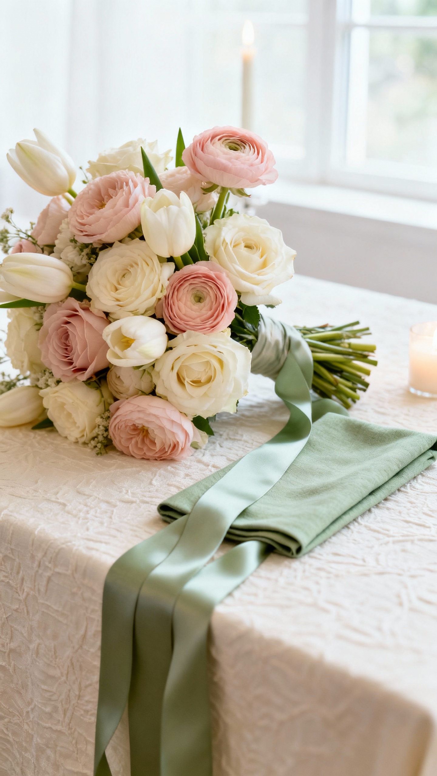
This is the ultimate romantic spring combo, and it looks especially good in natural light. Keep blush on the florals (roses, ranunculus) and use sage in bridesmaid dresses or linens for contrast. Ivory keeps everything airy, so your photos won’t feel too “pink” or overly warm.
2) Powder Blue + Butter Yellow + Cream
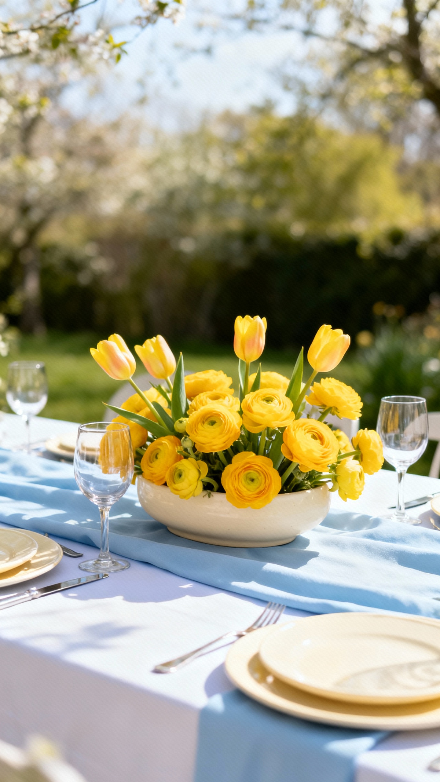
Powder blue photographs crisp and clean, while butter yellow adds sunshine without turning neon. Cream ties it together so the whole palette feels elevated instead of theme-y. If you’re doing outdoor portraits, this trio pops against green gardens and still looks soft at golden hour.
3) Lavender + Dusty Rose + Light Gray
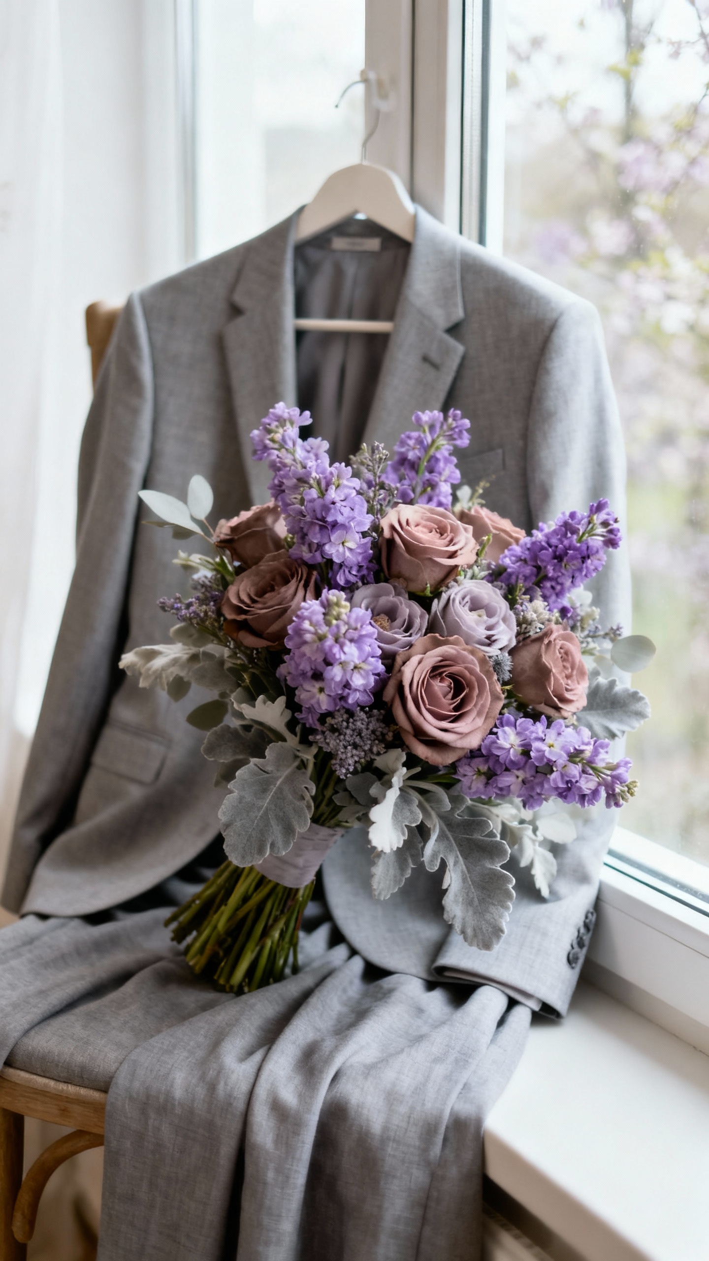
Lavender is peak April and reads dreamy on camera, especially when paired with a muted pink that keeps it romantic. Light gray is your secret weapon for grounding the look—think suits, stationery, or napkins—so the purples don’t overwhelm. This palette is also super flattering in photos with overcast skies (aka classic spring weather).
4) Peach + Coral + Fresh Green
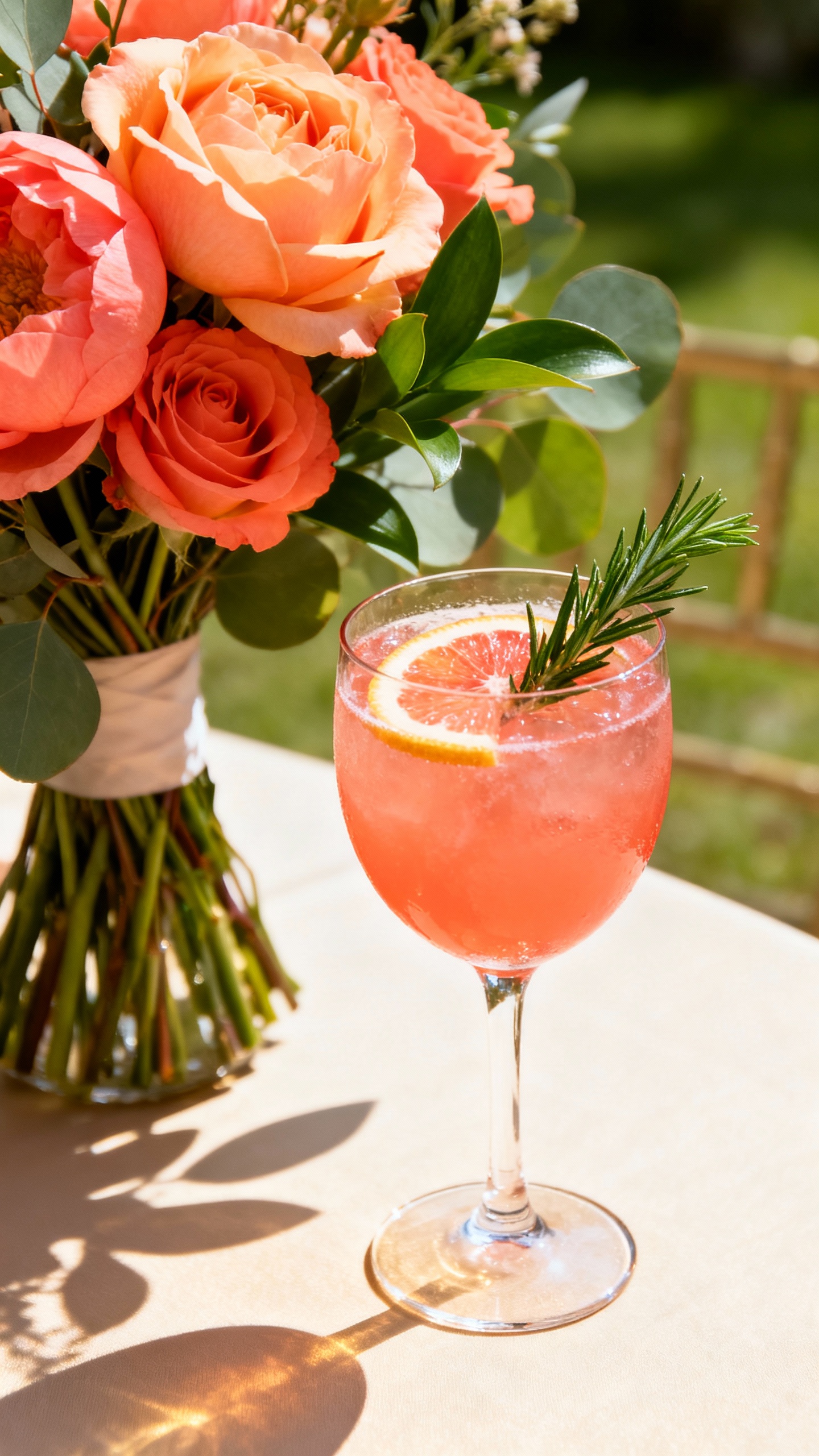
If you want bright but still sophisticated, peach and coral bring the glow while fresh green keeps it botanical. This palette shines in close-up detail shots: bouquets, tablescapes, and cocktails look instantly lively. To keep it photo-ready (not chaotic), pick one hero shade (coral or peach) and let the other show up as an accent.
5) Classic White + Eucalyptus + Champagne
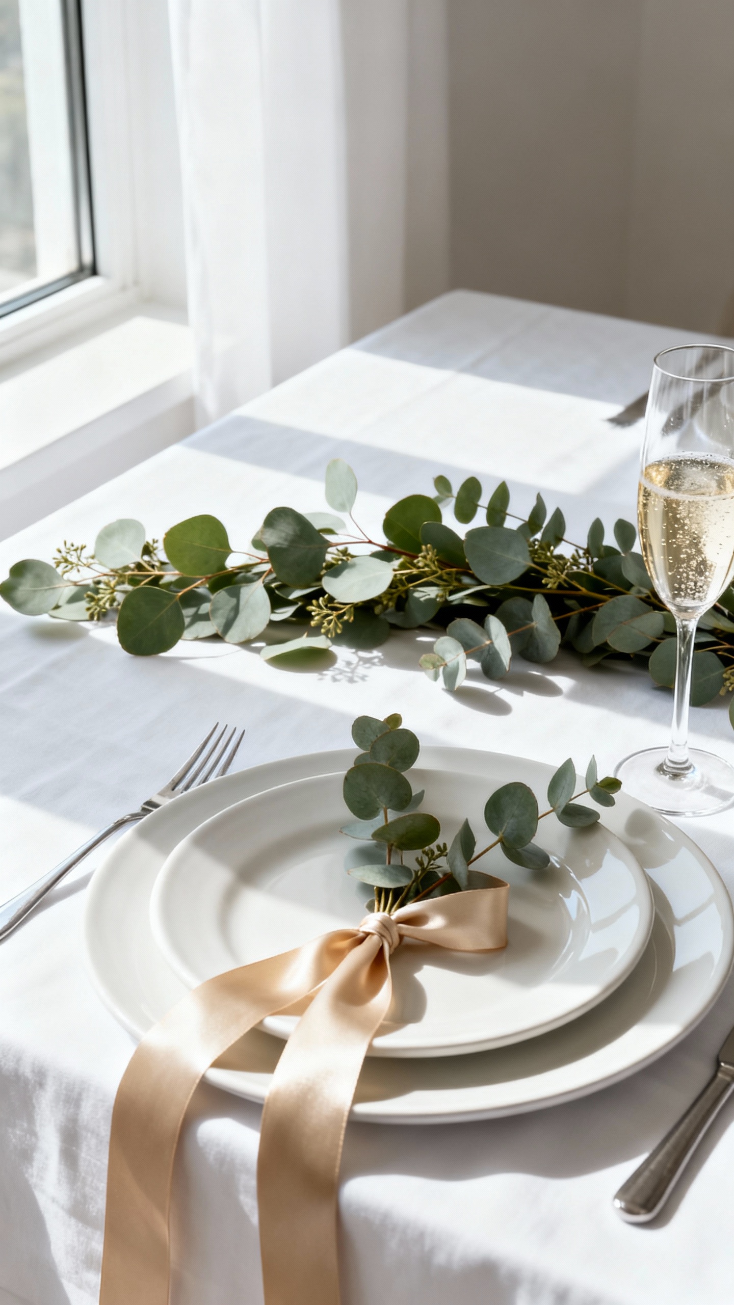
This is minimal, luxe, and impossible to mess up in photos—especially if you love a clean editorial vibe. White and eucalyptus photograph beautifully with lots of texture: layered whites, matte ceramics, airy florals, and greenery with movement. Champagne adds warmth through metallics (flatware, frames, candleholders) so your images don’t feel too stark.
FAQ
How do I choose an April wedding color palette that photographs well?
Look for a balance of light + contrast: one or two soft shades, one grounding neutral, and a subtle accent (metallics count). If you’re taking a lot of outdoor photos, test your colors next to greenery—some pastels can disappear without a deeper neutral to anchor them.
What colors should I avoid for April wedding photos?
Super-saturated neons can cast odd color onto skin and reflect harshly in bright daylight. Also be cautious with “almost-white” dresses for bridesmaids (very pale beige or icy gray) because they can photograph close to the wedding gown depending on lighting.
How many colors should I use for a cohesive look?
Three is the sweet spot for most weddings: a main color, a secondary color, and a neutral. If you want a fourth, make it an accent used sparingly—like ribbon, candles, signage details, or a metallic.
Do bridesmaid dresses need to match the palette exactly?
No, and photos often look better when they don’t match perfectly. Choose one palette color for dresses (like sage, powder blue, or light gray) and let florals, linens, and stationery bring in the other shades for a layered, Pinterest-friendly look.
What’s the easiest way to tie the palette into photos beyond flowers?
Pick two “photo hotspots” to style: the ceremony backdrop and the reception tables. Use your palette in linens, candles, menus, and place cards—these details show up in flat lays and wide shots, making the whole gallery feel coordinated without spending a fortune on extra decor.