
May weddings are that sweet spot: fresh blooms, golden-hour light, and enough warmth to feel like a celebration (without full summer heat drama). The vibe? Spring—just not “everything is baby pink” spring.
These palettes keep it modern and elevated, with color that photographs beautifully and still feels season-appropriate for May.
Top 5
1) Terracotta + Blush + Cream + Olive
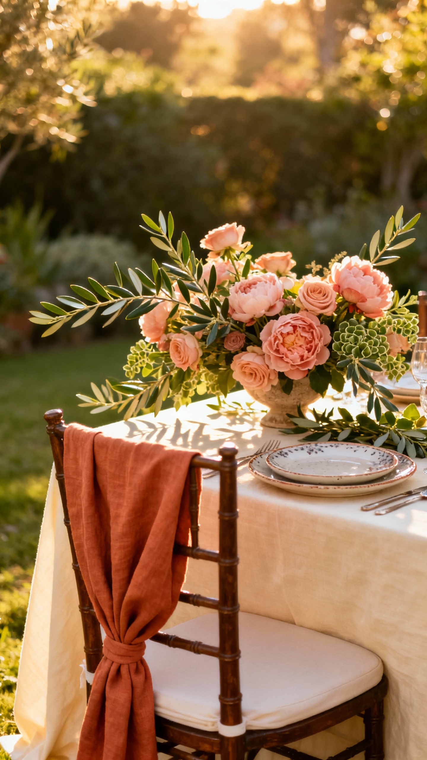
This is the “sun-kissed garden” palette that reads warm and romantic without going pastel-heavy. Use terracotta for bridesmaid dresses or napkins, then soften it with blush florals and creamy linens. Olive greenery makes everything feel intentional (and it looks amazing in outdoor venues). Add brass or gold accents to bring it home.
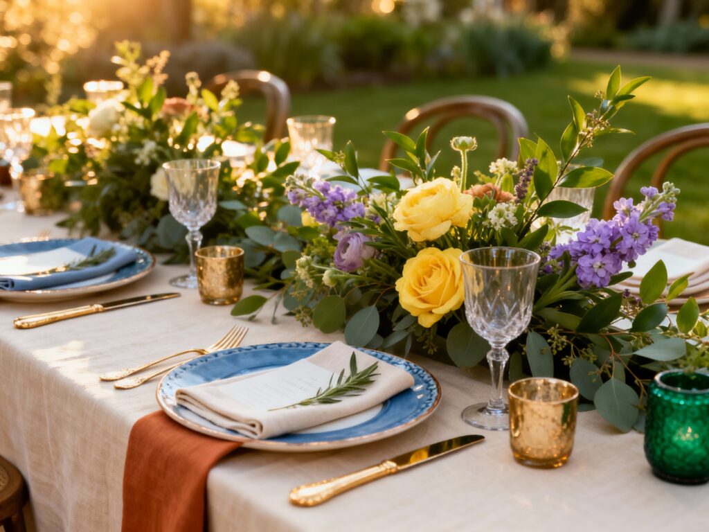
2) Dusty Blue + Soft Sage + White + Champagne
If you want airy and classic but not sugary, this combo is your best friend. Dusty blue works beautifully for suits, stationery, and bridesmaid dresses, while sage keeps it springy and organic. Stick to crisp white flowers (plus a little chamomile-style filler) for a clean, editorial look. Champagne details in glassware, signage frames, or candles make it feel wedding-level luxe.
3) Butter Yellow + Peach + Coral + Warm White
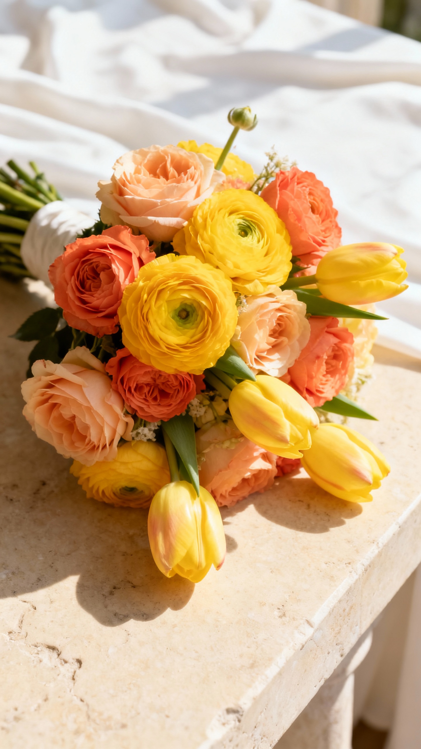
Butter yellow is having a moment, and May is the perfect month to pull it off without it feeling too “Easter.” Keep it grounded with warm whites and use peach/coral as the pop color in bouquets, escort cards, or a statement table runner. This palette shines in photos, especially at brunch or garden receptions. Try clear acrylic signage with warm-toned typography for a modern finish.
4) Lavender + Plum + Eucalyptus + Ivory
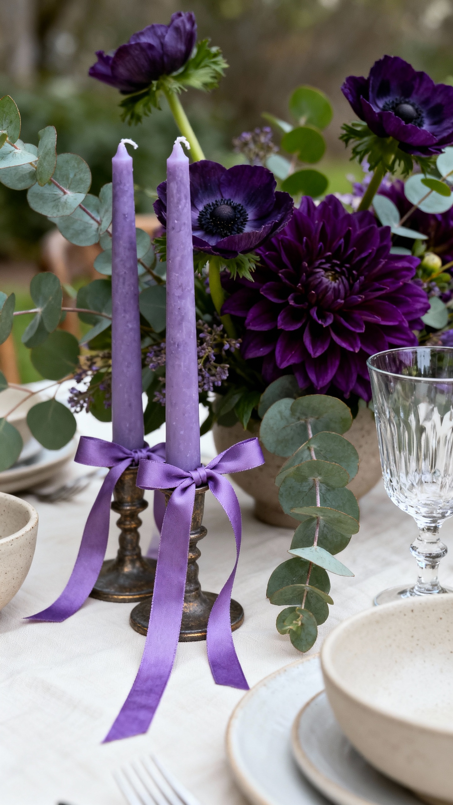
This is your spring palette with depth—like pastels’ cooler, more sophisticated sister. Use lavender as the lighter base (think ribbons, candles, or bridesmaid dresses) and add plum in small, high-impact touches like bud vases or a ceremony backdrop. Eucalyptus keeps it fresh and slightly moody in a good way. Ivory linens and white florals prevent it from going too dark.
5) Emerald + White + Black + Soft Gold
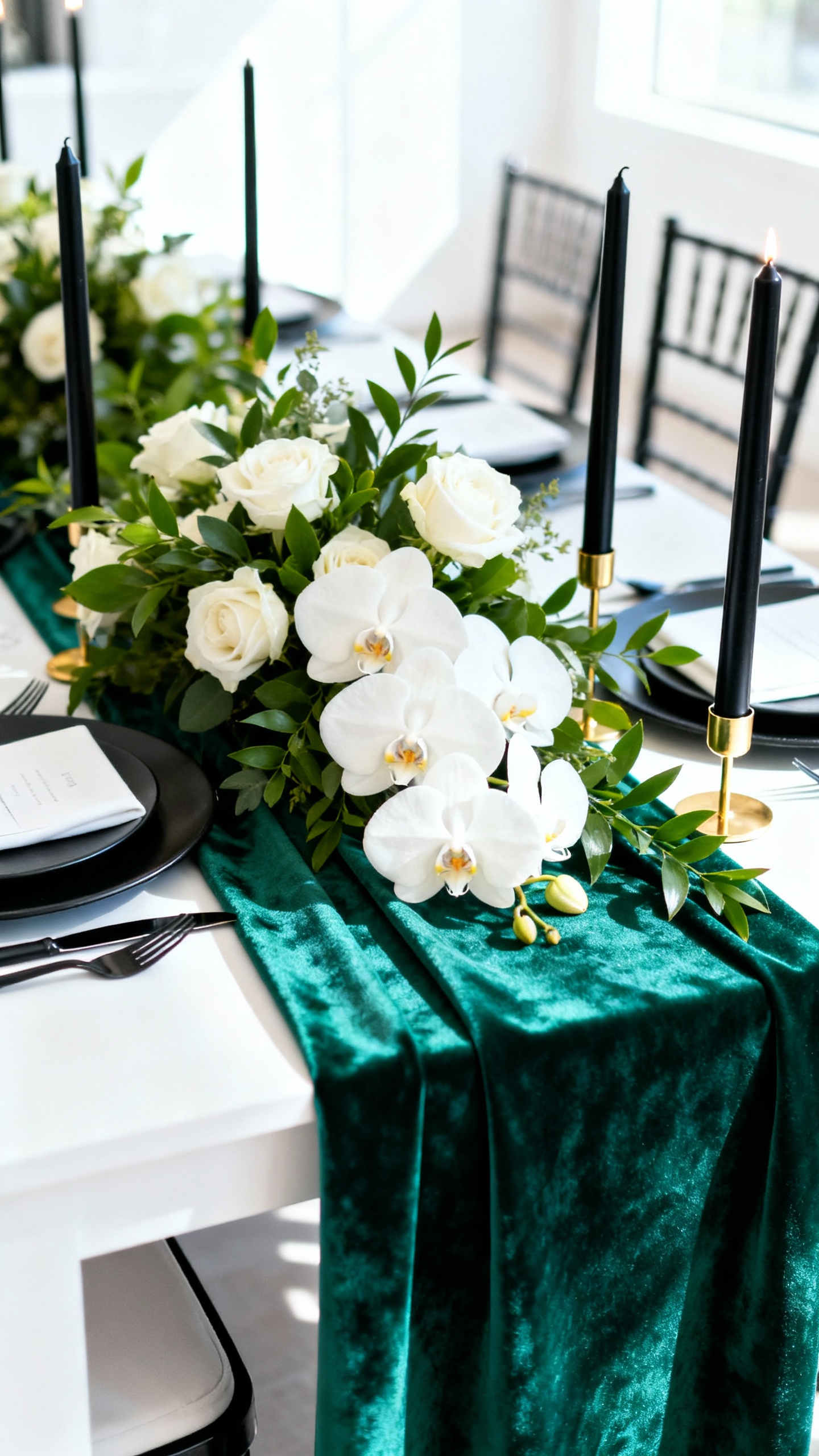
For couples who want “spring wedding” but also want it chic, this is the power palette. Emerald feels lush and alive in May (especially against real greenery), while white flowers keep it clean and timeless. Black adds contrast—use it for signage, place cards, or tux details—so the whole look feels crisp in photos. Soft gold in flatware or candleholders warms it up without turning flashy.
FAQ
How do I keep a May wedding palette from looking too pastel?
Pick one “spring-light” color and pair it with at least one grounding shade (olive, terracotta, navy, plum, black) plus a neutral (ivory, warm white, champagne). The contrast makes it feel modern and intentional, not like an Easter basket.
What colors photograph best for outdoor May weddings?
Mid-tones and warm neutrals tend to photograph beautifully in bright natural light: terracotta, dusty blue, sage, butter yellow, emerald, and champagne. Super pale pastels can wash out in midday sun, so use them as accents instead of the main event.
How many colors should I use in my wedding palette?
Aim for 3–5 total: one main color, one secondary color, one accent, plus one or two neutrals. It’s easier to execute across florals, attire, and tablescapes—and it keeps your Pinterest vision from turning chaotic.
What’s the easiest way to add color without changing bridesmaid dresses?
Go color-forward with florals, stationery, napkins, candles, and signature cocktails. You can keep outfits neutral and still have a strong palette through tablescape details and ceremony décor.
Can I mix warm and cool tones in a May wedding palette?
Yes—just tie them together with a consistent neutral and one repeating element (like greenery or gold metal). For example, dusty blue (cool) works with champagne (warm) when you keep white florals consistent and repeat the tones in paper goods and linens.