
Fruit-inspired wedding colors are having a moment, and honestly? It’s the easiest way to get summer energy without looking like a themed party. The key is treating the “fruit” part as inspiration, then elevating it with neutrals, metallics, and intentional textures.
Below are five elegant, Pinterest-friendly palettes that feel fresh, romantic, and totally wedding-ready.
Top 5
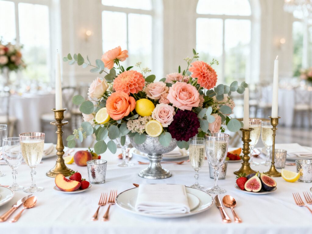
1) Peach + Champagne + Soft Sage (Peach Bellini)
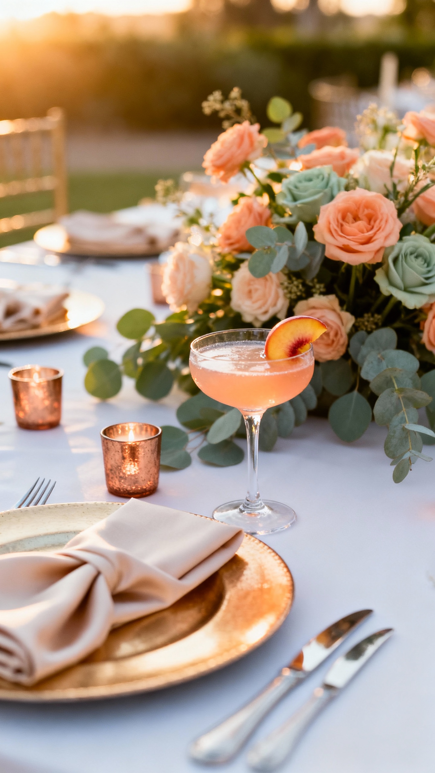
This palette is warm, glowy, and universally flattering in photos—especially at golden hour. Use peach for bridesmaid dresses or signature cocktails, champagne for linens or stationery foil, and soft sage in greenery-forward florals. For elegance, anchor it with ivory (not stark white) and mix matte ceramics with a little crystal or glass.
2) Strawberry + Blush + Cream + Antique Gold (Strawberries & Silk)
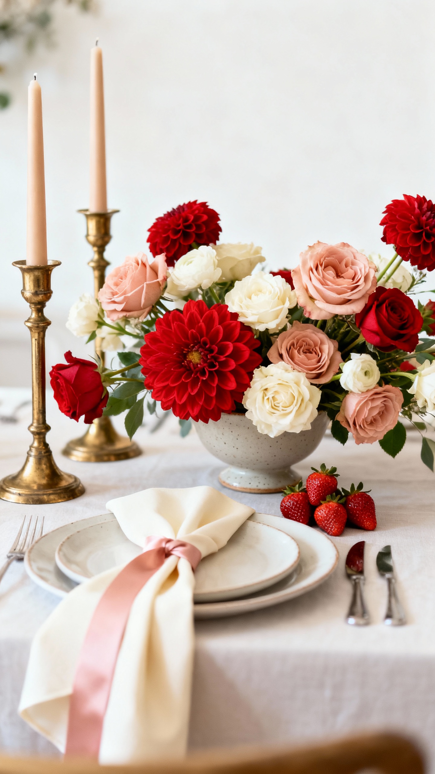
Strawberry red can read bold, but when you soften it with blush and cream, it turns instantly romantic. Keep the “strawberry” as an accent: tapered candles, napkins, bouquet ribbon, or a pop in the florals (garden roses, ranunculus, dahlias). Antique gold flatware or frames make it feel timeless instead of trendy.
3) Watermelon Pink + Coral + Eucalyptus + White (Modern Watermelon)
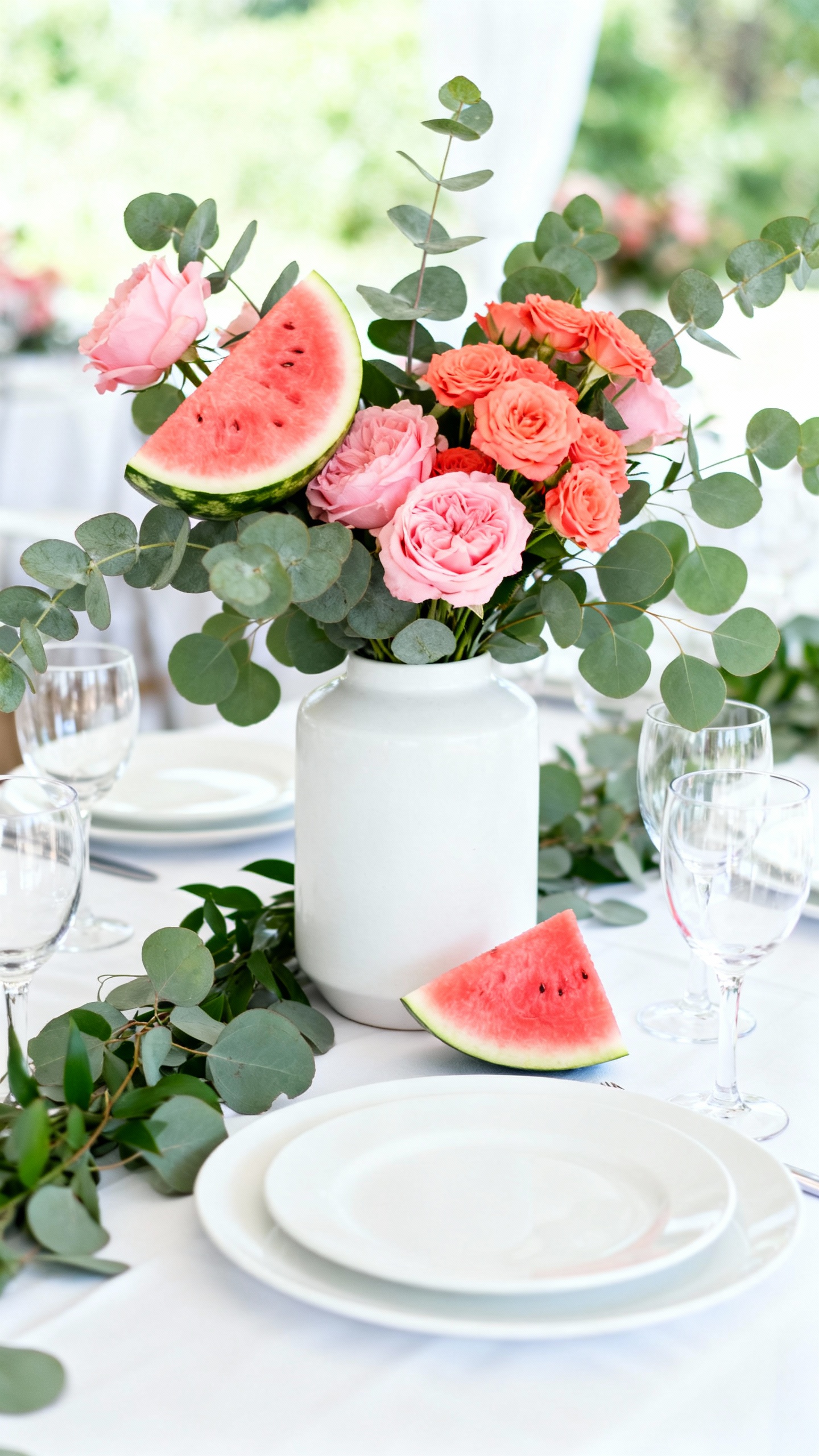
This is the fun one—just styled in a clean, modern way. Think watermelon pink and coral in your floral recipe, then keep everything else crisp with white linens and cool eucalyptus greenery. The elegant trick: choose one statement moment (like a ceremony installation or escort card wall) and keep the rest minimal so it doesn’t get loud.
4) Lemon + Buttercream + Dusty Blue + Silver (Lemon Sorbet Chic)
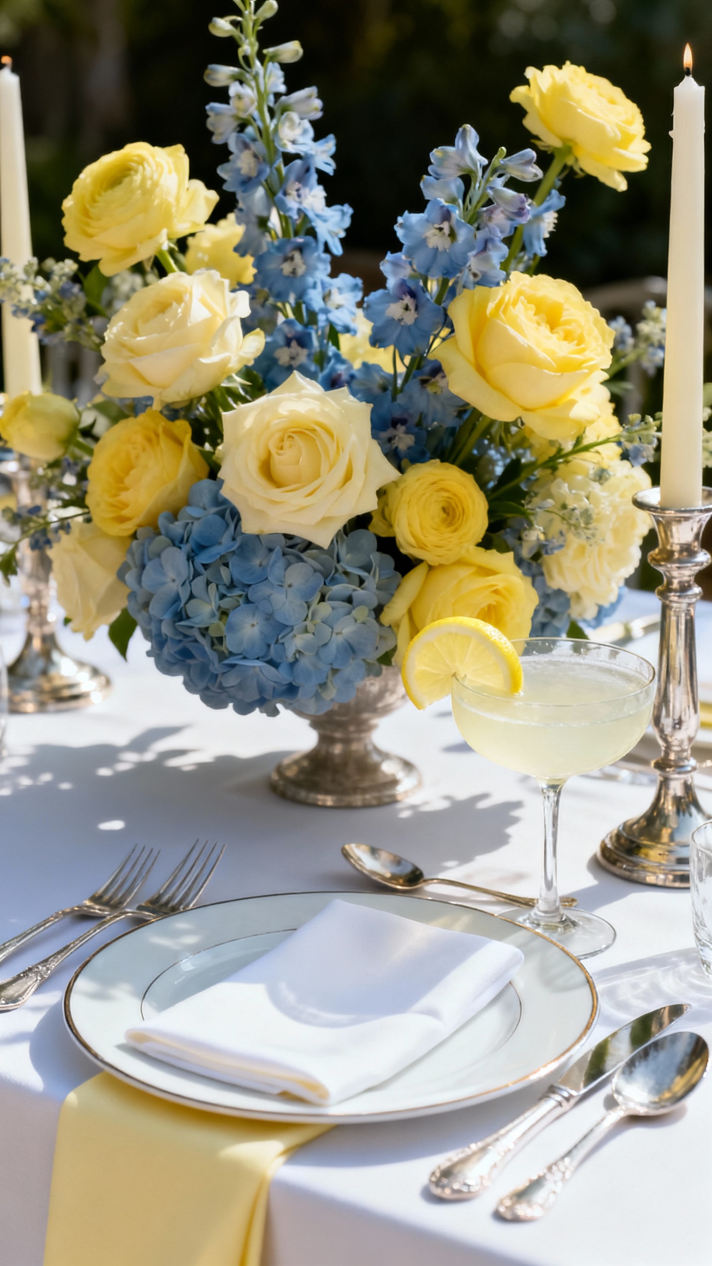
Lemon yellow is basically sunshine, but buttercream makes it wearable and soft. Add dusty blue for contrast (it photographs beautifully) and finish with silver details for a cool, polished edge. This palette is gorgeous for coastal venues, garden ceremonies, or anywhere you want bright but still refined—especially with white florals and airy draping.
5) Fig + Plum + Taupe + Rose Gold (Late-Summer Figs)
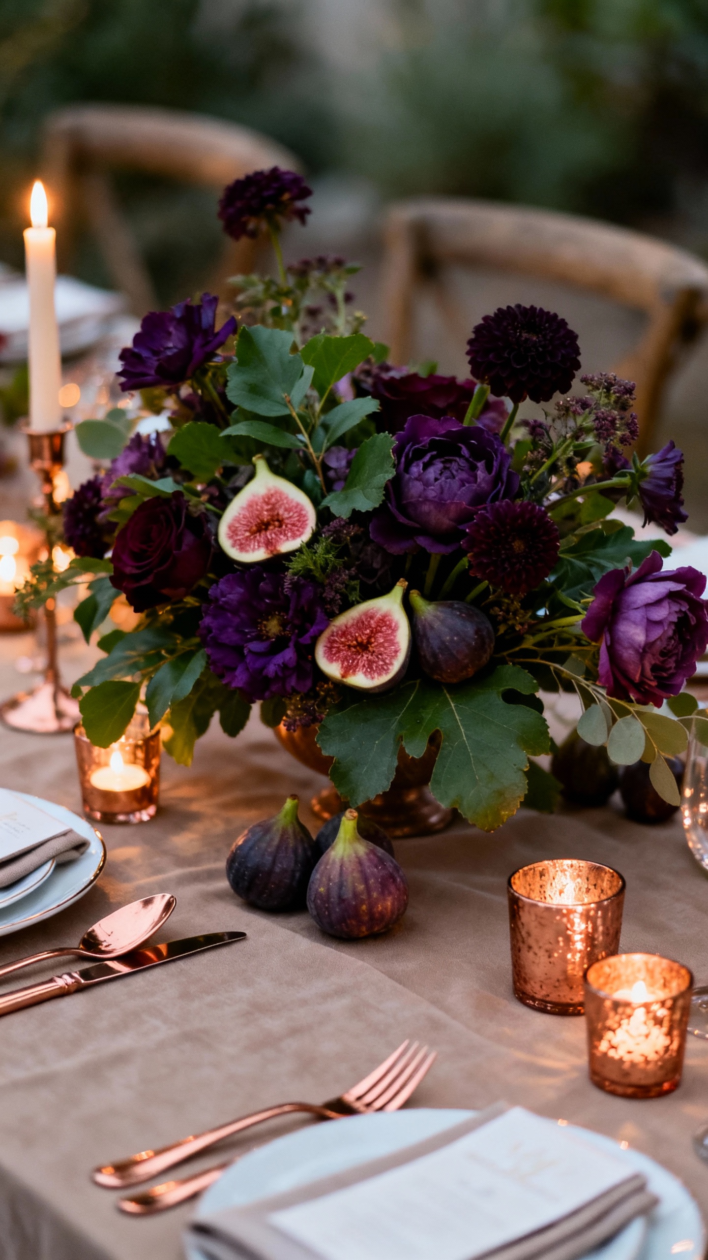
Figs bring that moody, elegant richness that still works in summer—especially late July through September. Pair plum tones with taupe linens and lots of candlelight, then add rose gold touches for a soft glow (think votives, signage hardware, or subtle shimmer in invites). Keep florals sophisticated with deep berries, textured greenery, and a few creamy blooms to balance it out.
FAQ
How do I make fruit-inspired colors look elegant instead of “theme-y”?
Use fruit shades as accents, not the whole story. Ground the palette with elevated neutrals (ivory, champagne, taupe) and one metallic, then repeat the color in small, intentional places like stationery details, candles, and select blooms.
What’s the easiest way to choose bridesmaid dress colors from these palettes?
Pick the softest or most wearable tone as the dress color (peach, blush, dusty blue, sage, taupe), then use the brighter fruit shade in bouquets and tablescapes. If you want a mix-and-match look, keep undertones consistent (warm with warm, cool with cool).
Which palette photographs best in harsh midday summer light?
Peach + champagne + sage and lemon + buttercream + dusty blue tend to photograph beautifully because they’re light without being neon. Avoid ultra-saturated shades in large blocks under direct sun; save them for florals and small décor moments.
What flowers match these palettes without being hard to source?
Roses, spray roses, lisianthus, ranunculus (seasonal), carnations (modern varieties), dahlias (late summer), and lots of greenery are your reliable staples. Bring your palette to your florist and ask for “tone-on-tone” options so the colors feel layered, not flat.
How can I carry the palette through the reception without spending a lot?
Focus on three high-impact areas: linens (or napkins), candles, and a floral moment (like the sweetheart table or entry arrangement). Repeat the palette in paper goods—menus, place cards, and bar signage—because color in print is often cheaper than adding more florals.