

Elegant floral wedding decor is all about intention: a few luxe-looking moments, consistent styling, and details that feel elevated (not chaotic). The good news? Most “cheap-looking” floral issues aren’t about budget—they’re about placement, proportions, and finishing touches.
Below are the top floral decor mistakes that can quietly downgrade your whole aesthetic, plus easy fixes that make everything feel more editorial and expensive.
Top 5
1) Using Too Many Flower Types at Once
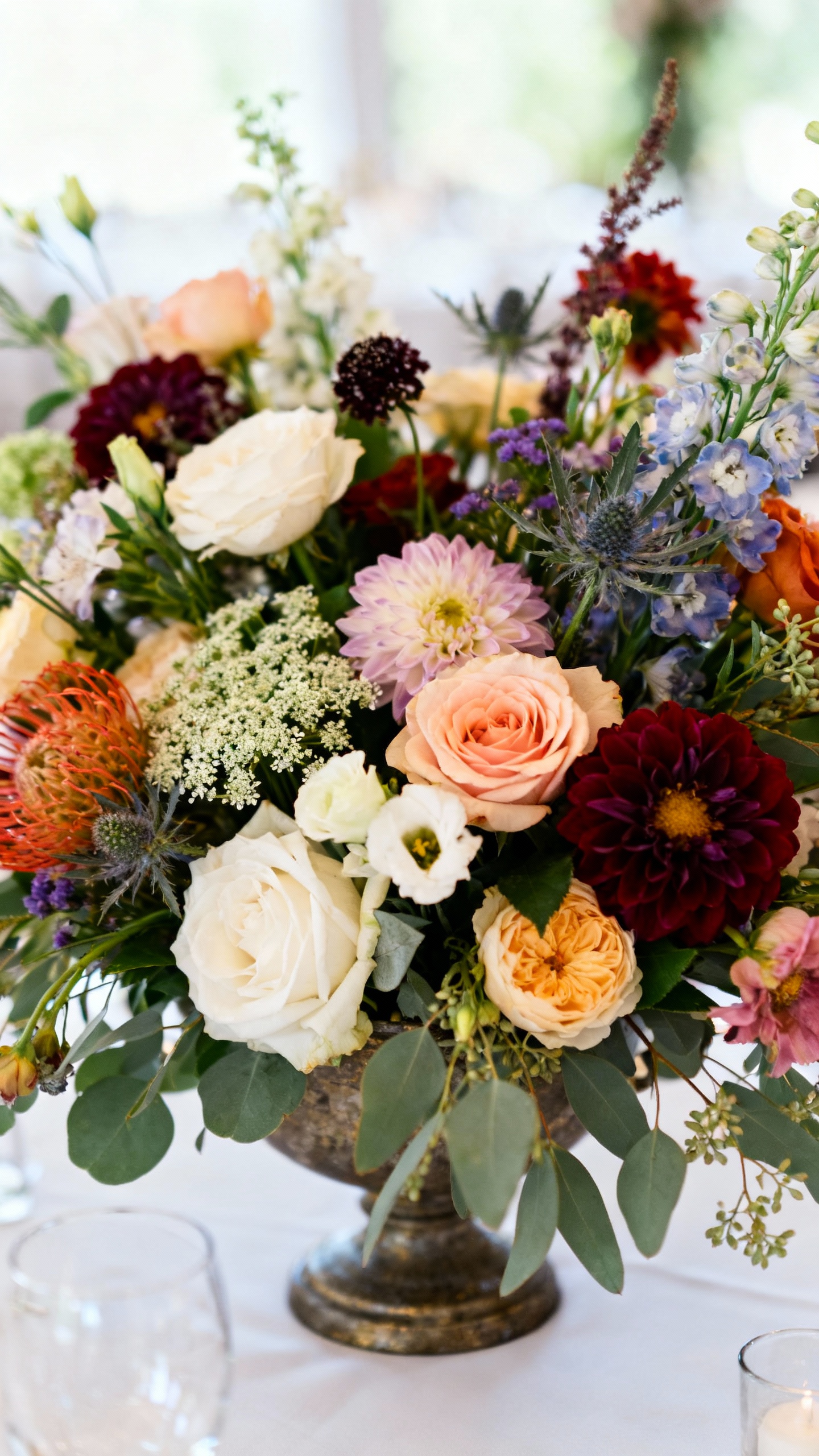
When every centerpiece has 12 different blooms, the look can read “craft store assortment” instead of curated. Too much variety also makes colors compete, which breaks that effortless, elegant vibe. Fix it by choosing 3–5 core flowers and 1–2 supporting textures (like bud vases greenery or berries) and repeating them throughout your day. Consistency is what makes it look intentional and high-end.
2) Skipping Greenery (or Using the Wrong Kind)
No greenery can make arrangements feel flat and “plopped,” but the wrong greenery can also cheapen things fast (hello, stiff-looking leatherleaf). The fix: choose one signature green that matches your vibe—like eucalyptus for modern, ruscus for classic, or olive for Mediterranean—and use it as a soft frame. Ask your florist for airy, movement-based greens instead of dense filler so the flowers look like they’re floating, not stuffed.
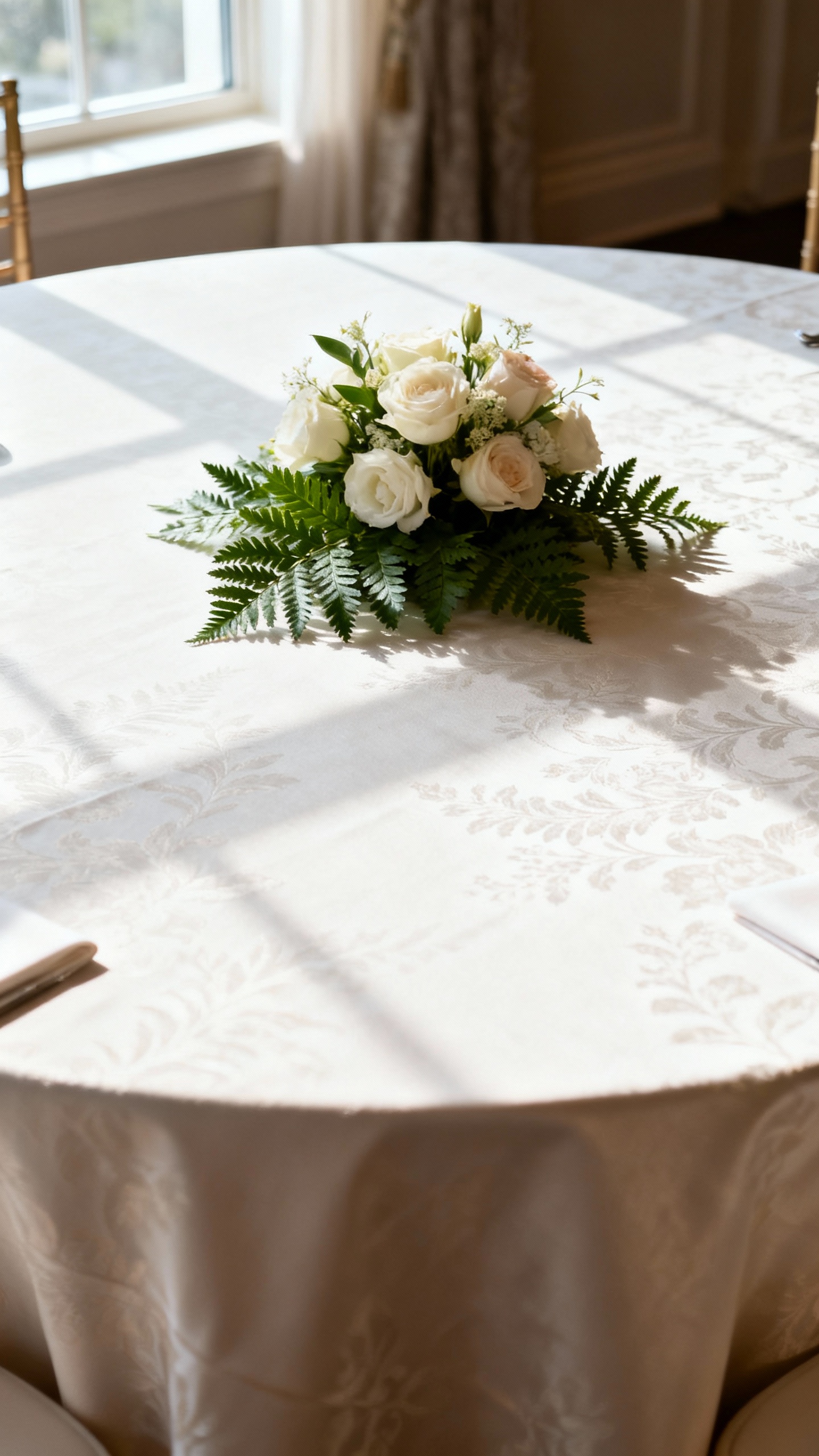
3) Arrangements That Are the Wrong Scale for the Space
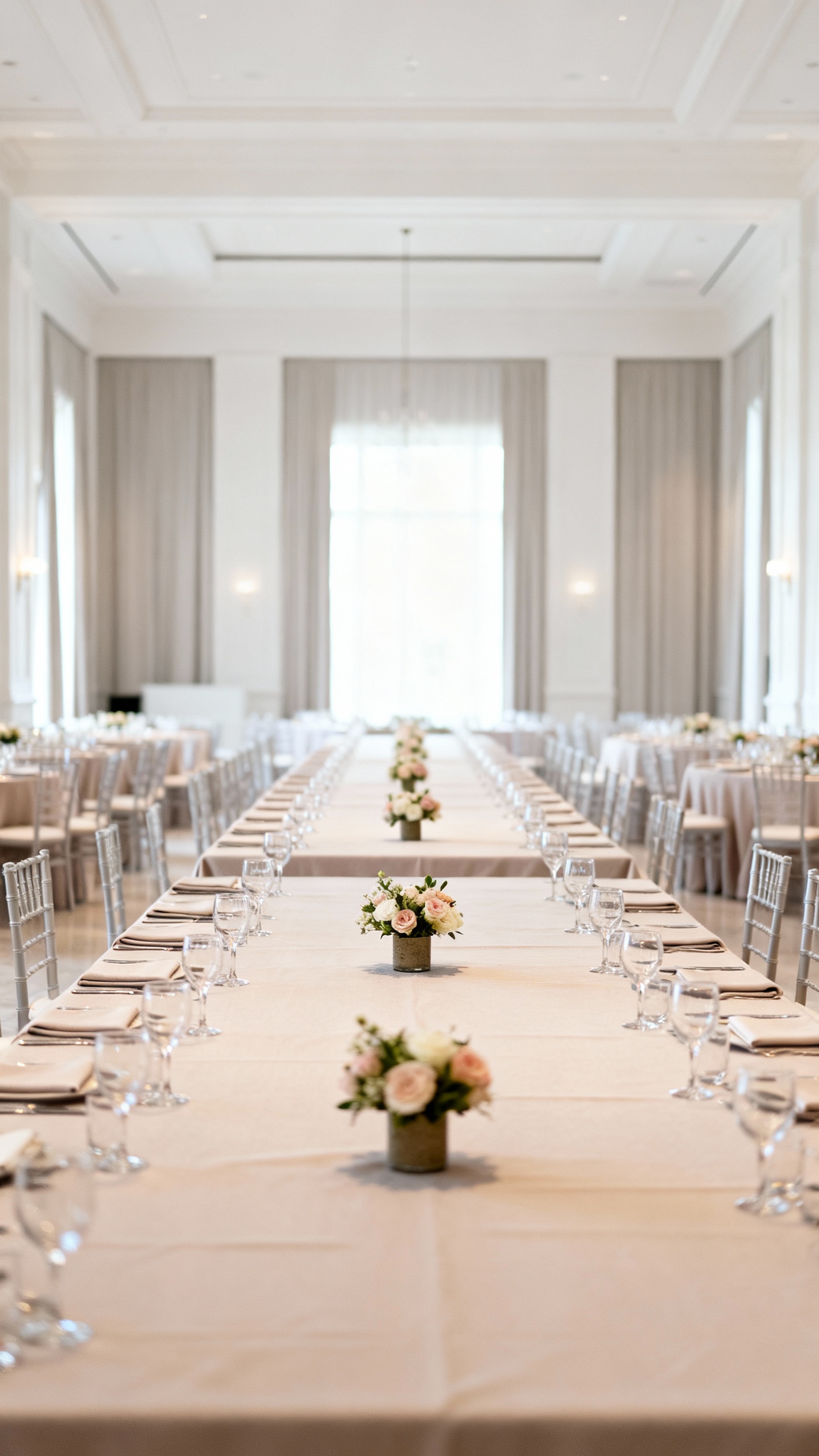
Tiny arrangements on long banquet tables or short centerpieces in a huge ballroom can feel underwhelming and instantly less luxurious. Scale is what creates that “wow,” even with fewer stems. Fix it by choosing one statement moment per area: a lush entry piece, elevated ceremony flowers, or fuller head table styling—then keep everything else simpler but coordinated. If budget is tight, add height with tasteful stands or vary centerpiece sizes for a designed look.
4) Cheap-Looking Vessels and Mismatched Finishes
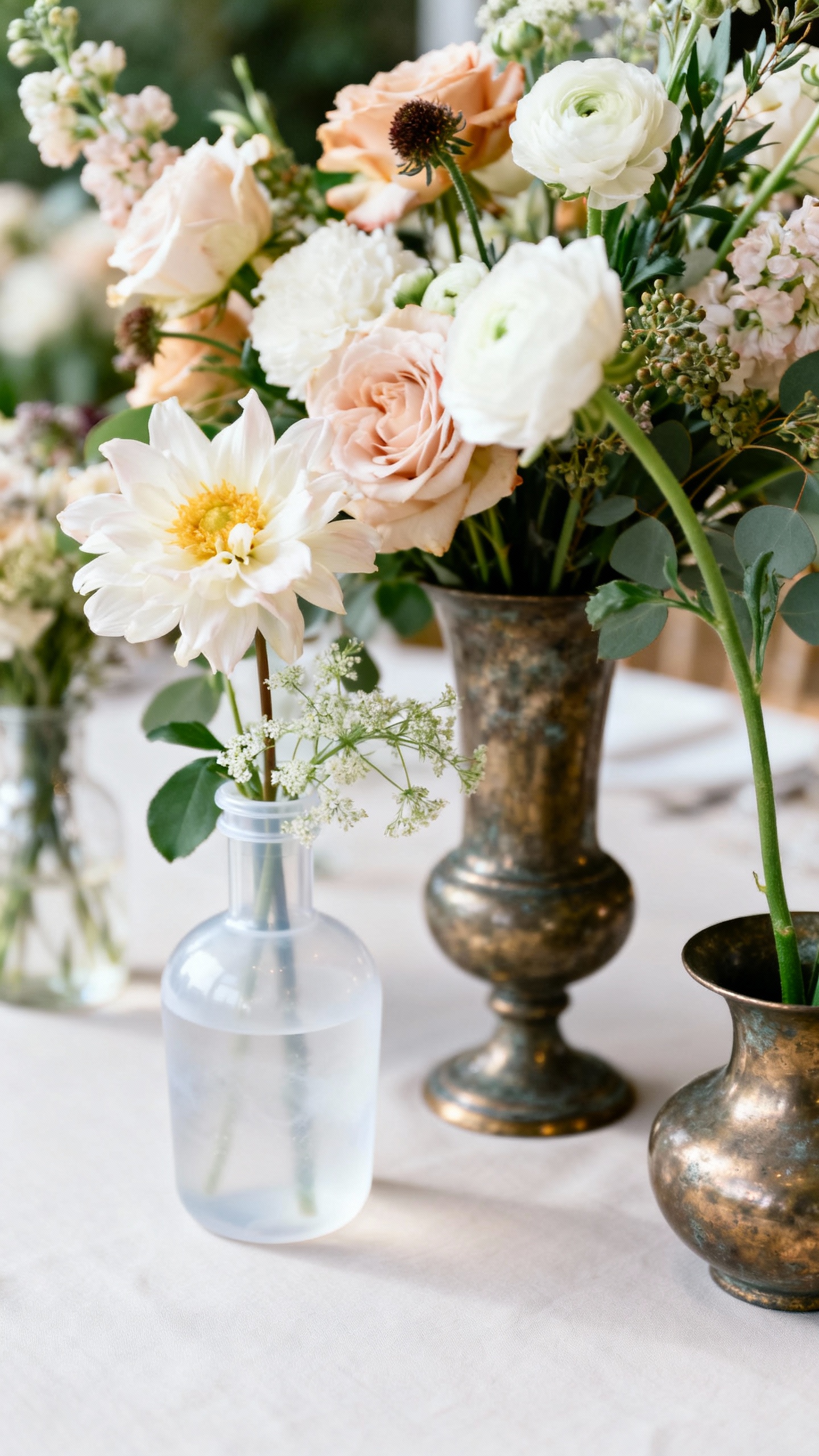
Your flowers can be gorgeous, but if they’re in lightweight plastic, cloudy glass, or random vases from different eras, the whole tablescape looks less polished. The fix is to pick one vessel style (clear glass, matte ceramic, brushed gold, etc.) and stick to a consistent finish across the room. If you’re mixing metals, do it intentionally: choose a “main” metal and a “supporting” one, and repeat both at least three times (candlesticks, flatware, signage frames).
5) Forgetting the Finishing Touches (Mechanics, Waterlines, and Setup)
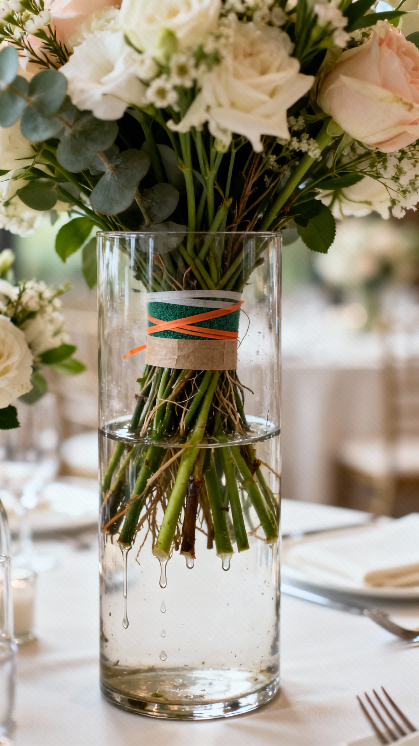
Visible floral foam, rubber bands, messy tape, and low waterlines are the little things guests may not name—but they absolutely feel. These details are what separates “nice” from “luxury.” Fix it by asking for polished mechanics: hidden foam, clean vase interiors, and thoughtful staging so arrangements look fresh from every angle. If you’re DIY-ing, wrap foam in waterproof tape and cover the base with greenery so nothing looks exposed in photos.
FAQ
How can I make wedding flowers look expensive on a budget?
Prioritize fewer, bigger impact moments instead of spreading flowers thin everywhere. Use a consistent color palette, repeat the same flower types, and invest in elevated vessels and candlelight. Even simple blooms look luxe when the styling is cohesive and the scale makes sense.
Is it better to choose real flowers or faux for an elegant look?
Real flowers are usually easier to make look high-end up close, especially in photos. That said, premium faux can look beautiful when used in larger installations or areas guests won’t touch. If you mix, keep faux out of handheld items like bouquets and use it for backdrops or overhead pieces.
What flower colors look most timeless for a wedding?
Soft neutrals (ivory, white, blush, champagne) are the most classic, and they photograph beautifully in any lighting. Muted tones like dusty rose, mauve, and soft sage feel modern but still elegant. If you want bold color, keep it to one statement shade and let neutrals support it.
How do I avoid “prom centerpiece” vibes?
Skip tight round balls of flowers and opt for looser shapes with movement and negative space. Use fewer flower varieties, choose one great greenery, and upgrade the vessel. Add candlelight and keep table styling minimal so the florals don’t have to do all the work.
What should I tell my florist to get a more elevated design?
Ask for a “refined, airy, editorial” look with intentional negative space and hidden mechanics. Share your venue photos, table sizes, and linen colors so scale and tones are correct. Request a consistent recipe of blooms and greenery across personal flowers, ceremony, and reception for a cohesive, luxe finish.