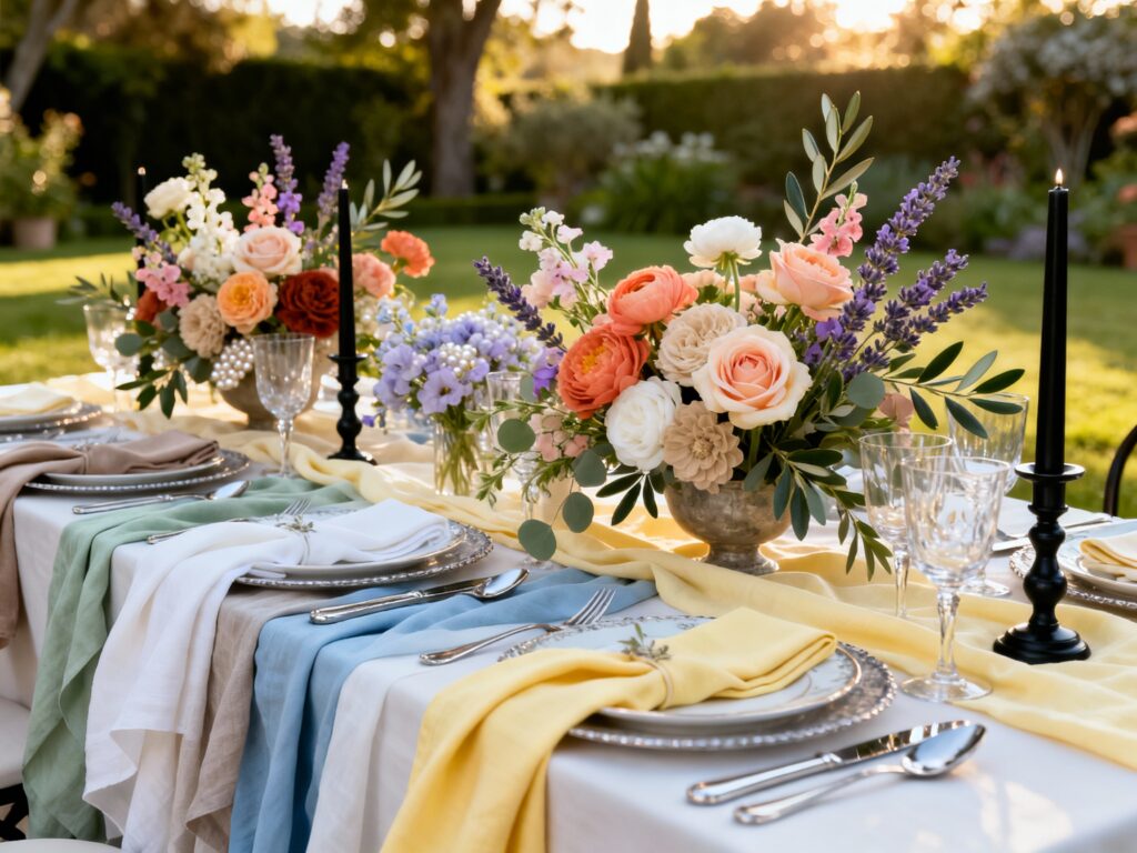
Summer weddings are a vibe: longer days, golden-hour photos, and flowers that actually show up. The only catch? A lot of “summer” color advice can start to look like a coastal bachelorette weekend.
If you want something fresh, elevated, and very much wedding (not beach party), these palettes keep the season’s brightness while still feeling intentional and modern.
Top 5
1) Buttercream Yellow + Sage + Soft White
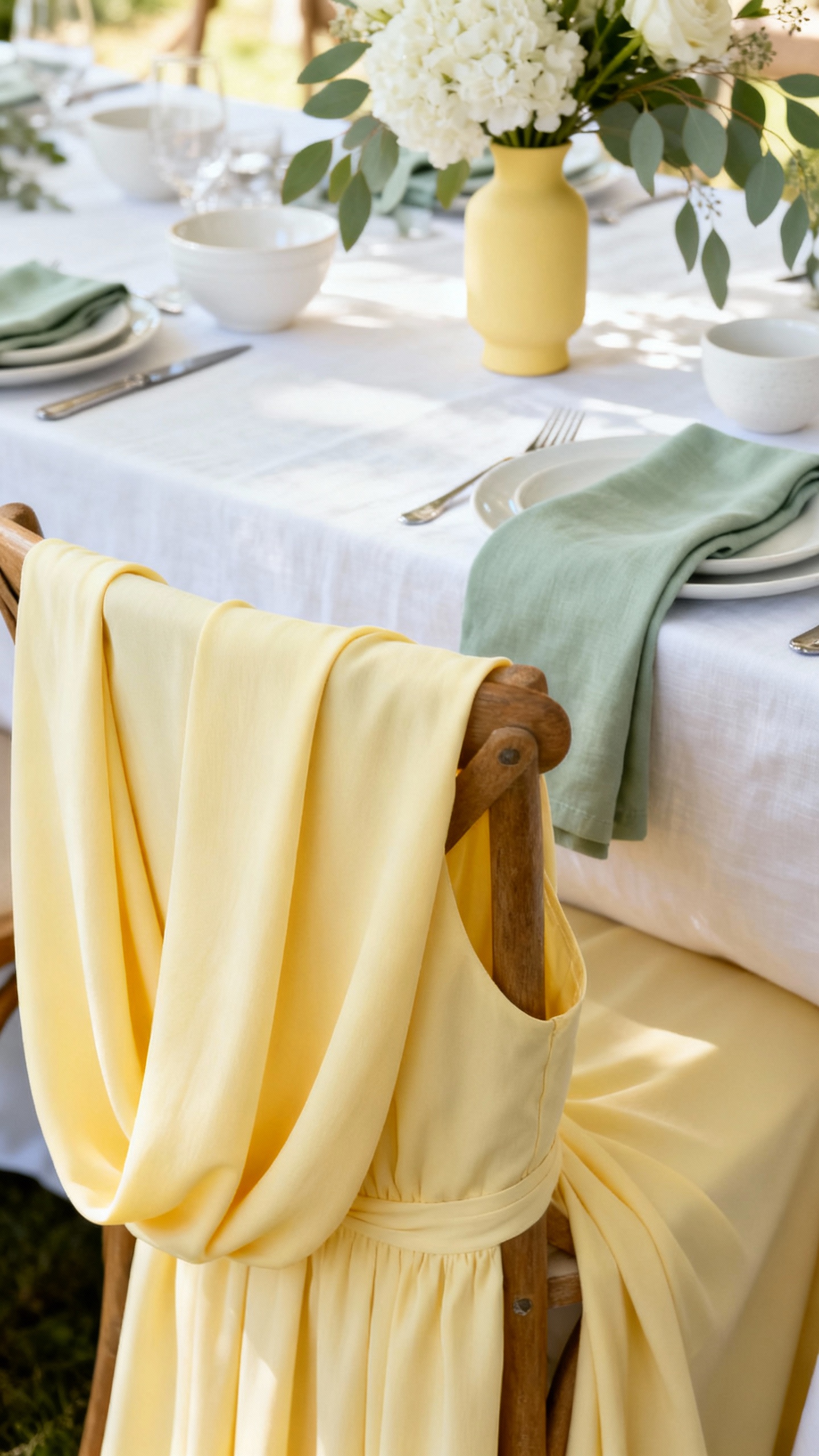
Buttercream reads sunny without screaming “lemonade stand,” and sage keeps it grounded. Use soft white as your base for linens and stationery, then layer yellow in bridesmaid dresses or bud vases. Finish with warm metallics (champagne or brushed gold) for a glowy, upscale look.
2) Dusty Blue + Taupe + Ivory + Antique Rose
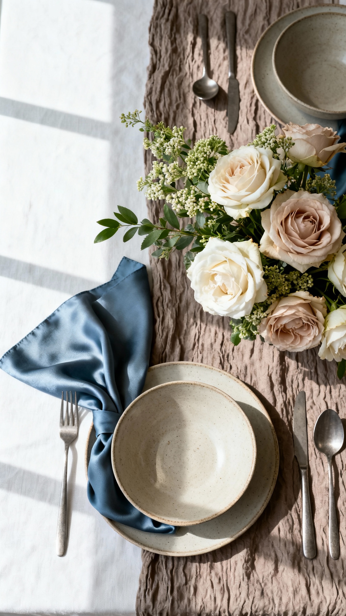
This is the airy summer palette for couples who want romance without going pastel-princess. Dusty blue works beautifully for suits, napkins, or watercolor invites, while taupe keeps the whole look mature. Add antique rose in florals (roses, dahlias, garden sprays) for that soft “just married” warmth.
3) Olive + Terracotta + Cream + Black Accent
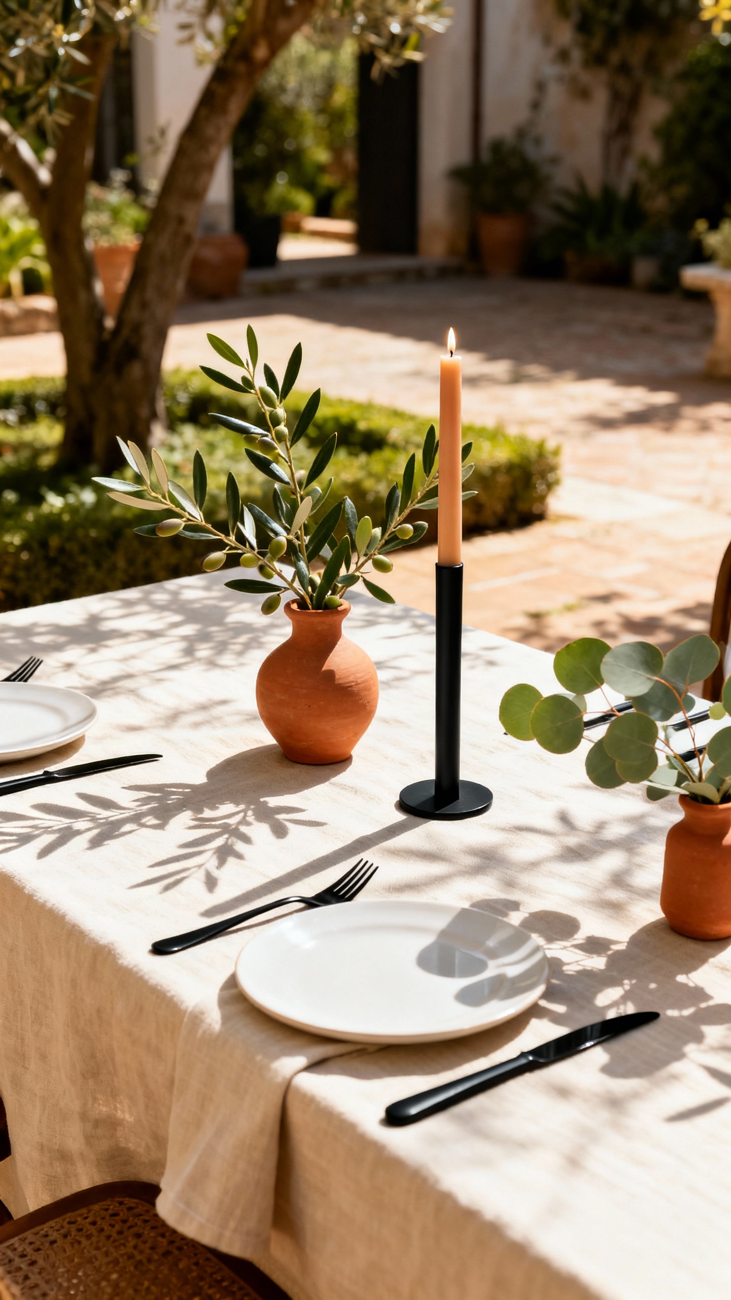
If you love a sun-baked, European-garden feel, this one delivers without drifting into “boho beach.” Cream and olive handle the main palette (linens, greenery, signage), terracotta brings the heat in florals and candles, and a tiny black accent sharpens everything. Think black taper candles, black ink on menus, or sleek black place cards.
4) Lavender + Periwinkle + Pearl White + Silver
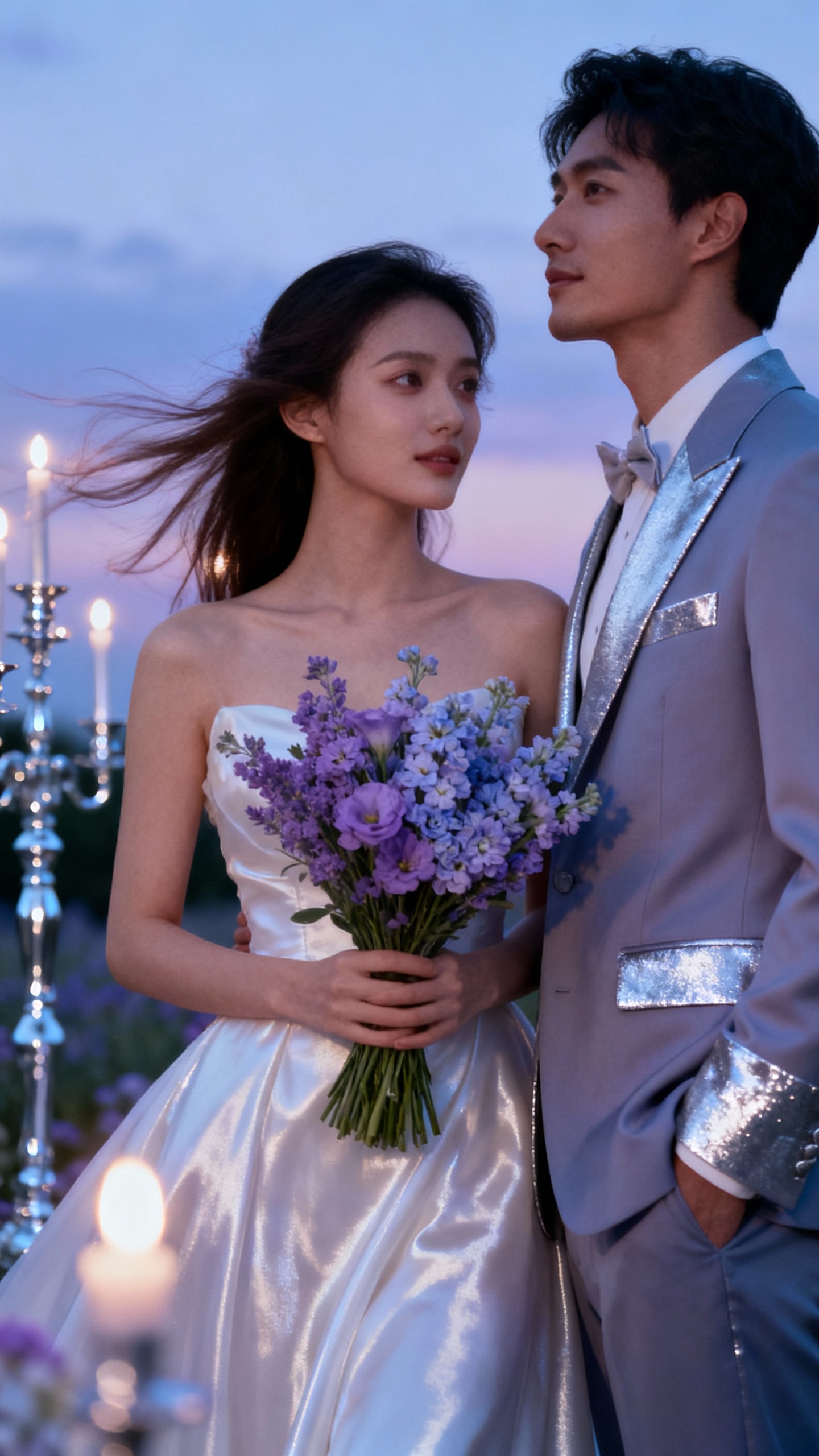
Cool-toned and dreamy, this palette feels like an evening wedding with a breeze—light, not loud. Lavender and periwinkle are flattering in bridesmaid dresses and look insanely good in twilight photos. Keep the base pearl white and use silver for cutlery, chargers, or a satin ribbon moment to make it feel crisp and elevated.
5) Coral (Muted) + Blush + Sand + Eucalyptus
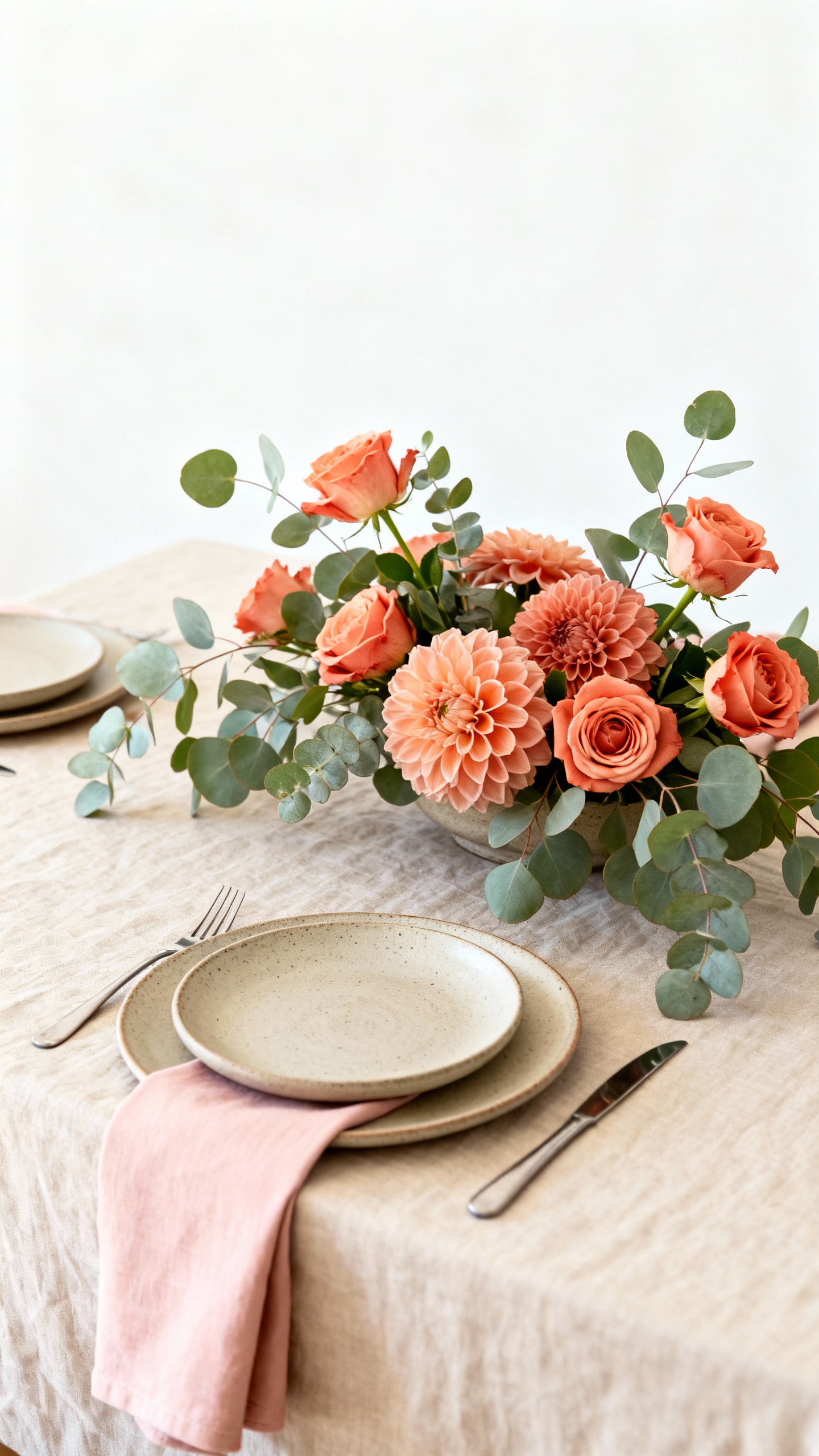
Coral can totally be wedding-chic when you mute it and pair it with softer neutrals. Use blush and sand for your foundation (linens, stationery, bridesmaids), then bring in coral through florals, signature cocktails, or small details like napkins. Eucalyptus adds a clean, modern green that keeps everything from going tropical.
FAQ
How do I make a summer palette feel “wedding” instead of “vacation”?
Anchor it with a true neutral (ivory, cream, soft white, taupe) and keep your brightest color to accents, not everything. Upgrade the look with consistent finishes—matching metal tones, thoughtful paper goods, and one repeating detail like ribbon color or candle style.
What colors photograph best in harsh summer sunlight?
Softer, slightly muted tones tend to photograph more flattering than neon-bright shades. Buttercream, dusty blue, sage, olive, lavender, and blush all hold up well in midday light and look especially nice during golden hour.
Can I use black in a summer wedding palette?
Yes—just use it like eyeliner, not foundation. Small touches (menus, taper candles, modern frames, groom’s tux accents) add contrast and keep the palette from feeling too sweet, especially when you’re working with creams, pastels, or warm earth tones.
How many colors should I actually use for the wedding?
A reliable formula is 3 main colors plus 1–2 neutrals. For example: dusty blue + antique rose + taupe, with ivory as your base. This keeps decisions easy and makes your decor look cohesive on Pinterest and in real life.
What’s the easiest way to “tie in” the palette across the whole day?
Repeat your colors in three places: ceremony florals, reception tables (linens/napkins/candles), and stationery (invites, menus, escort cards). Even if your flowers vary, keeping one consistent shade in linens or paper goods instantly makes the day feel coordinated.
