
If your wedding mood board lives somewhere between enchanted garden and soft fairytale glow, you’re in the right place. Fairy wedding color palettes are all about airy tones, twinkly accents, and that “is this real life?” kind of romance.
Below are five dreamy, Pinterest-loved palettes that read magical without feeling like a costume. Think: wearable colors, photo-friendly combos, and easy ways to sprinkle in sparkle.
Top 5
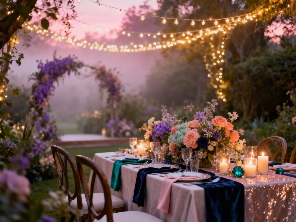
1) Moonlit Lavender + Silver + Misty Blue
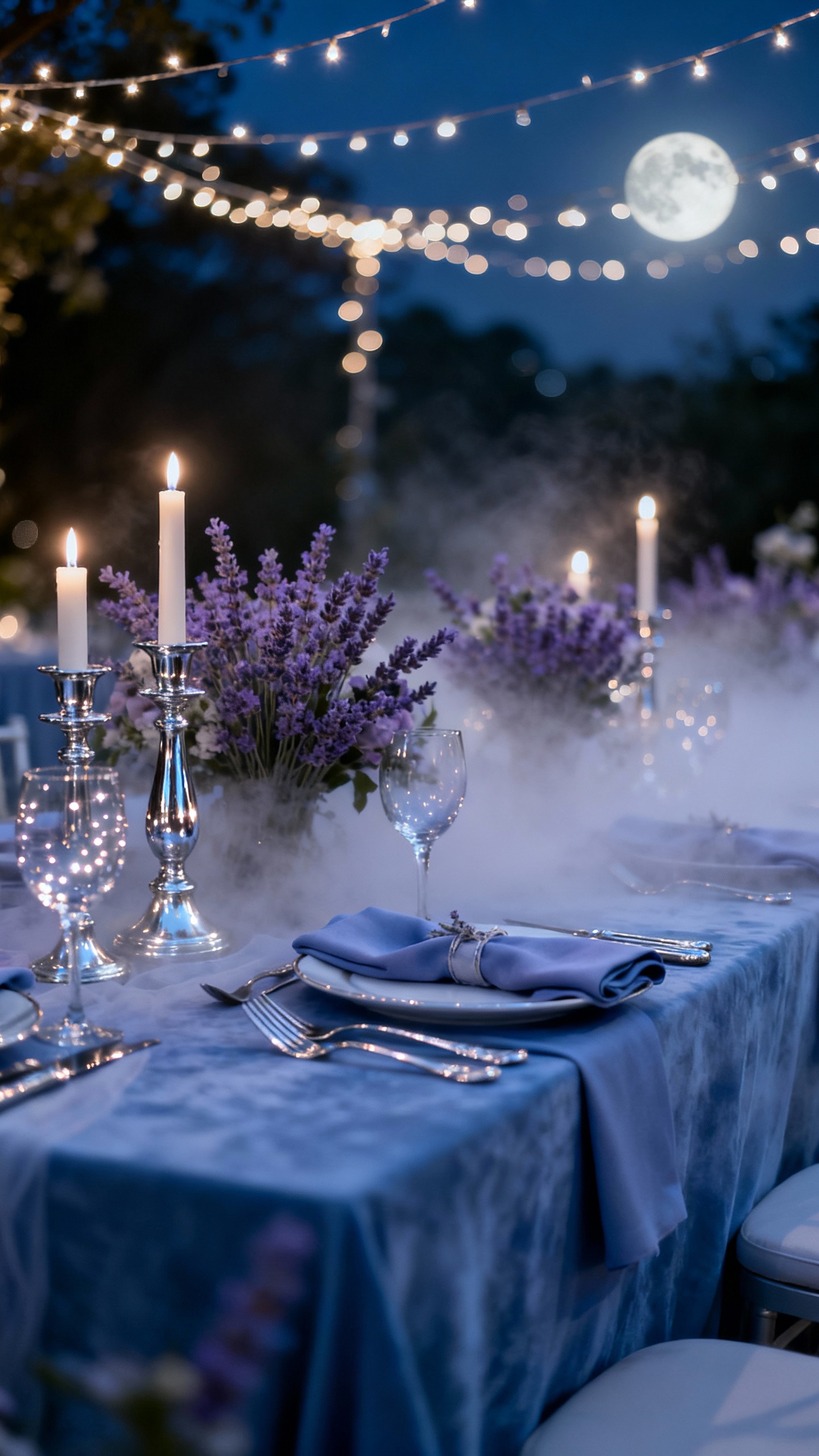
This palette feels like dancing under string lights with a cool night breeze—soft, romantic, and a little mysterious. Use lavender for bridesmaid dresses, misty blue for linens, and silver for flatware, candleholders, and shimmer in your stationery. Florals look extra ethereal with white anemones, pale lilac roses, and dusty blue delphinium. Add a “moonlight” touch with mirrored signage or silver-edged menus that catch the light in photos.
2) Blush Rose + Champagne + Pearl White

If you want fairy vibes that still feel timeless and elegant, this is your girl. Blush and champagne photograph beautifully in every season, and pearl white keeps it fresh instead of overly pink. Try champagne satin table runners, blush taper candles, and pearl accents like beaded napkin rings or a subtle shimmer veil. For florals, mix blush garden roses with white ranunculus and a little baby’s breath for that floaty, “just-picked” look.
3) Sage Green + Cream + Soft Gold
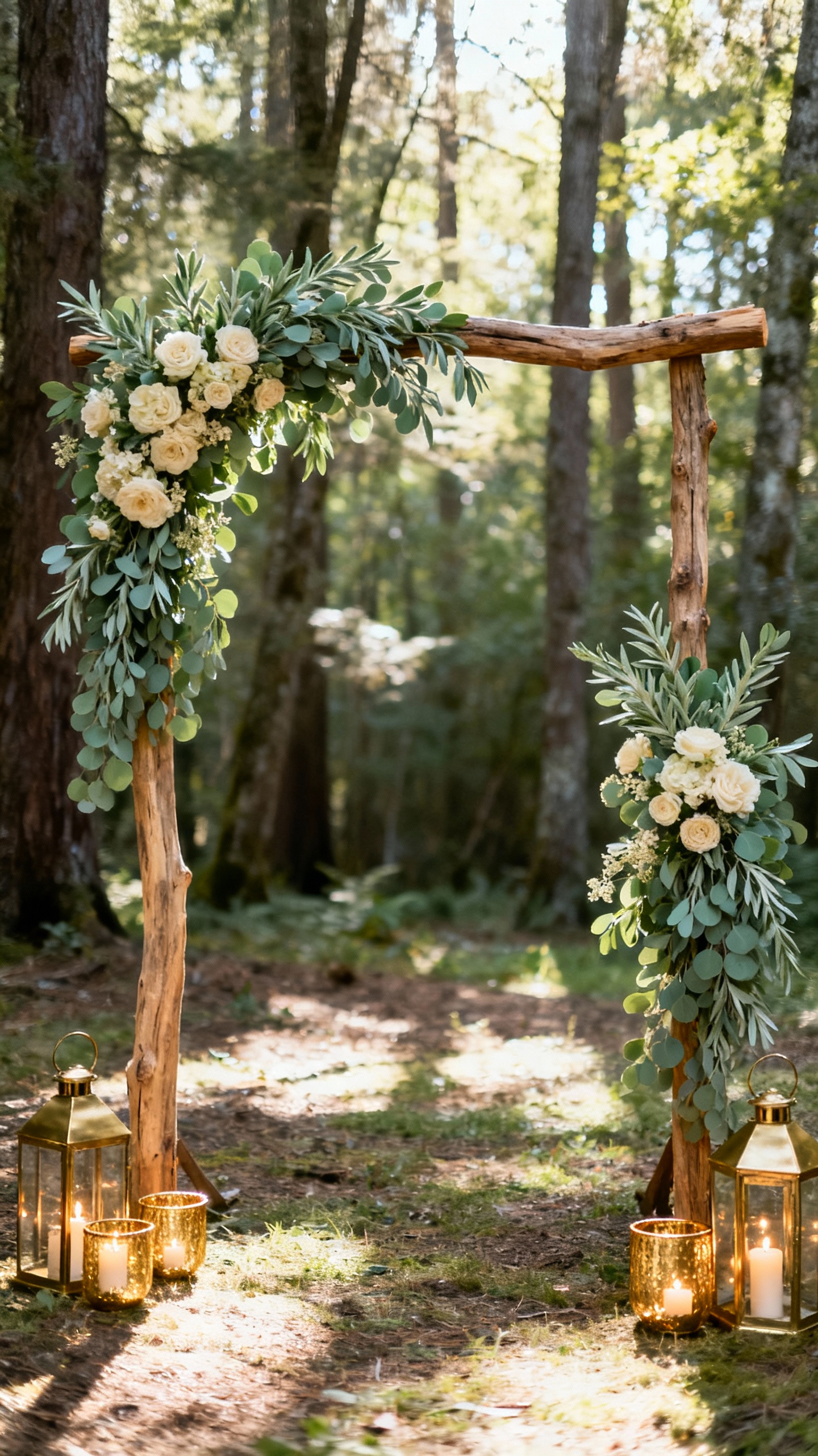
This palette is perfect for woodland fairy energy—grounded, natural, and effortlessly romantic. Sage reads chic and modern, cream keeps it airy, and soft gold brings the magic (without going full glitter). Use sage in bridesmaid dresses or napkins, cream in linens and draping, and gold in frames, escort card holders, and cake details. Bonus: greenery-forward florals (eucalyptus, ruscus, olive) help stretch your budget while still looking lush.
4) Butterfly Peach + Coral Pink + Warm Ivory
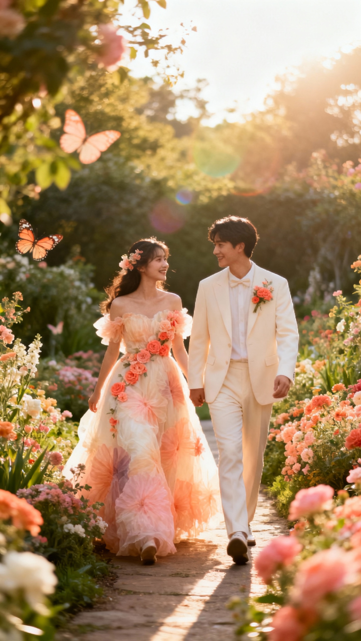
This one is for the couples who want their fairytale to feel sun-kissed and joyful, not icy and pastel. Peach and coral bring a playful glow to photos—especially golden hour—and warm ivory keeps it soft and romantic. Use coral in your bouquet ribbons or signature cocktails, peach in florals (think dahlias or roses), and ivory for your main foundation like linens and invites. Add a whimsical touch with watercolor table numbers or ombré candles that look straight off a Pinterest board.
5) Midnight Navy + Emerald + Starry Gold

For a more dramatic fairy vibe, go “enchanted castle at night” with deep jewel tones and twinkly gold. Navy and emerald feel luxe and cozy, while gold brings the starlight moment—perfect for candlelit receptions. Try navy linens with emerald glassware, or flip it with emerald bridesmaid dresses and navy suits for a rich contrast. Gold works best in small, high-impact details like constellation-inspired signage, gold-leaf cake accents, or tiny fairy lights tucked into greenery.
FAQ
How do I make my wedding feel “fairy” without going over-the-top?
Focus on texture and lighting first: soft draping, lots of candles (or LED if needed), and warm string lights instantly create a dreamy vibe. Then layer in delicate details like ribbon, subtle shimmer, and garden-style florals. If you keep your palette cohesive, it’ll read magical—not costume-y.
What’s the easiest way to tie a color palette together across the whole day?
Pick one main color, one neutral, and one metallic accent, then repeat them in 3–5 places: invitations, ceremony florals, table linens, bridal party outfits, and signage. Consistency beats complexity every time. Even simple rentals look custom when the colors echo each other.
Which fairy color palettes photograph best?
Blush/champagne/white and sage/cream/gold are super camera-friendly because they’re light, balanced, and flattering on skin tones. For evening weddings, midnight navy/emerald/gold pops beautifully in candlelight. Avoid using too many similar mid-tones at once—contrast helps details stand out in photos.
Can I mix pastels with jewel tones and still look cohesive?
Yes—just use one as the “lead” and the other as an accent. For example, pair misty blue and lavender with tiny touches of emerald in glassware or ribbon, or keep jewel tones in attire while using lighter florals and linens. A shared metallic (like gold) is the easiest bridge between the two.
What flowers fit a fairy wedding aesthetic on a budget?
Lean into airy fillers and greens: baby’s breath, limonium, greenery garlands, and seasonal blooms can create that enchanted look without the luxury price tag. Ask for garden-style arrangements with movement (not tight balls) so everything feels whimsical and organic. Repurpose ceremony florals to the reception to get extra mileage.