
Color is the fastest way to set the whole vibe of your wedding. Whether you’re going full Pinterest mood board mode or you just want your florals and outfits to feel cohesive, this year’s trending palettes are all about intentional contrast, warm softness, and a little personality.
Below are five wedding color combos that are everywhere right now (in the best way), plus easy ways to use them across invites, attire, florals, and tablescapes.
Top 5
1) Butter Yellow + Ivory + Sage
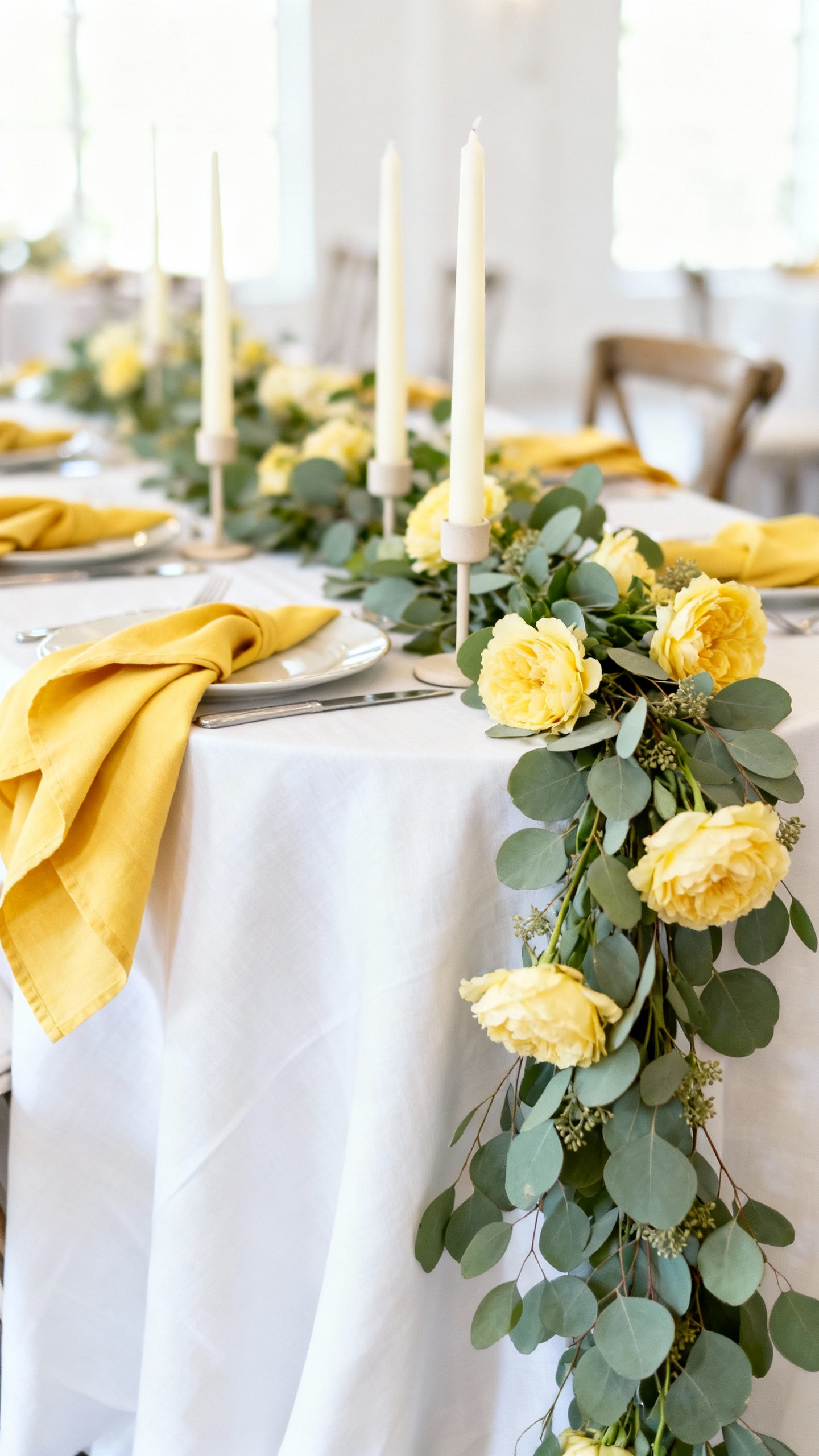
This palette is soft, sunny, and romantic without feeling too “theme-y.” Use butter yellow for bridesmaid dresses or napkins, keep ivory for linens and candles, and weave sage through greenery-heavy florals. It photographs beautifully in natural light and works for garden, vineyard, and backyard weddings.
2) Terracotta + Blush + Cream
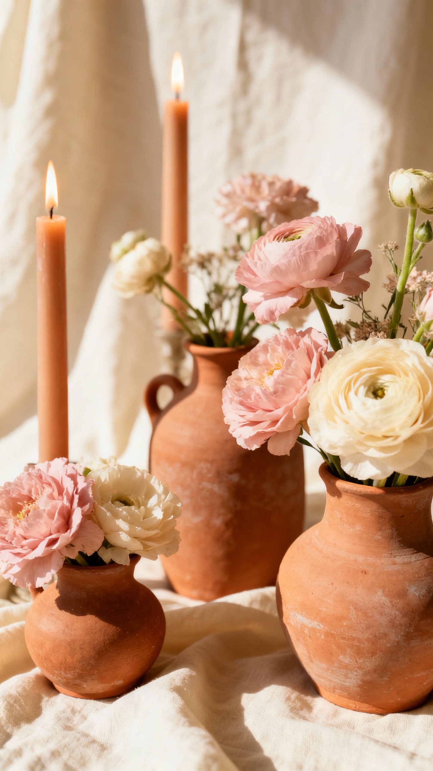
Warm neutrals are still having a major moment, and this trio is the definition of cozy-elevated. Terracotta shows up best in ceramics, taper candles, or groom/groomsmen ties, while blush keeps things airy in blooms and stationery. Cream grounds it all so the palette feels timeless, not trendy.
3) Dusty Blue + Champagne + Pearl White
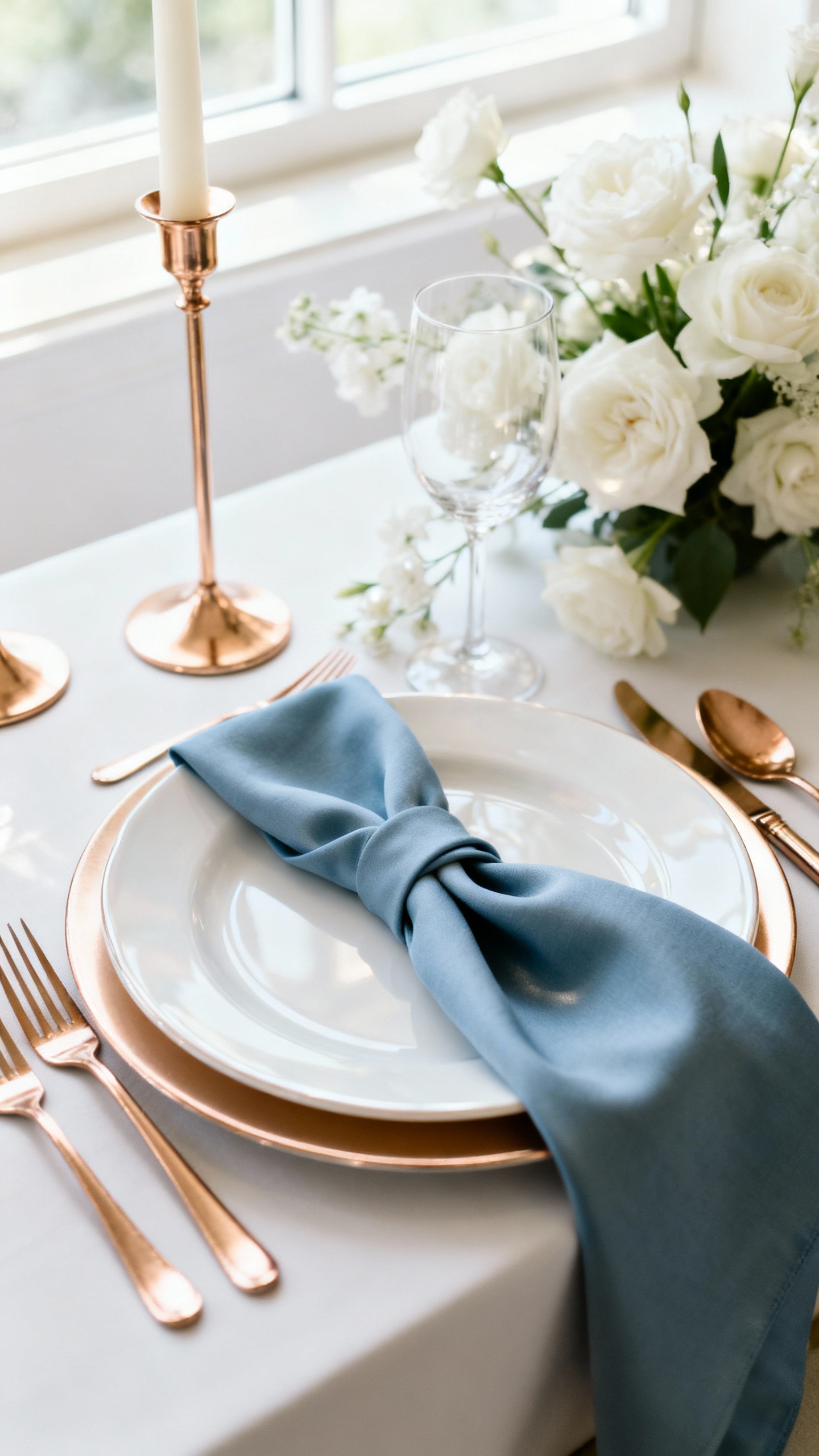
If you want classic with a modern sheen, this is the combo. Dusty blue is gorgeous for bridesmaids, suit accents, or watercolor invites, and champagne brings that subtle glow through metallic details and glassware. Pearl white keeps the whole look polished and upscale, especially for ballroom or coastal weddings.
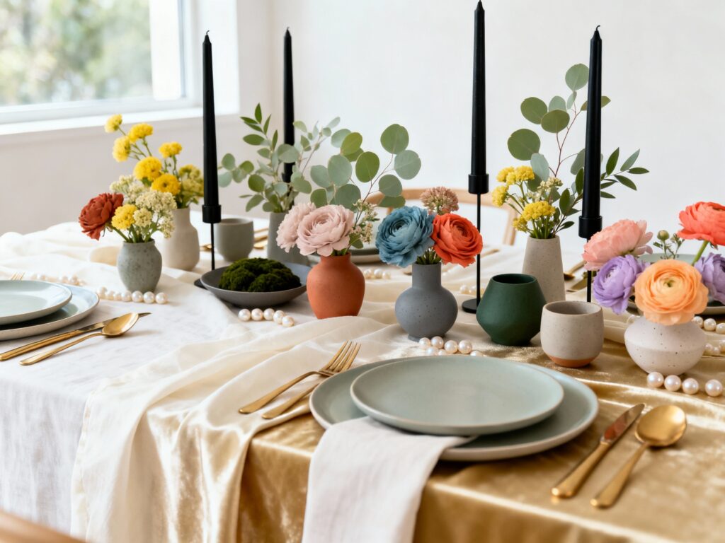
4) Forest Green + Black + Warm Gold
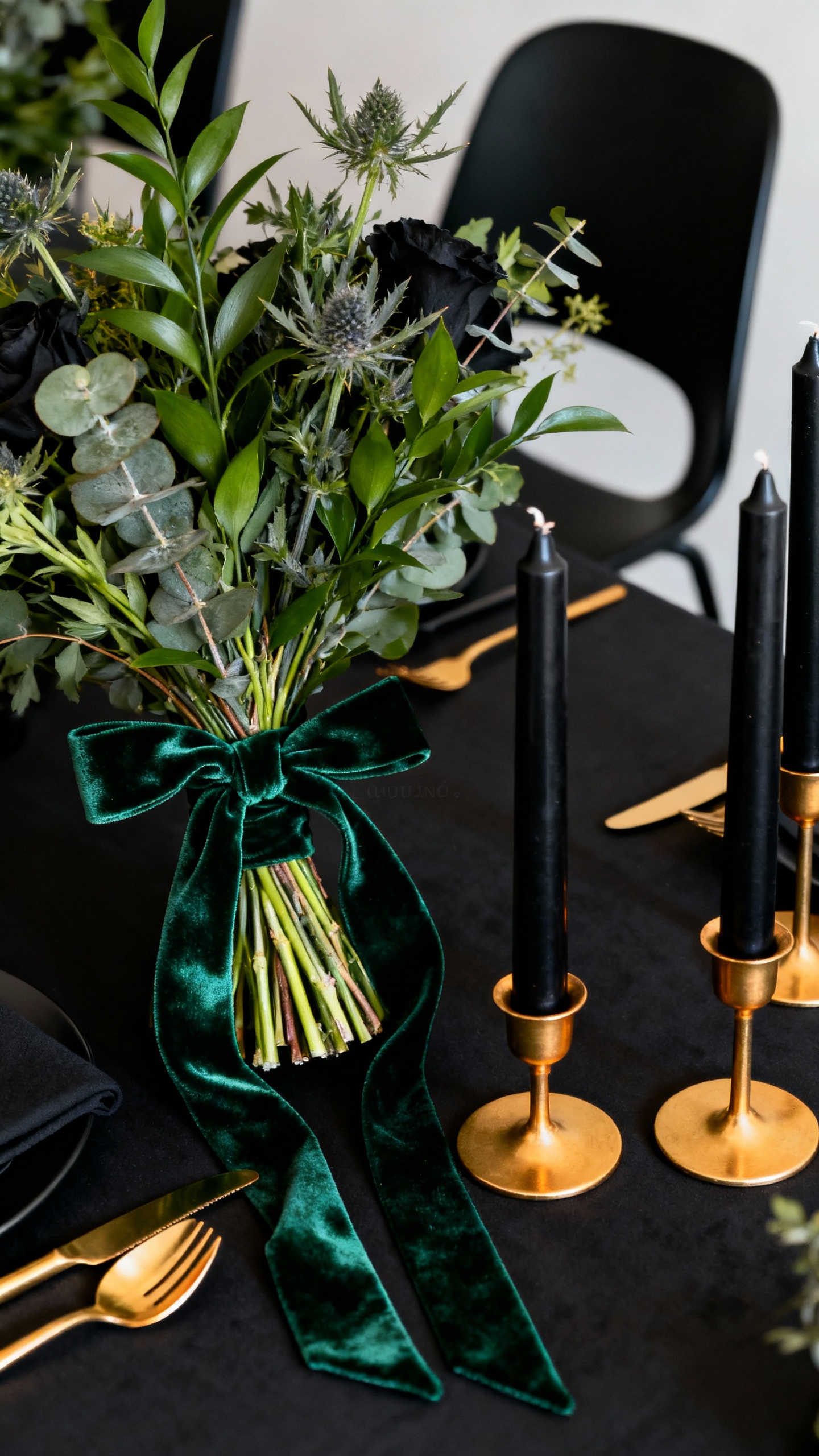
This palette is moody in a chic way, not a heavy way. Forest green in lush arrangements or velvet ribbons gives instant depth, while black adds crisp contrast in signage, chairs, or even a tux moment. Warm gold (not icy silver) is the finishing touch—think candleholders, flatware, or foil on your invites.
5) Coral + Peach + Soft Lilac
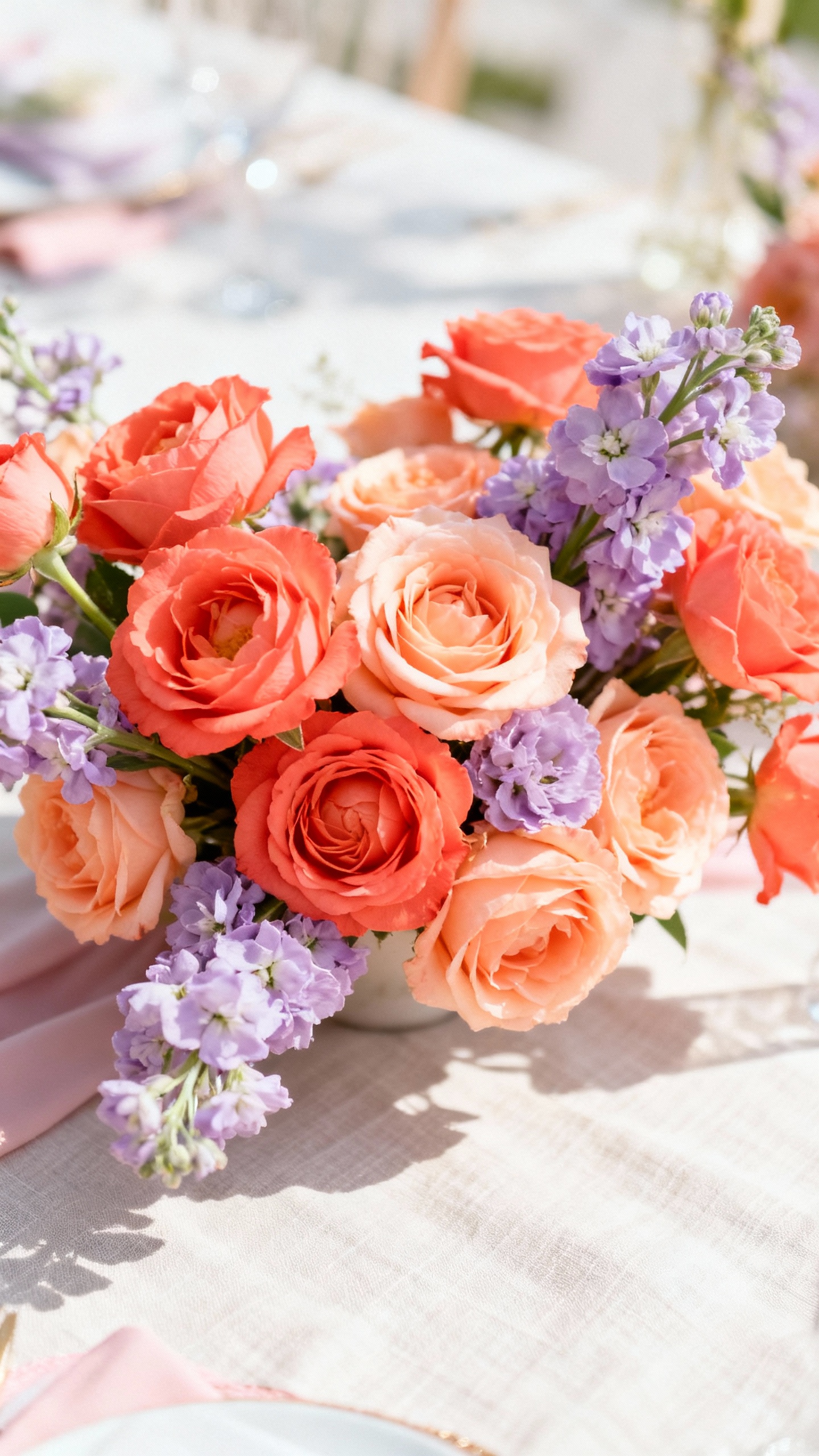
This is the fun, confident palette for couples who want color that feels fresh and joyful. Coral and peach play perfectly in summer florals and cocktail napkins, and soft lilac keeps it romantic (especially in bridesmaid dresses or ribbons). Keep your neutrals light—white linens and clear glass—so the colors stay bright and intentional.
FAQ
How do I choose wedding colors that won’t feel dated later?
Pick one “trend” color and pair it with timeless neutrals like ivory, cream, or champagne. Use the trend shade in easy-to-swap places (napkins, signage, bridesmaid dresses) and keep your core pieces classic (linens, candles, suit colors). That way your photos still feel like you, not a specific year.
How many colors should a wedding palette include?
A sweet spot is 3 to 5 total: one main color, one supporting color, and 1–3 neutrals or metallics. This keeps your design cohesive while still giving you flexibility for florals, attire, and tablescapes. If you’re overwhelmed, start with two colors and add neutrals after.
Do my bridesmaid dresses have to match my wedding colors exactly?
No—and mismatched looks are very in right now. Aim for “in the same family” instead of identical: varying shades of dusty blue, mixed greens, or warm sunset tones all look intentional in photos. Tie everything together with consistent bouquets and accessories.
What’s the easiest way to make my color palette look expensive?
Layer tones and textures instead of adding more colors. Think matte linens with glossy glassware, soft florals with structured candles, or ribbon in velvet/satin. Also, choose one metal (warm gold or silver) and repeat it consistently across details like flatware, frames, and signage.
How do I make trendy colors work in any season?
Adjust the shade depth and your materials. For example, butter yellow can be light and airy in spring, but warmer and richer with amber glass in fall. Pair bright palettes with seasonal florals and greenery, and use lighting (candles, bistro lights) to shift the mood without changing your whole scheme.