
Picking wedding colors can feel like a whole personality test, but it doesn’t have to. You can lock in a palette you love in 10 minutes—without spiraling, without 47 saved boards, and without second-guessing every shade of “champagne.”
Use this quick method to choose colors that look intentional in photos, work with your venue, and make planning decisions easier from bridesmaid dresses to florals.
Top 5
1) Start With Your Venue “Base Color”
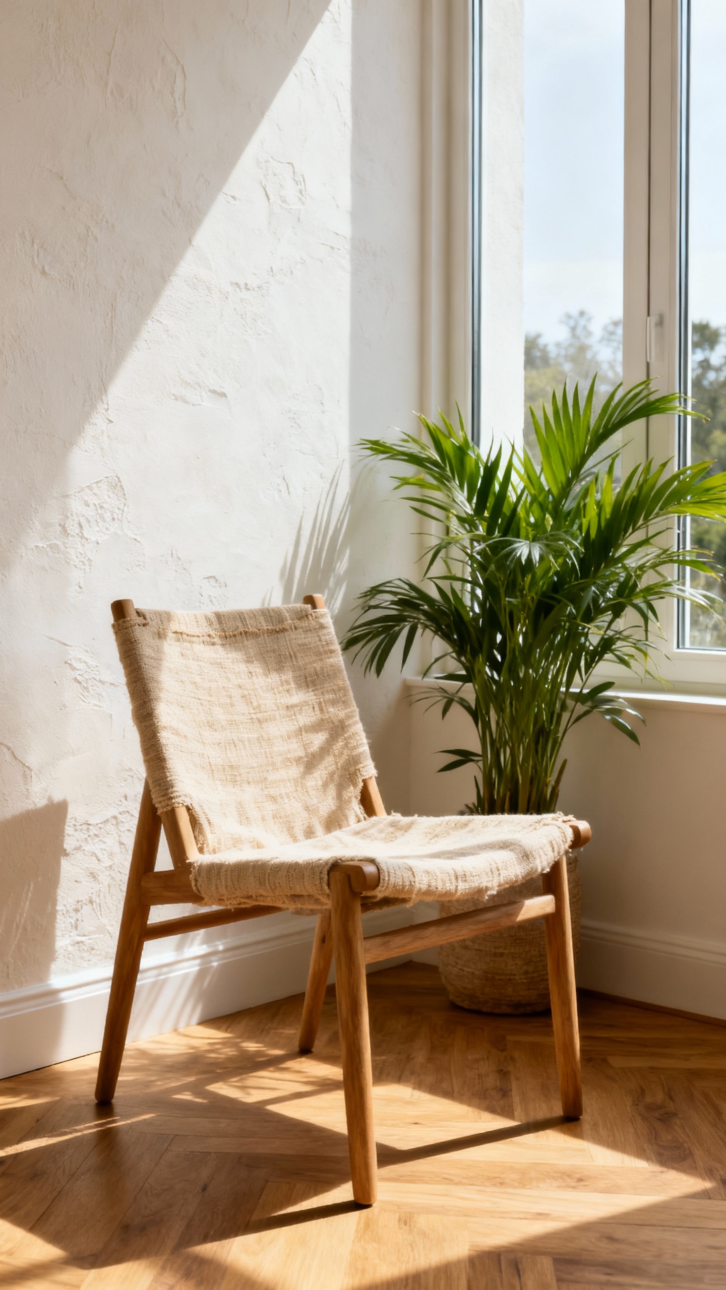
Look at your venue’s permanent colors: floors, walls, chairs, greenery, and lighting. Choose one “base” from what’s already there (like stone, white, wood, or garden green) so your palette feels naturally cohesive. This instantly narrows your options and keeps everything from fighting the space. If you’re between venues, pick the one you love most and build around it.
2) Pick One Statement Color You’d Wear Again
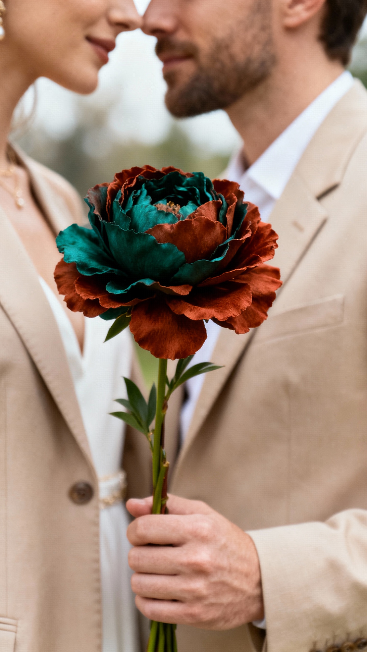
Choose a main color that feels like you—something you’d actually wear to a nice dinner, not just a wedding trend you’ll tire of. This is the shade that shows up in the big visual moments (bridesmaids, key florals, linens, or signage). If you can picture it as a dress, a nail color, or a bouquet ribbon you’d save, you’re on the right track. Keep it to one strong “hero” color to avoid chaos.
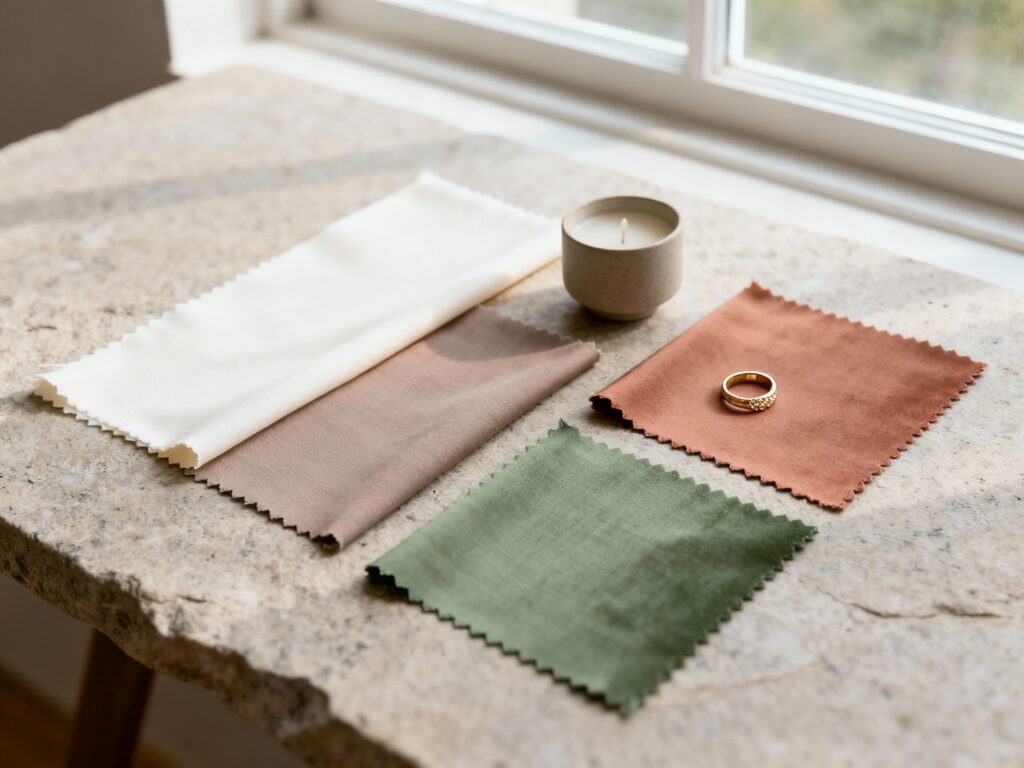
3) Add a Supporting Neutral (Yes, You Need One)
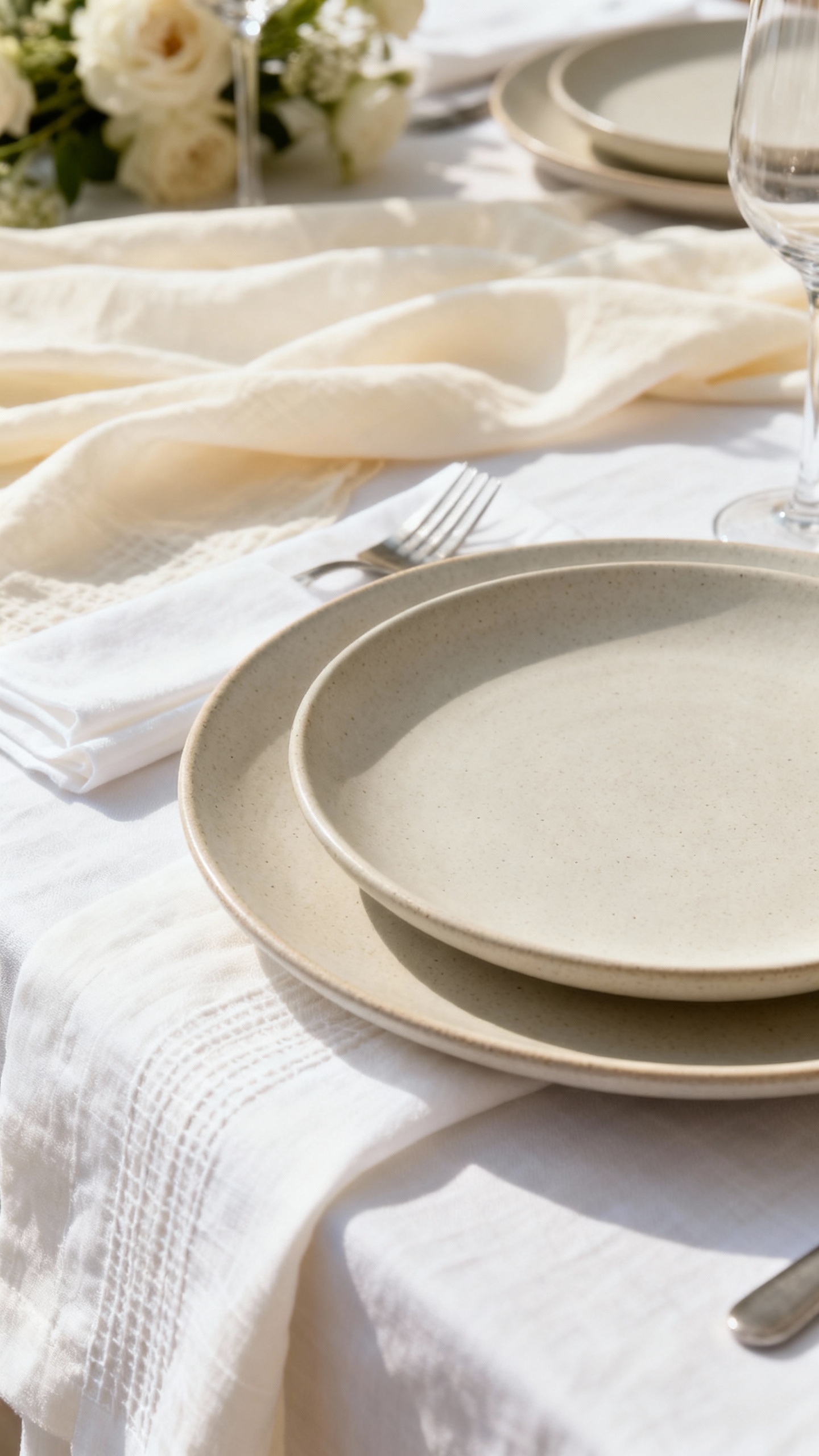
A neutral is the glue that makes your palette look expensive and clean in photos. Pick one: ivory, soft white, taupe, sand, gray, or classic black (depending on your vibe). This neutral can live in linens, stationery, candles, or groomsmen details, and it helps your statement color pop. Bonus: neutrals make it way easier to match items across different brands and fabrics.
4) Choose a Metallic That Matches Your “Hardware”
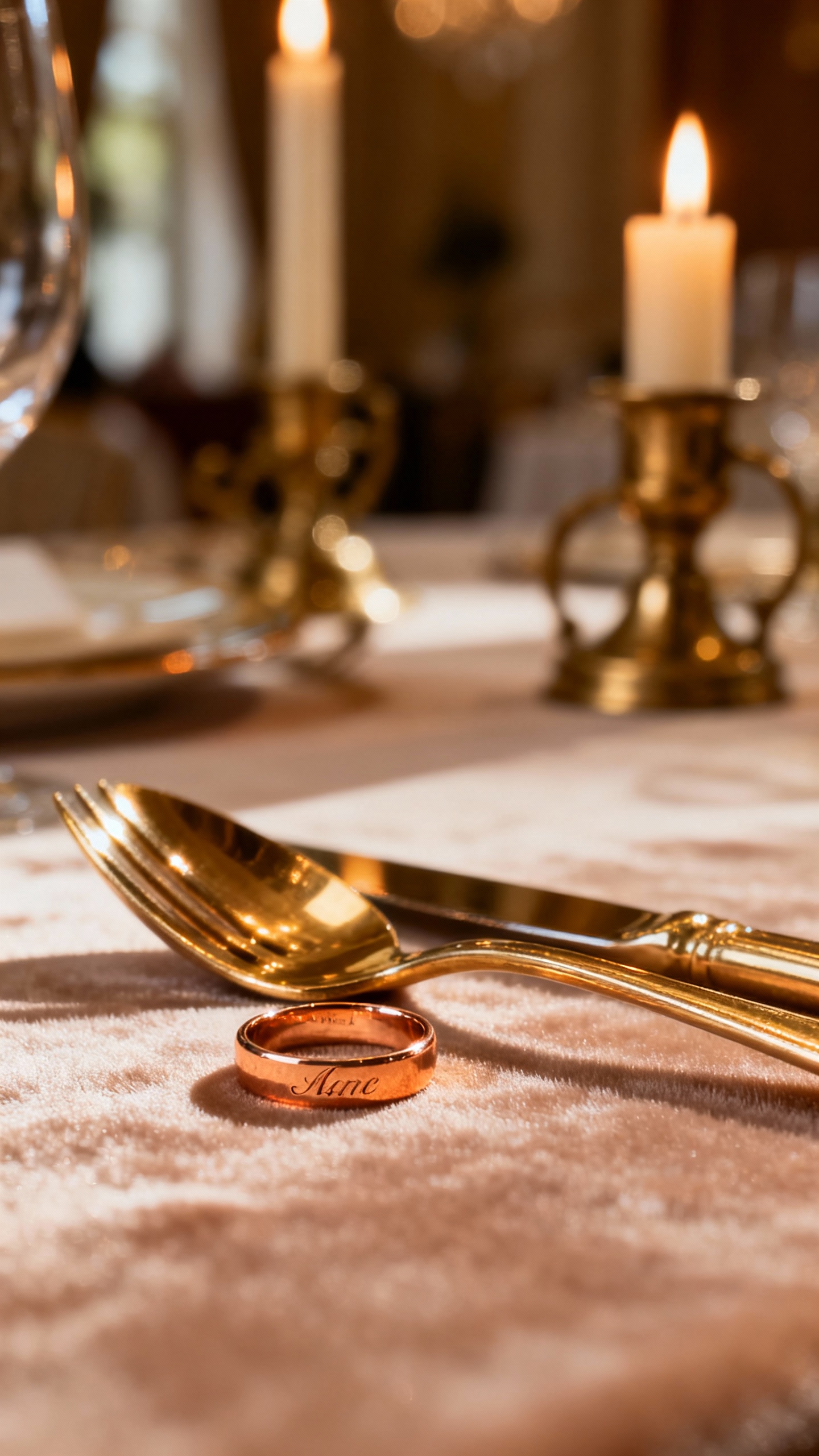
Think of your metallic like jewelry for the whole wedding: gold, champagne gold, silver, or rose gold. Match it to what you’ll already have—ring tones, venue fixtures, flatware, candle holders, and even your dress details. Metallics show up in photos more than you think (especially in reception lighting), so choosing one keeps everything consistent. If you’re torn, warm venues usually love gold, and modern spaces often look sharp with silver.
5) Do the “3-Photo Scroll Test” and Lock It In
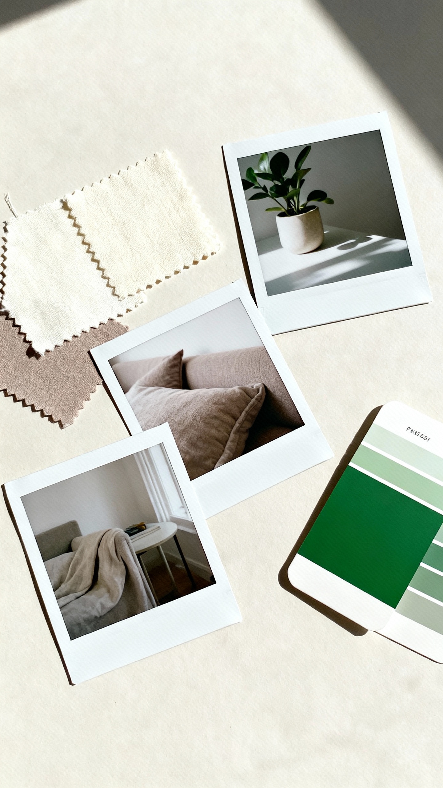
Open Pinterest and save exactly three photos that you’d be thrilled to copy the mood of (not every detail—just the vibe). Put them side by side and circle the repeating colors you notice: you’ll usually see one hero color, one neutral, and one accent (often green from florals). If your three photos don’t share a clear overlap, your palette isn’t ready yet—swap one photo and try again. Once you see the pattern, write your palette as 3–5 colors and stop shopping for new ones.
FAQ
How many wedding colors should I choose?
Most weddings look best with 3–5 colors total: one main color, one neutral, one metallic, and (optional) one accent plus greenery. More than five can start to feel busy unless you’re intentionally doing a colorful, maximalist look. If you’re overwhelmed, do three: neutral + statement color + greenery.
How do I pick colors that photograph well?
Go for contrast and clarity: pair a medium or deep statement color with a lighter neutral so details don’t blend together. Avoid relying only on very pale shades (like blush + champagne + ivory) unless you add texture or a darker accent. Also consider lighting—warm indoor lighting makes colors look warmer, while bright daylight can wash out pastels.
What if my bridesmaids all want different dress colors?
Give them a controlled palette: choose one color family (like blues or earthy tones) plus a fabric direction (satin, chiffon, matte) and let them pick shades within that range. Keep your bouquets and accessories consistent to tie it all together. The result looks intentional, not random.
Do I have to match my flowers to my wedding colors?
No—your flowers can “support” your palette instead of matching it exactly. A great trick is to keep florals mostly neutral (white/ivory/green) and add your statement color with a few standout blooms or ribbons. This looks elevated, helps with seasonal availability, and keeps costs more predictable.
How do I make my palette feel cohesive across the whole wedding?
Repeat your main color in at least three places (for example: bridesmaid dresses, a signature flower, and reception linens or candles). Use your neutral as the backdrop for signage and stationery so it’s readable and clean. Then sprinkle your metallic in small moments—frames, chargers, table numbers—so the whole day feels curated from ceremony to send-off.