
Black wedding invitations are the ultimate “we mean it” moment: elegant, modern, and instantly memorable. If you want your stationery to feel bold without feeling heavy, it’s all about pairing black with the right typography, finishes, and accents.
Below are five black invitation design directions that photograph beautifully for Pinterest, set the tone for your day, and still feel timeless enough to love years from now.
Top 5
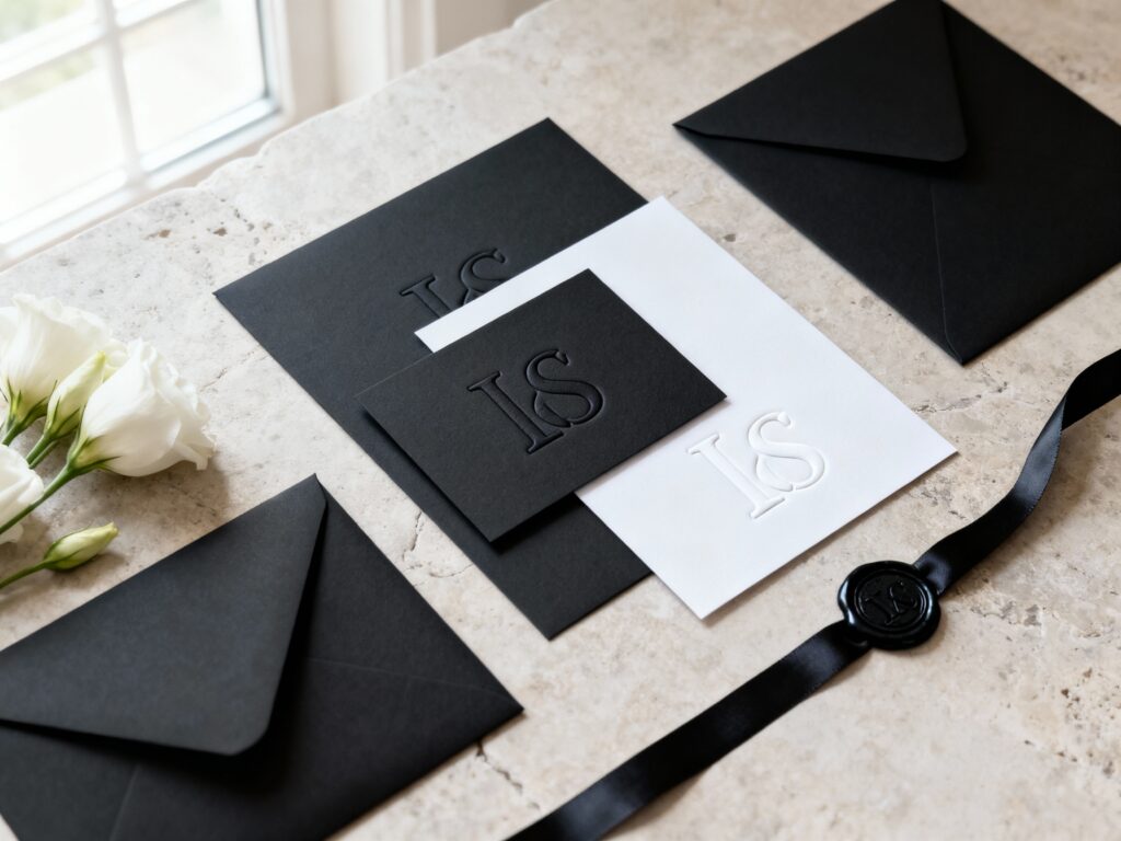
1) Classic Matte Black with White Letterpress
This is the black-tie icon: a matte black card with crisp white letterpress or deep embossing. It reads clean, feels luxe in-hand, and works for everything from ballroom weddings to modern museums. Keep the layout minimal (ample spacing, fewer fonts) so the contrast does the work.
2) Black Velvet Paper with Foil Script Accents
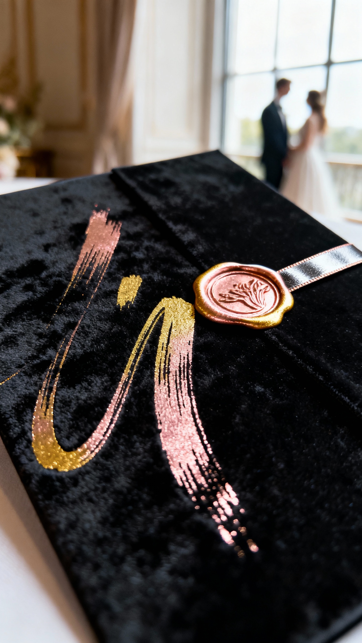
Velvet-touch or suede-like paper brings instant “expensive” energy, especially with gold, silver, or rose gold foil. Use foil for your names or a short line like “Together with their families” so it feels intentional, not busy. Pair with a simple sans-serif for details to keep it legible and sleek.
3) Modern Minimal Black with Clean Sans-Serif Typography
If your vibe is contemporary and editorial, go for a black invitation with sharp sans-serif type and a structured layout. Think alignment, clear hierarchy (names biggest, date next), and zero extra flourishes. Add a matching black details card and a white RSVP for a chic, high-contrast suite.
4) Black Invitations with Floral Line Art in White or Metallic Ink
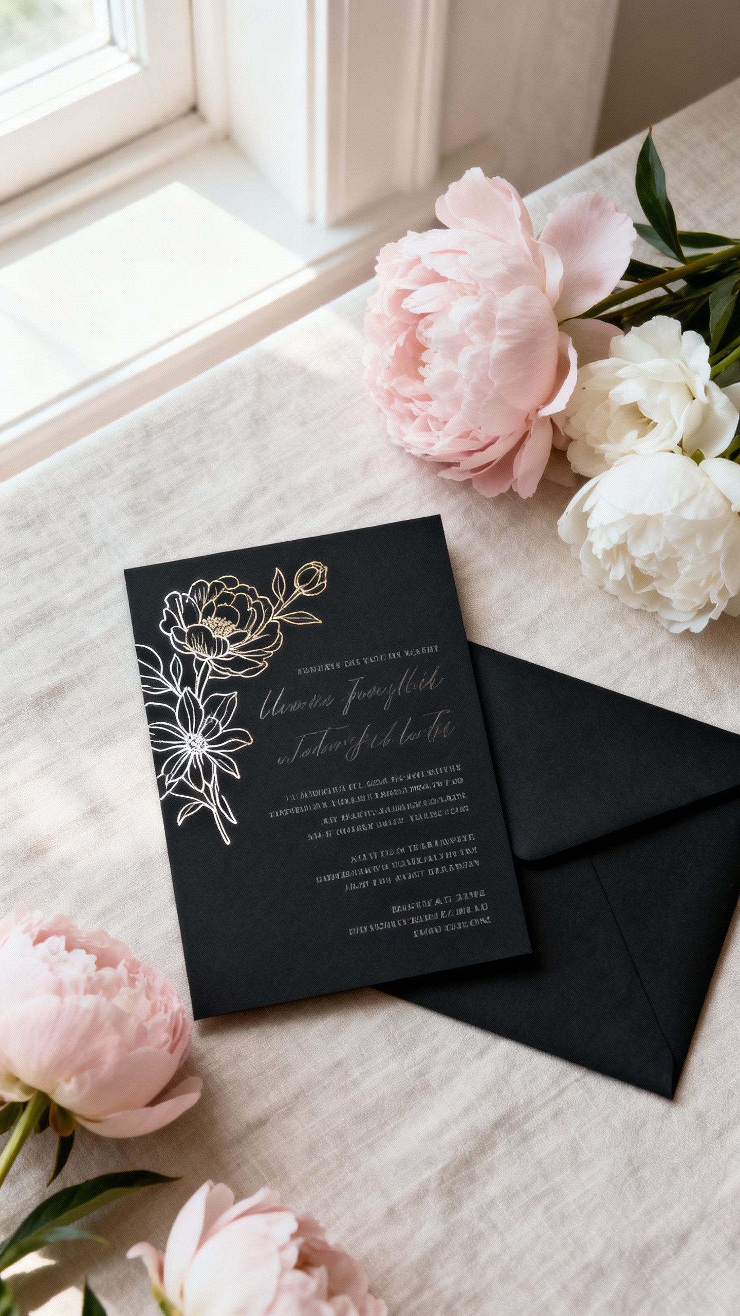
For a romantic look that still feels bold, choose black stationery with delicate floral line drawings. White ink keeps it airy; metallic ink adds glow without going full glitter. This style is perfect for garden-at-night weddings, moody fall palettes, or couples who want soft details on a dramatic base.
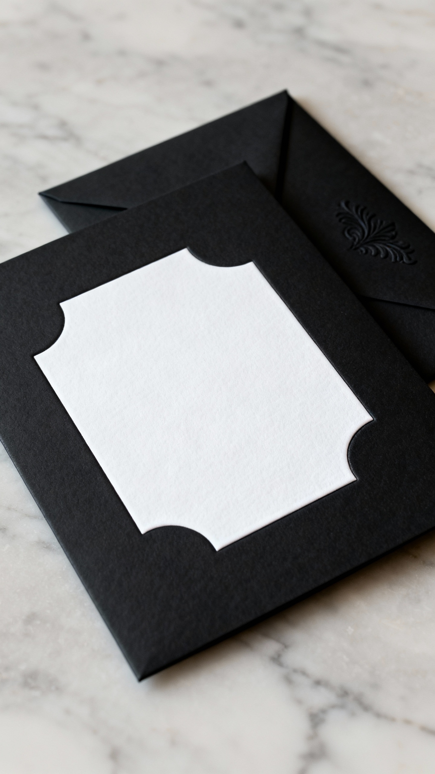
5) Black Acrylic or Vellum Overlay Invitations
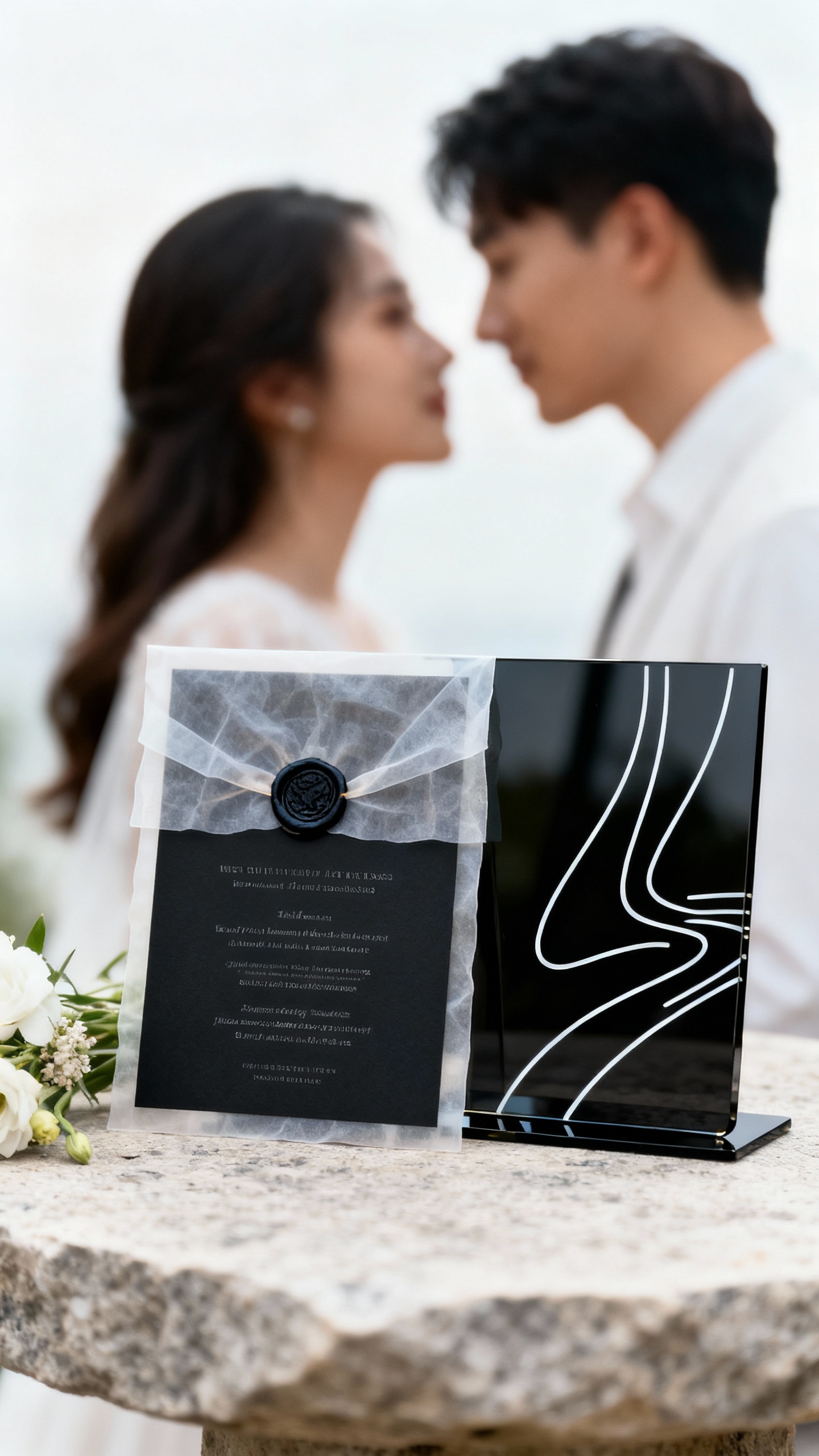
Want a statement invitation that looks like a styled shoot? Try black acrylic with white ink, or a black printed card topped with a vellum overlay and wax seal. Keep the wording short on the overlay and put the full details on a separate card so nothing feels crowded. This option shines for modern venues and candlelit receptions.
FAQ
Do black wedding invitations feel too “dark” for a wedding?
Not at all—black can read very elegant and celebratory when balanced with clean typography and thoughtful accents. Pair black with whites, creams, metallics, or even soft blush to keep the vibe refined instead of heavy. The key is contrast and spacing, not cramming in extra design elements.
What wording looks best on black invitations?
Short, classic wording works beautifully because it keeps the design uncluttered and easy to read. Stick to high-contrast ink (white or metallic) and limit yourself to two fonts: one for names and one for details. If you love a script font, use it for names only and keep the rest simple.
Which envelopes go best with black invitation suites?
Black envelopes are stunning, but consider your mailing situation: they can show scuffs more easily. Popular pairings are white, ivory, or taupe envelopes for contrast, or black envelopes with a white ink address for a dramatic look. A liner (metallic, marbled, or botanical) adds a surprise “wow” when guests open it.
Are black invitations harder to print or more expensive?
They can be, depending on your print method and paper choice. Letterpress, foil, and white ink printing on dark stock often cost more than standard digital printing on light paper. If you’re budgeting, choose a matte black cardstock with high-quality digital white ink and save specialty finishes for one focal detail.
How do I tie black invitations into the rest of my wedding decor?
Repeat the black in small, intentional touches: menus, place cards, table numbers, or a welcome sign. Then soften the look with candlelight, florals, and texture (linen napkins, velvet ribbons, or metallic chargers). Keeping a consistent type style across your stationery makes everything feel cohesive, even if your color palette includes other tones.