
If your dream wedding mood board lives somewhere between fashion week and a glossy magazine spread, you’re in the right place. “Extravagant” doesn’t have to mean chaotic—it can mean intentional, elevated, and photo-ready from every angle.
Below are five wedding themes that feel truly editorial (aka they look expensive, even when you’re being smart with the budget). Think bold styling, curated details, and a few wow moments that make guests and cameras pause.
Top 5
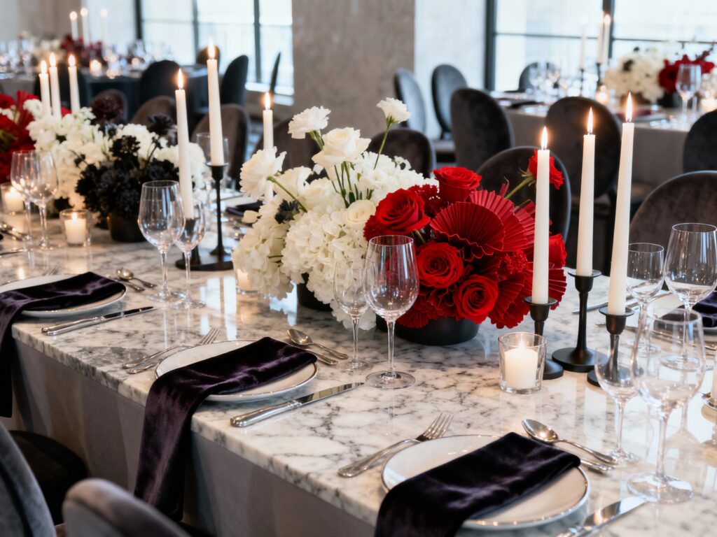
1) Modern Baroque in a Historic Venue
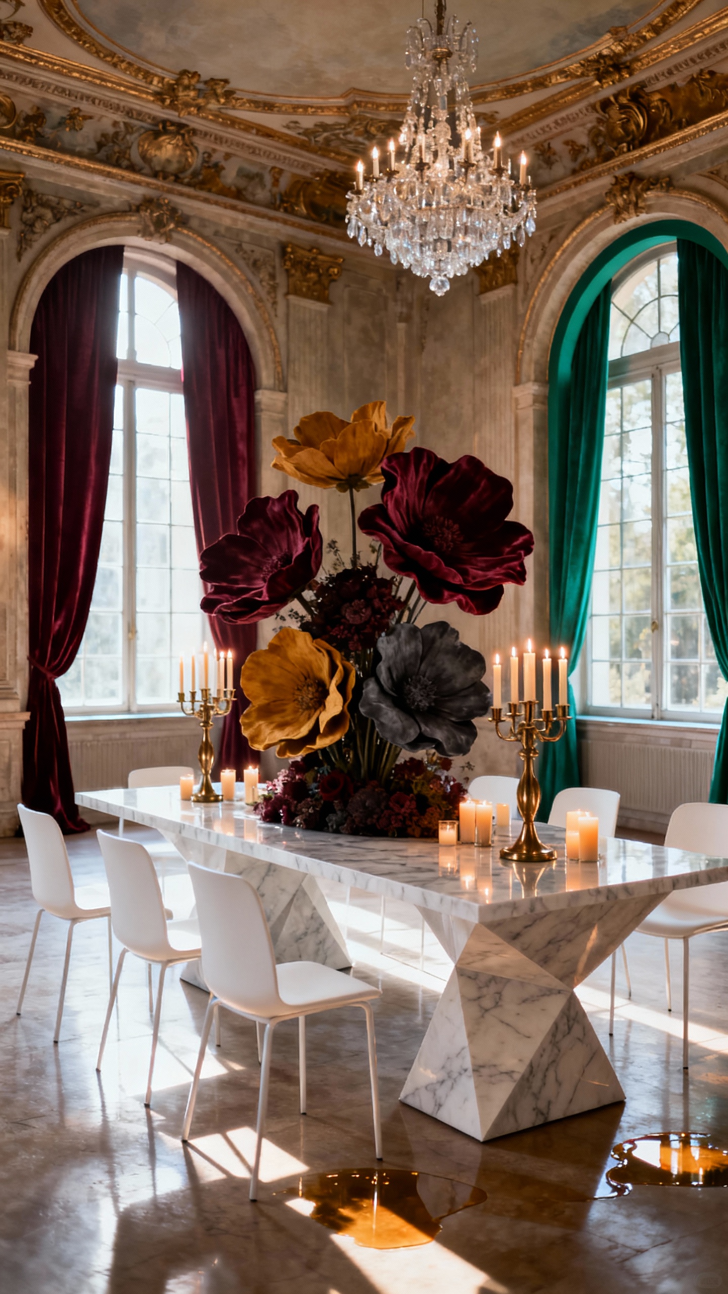
Pair an old-world space (estate, museum, grand ballroom) with sleek modern styling for an instant editorial contrast. Go heavy on sculptural florals, dramatic candlelight, and luxe textures like velvet linens or satin chair ties. Keep the palette tight—cream, gold, black, or deep jewel tones—so it reads “fashion” instead of “theme party.”
2) Black-Tie Garden Party, But Make It Couture
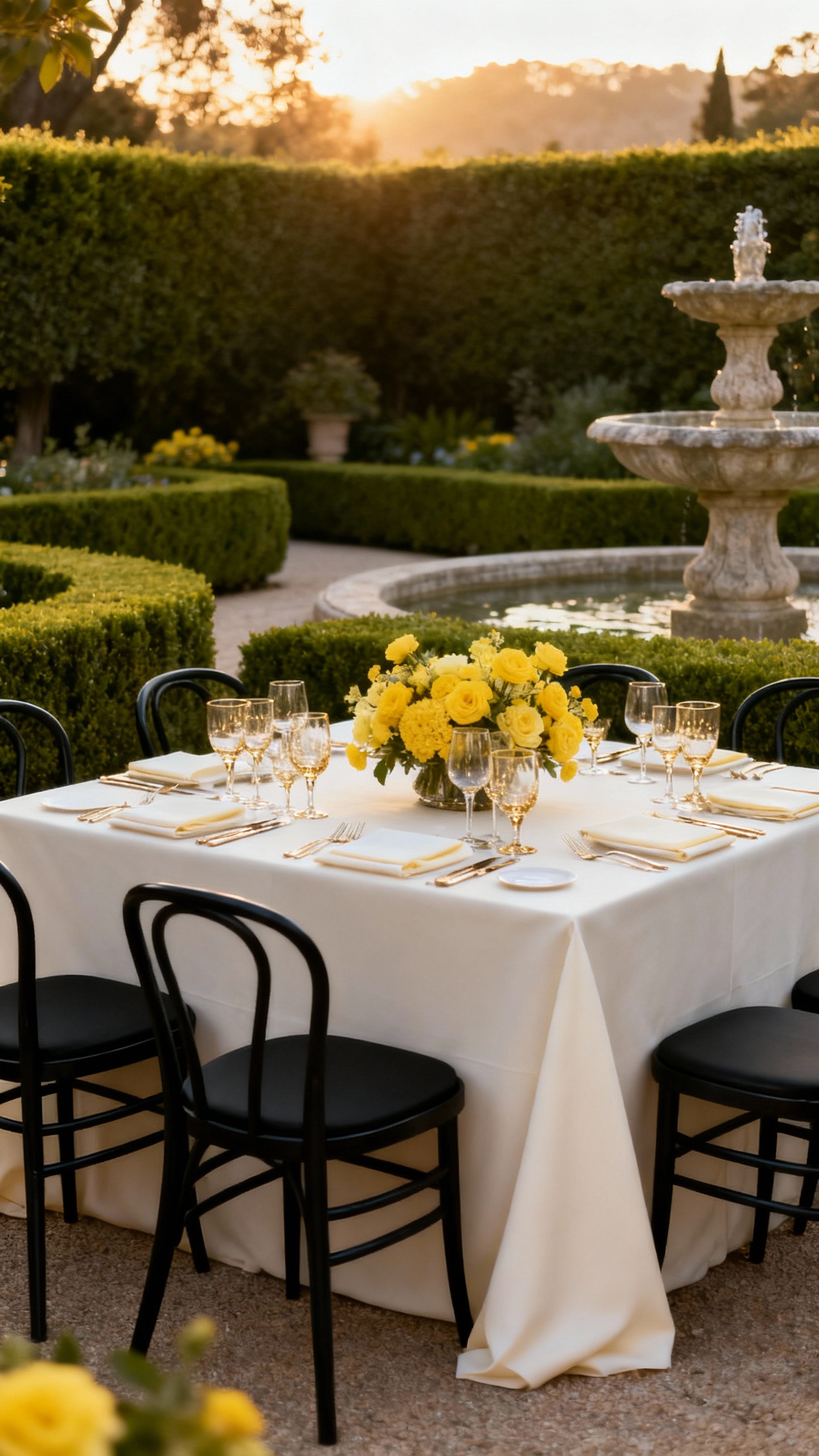
This is the classic garden wedding’s rich older sister: tailored, polished, and photo-forward. Choose crisp neutrals with one standout color (butter yellow, cornflower blue, or tomato red) and repeat it in florals, stationery, and signature cocktails. Add high-end touches like structured floral hedges, a statement aisle runner, and a dress code that actually matches the vibe.
3) Monochrome Minimalism with a Statement Install
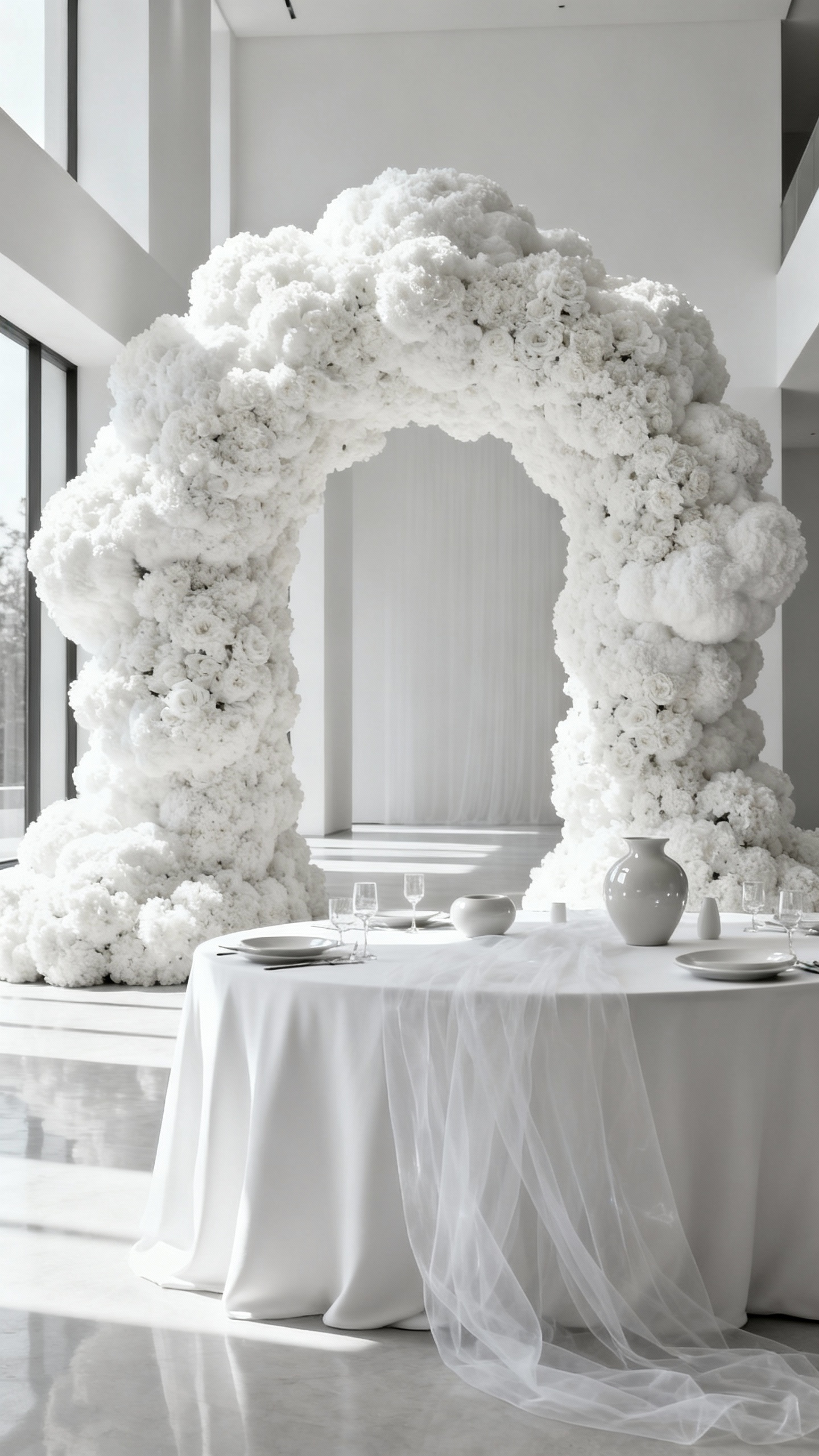
Minimal doesn’t mean boring—it means every detail is doing its job. Commit to one color family (all white, all blush, all champagne, even all black) and create depth with finishes: matte, glossy, sheer, and metallic. The “extravagant” part comes from one oversized moment: a ceiling floral cloud, a sculptural ceremony arch, or a bold fabric drape wall behind the sweetheart table.
4) Old Hollywood Gala with a Modern Edge
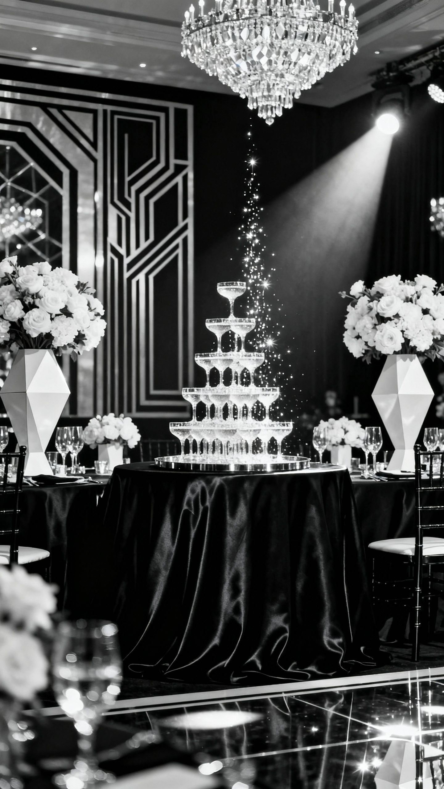
Bring the glamour with clean lines and intentional styling so it feels timeless, not costume-y. Think black-and-white photo moments, glossy invitations, champagne towers, and crystal details—but mix in modern fonts, sleek signage, and contemporary florals. For Pinterest-level impact, prioritize lighting: uplighting, pin spots on tablescapes, and a dance floor moment that looks incredible at night.
5) Destination Riviera Romance (Even If You’re Not Leaving Town)
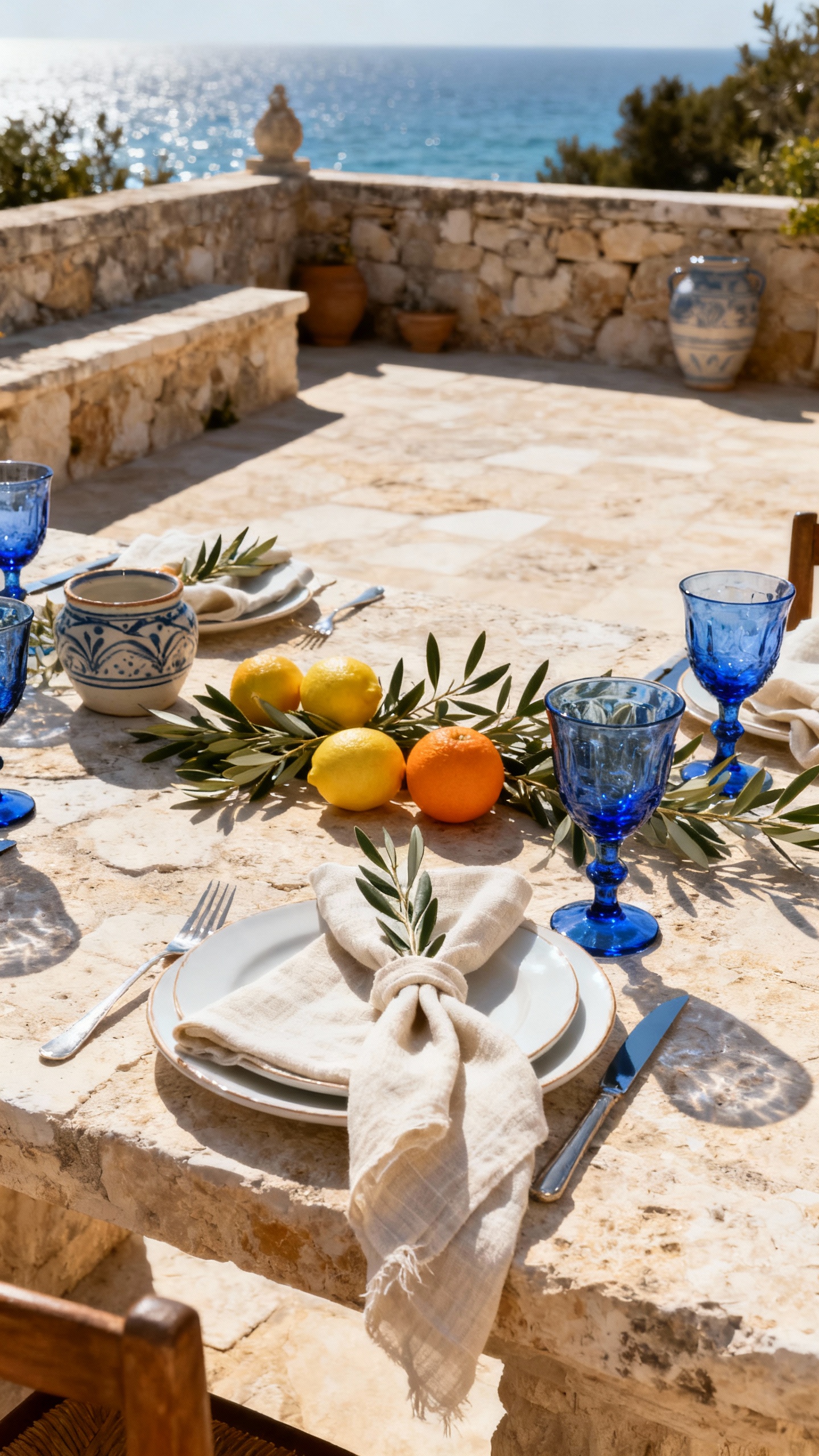
Channel the Mediterranean with warm neutrals, stone textures, and breezy styling that looks effortless (but isn’t). Use citrus accents, olive branches, coastal blues, and relaxed-yet-luxe table settings like layered ceramics and tapered candles. A live musician moment (strings, sax, or acoustic guitar) plus a late-night espresso bar will sell the “we’re on the coast” fantasy instantly.
FAQ
How do I make a wedding theme feel “editorial” instead of just expensive?
Editorial is about cohesion and curation. Choose a clear color story, repeat a few signature shapes or textures (like arches, spheres, or draping), and keep signage, paper goods, and florals in the same design language. One or two oversized statement moments will photograph better than lots of random upgrades.
What’s the easiest way to add extravagance without blowing the budget?
Invest in what shows up in photos: lighting, a ceremony backdrop, and elevated tablescape layers (linens, candles, place cards). You can save on guest favors, overly complex florals everywhere, and anything that won’t be seen in the main camera angles. Focus your “wow” on one area—ceremony or head table—then keep the rest clean and intentional.
Which venues work best for these extravagant themes?
Look for venues with built-in character: historic mansions, art galleries, grand ballrooms, modern lofts with architectural lines, or outdoor spaces with mature landscaping. A venue with strong bones means you’ll need less decor to get that high-fashion feel. Bonus points for great natural light and a clean rain plan space.
What colors photograph most editorial for weddings?
Neutrals with contrast always read luxe: ivory, black, champagne, stone, and soft taupe. For a bold moment, pick one saturated accent (emerald, deep blue, oxblood, or marigold) and use it strategically. The trick is limiting the palette so photos feel styled, not scattered.
How do I keep the bridal party looking cohesive with an editorial theme?
Give guidance, not a strict uniform. Choose one color family and let silhouettes vary, or pick a fabric (like satin, crepe, or velvet) and keep tones within a tight range. For groomsmen, consider black-tie upgrades, crisp tailoring, and consistent accessories so the whole group looks like it belongs in the same spread.