
If your Pinterest board is giving “soft luxury,” “old-world romance,” and “but make it fresh,” a Rococo wedding color palette might be your perfect match. Think dreamy pastels, gilded details, and florals that look like they belong in a painted garden.
Rococo style is ornate but light—more airy and playful than heavy and formal. Below are five Rococo-inspired palettes (plus how to actually use them) so your wedding looks cohesive from invites to reception lighting.
Top 5
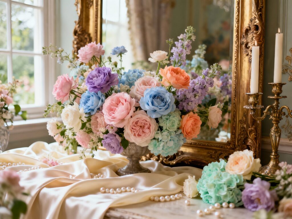
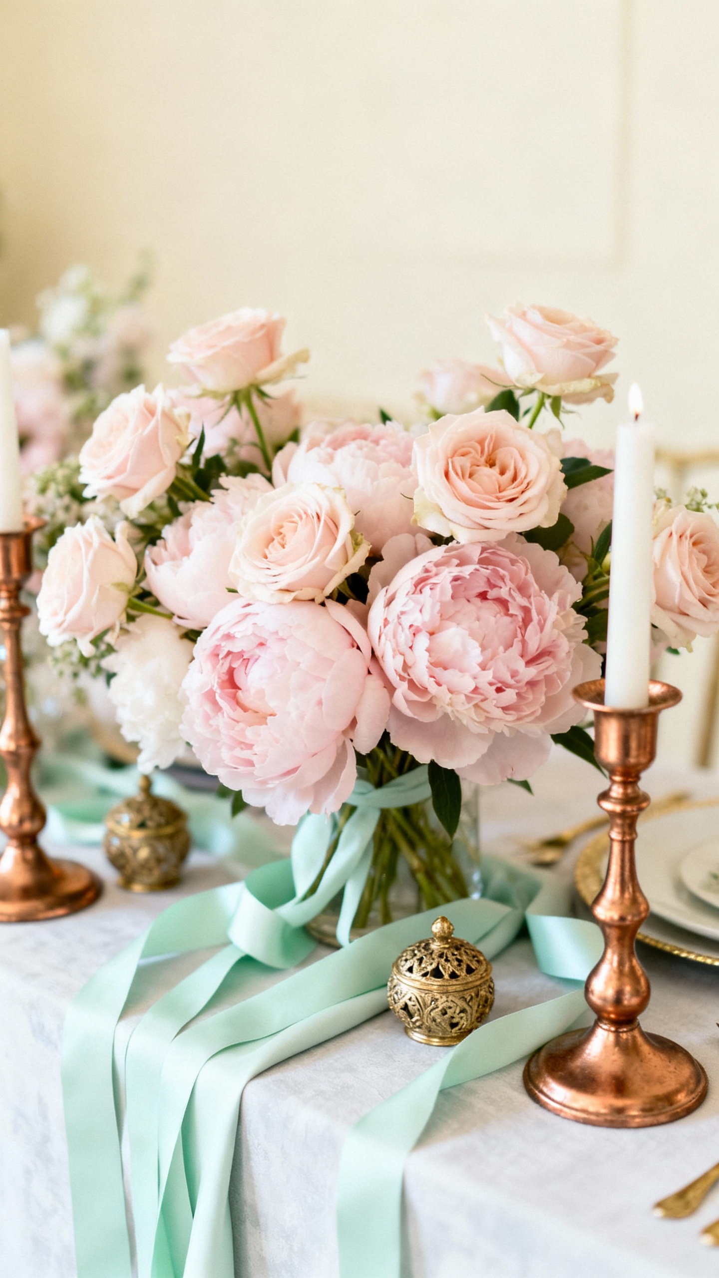
1) Blush Pink + Cream + Antique Gold
This is the signature Rococo trio: romantic, soft, and instantly elevated. Use blush for bridesmaid dresses or napkins, cream for linens and stationery, and antique gold for frames, flatware, or candlesticks. It photographs beautifully in natural light and works in every season with the right florals.
2) Powder Blue + Pearl White + Champagne
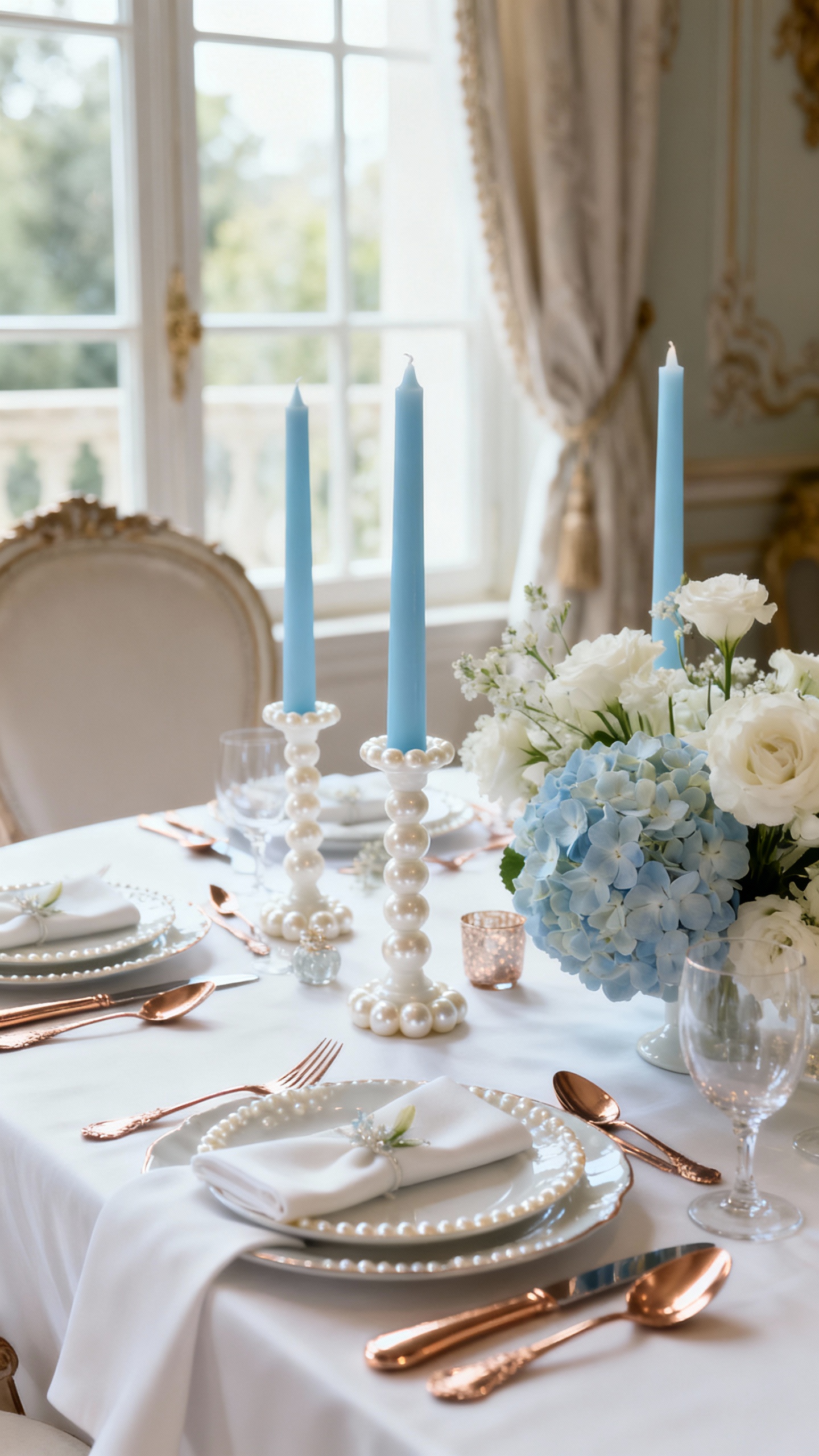
Powder blue gives you that French salon vibe without feeling costume-y. Pair it with pearl white for a clean base, then add champagne (instead of bright gold) for a warmer, more modern shine. This palette is especially pretty for spring and summer weddings, and it looks amazing with delicate ribbon and bow details.
3) Lavender + Dusty Rose + Soft Sage
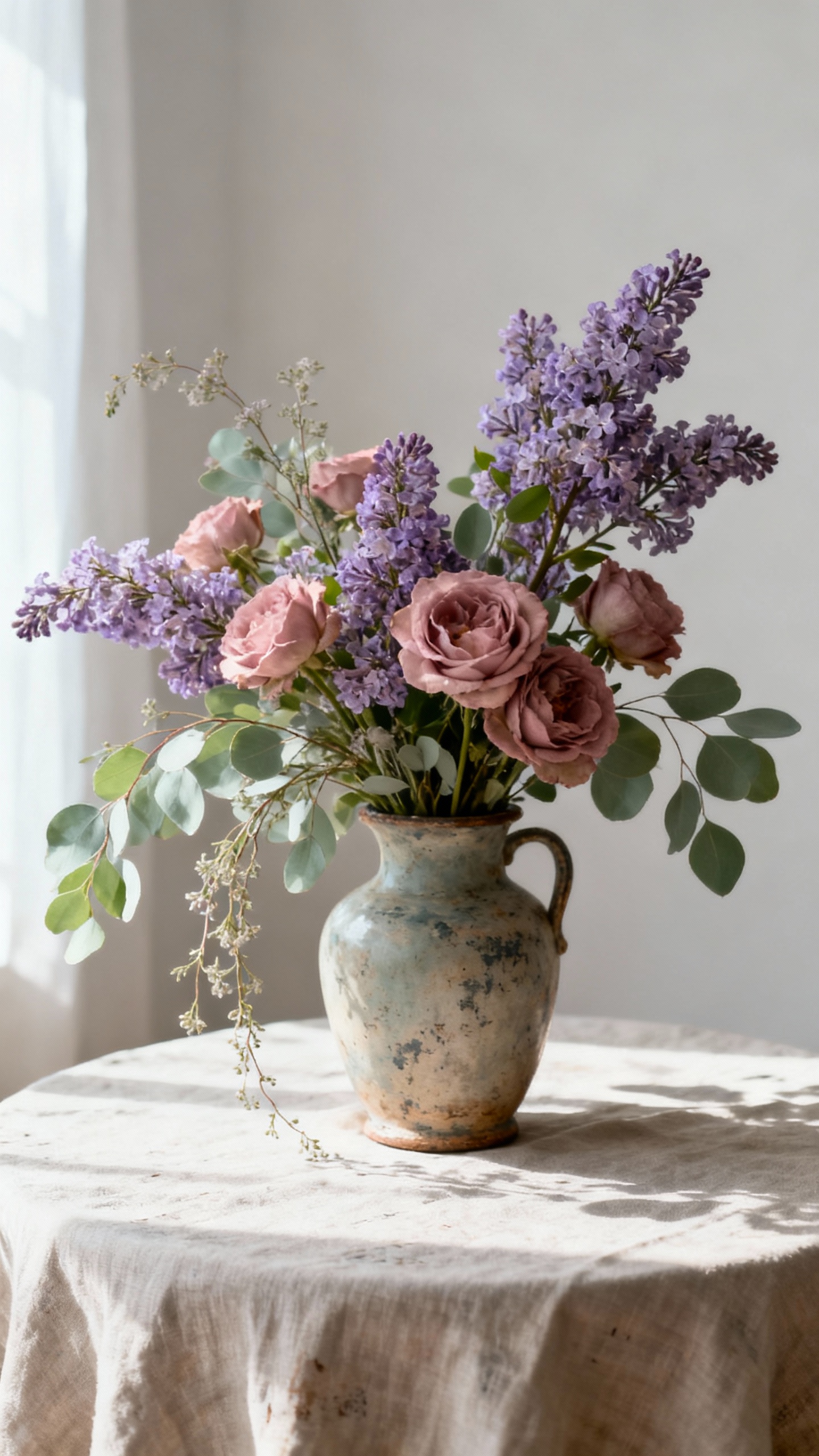
If you want Rococo romance but a little garden-fresh, this trio is it. Lavender and dusty rose feel painterly together, while soft sage keeps everything grounded and natural. Try sage in the greenery and place cards, then let lavender show up in bridesmaid dresses, signature cocktails, or tapered candles.
4) Peach + Butter Yellow + Ivory
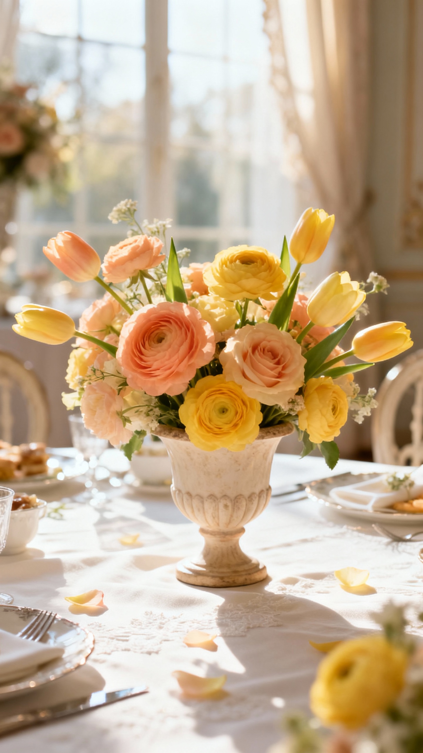
This palette brings the “sunlit pastel” energy that Rococo does so well. Peach and butter yellow feel warm and inviting, while ivory keeps the look bridal and refined. Use this for a brunch wedding, a courtyard reception, or any venue with lots of windows—bonus points for citrus accents and airy floral arrangements.
5) Mint + Pale Pink + Gilded Bronze
Mint adds a playful twist that still feels historically inspired, especially when it’s pale and chalky (not neon). Pale pink keeps it romantic, and gilded bronze is the deeper metallic that makes everything feel collected and intentional. Bring bronze in through vintage candleholders, mirror seating charts, or a bar display with ornate frames.
FAQ
What makes a color palette “Rococo” for a wedding?
Rococo palettes are typically light, pastel-leaning, and romantic, with a luminous metallic like gold, champagne, or bronze. The vibe is ornate but airy—think soft colors, layered textures, and elegant details like bows, pearls, and florals that feel “painted.”
How do I keep Rococo from looking too theme-y?
Choose one hero pastel and keep the rest as supportive neutrals (cream, ivory, pearl white). Use ornate touches strategically—like frames, candlesticks, and stationery details—rather than on every surface. Mixing vintage-inspired pieces with clean modern rentals also keeps it current.
What flowers fit a Rococo wedding color palette?
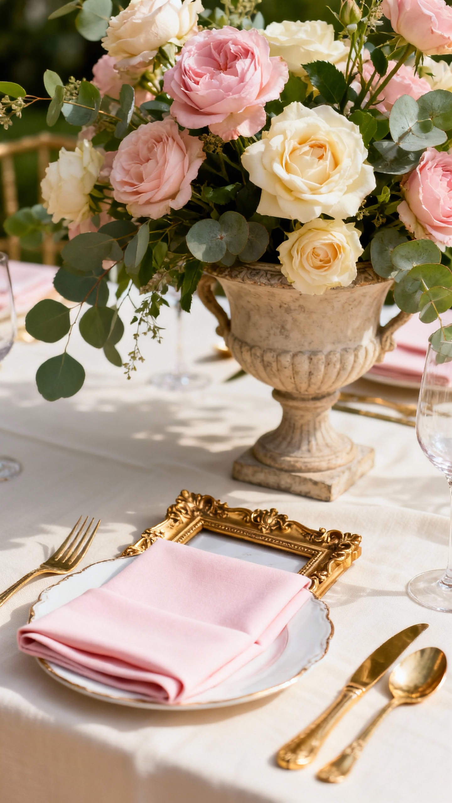
Think garden roses, peonies, ranunculus, sweet peas, lisianthus, and hydrangea in soft tones. Add airy fillers and trailing elements for movement, plus a little contrast with deeper blush, mauve, or muted greenery so arrangements don’t look flat in photos.
Which metallic works best: gold, champagne, or bronze?
Antique gold is the classic Rococo choice and looks stunning with blush, cream, and pastel blue. Champagne feels softer and more modern, especially with pearl white and powder tones. Bronze is great if you want a slightly moodier, collected look while still staying romantic.
How can I use the palette across the wedding without overdoing it?
Pick 2–3 main colors and assign them jobs: one for fashion, one for florals, one for paper goods or tablescape details. Keep linens neutral, then layer color through napkins, candles, ribbons, and blooms. A consistent metallic finish ties everything together from ceremony décor to reception styling.