
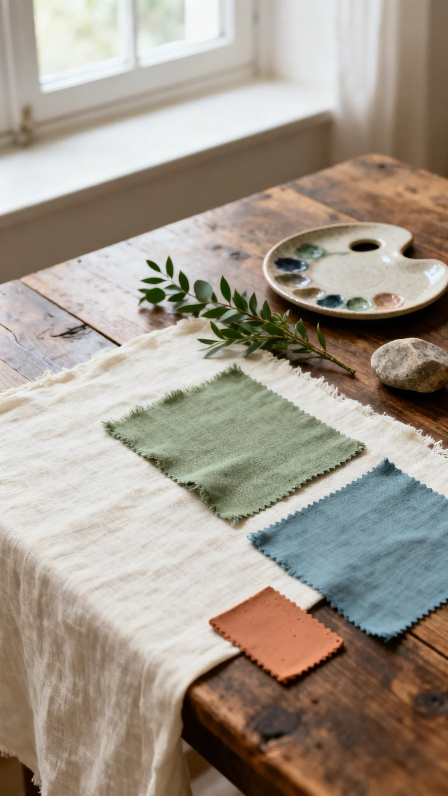
Country weddings shine when the palette feels pulled from the landscape—soft skies, sun-warmed clay, and creamy light. The mix of sage, dusty blue, terracotta, and cream is relaxed but intentional, giving you that “effortless” look while still photographing beautifully.
Use these colors like you would in nature: let one or two lead, and let the others support in smaller moments. Below are practical ways to style this aesthetic from ceremony to send-off, with easy swaps for any season or budget.
1) Set the color roles (lead, supporting, accent)
Start by choosing a lead color for the biggest surfaces, then two supporting tones, and one accent used sparingly. Sage and cream are natural “base” colors for country weddings because they feel airy and organic. Dusty blue reads romantic and calm, while terracotta adds warmth and definition in photos. Keeping the roles clear prevents the palette from turning muddy or too busy.
2) Invitations that preview the whole vibe
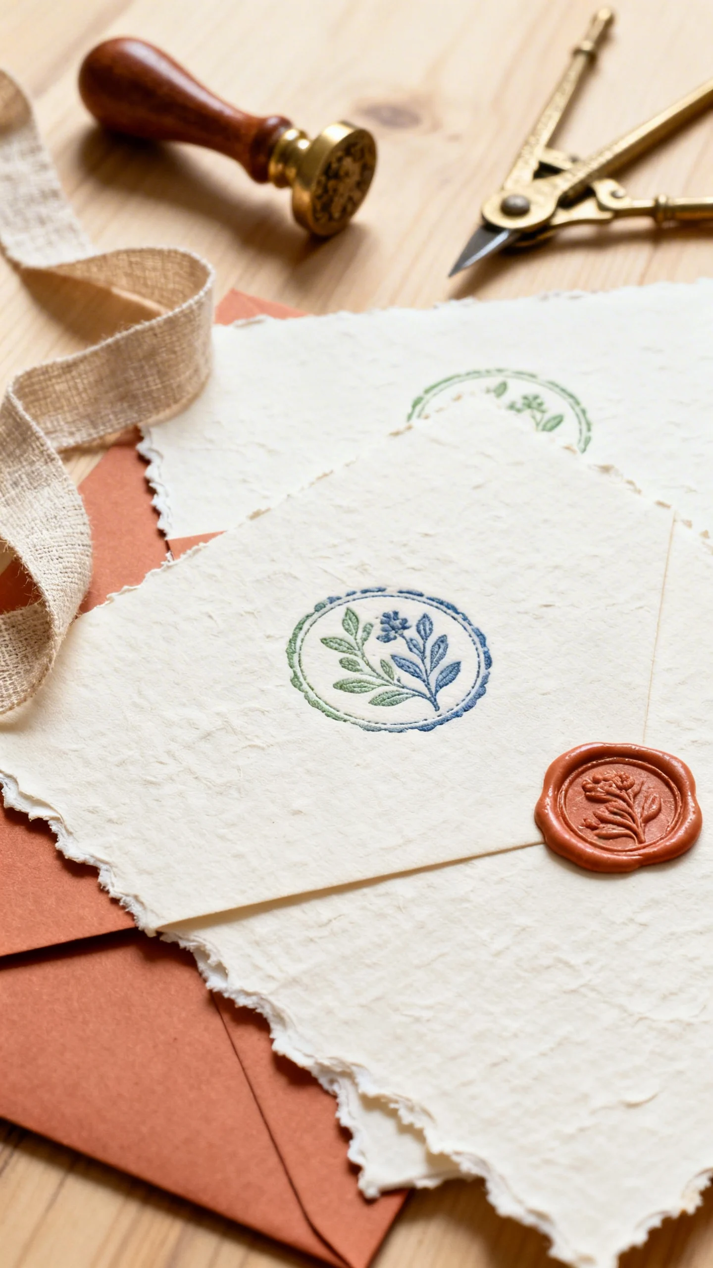
Bring the palette into paper goods with cream cardstock and sage or dusty blue ink for a soft, vintage feel. Add terracotta through wax seals, envelope liners, or a thin border to warm things up without overpowering. Consider deckled edges or a subtle linen texture to keep it rustic-modern instead of overly formal. If you’re doing day-of signage, repeat the same fonts and tones for instant cohesion.
3) Bridesmaid dresses: dusty blue + sage mix-and-match
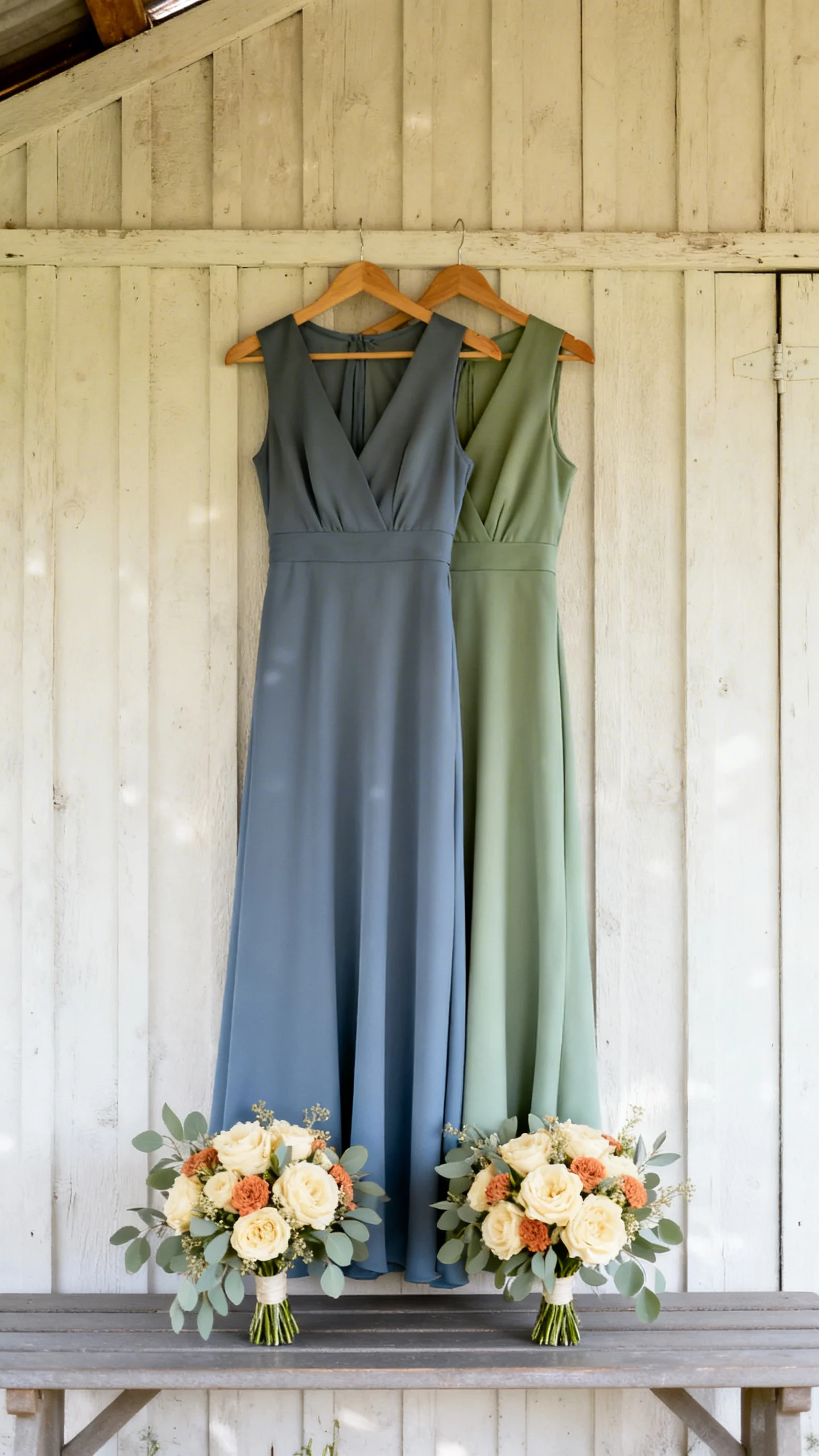
Dusty blue and sage look especially pretty in outdoor light and flatter a wide range of skin tones. For a modern country vibe, let your bridesmaids choose either shade in similar fabric finishes (matte chiffon or crepe works well). Then tie the group together with identical bouquets featuring cream blooms and a touch of terracotta. This creates variation without visual chaos in photos.
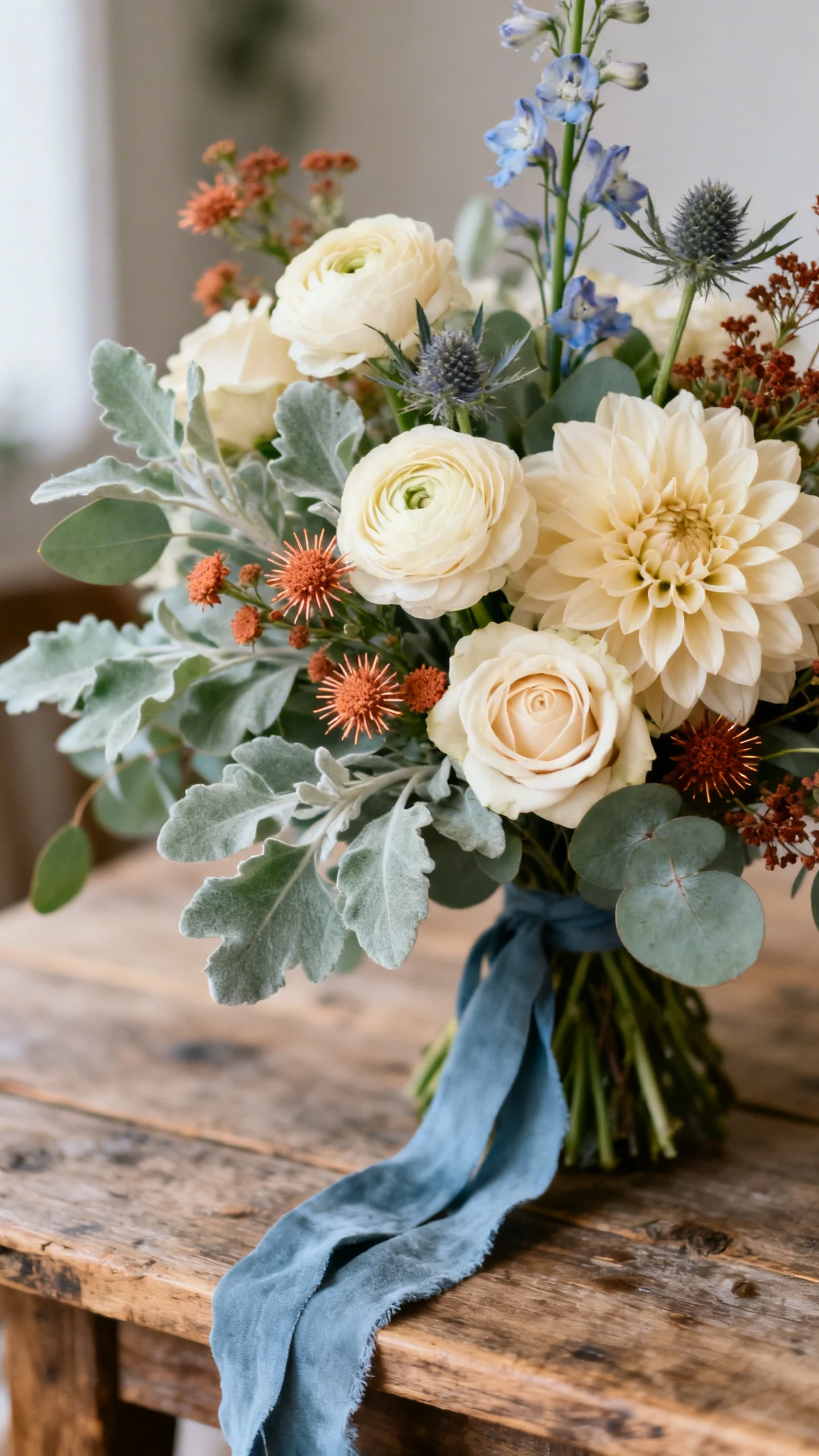
4) Florals: cream-forward with terracotta “sparks”
For a country aesthetic, keep your floral recipe creamy and garden-inspired, then punctuate it with terracotta for warmth. Think cream roses, ranunculus, or dahlias paired with rust-toned accents and plenty of sage greenery. Dusty blue can show up through delphinium, thistle, or ribbon rather than trying to force blue flowers everywhere. The result feels natural, not overly curated.
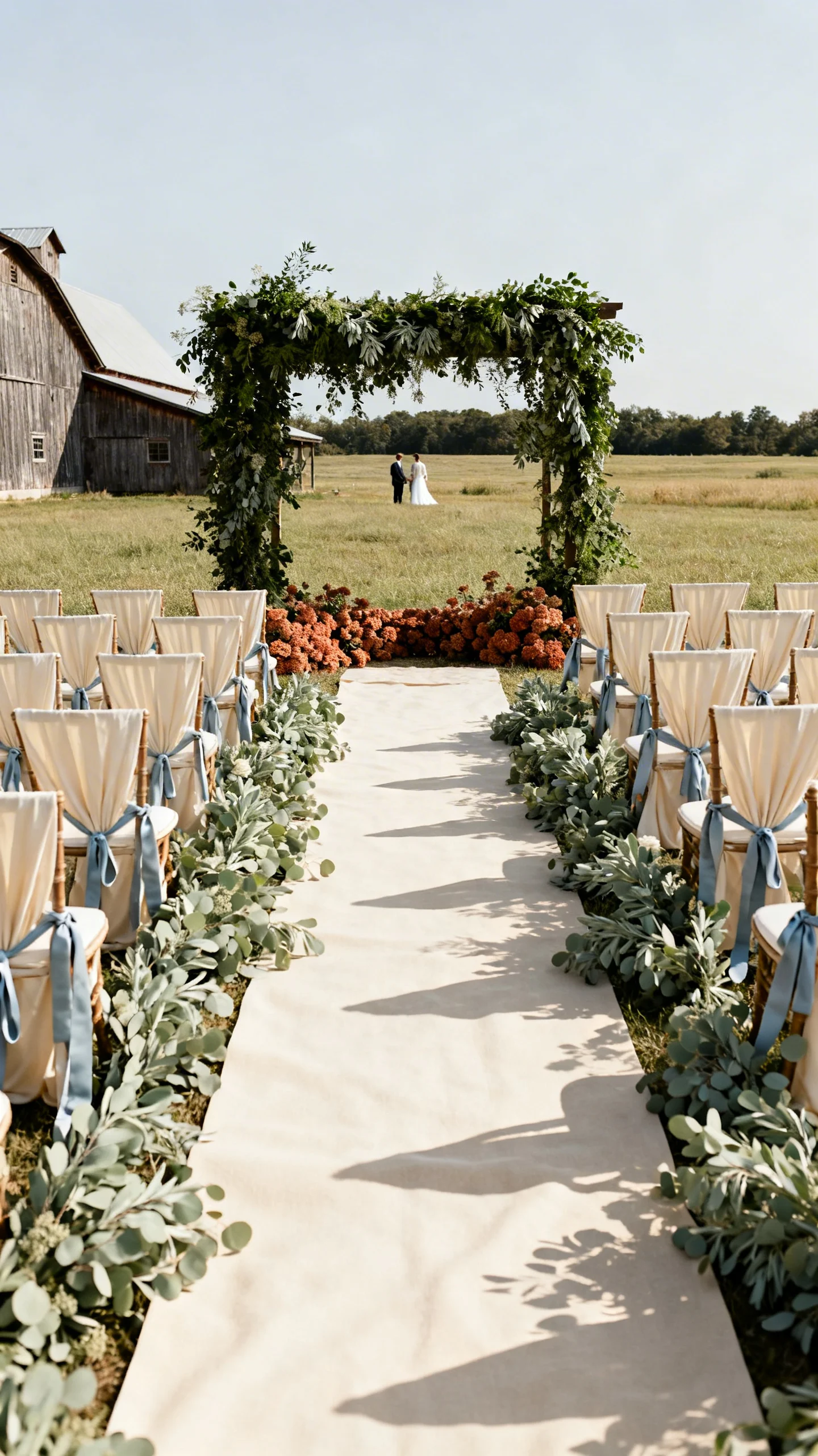
5) Ceremony styling: sage greenery + cream textiles
Use cream as the main “light source” at the ceremony—aisle runners, draping, or chairs look instantly elevated in a soft neutral. Then layer in sage through greenery-lined aisles, ground arrangements, or a full arbor install. Dusty blue works beautifully in subtle ways like ceremony programs or ribbons tied to reserved seating. Finish with a terracotta detail, like clay-toned arrangements at the altar base, for depth.
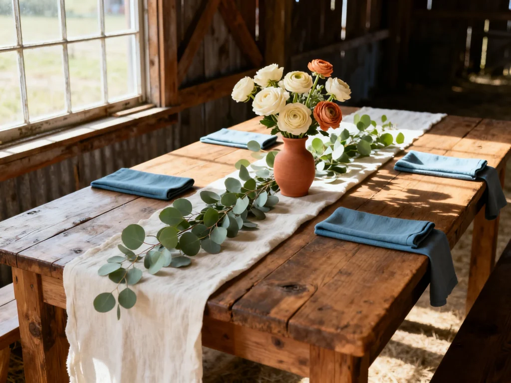
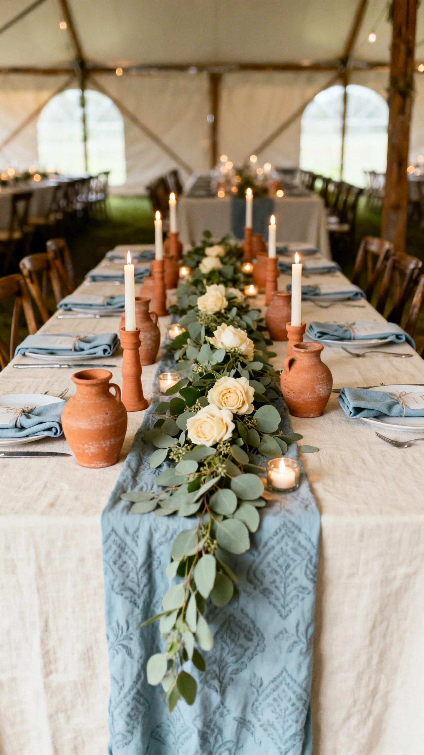
6) Reception tables: terracotta vessels and cream linens
Cream linens create that welcoming, candlelit glow even in daytime receptions, especially in barns or tents. Add terracotta through bud vases, taper holders, or textured napkin rings for a warm, earthy touch. Bring in dusty blue with napkins or a patterned runner, then soften everything with sage greenery down the center. Keep one element consistent across all tables so the room feels pulled together.
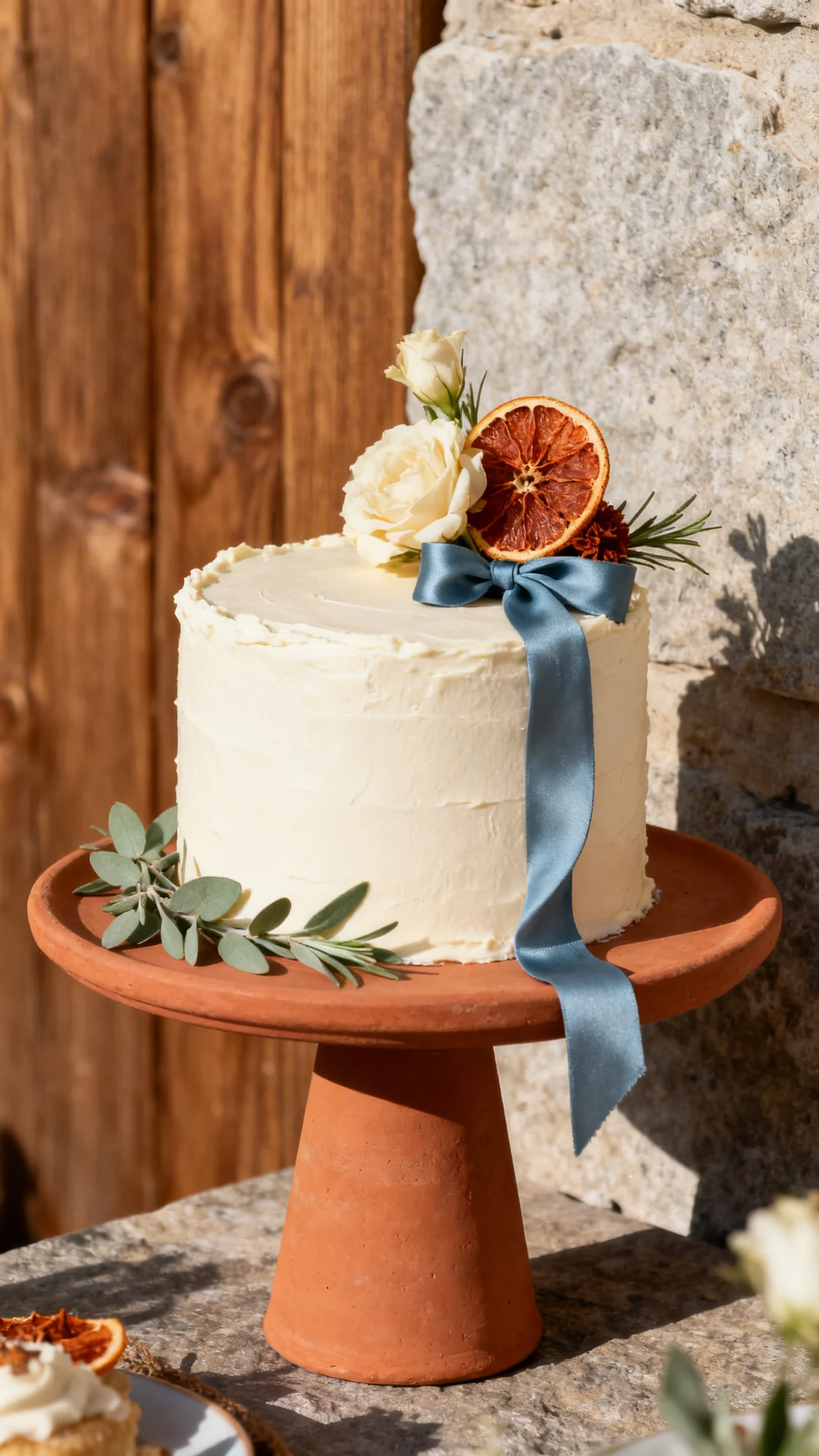
7) The cake and dessert table: simple, rustic, and photogenic
A cream buttercream cake fits this palette perfectly and looks timeless against wood, stone, or farm-table backdrops. Add dusty blue and sage with fresh florals or silk ribbons, and introduce terracotta with dried citrus, rust-toned blooms, or a clay-colored stand. If you’re serving pies or cookies, use cream display risers and let the warm dessert colors echo the terracotta theme. The key is minimal styling with a few intentional color moments.
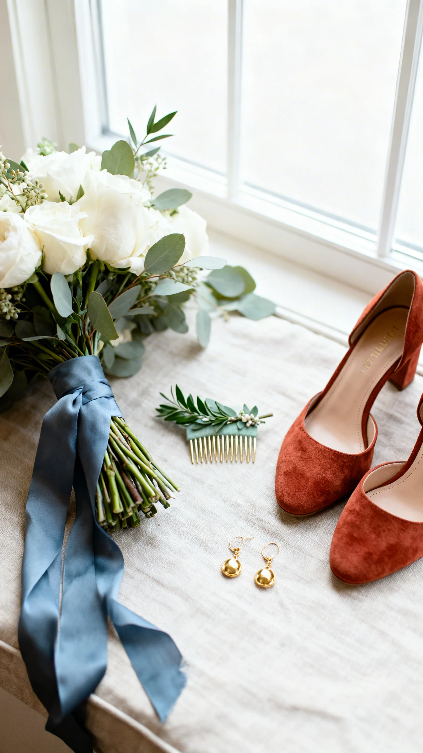
8) Bridal details: bouquet ribbon, shoes, and jewelry
If your dress is classic ivory or cream, you can weave in color without changing your overall look. Dusty blue ribbon on the bouquet reads romantic and makes detail photos pop. Terracotta heels, a sage hair comb, or warm-toned earrings are small touches that feel special and personal. Choose one or two accessories so it looks curated, not costume-like.
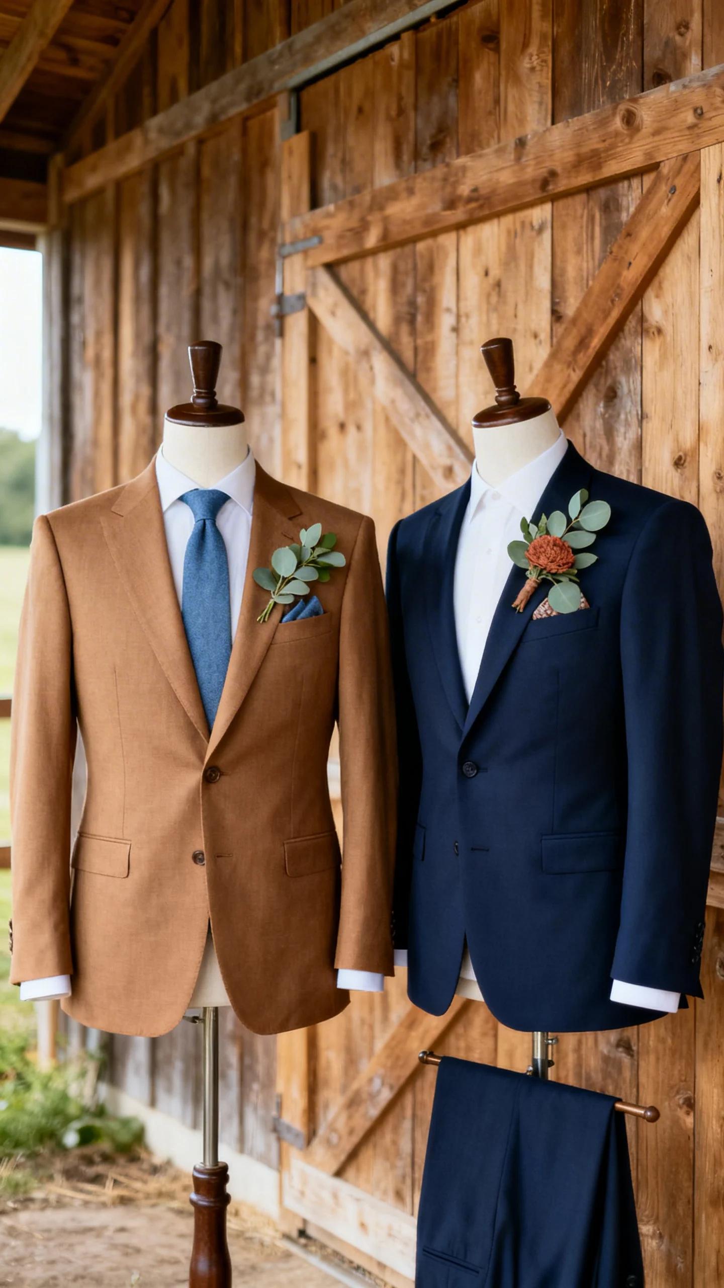
9) Groomsmen and groom styling: modern country, not overly rustic
Warm neutrals and soft blues look sharp in a country setting without leaning too “theme.” Consider a tan or medium-brown suit with a dusty blue tie, or a classic navy suit with a terracotta boutonniere accent. Sage can come through in pocket squares or boutonnieres with eucalyptus and soft greenery. Keep patterns subtle and let the palette do the work.
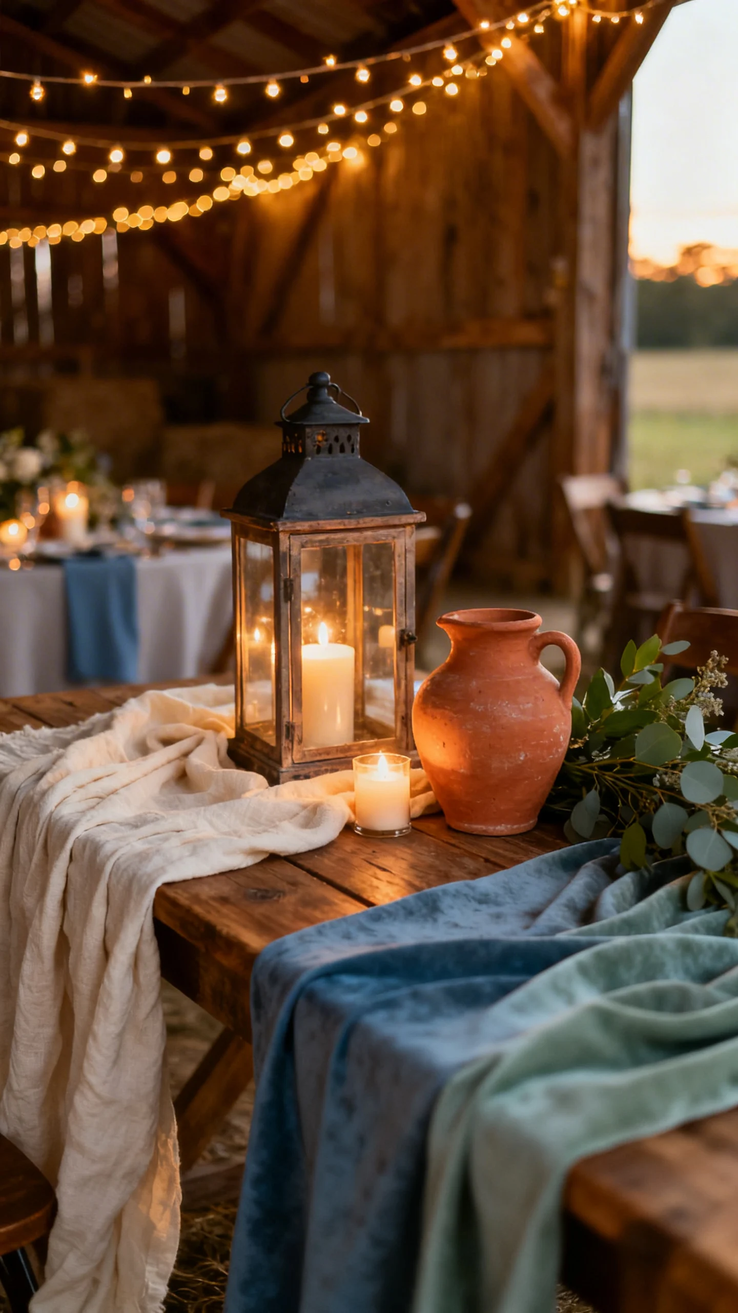
10) Lighting and textures that make the colors glow
This palette is at its best with warm lighting and natural texture—think string lights, lanterns, candles, wood, and linen. Cream reflects light and keeps spaces feeling open, while terracotta adds cozy richness as the sun sets. Dusty blue and sage photograph beautifully when paired with matte finishes rather than glossy decor. If you can, test your colors together under your venue lighting so everything stays soft and true.
FAQ
How do I keep sage and dusty blue from looking too cool?
Lean on cream and terracotta as your warmers, especially in linens, candles, and wood tones. Warm lighting (string lights, amber bulbs, lots of candles) also helps the blues and greens feel inviting instead of icy.
What is the easiest way to include terracotta without overwhelming the palette?
Use terracotta as an accent in small, repeatable details: bud vases, taper candles, ribbons, wax seals, or a few standout blooms. A little terracotta goes a long way and adds instant depth.
Which season works best for a sage, dusty blue, terracotta, and cream wedding?
It’s versatile year-round. Spring and summer highlight the airy sage and blue, while fall and winter make the terracotta and cream feel extra cozy—just adjust textures and lighting to match the season.
Can I use this palette for a barn venue without it feeling too dark?
Yes—make cream your dominant color for linens and draping to brighten the space. Add sage greenery for freshness, and keep terracotta to smaller accents so the barn’s wood tones don’t compete.
How many colors should I feature in one photo moment (like a tablescape or bouquet)?
Aim for two main colors plus one accent in a single setup. For example: cream and sage as the base, with terracotta as the accent, and dusty blue saved for napkins or ribbon to keep it clean and intentional.