
A country wedding reception can feel equal parts relaxed and elevated when your decor has a clear plan: warm lighting, thoughtful signage, and tablescapes that look gathered—not fussy. The goal is a space that photographs beautifully on Pinterest while still feeling like you, your people, and your favorite place in the countryside.
Below are practical decor ideas you can mix and match to build a cohesive country wedding aesthetic, from glow-worthy lighting layers to signage that guides guests with charm, and tables that invite everyone to linger.
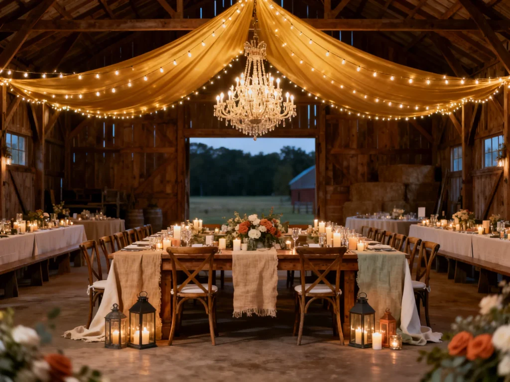
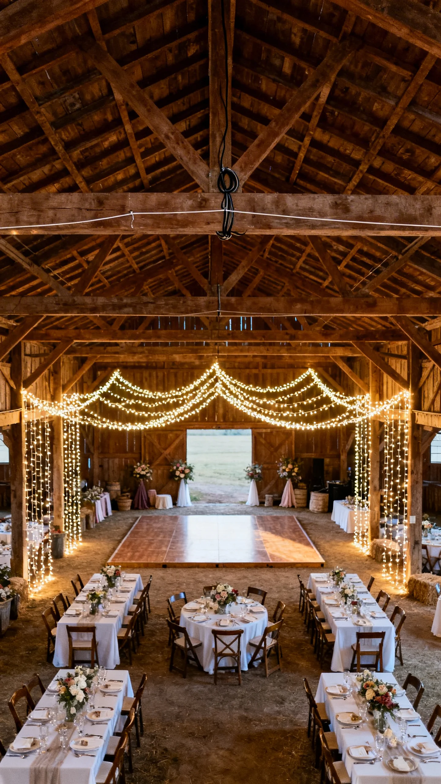
Layer string lights for a soft, golden canopy
Start with overhead string lights to set the mood before guests even sit down. Zig-zag strands over the dance floor and dining area, then add a few vertical drops at corners for depth in photos. Warm white bulbs read classic and flattering, especially in barns and open-air tents. Keep cords tidy by anchoring lines to beams, poles, or tension wire so everything looks intentional.
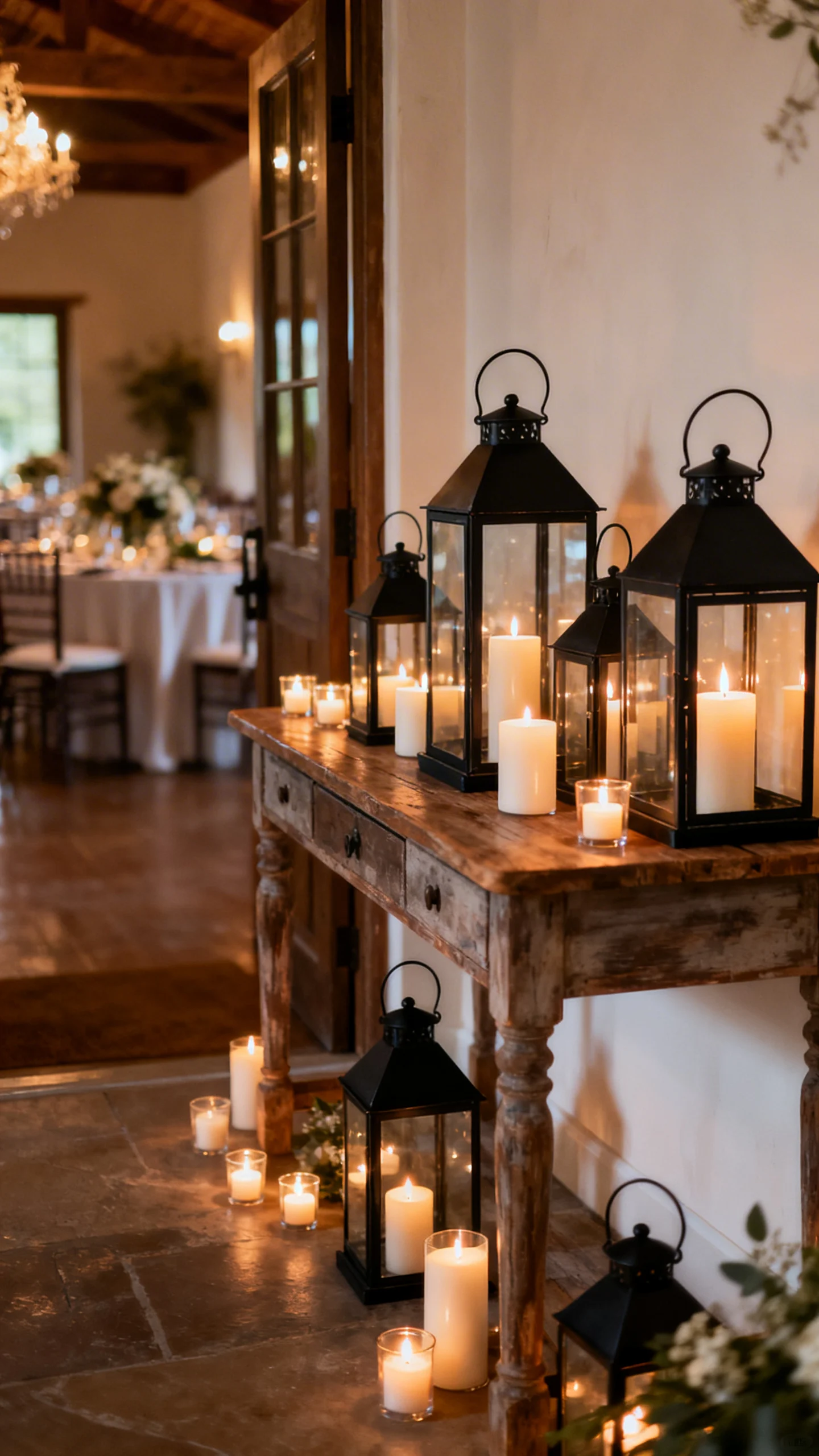
Mix lanterns and candles to create “country glow”
Lanterns bring instant rustic structure and help candles feel styled instead of scattered. Use a mix of sizes on entry tables, bar tops, and along aisle-adjacent areas near the reception space. Choose glass-sided lanterns if your venue can be breezy, and consider LED candles when open flames are limited. Repeating the same lantern finish (black, brass, or aged zinc) keeps the look cohesive.
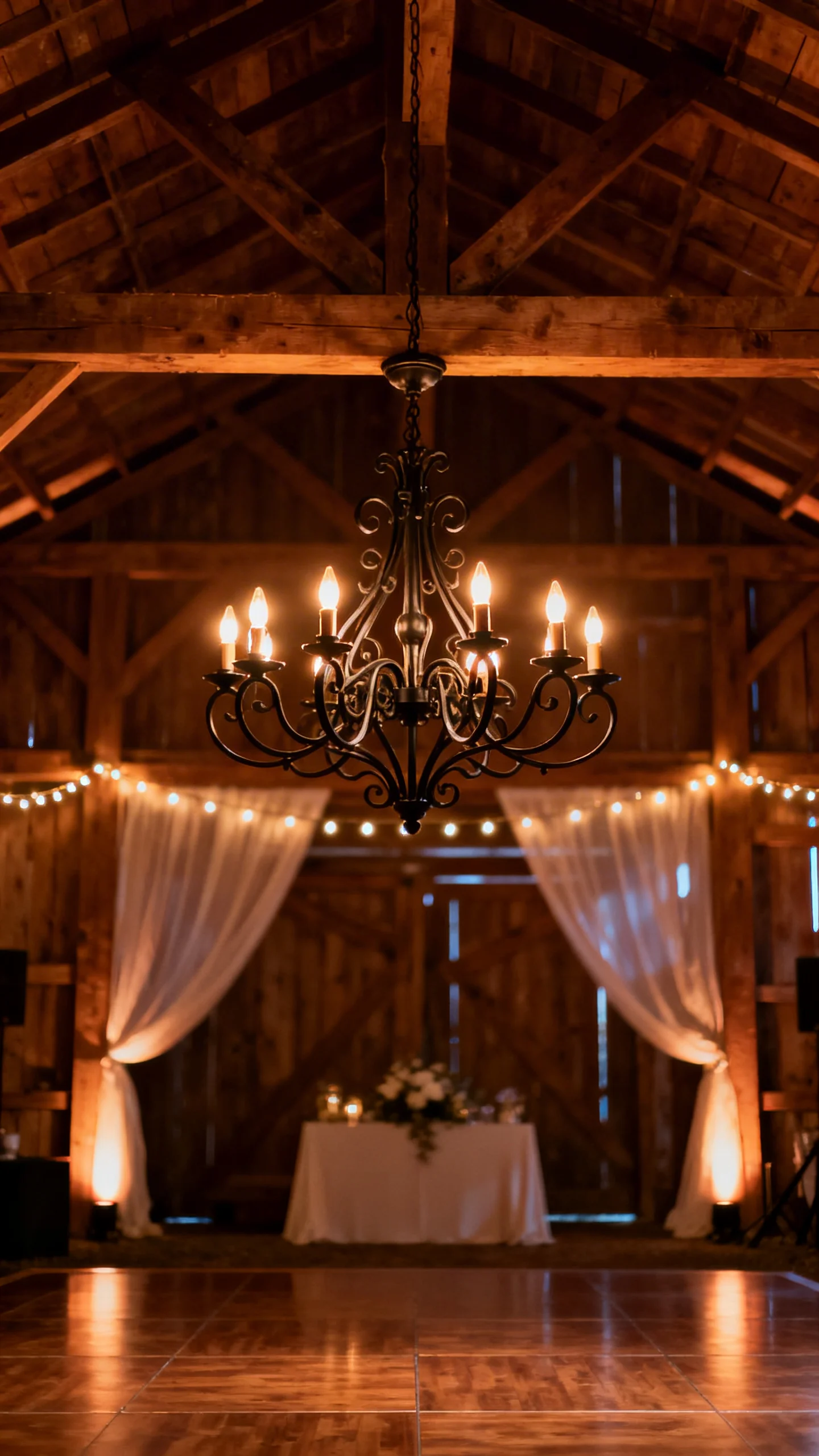
Use a statement chandelier to elevate a barn or tent
A single chandelier can make a simple space feel designed, especially centered above the dance floor or head table. Look for wood-bead, wrought iron, or vintage-inspired crystal for that “polished country” balance. If rigging is tricky, ask your rental team about lightweight faux chandeliers that still photograph like the real thing. Pair it with softer perimeter lighting so the chandelier reads as a focal point, not the only light source.
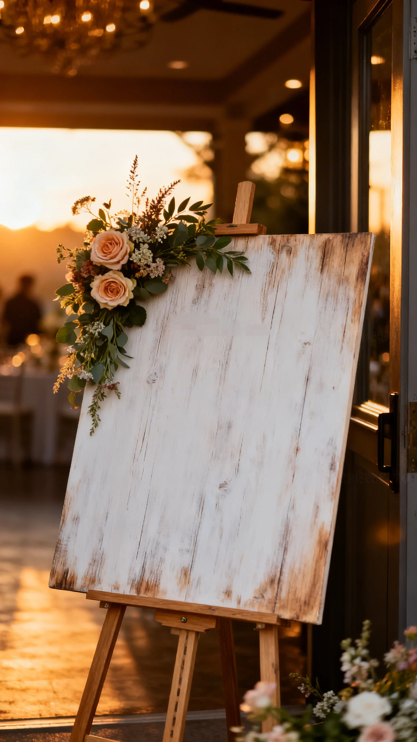
Guide guests with a welcome sign that matches your materials
A welcome sign sets the tone, so match it to your textures: stained wood, canvas, or a whitewashed board works beautifully for country aesthetics. Keep the wording simple and readable from a distance, especially if guests are arriving at sunset. Add a small floral accent that mirrors your centerpieces for continuity. If you’re using multiple signs, repeat the same font family to make everything feel like one suite.
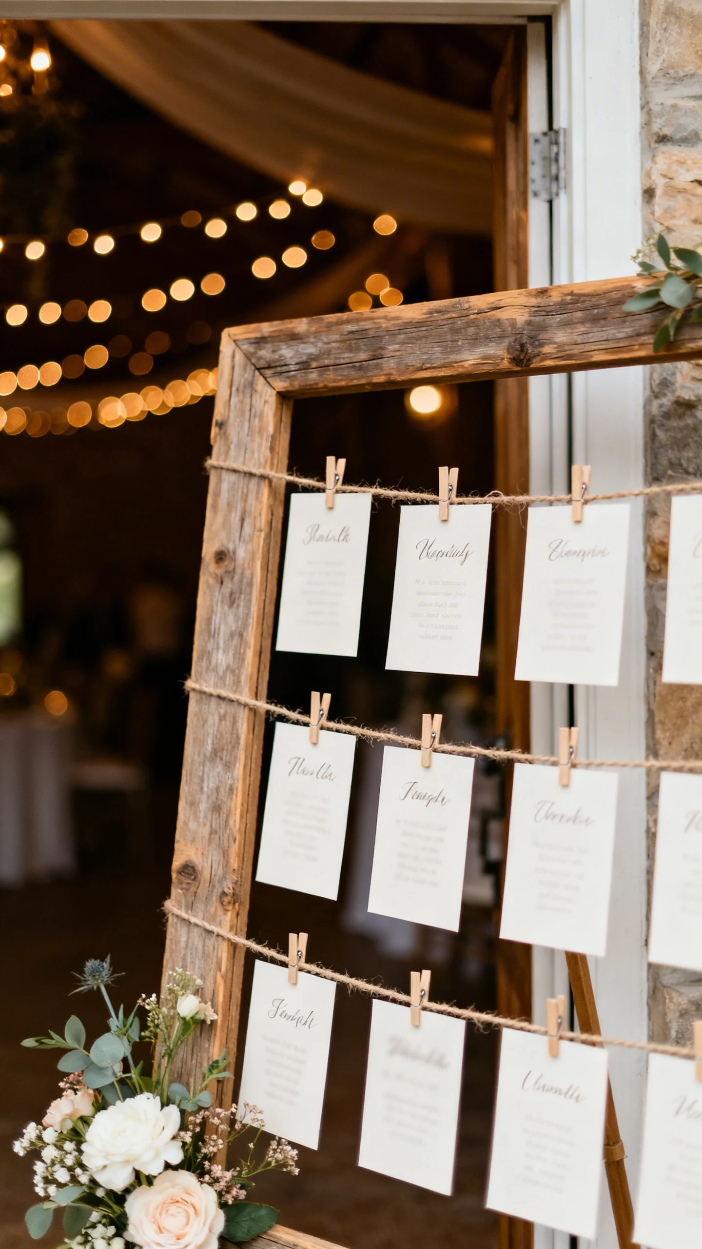
Design a seating chart that feels like part of the decor
Country receptions shine when function is also pretty, and a seating display is prime real estate. Try escort cards clipped to twine on a frame, names pinned to a cork board, or cards tucked into mini envelopes on a shelf. Keep table numbers large and consistent so guests don’t crowd around searching. Place it near the entrance with good lighting so it’s easy to read and easy to photograph.
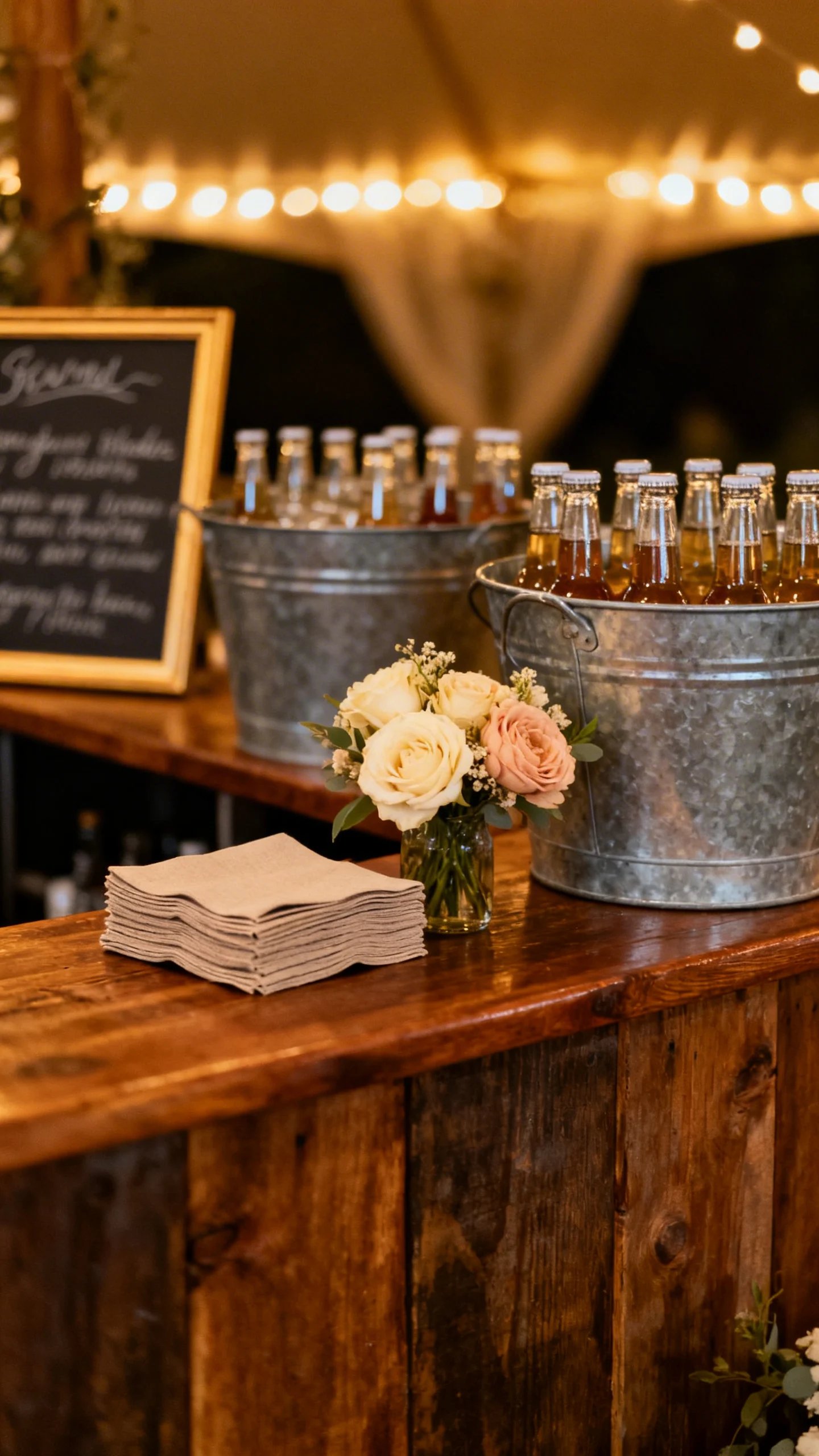
Dress up the bar with a simple sign and styled details
A bar area becomes a mini backdrop when you add one great sign and a few intentional touches. Use a wooden “Drinks” sign, a chalkboard menu, or a printed cocktail list in an aged frame. Add galvanized tubs for bottled drinks, a small floral arrangement, and a stack of napkins that match your palette. If you’re offering signature drinks, give them playful country-inspired names tied to your story or venue.
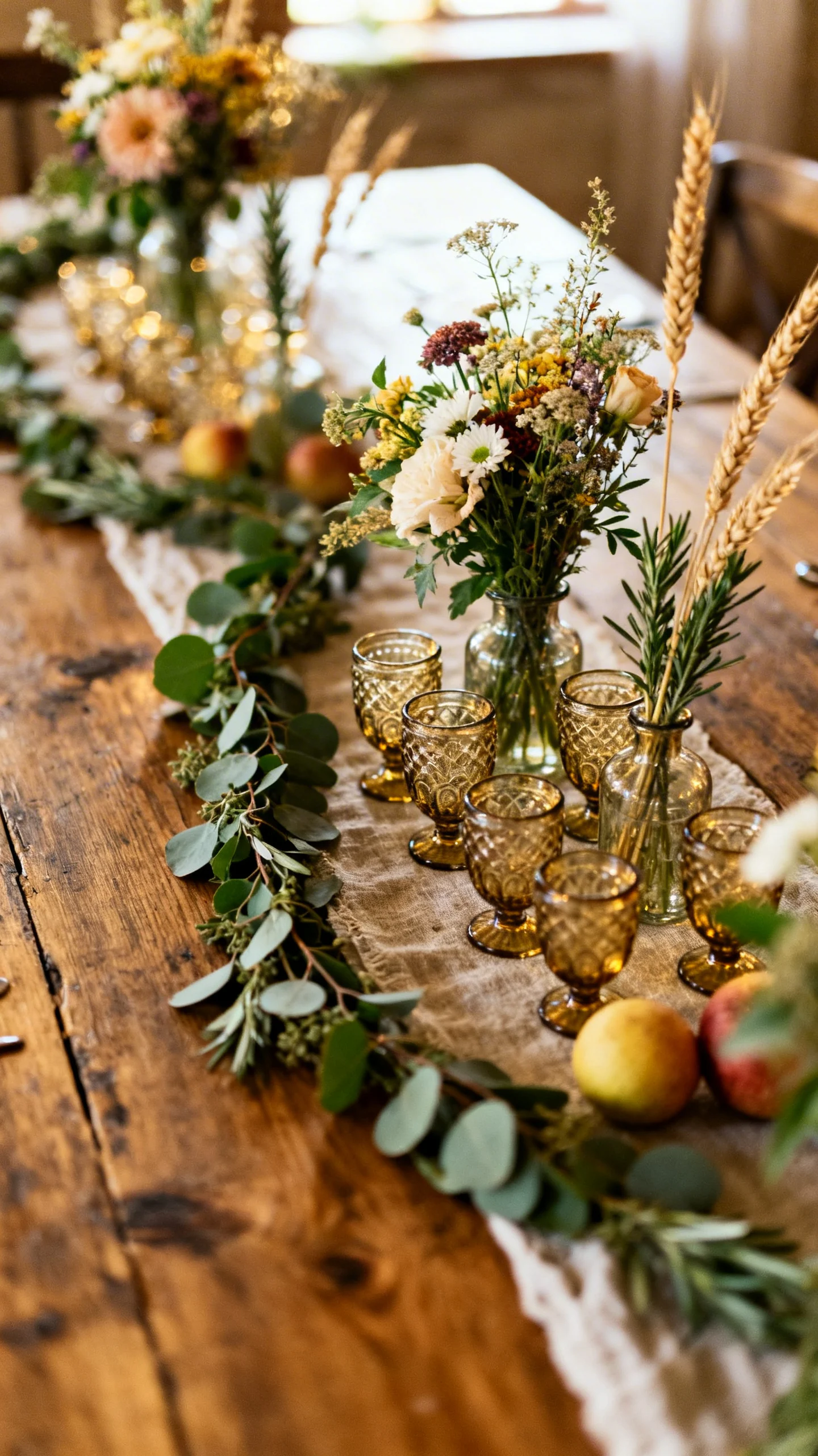
Create tablescapes with natural runners and layered textures
For a country wedding aesthetic, skip the overly perfect and lean into texture: cheesecloth, linen, or burlap-style runners can instantly warm up standard tables. Layer with simple place settings and let the runner provide the softness. Keep colors grounded—ivory, sand, sage, dusty blue, or terracotta look right at home in rural venues. Steam or press runners ahead of time so they feel relaxed, not wrinkled.
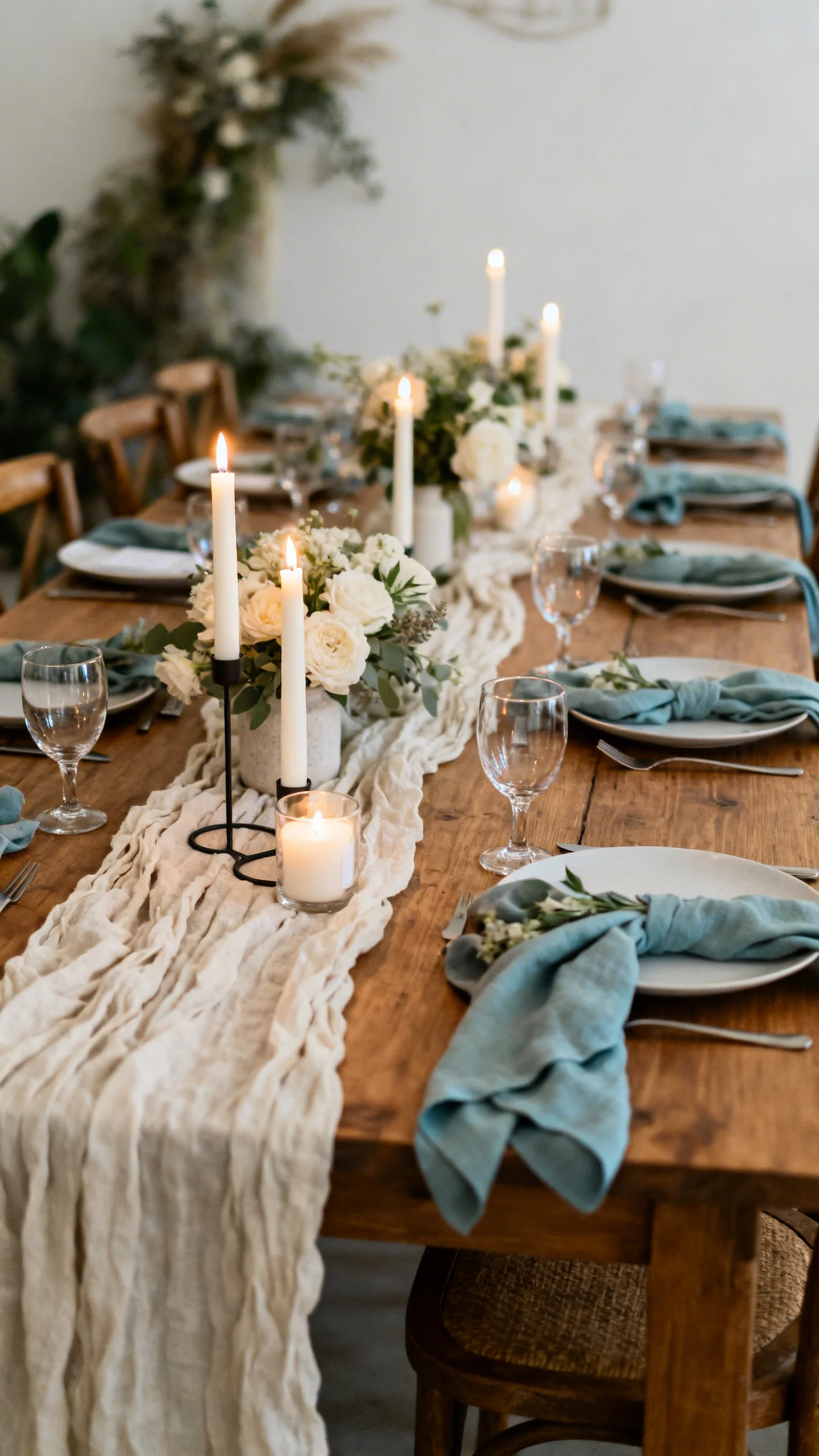
Choose centerpieces that feel gathered from the landscape
Wildflower-inspired arrangements, greenery garlands, and bud vases look effortless while still feeling special. Mix heights carefully: keep taller pieces narrow so guests can see across the table and talk comfortably. Add in fruit, herbs, or wheat-like stems for a subtle nod to the countryside without going theme-y. Repetition is your friend—use the same few vase styles across tables for a clean, Pinterest-ready look.
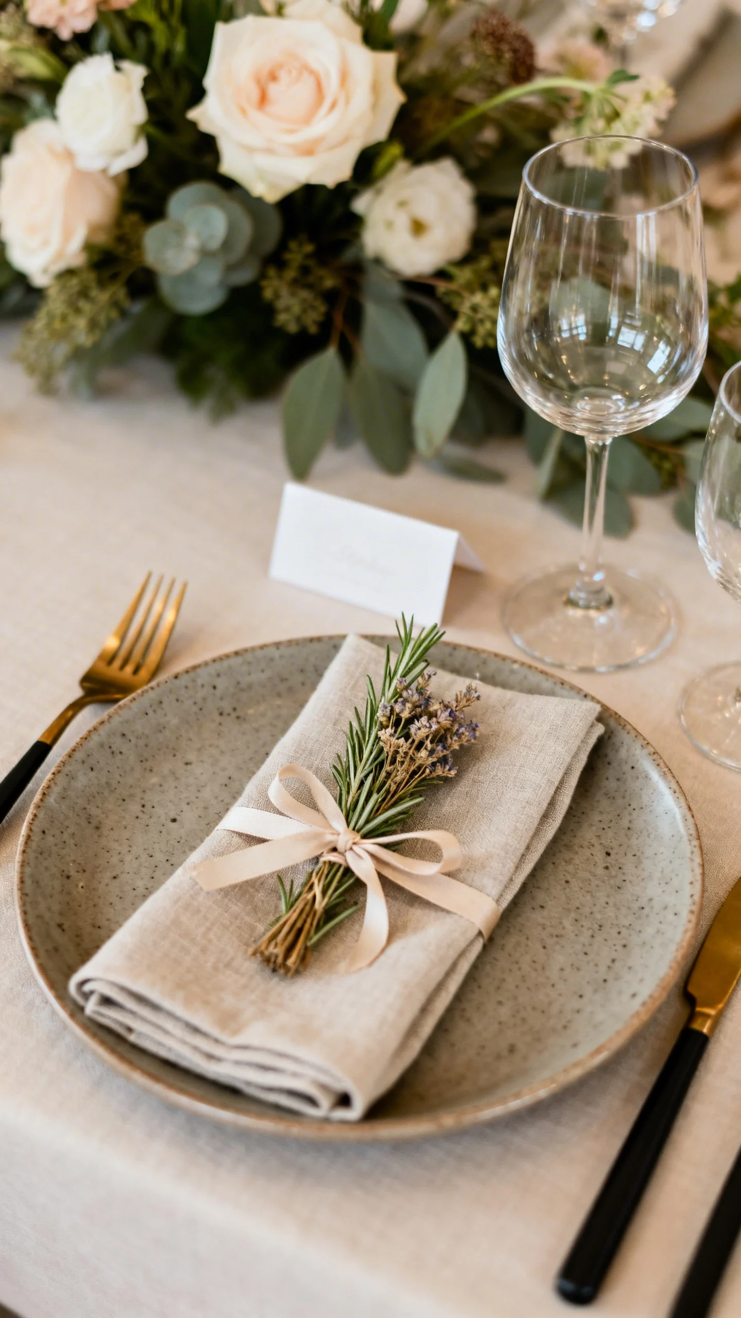
Elevate place settings with small, personal touches
Name cards tied to a sprig of rosemary, a mini dried flower bundle, or a simple ribbon bow can make every seat feel curated. Use stoneware-style plates, gold or matte black flatware, or clear goblets to balance rustic textures with a modern edge. If you’re doing favors, place them at each setting so they double as decor. Keep your color palette tight so the overall tablescape reads calm and intentional.
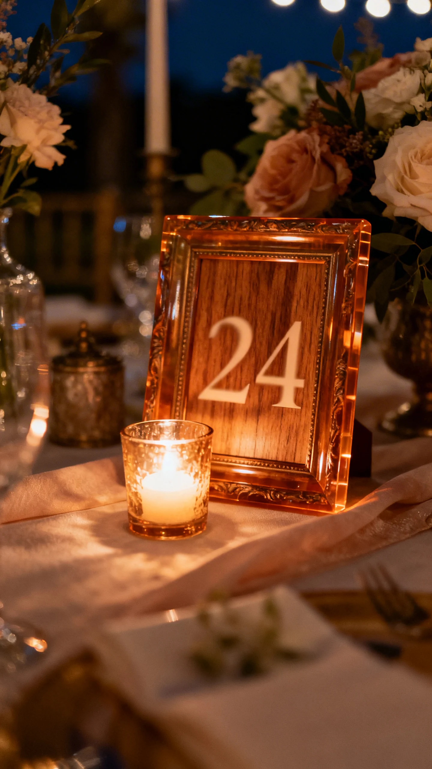
Finish with table numbers and signage that tie it all together
Table numbers are tiny but powerful for style: wood blocks, acrylic in warm tones, or vintage frames all work in a country reception. Match the finish to your other signage so nothing feels random. Add subtle lighting—like a small votive near the number—so it’s visible after dark. If you have specialty areas (guest book, desserts, cards), use the same sign style for a seamless look.
FAQ
What kind of lighting looks best for a country wedding reception?
Warm white lighting is the most flattering and reads romantic in photos. Combine overhead string lights with smaller sources like lanterns, candles, or pin spots so the space feels layered. If your reception runs late, make sure key areas (seating chart, bar, bathrooms paths) are well lit for comfort and safety.
How do I keep my signs cohesive without buying everything custom?
Pick one font pairing and one material direction (for example, stained wood + white lettering, or ivory paper in aged frames). Then print templates at home or through a local print shop and reuse frames across the day. Keeping the same wording style and spacing makes even budget signs look coordinated.
What are the easiest country tablescape upgrades on a budget?
Add texture first: runners, linen napkins, and a few bud vases go a long way. Use candles in mixed heights for glow, and repeat the same vase shapes across tables to look more “designed.” Borrow or thrift mismatched glassware only if it fits your palette; otherwise, simple and consistent wins.
How can I make a barn reception feel more polished?
Focus on lighting and clean lines: a statement chandelier, tidy string light placement, and intentional signage elevate the space fast. Choose a refined color palette and repeat materials across signs, table numbers, and stationery. Also consider hiding clutter areas with draping or greenery to keep photos looking clean.
What should I prioritize first: lighting, signs, or tablescapes?
Prioritize lighting first because it affects the entire mood and how everything photographs. Next, handle key signs that help guest flow (welcome, seating, bar). Then finalize tablescapes with runners, centerpieces, and place setting details once your overall palette and materials are set.