
Beach wedding aesthetics are at their best when the color palette feels pulled straight from the shoreline: airy neutrals, watery pastels, and a few warm, sunlit pops. The goal is cohesive and photo-friendly, without looking overly themed or trying too hard.
Below, you’ll find practical ways to use sand, sea glass, coral, and sunset tones across your florals, attire, tablescapes, stationery, and décor—so everything looks intentional from ceremony to send-off.
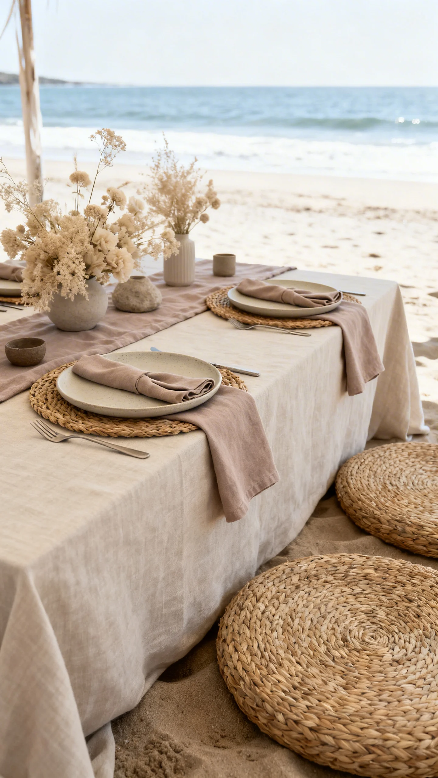
Start with Sand as Your Neutral Base
Sand tones keep a beach palette grounded and timeless, especially in bright coastal light. Use ivory, oatmeal, dune beige, and soft taupe as your “background” across linens, signage, and attire. This gives your brighter accents a clean place to land without visual clutter. It also photographs beautifully against water and sky.
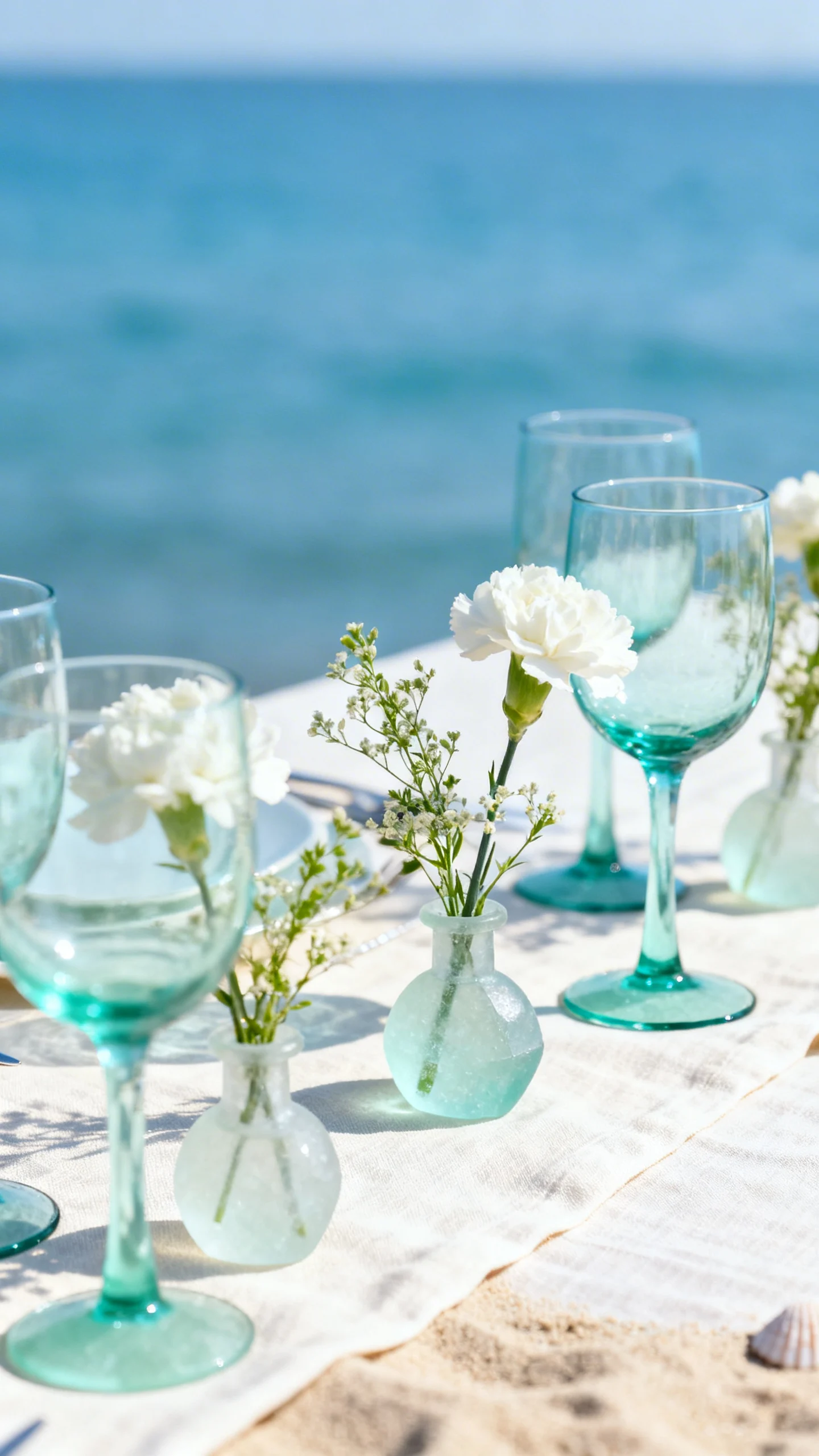
Sea Glass for a Soft, Coastal Wash
Sea glass shades like mint, aqua, and pale teal instantly feel beachy without leaning tropical. Work them into bridesmaid dresses, napkins, or bud vases for a fresh wash of color. Sea glass also pairs well with both silver and gold details, so you can keep your metals flexible. For a modern look, stick to one sea-glass tone and repeat it throughout.
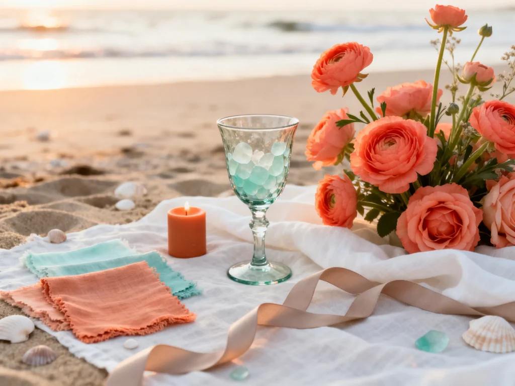
Coral as the “Just Enough” Pop
Coral adds warmth and energy, especially during golden hour, but it’s best used as an accent rather than the main event. Add coral through bouquet blooms, escort cards, or a signature cocktail garnish. It flatters a wide range of skin tones and brings life to neutral table settings. If you want it subtle, choose peachy coral instead of neon-bright shades.
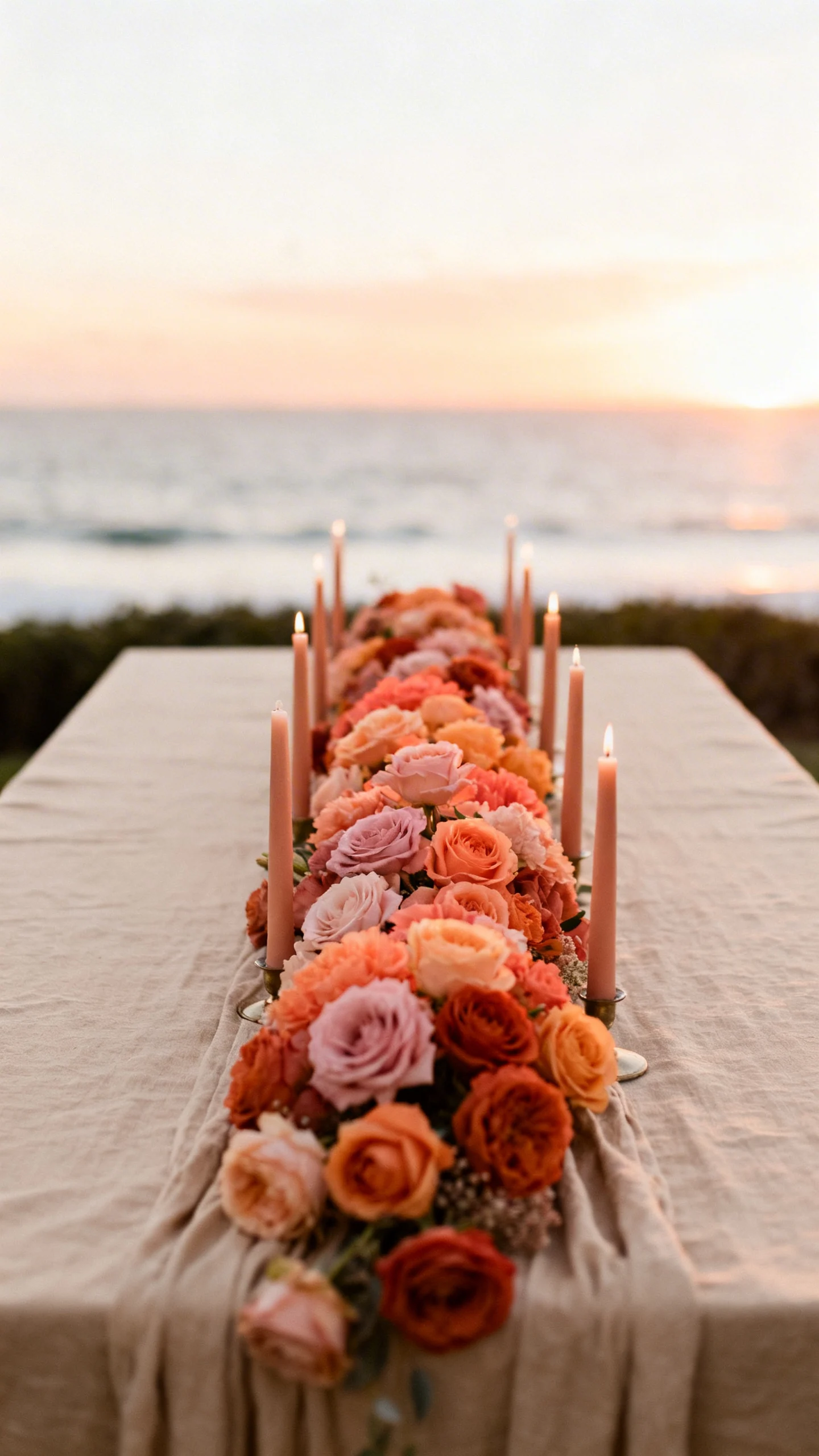
Sunset Ombre for Ceremony-to-Reception Flow
Sunset palettes shine when they transition gradually: blush to coral to apricot to warm terracotta. Use this ombre effect in your aisle florals, bridesmaid lineup, or taper candles across long tables. It creates movement in photos and helps the day feel like it’s unfolding naturally. Keep at least one steady neutral (like sand) so the gradient still feels cohesive.
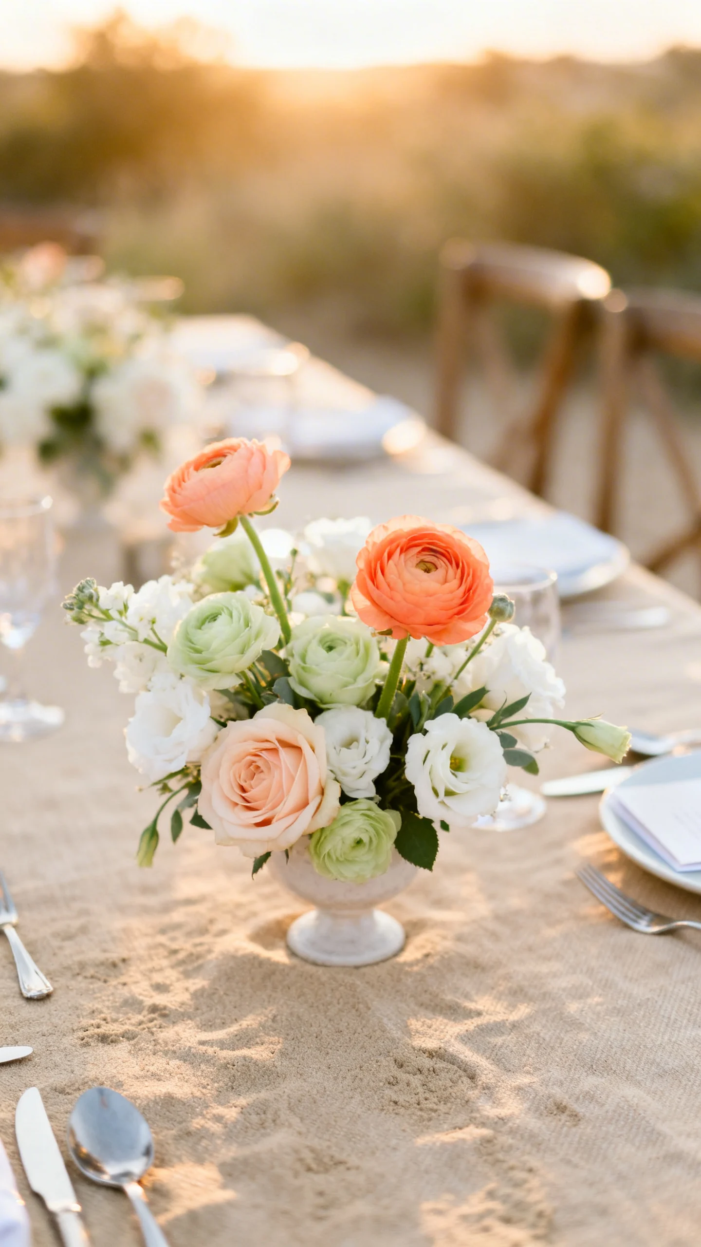
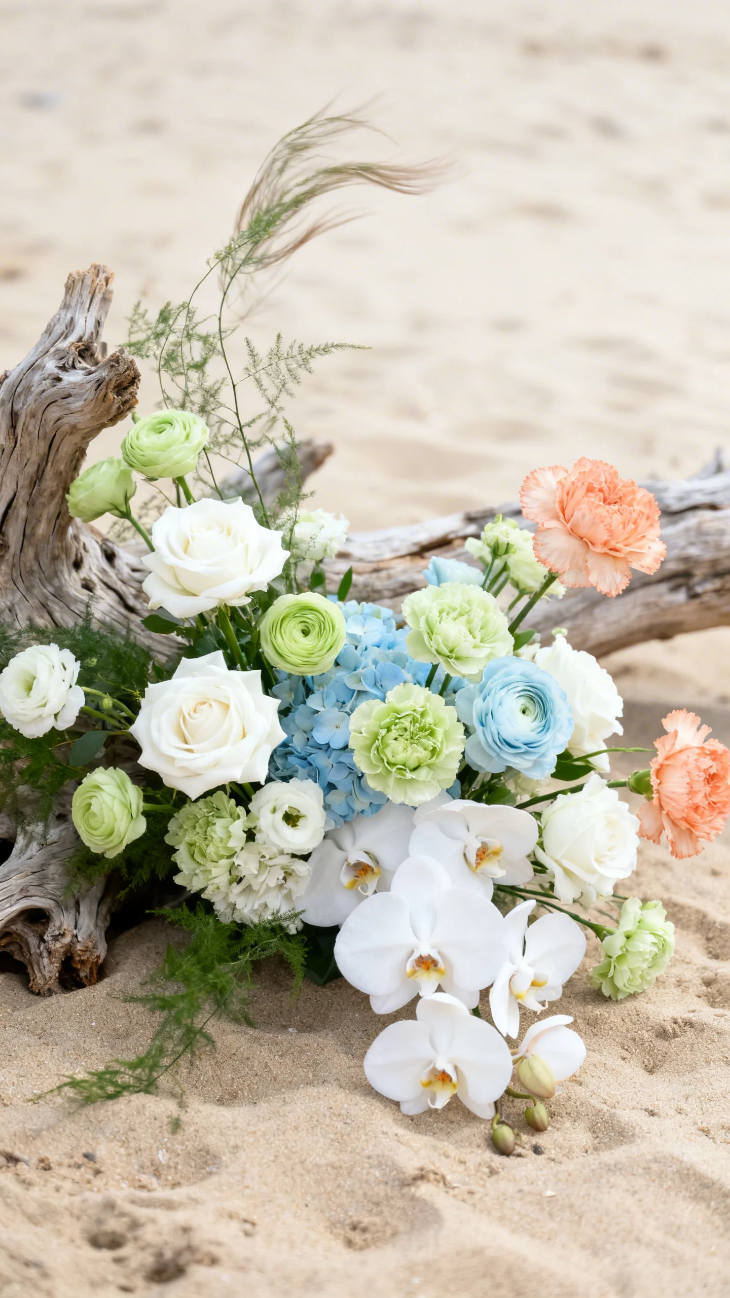
Florals That Look Like They Belong on the Shore
Choose blooms and textures that feel airy and wind-friendly, like roses, ranunculus, lisianthus, orchids, and plenty of delicate greenery. For sand + sea glass, lean into whites, pale greens, and soft blues; for coral + sunset, add peach, papaya, and warm pinks. Ask your florist for a mix of shapes to mimic the shoreline—soft, organic, and not too tight. A little asymmetry reads effortless on the beach.
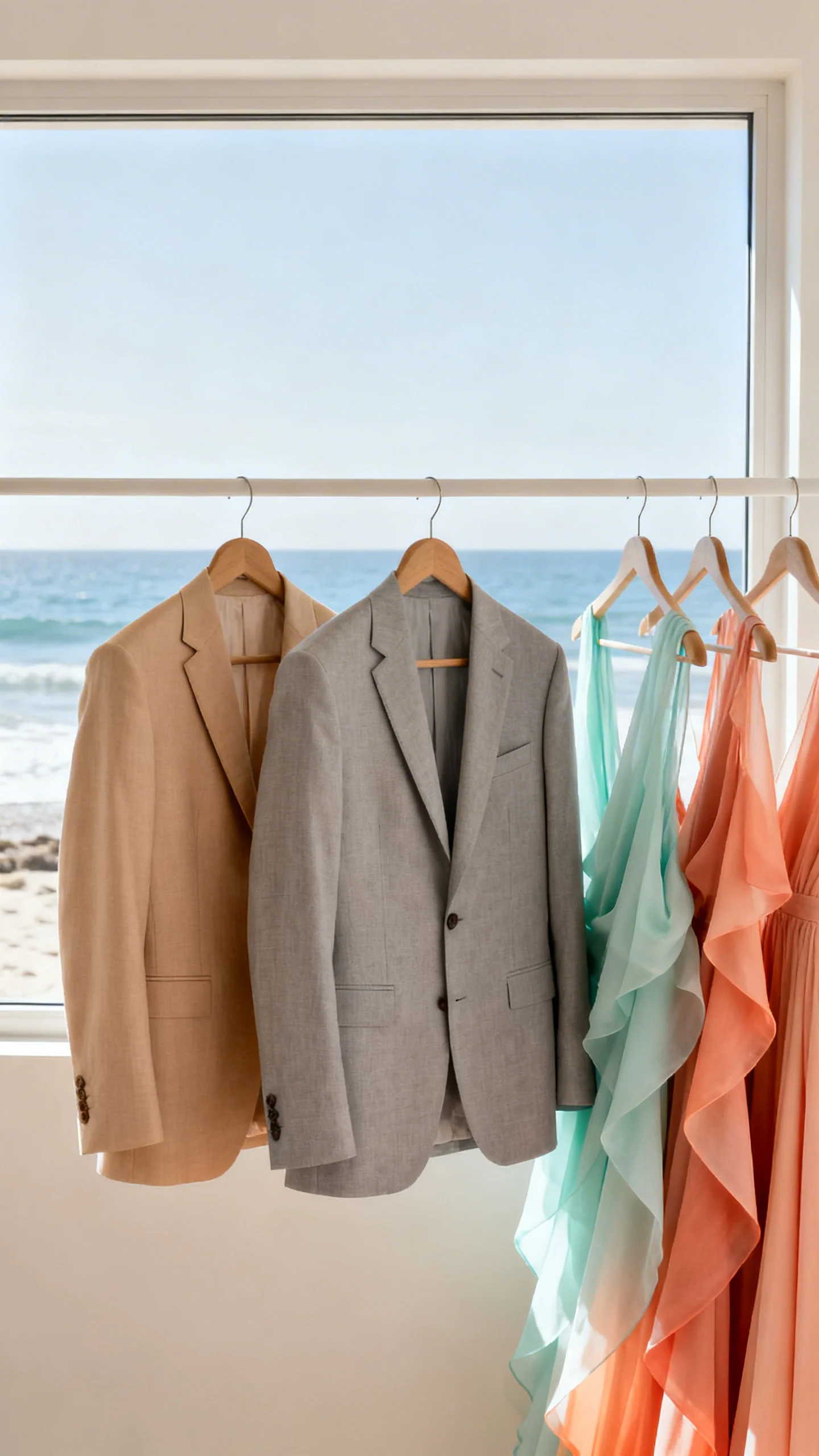
Bridesmaid and Groomsmen Color Pairings
Sea glass bridesmaid dresses with sand-toned bouquets look clean, coastal, and modern. For a warmer vibe, put bridesmaids in coral or sunset shades and dress groomsmen in light tan or soft gray suits with neutral shirts. Ties and pocket squares are an easy place to echo the palette without going matchy. If you’re mixing shades, keep fabrics consistent for a polished look.
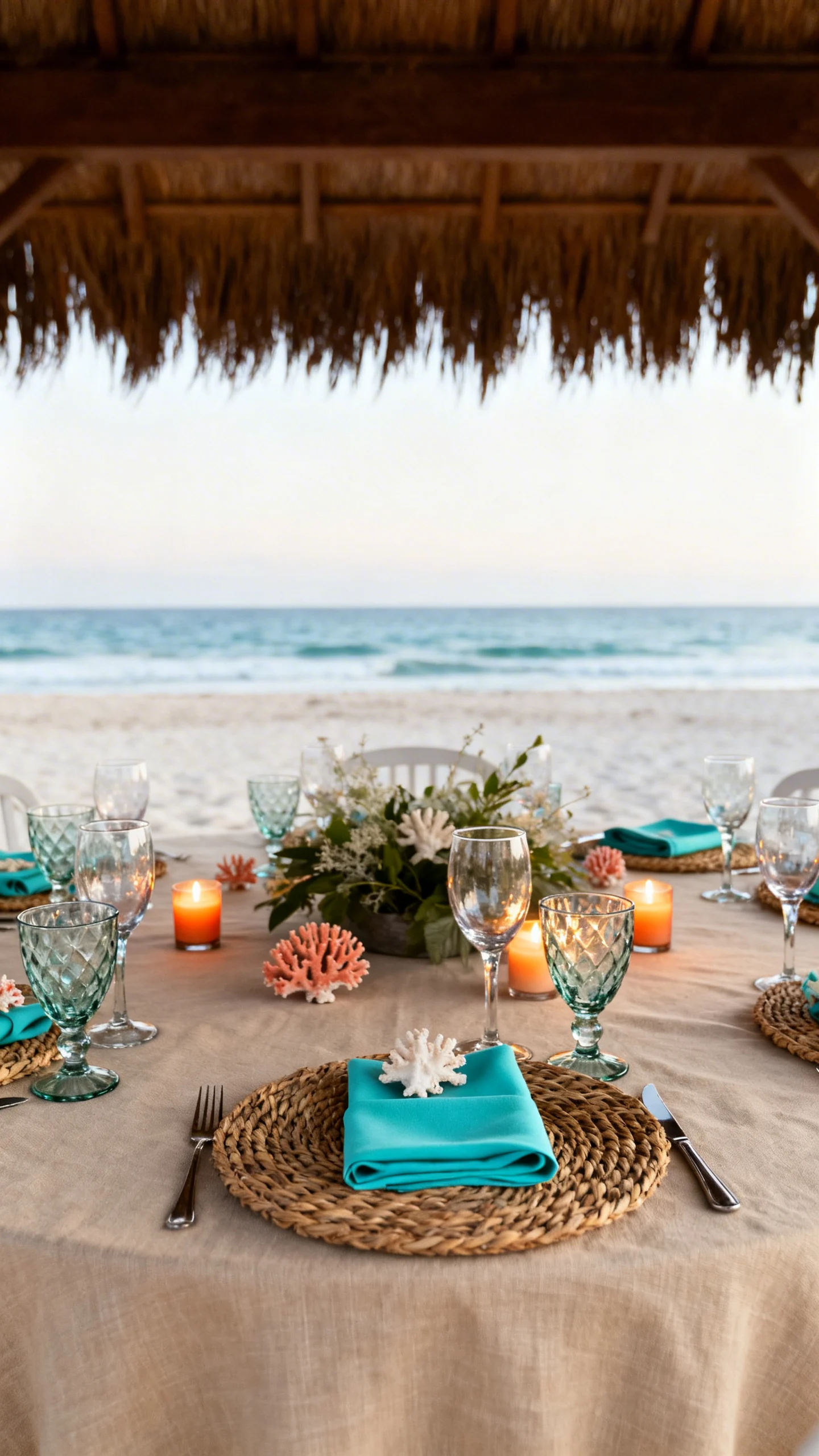
Tablescapes: Layer Neutrals, Then Add Color in Small Hits
Start with sand-colored linens or woven chargers to create that beach texture without using literal shells everywhere. Add sea glass through colored goblets or napkins, then warm it up with coral place cards or sunset taper candles. The trick is repetition: pick two accent colors and use them in at least three places on the table. Keep centerpieces lower and airier so ocean views stay part of the design.
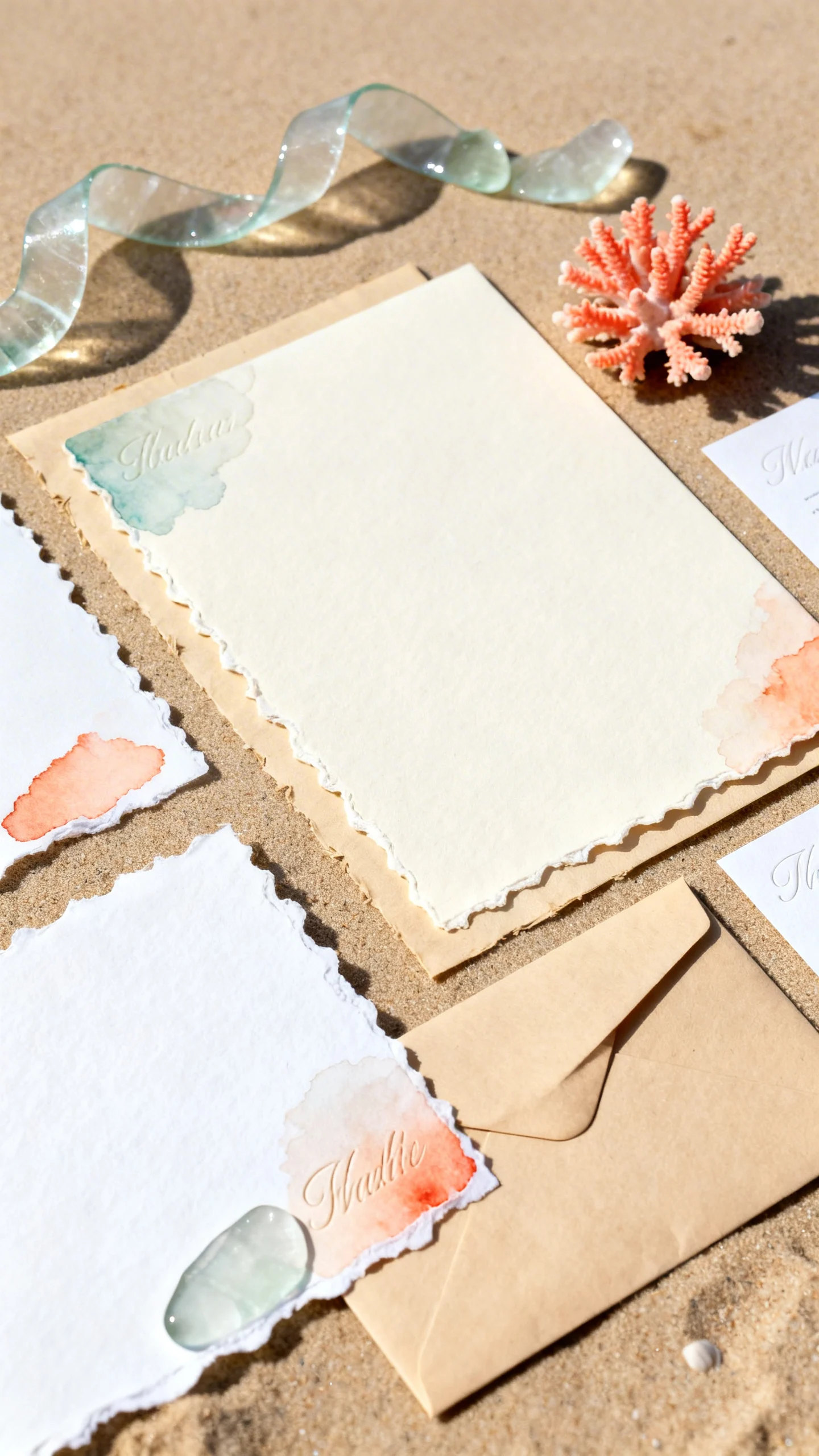
Stationery and Signage That Feels Coastal (Not Kitschy)
Use sand as your paper base—ivory, warm white, or recycled beige—and bring in sea-glass ink or watercolor washes. Coral works well for a single line of emphasis, like names or table numbers, while sunset gradients can show up on bar menus or welcome signs. Choose clean fonts and plenty of white space so it stays modern. If you want texture, consider deckled edges or subtle embossing.
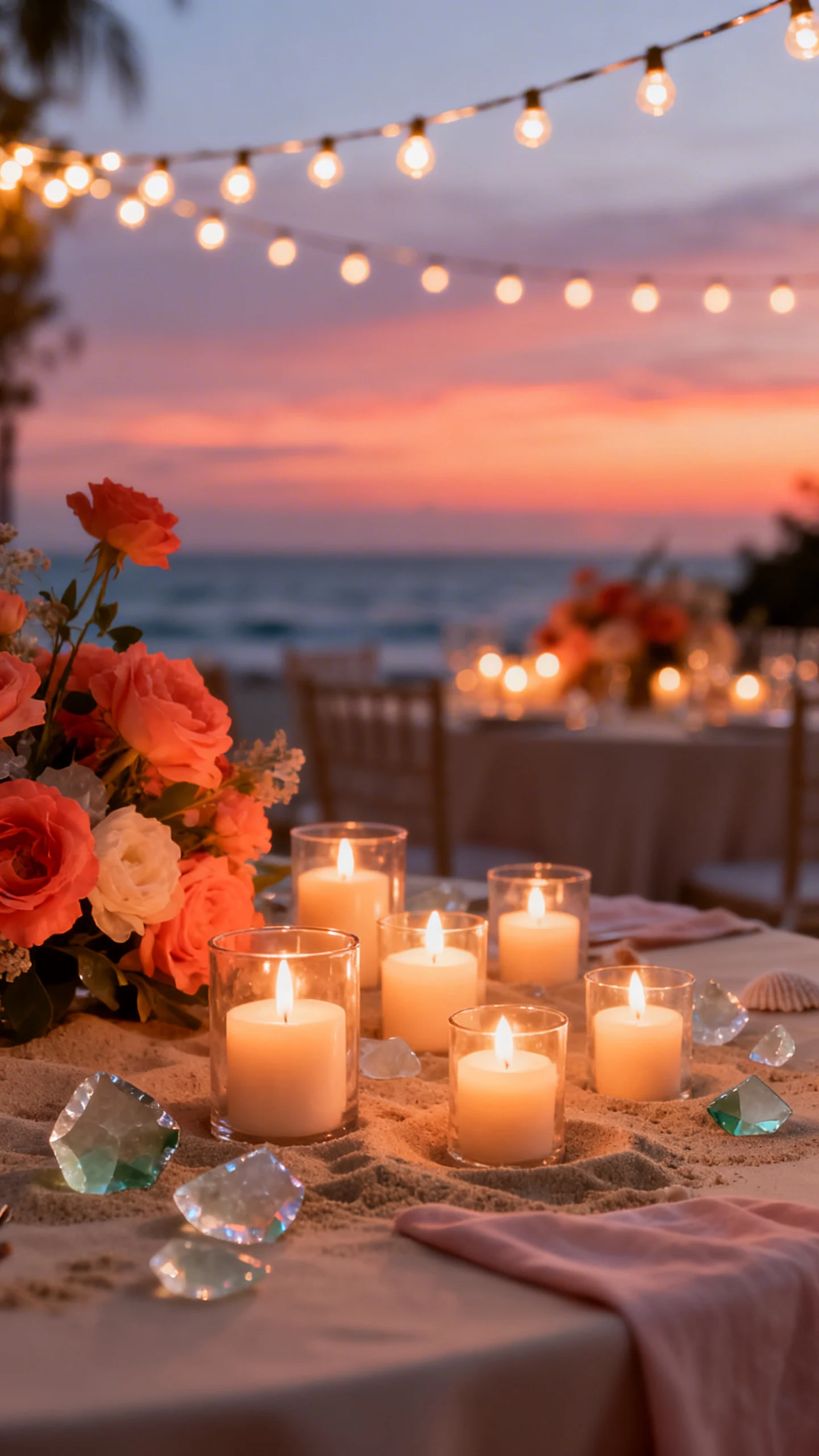
Lighting That Makes the Palette Glow
Beach light changes quickly, so plan lighting that supports your colors from late afternoon into night. Warm string lights and candles make coral and sunset tones feel rich and romantic, while sea glass stays crisp. Avoid overly cool LEDs that can turn sand neutrals gray in photos. If you’re under a tent, add warm uplighting and keep it consistent across the space.
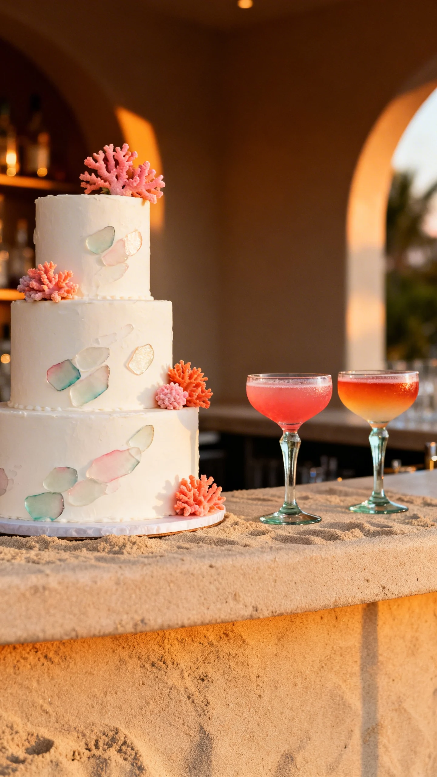
Finishing Touches: Cake, Cocktails, and Guest Details
A simple ivory cake with sea-glass painted strokes or coral sugar florals ties right into the palette without looking busy. Signature cocktails can mirror your colors—think sea-glass spritzes, coral margaritas, or a sunset mocktail with layered juices. For guest touches, try sand-toned fans, sea-glass escort cards, or coral ribbon on favor boxes. Keep details intentional and limited so everything still feels elevated.
FAQ
How do I keep sand and sea glass from looking too washed out?
Add contrast through texture and a few deeper accents: rattan, driftwood tones, warm metallics, or a slightly deeper teal in small doses. Crisp white also helps the palette look fresh in photos.
What metals work best with these beach wedding colors?
Champagne gold and brushed gold look beautiful with sand, coral, and sunset shades, while silver pairs especially well with sea glass. If you want to mix metals, keep one dominant and use the other as a small accent.
Can I use coral without making it feel tropical?
Yes—choose softer coral (more peach than neon) and pair it with sand and plenty of white. Use coral in smaller areas like bouquet accents, napkins, or stationery highlights rather than full-coverage décor.
What are easy ways to do a sunset palette without spending a lot on florals?
Use candles, linens, and paper goods to create the gradient effect, then keep florals simpler in whites and greenery. Colored taper candles and ombre napkins can deliver the sunset vibe at a lower cost.
How many colors should I commit to for a cohesive look?
A strong approach is one neutral (sand), one cool accent (sea glass), and one warm accent (coral or a sunset tone). Repeat each color consistently across attire, tables, and signage so it feels intentional.