
Black wedding invitations are the definition of “quiet luxury” when they’re done with the right details. The trick is making them feel rich and intentional—not flat, crafty, or hard to read.
Below are the fonts, papers, and finishes that photograph like a dream, feel elevated in-hand, and set the tone for a chic, modern wedding from the first envelope.
Top 5
1) High-Contrast Serif Fonts (Didone & Modern Serif)
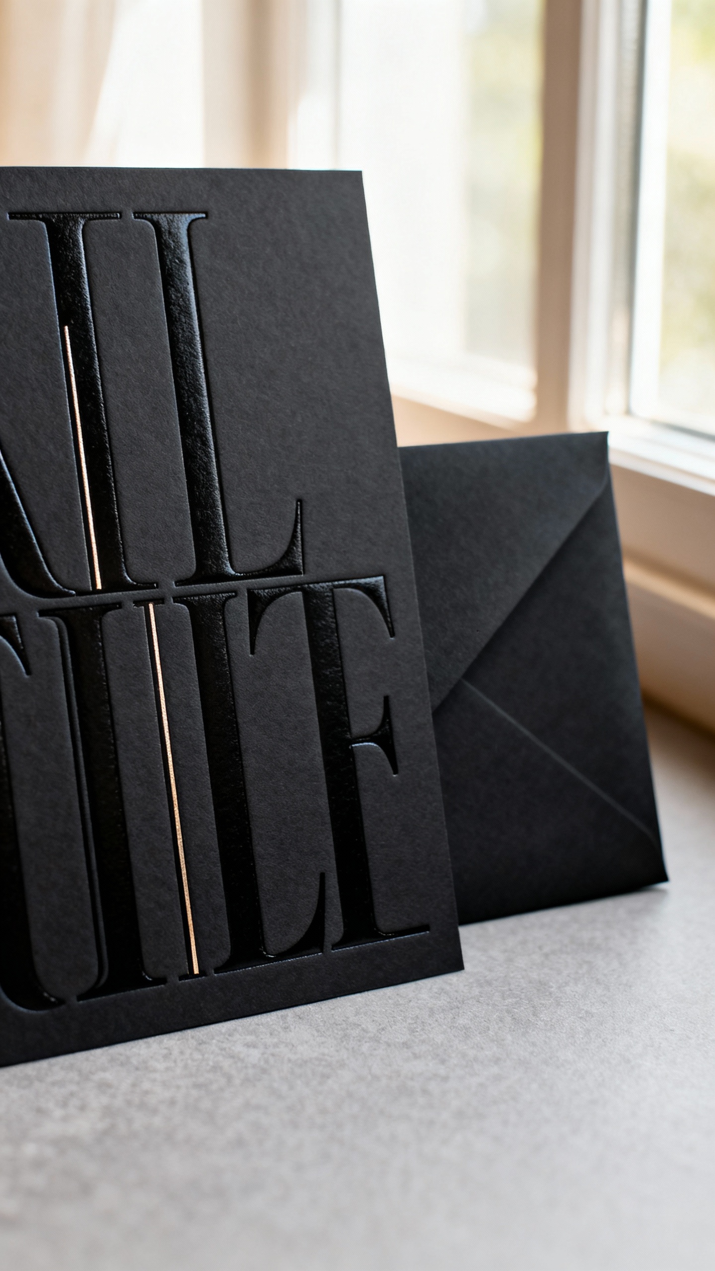
If you want instant luxury, go for a crisp, high-contrast serif on black—think tall letters, thin hairlines, and a fashion-editor vibe. These fonts feel formal without being stuffy and look especially good with foil or letterpress. Keep line spacing airy so names and details feel editorial, not crowded.
2) Soft-Touch Black Paper (Velvet Matte Finish)
Soft-touch stock is that “you have to feel this” moment—matte, silky, and expensive-looking under any light. It also photographs beautifully for flat lays because it avoids harsh glare. Pair it with clean typography and a slightly thicker weight so it feels substantial the second guests pick it up.
3) Black Cotton Paper + Blind Letterpress
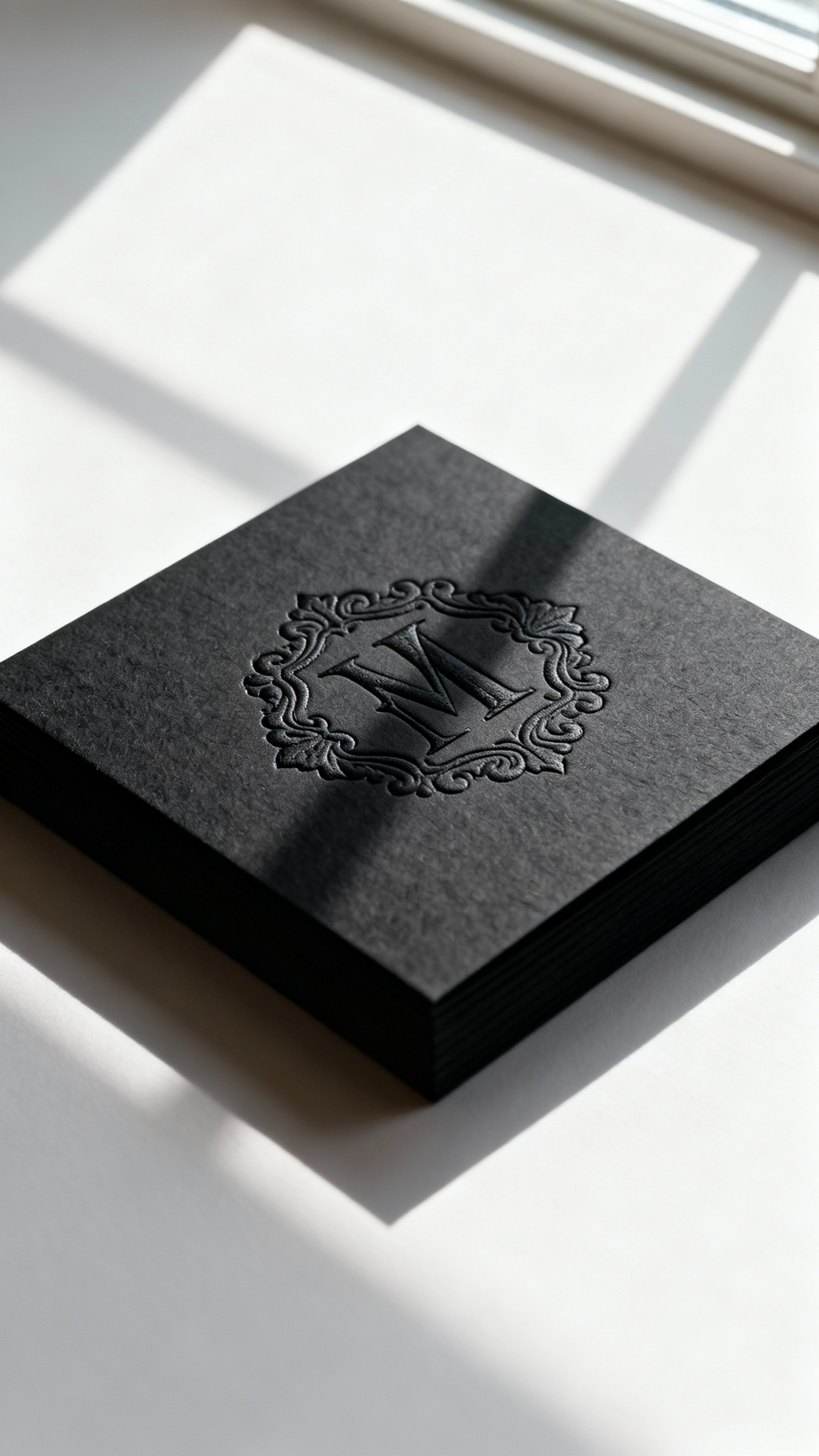
For a minimal, ultra-luxe look, black cotton paper with blind letterpress (no ink, just an impression) is so chic. The texture and depth do all the talking, making it perfect for couples who want modern elegance without shine. Pro tip: keep the wording short and let the impression be the star.
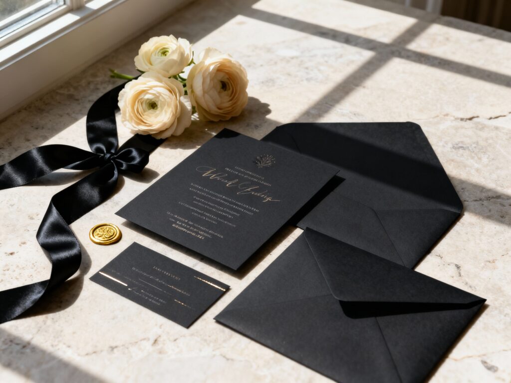
4) Metallic Foil Details (Gold, Champagne, or Silver)
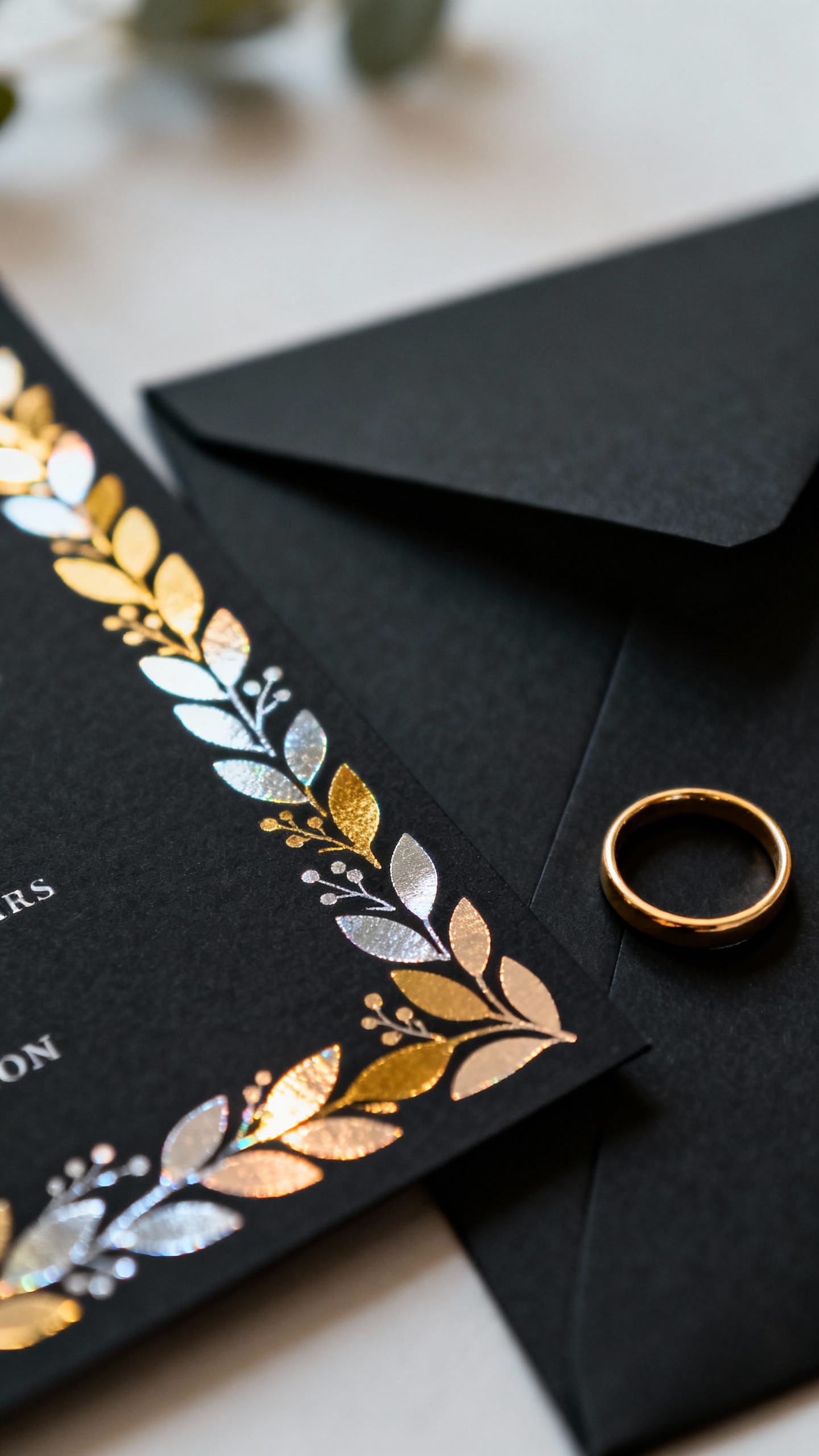
Foil on black is the easiest way to get that high-end contrast that reads “evening wedding” immediately. Gold is classic, champagne feels softer and more romantic, and silver gives sleek city vibes. Use foil strategically—names, monogram, or a border—so it feels refined instead of overwhelming.
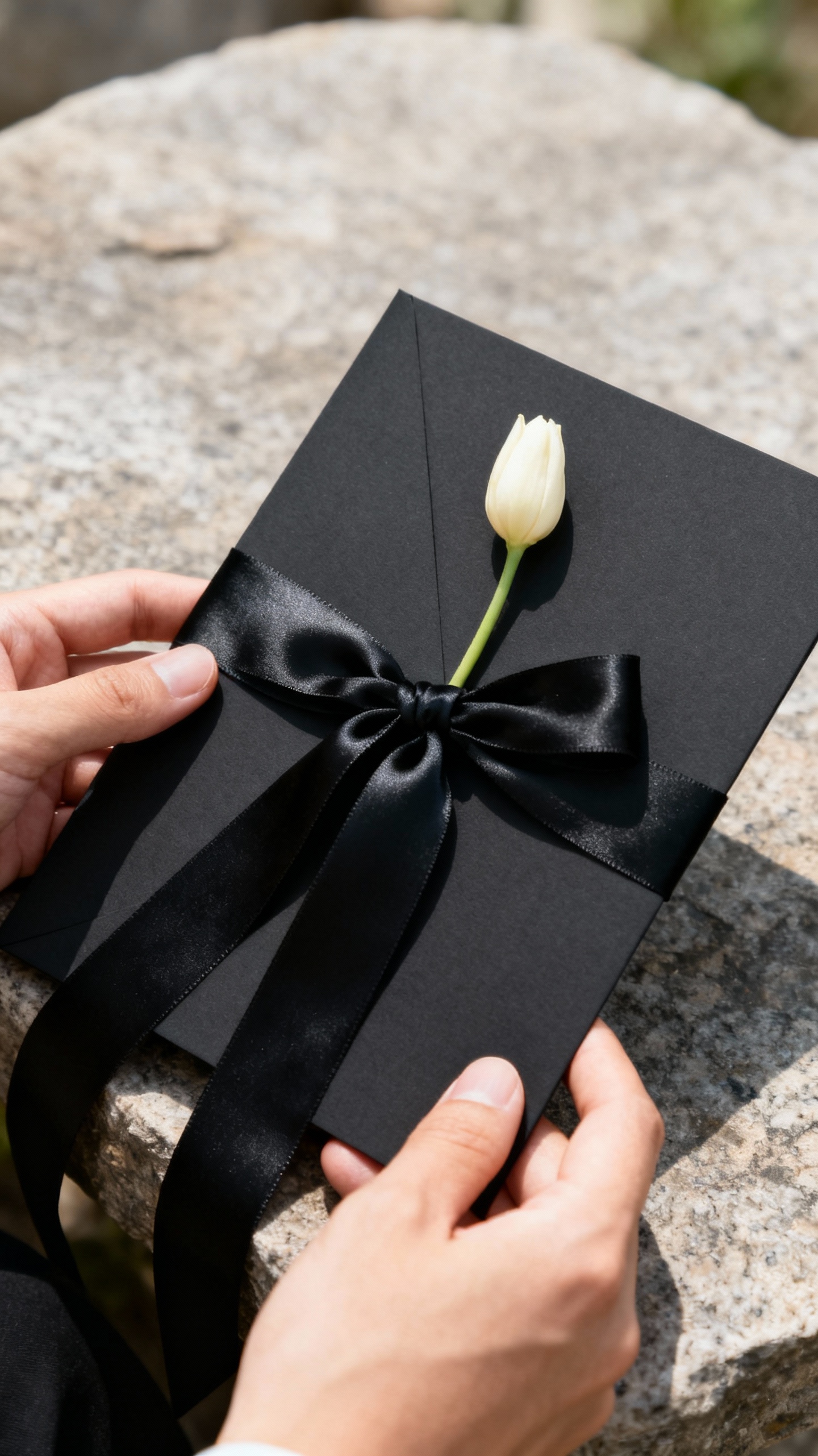
5) Luxe Finishes: Edge Painting, Wax Seals, and Lined Envelopes
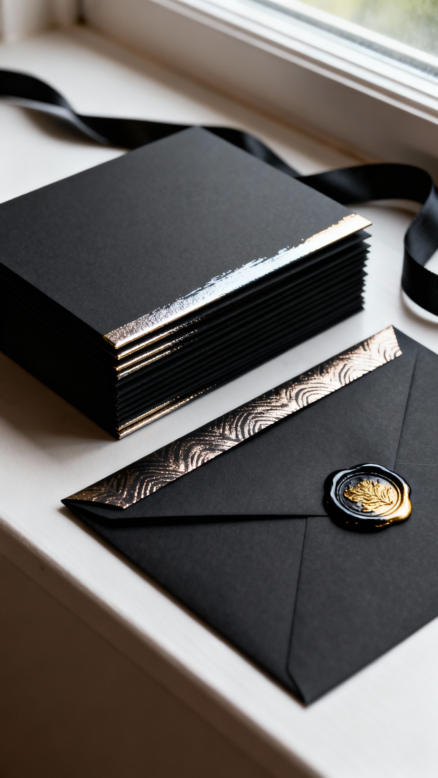
Finishing touches are what make a black suite feel truly custom. Black or metallic edge painting looks stunning in stack photos, while a wax seal adds romance and a little ceremony to opening the invite. Add an envelope liner (pattern, velvet-touch, or metallic) for that “wait, this is gorgeous” reveal.
FAQ
Will black wedding invitations be hard to read?
They can be if you use low-contrast ink or overly thin fonts. Stick to high-contrast printing (foil, white ink, or blind letterpress with strong lighting considerations) and choose fonts with clear letterforms. Always request a printed proof to check readability in real life, not just on a screen.
What ink colors look best on black invitations?
White ink is clean, modern, and the most readable for a minimalist vibe. Metallic foil (gold, champagne, silver, rose gold) feels formal and photographs beautifully. If you want something unexpected but still luxe, consider pearl or warm ivory ink instead of bright white.
Are black invitations okay for a daytime wedding?
Yes—just style them to match the vibe. For daytime, lean matte (soft-touch), use more whitespace, and consider pairing black with lighter accents like ivory envelopes or a delicate floral liner. For evening weddings, you can go heavier on foil, seals, and dramatic typography.
What paper weight feels the most luxurious?
Thicker stock almost always feels more premium, but the “best” depends on the printing method. Cotton paper is ideal for letterpress because it holds deep impressions, while soft-touch stocks feel plush even at moderate weights. Ask your stationer to recommend a weight that won’t curl and can handle your chosen finish.
How do I keep black suites from feeling too harsh or gothic?
Balance is everything. Use warm metallics (champagne or gold), soften the look with romantic serif fonts, and consider pairing black invites with ivory or taupe envelopes. You can also add a gentle design element—like a thin border, subtle monogram, or vellum overlay—to keep it elevated and approachable.