
Black wedding invitations are having a main-character moment—and honestly, it makes sense. They’re instantly elevated, photograph beautifully, and can swing from modern-minimal to old-money luxe depending on your details.
If you want something that feels contemporary (not Halloween, not “goth theme”), the secret is pairing black with intentional paper, typography, and a few well-chosen accents. Here are five looks that read modern and luxurious every single time.
Top 5
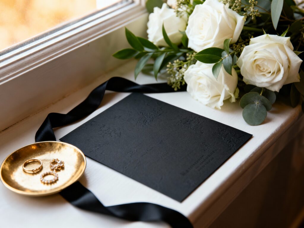
1) Matte Black + Blind Deboss Minimal Suite
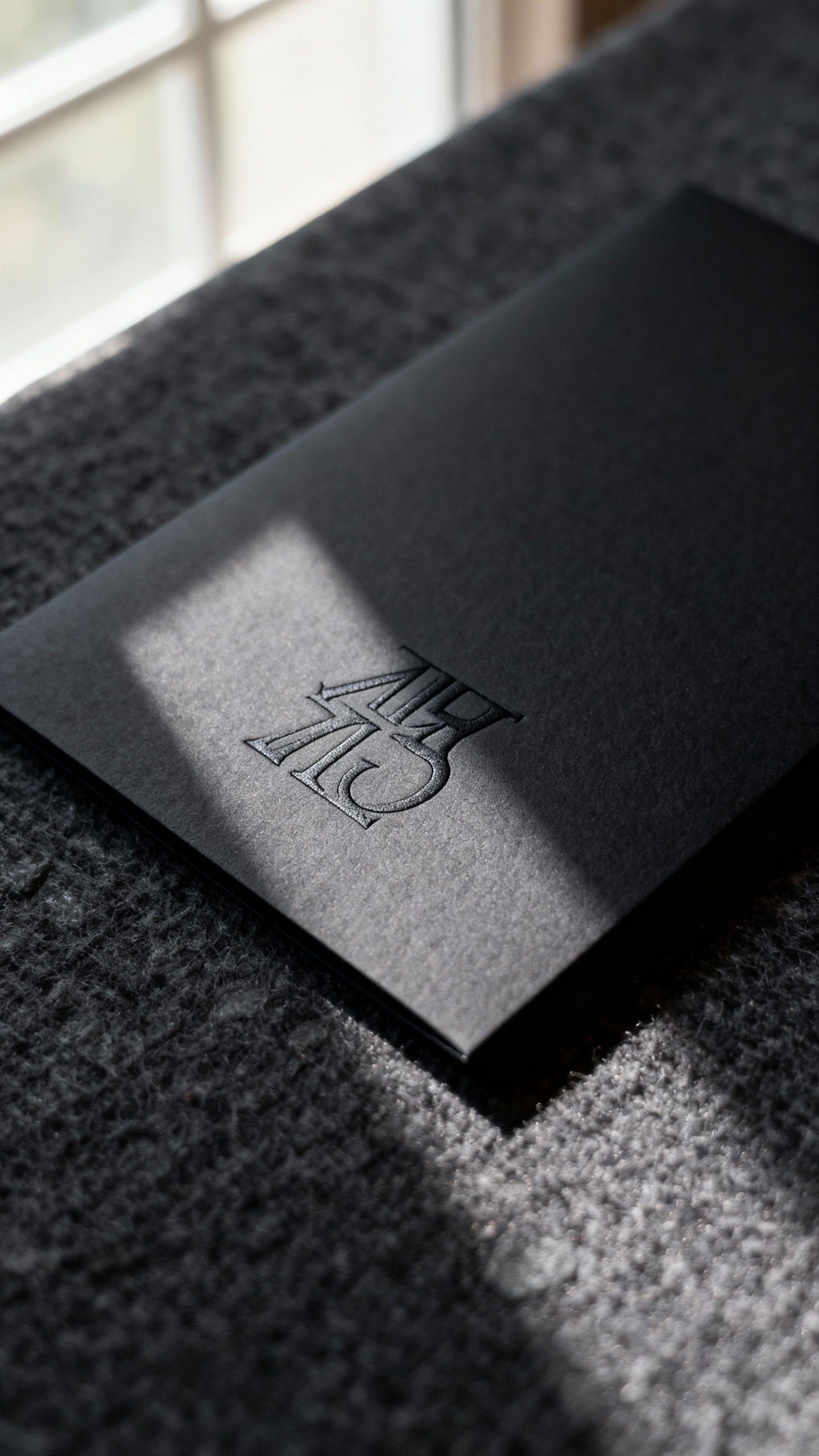
Matte black cardstock with blind deboss (no ink, just pressed texture) is quiet luxury at its finest. Keep the layout airy with wide margins and a modern serif or clean sans-serif. This style feels especially high-end when you add a matching black RSVP card and a simple details card. Finish with a black or clear envelope for an ultra-sleek vibe.
2) Black + White Letterpress with a Modern Serif
Letterpress gives you that crisp, tactile “designer suite” feel, and black ink on white cotton paper is timeless but still current. Choose a modern serif with slightly rounded edges so it feels fresh, not traditional. This is a great option if you love black invitations but want the suite to feel bright and editorial in photos. Pair with a black envelope liner for a subtle surprise.
3) Black Acrylic Invitations with Frosted or Clear Finish
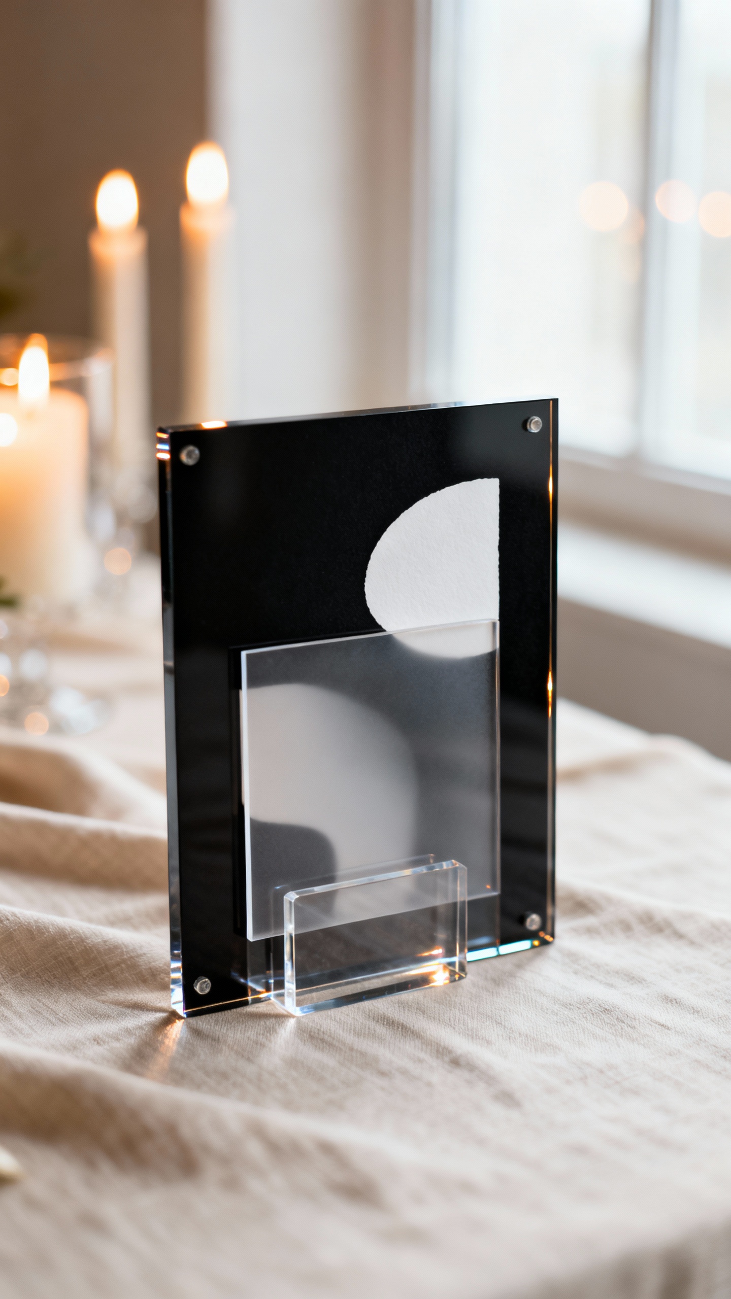
Acrylic invites instantly read modern and luxe, especially with white ink or a soft metallic print. Frosted acrylic softens the contrast and looks dreamy with candlelit or garden venues, while clear acrylic feels sharper and more architectural. Keep the wording minimal so the material can shine (literally). Pro tip: include a paper insert with reception details so guests have something easy to reference.
4) Black Invitations with Gold Foil (But Make It Clean)
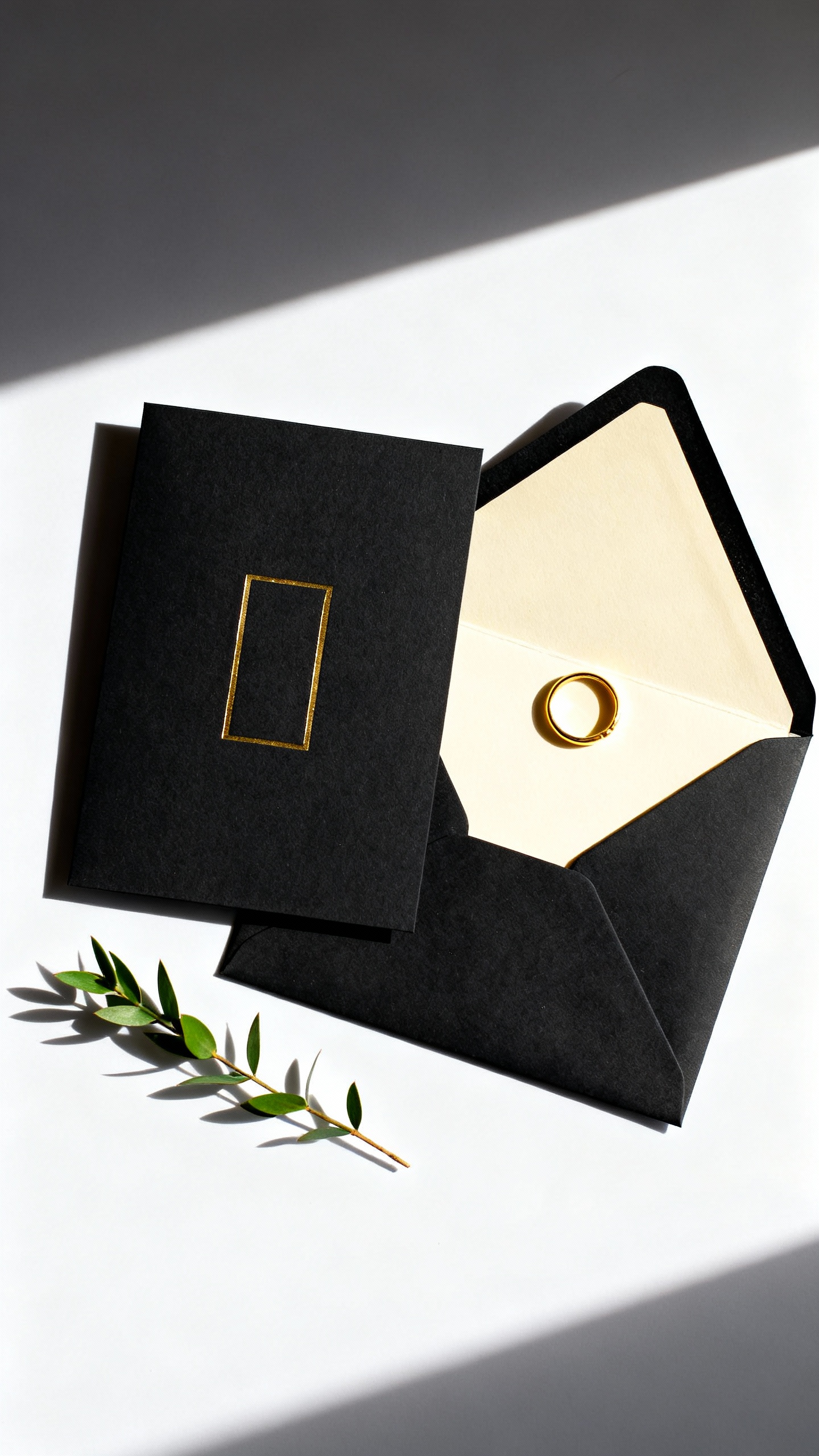
Gold foil on black is the classic glam combo, but the key is restraint: one foil moment, not ten. Use foil for your names or a thin border, then keep the rest in crisp white or a warm gray ink. This look is perfect for black-tie weddings and evening receptions because it feels rich without being busy. Pair with a wax seal in black or gold for a polished finish.
5) Black Watercolor or Ink-Wash Background with White Typography
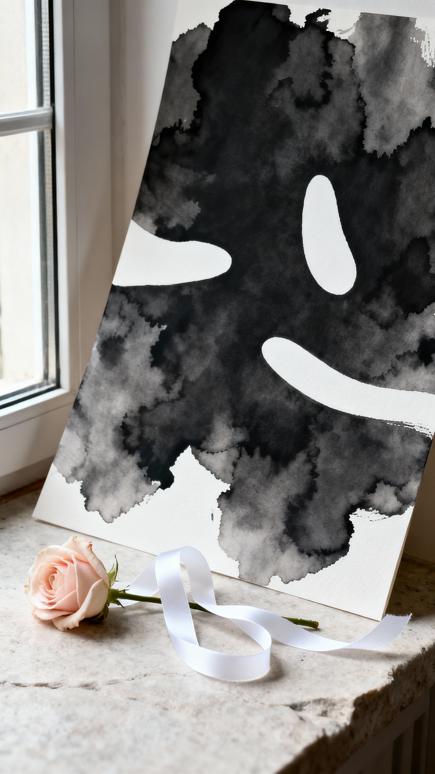
If you want black invitations that feel artistic (not harsh), go for a watercolor or ink-wash print. The slight variation in the background adds depth and makes the suite feel custom, especially with modern white typography layered on top. This style plays well with romantic florals, moody palettes, and venues like museums, lofts, and wineries. Add a vellum wrap to soften the look and give it that layered, luxe feel.
FAQ
Will black wedding invitations feel too dark or “goth”?
Not if you style them intentionally. Choose modern typography, clean layouts, and luxe materials (matte paper, cotton stock, acrylic) rather than themed graphics. Pairing black with white, taupe, or metallic accents keeps it elevated and wedding-appropriate.
What paper looks most luxurious for black invitations?
Matte heavyweight cardstock, soft-touch finishes, and cotton papers feel the most premium in hand. For extra impact, consider duplex (extra-thick) stock or a blind deboss detail. The goal is a rich texture that makes black look intentional, not flat.
Do black invitations cost more?
They can, depending on printing and materials. Foil, letterpress, and acrylic are typically higher-cost options, while flat digital printing on quality cardstock can keep things budget-friendly. If you want the luxe look for less, invest in one statement element (like a foil name line or a specialty envelope) and keep the rest simple.
What envelope colors go best with black wedding invitations?
Black envelopes look sleek and modern, while white or ivory feels classic and high-contrast. Champagne, taupe, and warm gray are gorgeous for a softer luxury vibe. If you choose black envelopes, consider a light ink color for addresses so they’re easy to read.
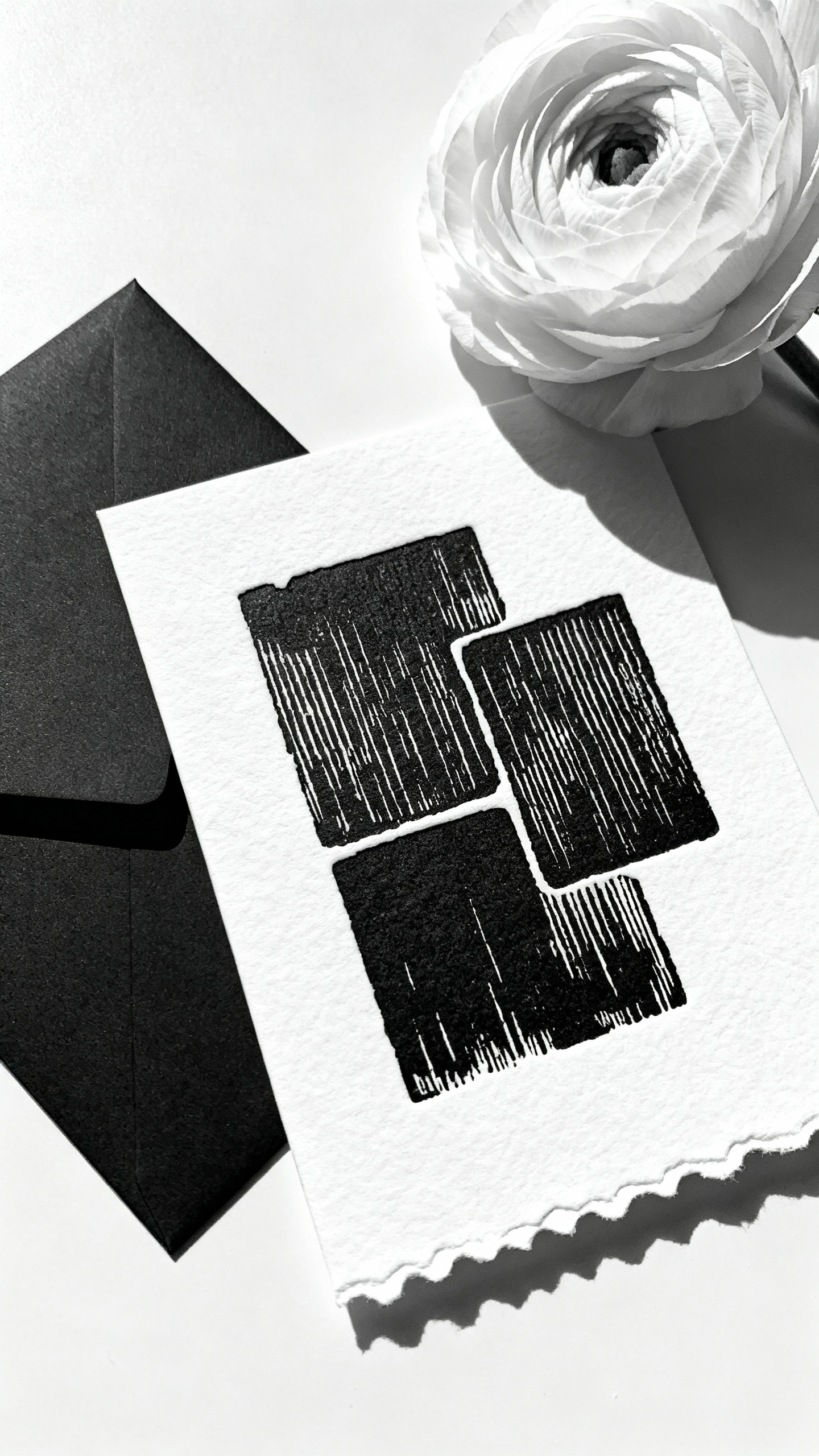
How do I make sure black invitations photograph well for flat-lays?
Use a mix of finishes and layers so the suite doesn’t read as one solid block in photos. Think vellum overlays, deckled white paper for inserts, or a subtle texture like debossing. Also, keep some light elements (white RSVP card, pale liner, or metallic accent) to balance the composition.