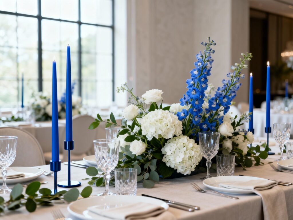
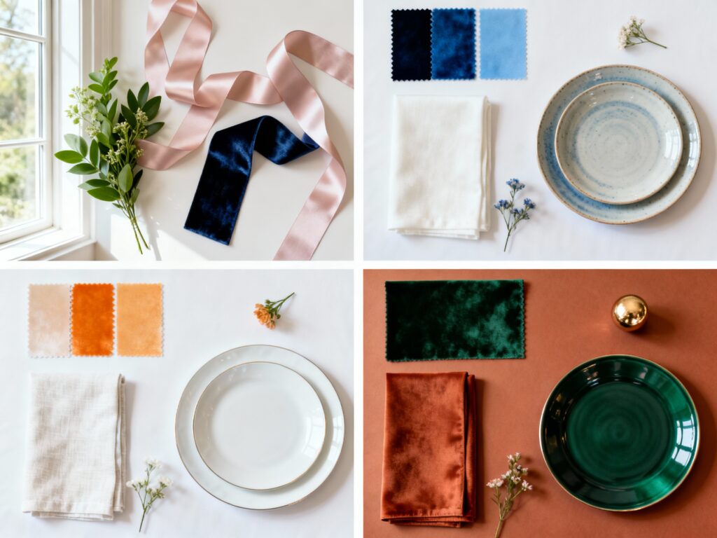
Top 5 Blue Wedding Ideas by Shade (Powder, Dusty, Navy, Cobalt, Slate)
Blue is that rare wedding color that can feel airy, romantic, editorial, or bold—depending on the shade. If you’re torn between “soft and sweet” and “make a statement,” you don’t have to pick just one vibe. Below are five Pinterest-ready blue wedding ideas, each matched to a specific shade (powder, dusty, navy, cobalt, slate) so […]
Top 5 Blue Wedding Ideas by Shade (Powder, Dusty, Navy, Cobalt, Slate) Read More »