
Rustic doesn’t have to mean rough around the edges. When you pair timeworn textures with a soft, edited palette—cream, sage, dusty rose, and mocha—you get a look that feels grounded, romantic, and quietly modern.
This color story is especially photogenic: warm neutrals keep everything cohesive, while the muted pink and green add depth without turning overly sweet or overly boho. Here are practical ways to style it from invites to florals to the reception tables.
Why this palette reads rustic and modern at the same time
Cream and mocha give you that natural, earthy base that suits barns, vineyards, and garden venues. Sage adds a fresh, contemporary note that keeps the look from feeling too vintage. Dusty rose brings softness without going bright, so the whole palette stays elevated. Together, they photograph like a warm filter—cozy, but still clean.
Cream as the “new white” for linens, draping, and paper
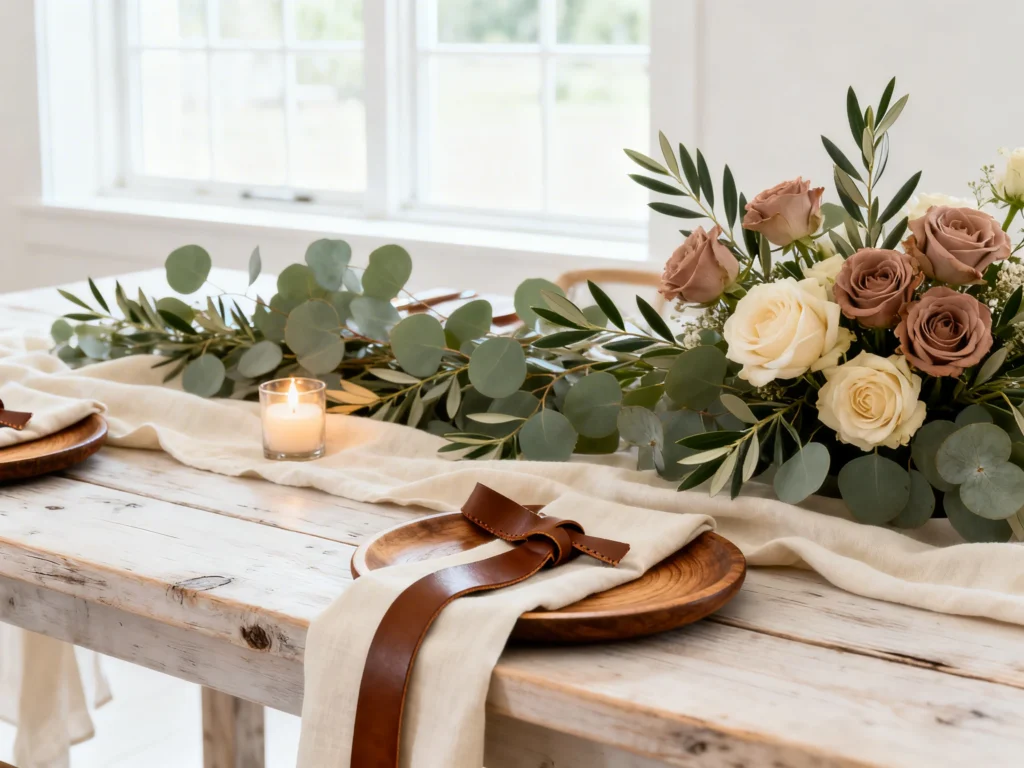
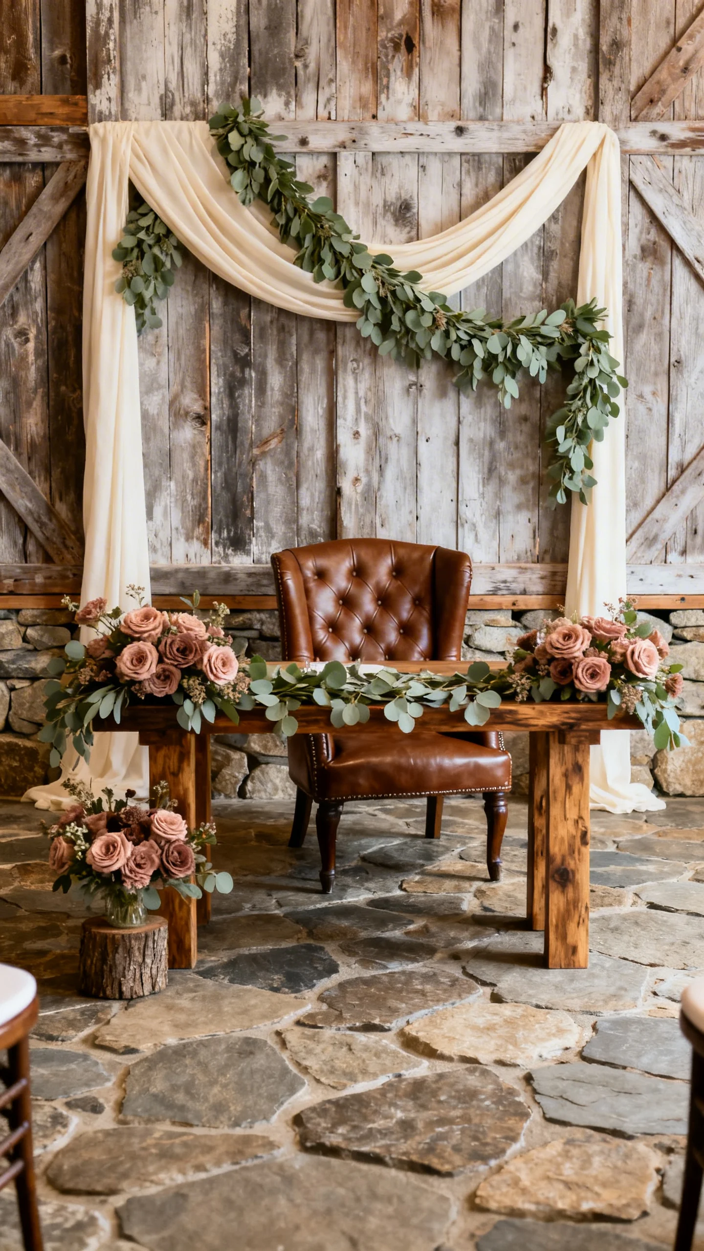
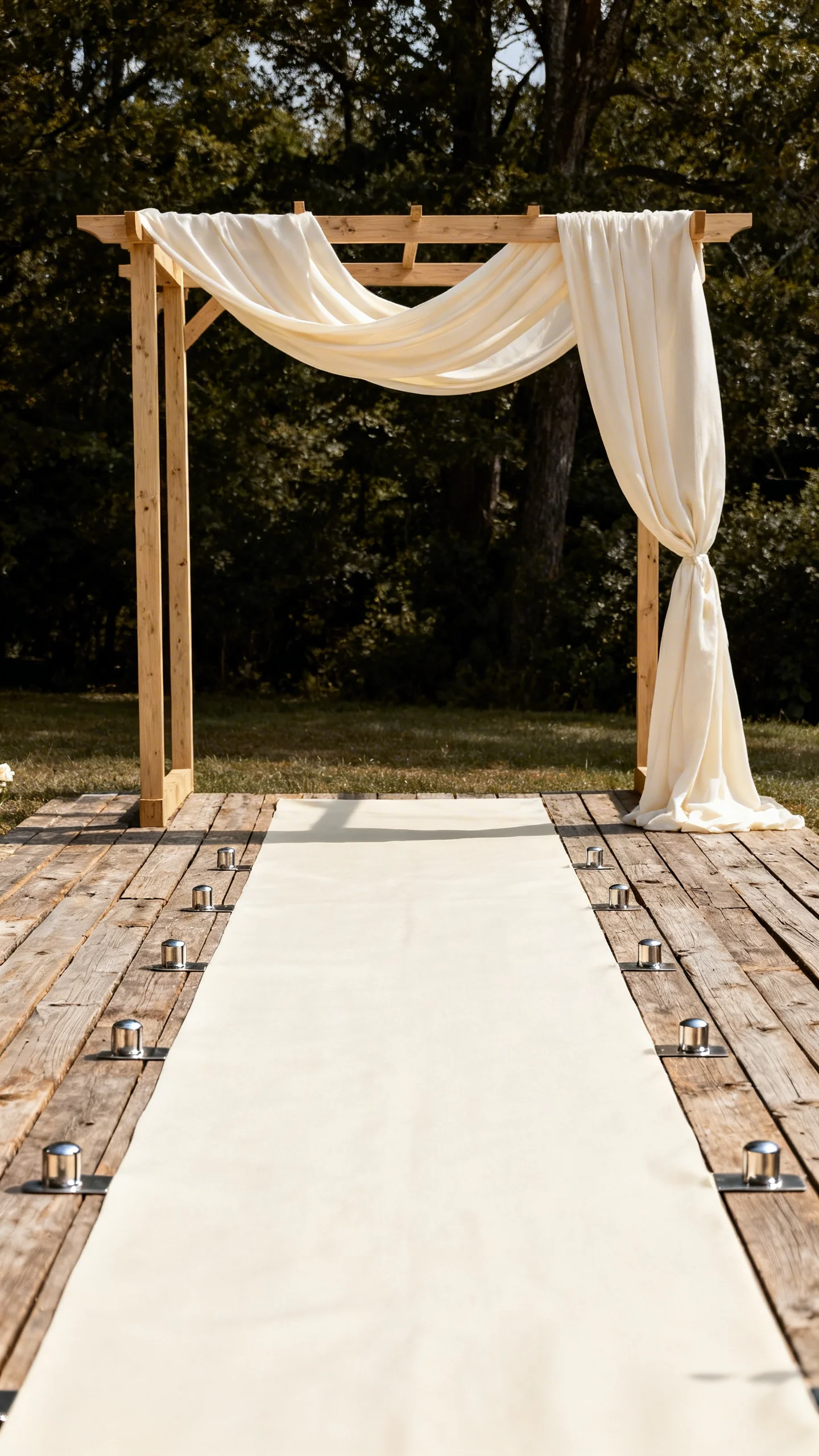
Choose cream for table linens and ceremony draping to soften rustic wood and stone. It creates a modern backdrop that feels intentional rather than stark. On stationery, swap bright white for warm cream stock to make your palette feel cohesive from the first impression. Cream also helps metallic accents (like gold or champagne) look more refined.
Sage greenery that looks curated, not chaotic
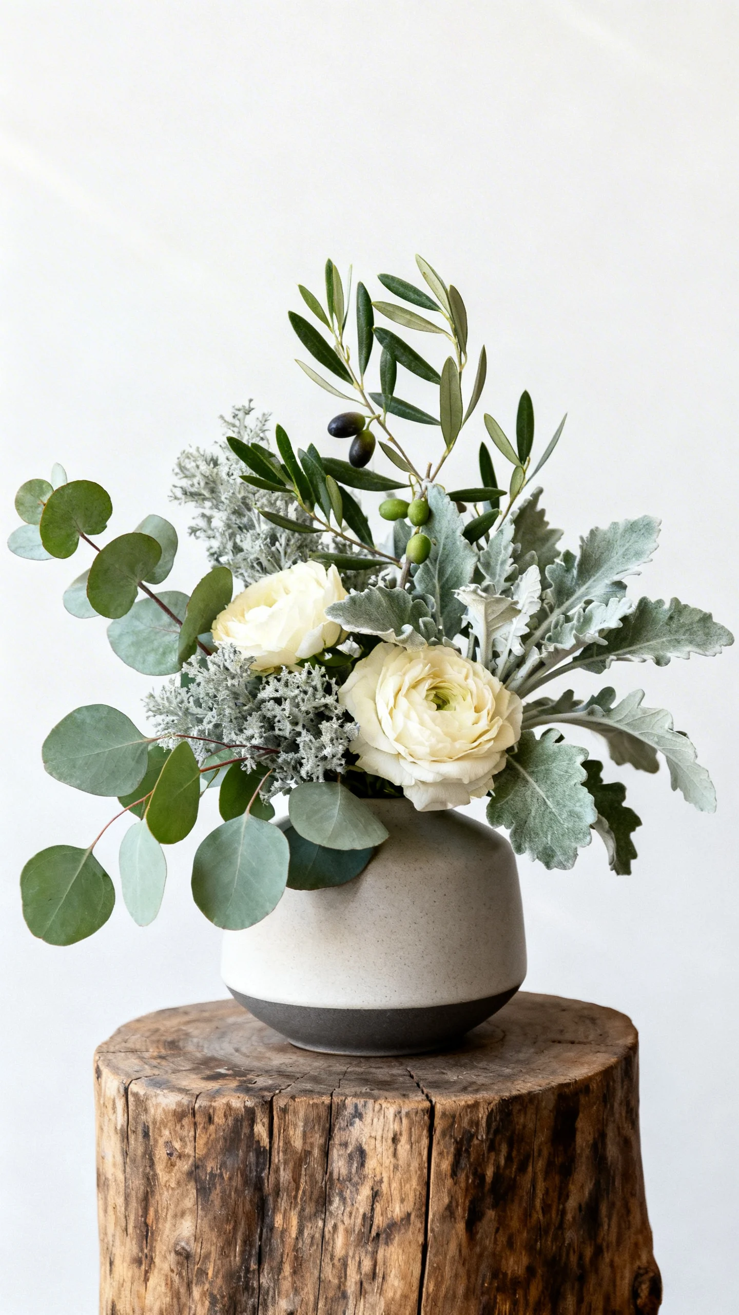
Use sage as your dominant green in florals so arrangements feel calm and designed. Think eucalyptus, olive, dusty miller, or sage-toned foliage instead of high-contrast, bright leaves. This keeps rustic elements like burlap, rattan, or raw wood from reading too “crafty.” Bonus: sage plays beautifully with both candlelight and daylight.
Dusty rose florals for romance without the bubblegum vibe
Dusty rose works best when you mix it with cream blooms and a touch of mocha-toned accents. Consider roses, spray roses, ranunculus, or dahlias in muted blush tones to keep things modern. If you want extra depth, add a few blooms in mauve or terracotta-rose for a natural gradient. This shade also flatters a wide range of skin tones in photos.
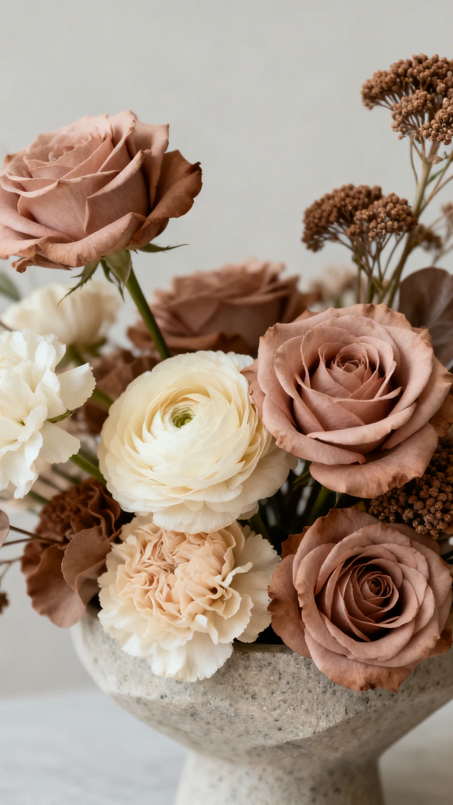
Mocha details that add depth and make everything look expensive
Mocha is your secret weapon for contrast, especially if your venue has lots of light wood or greenery. Bring it in through leather, velvet ribbons, bridesmaid dresses, or wood-toned signage. It grounds the sweetness of dusty rose and keeps cream from feeling too bridal-basic. Even small touches—like mocha napkins or place cards—can sharpen the whole design.
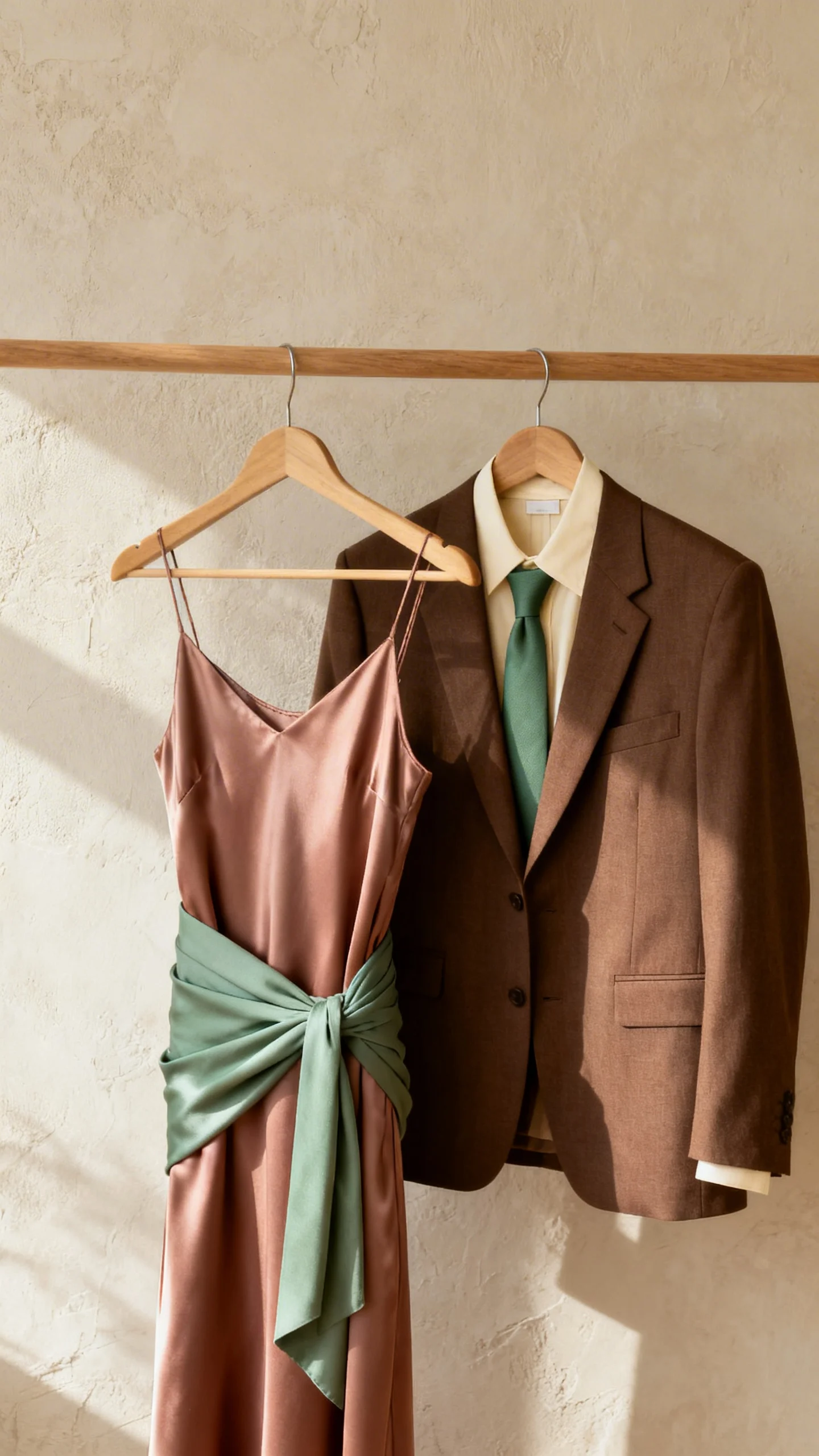
Bridesmaid and groomsmen looks that feel effortless
For bridesmaids, mocha and dusty rose dresses look stunning together, especially in mixed fabrics like satin and chiffon. Sage can show up in one dress shade, wraps, or bouquets for a softer mix-and-match lineup. For groomsmen, mocha suits or tan suits with sage ties feel on-theme without looking themed. Cream shirts and warm boutonnieres keep the palette cohesive.
Florals + texture: the modern rustic recipe
Focus on fewer, larger statement arrangements rather than many small ones. Pair cream blooms with sage foliage, then sprinkle in dusty rose highlights and mocha elements like dried pods or subtle branches. Keep shapes a little airy and asymmetrical for a current feel. Finish with clean ribbon tails in mocha or dusty rose for movement in photos.
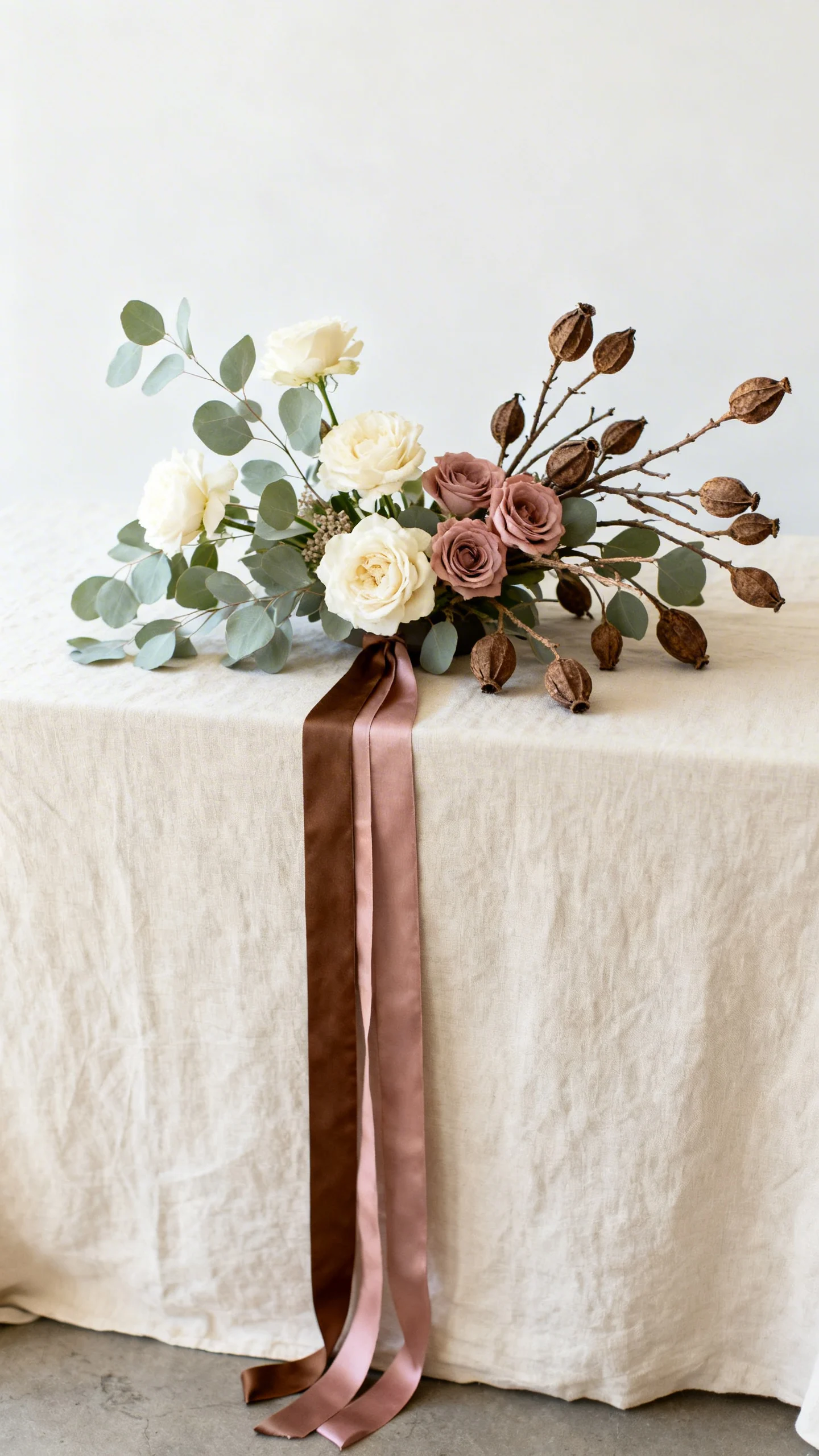
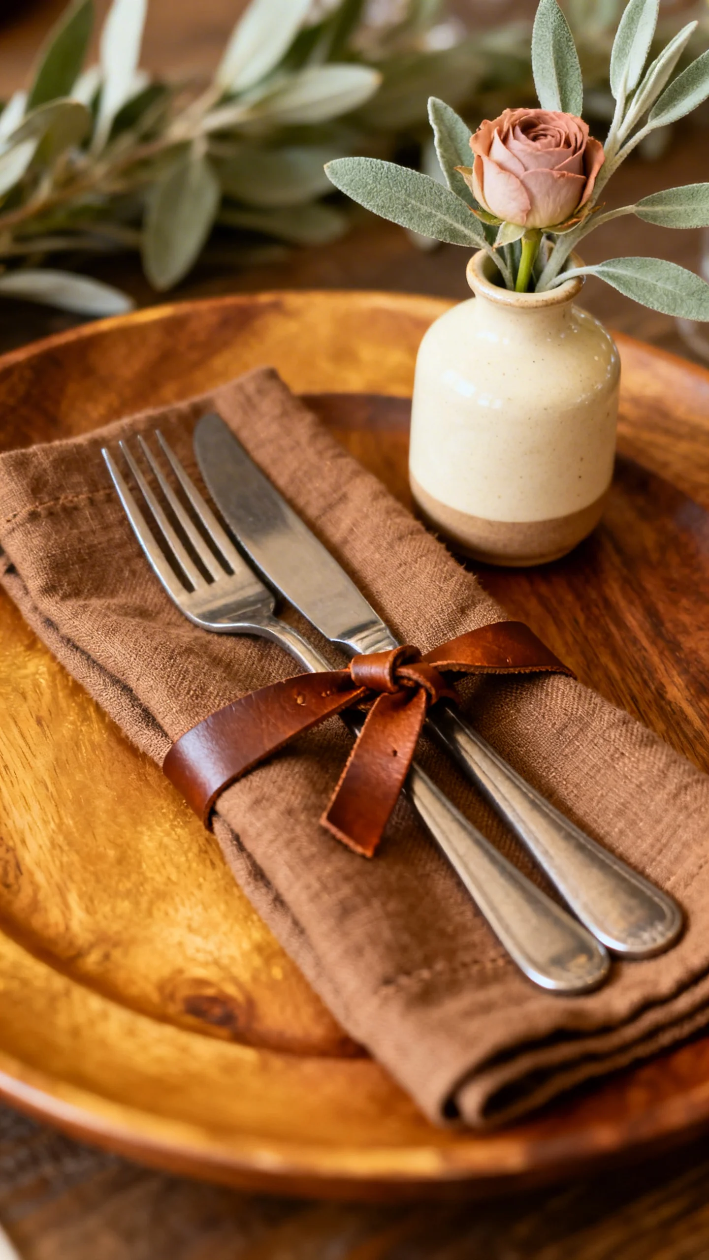
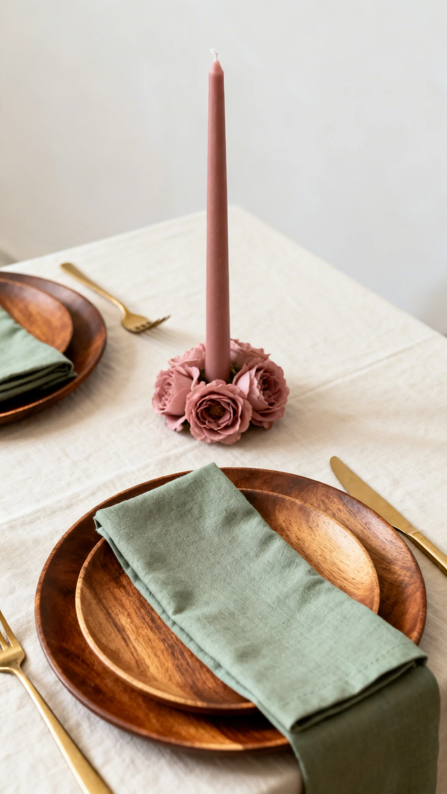
Table styling: layered neutrals with one intentional pop
Start with cream linens, then layer in mocha chargers or wood plates for warmth. Add sage through menus, napkins, or greenery runners, and let dusty rose appear in florals or a single tabletop element like taper candles. This “neutral base + gentle accent” approach keeps rustic venues from looking busy. Choose one metal finish—brushed gold or warm pewter—to keep it modern.
Invitations and signage: modern type meets organic color
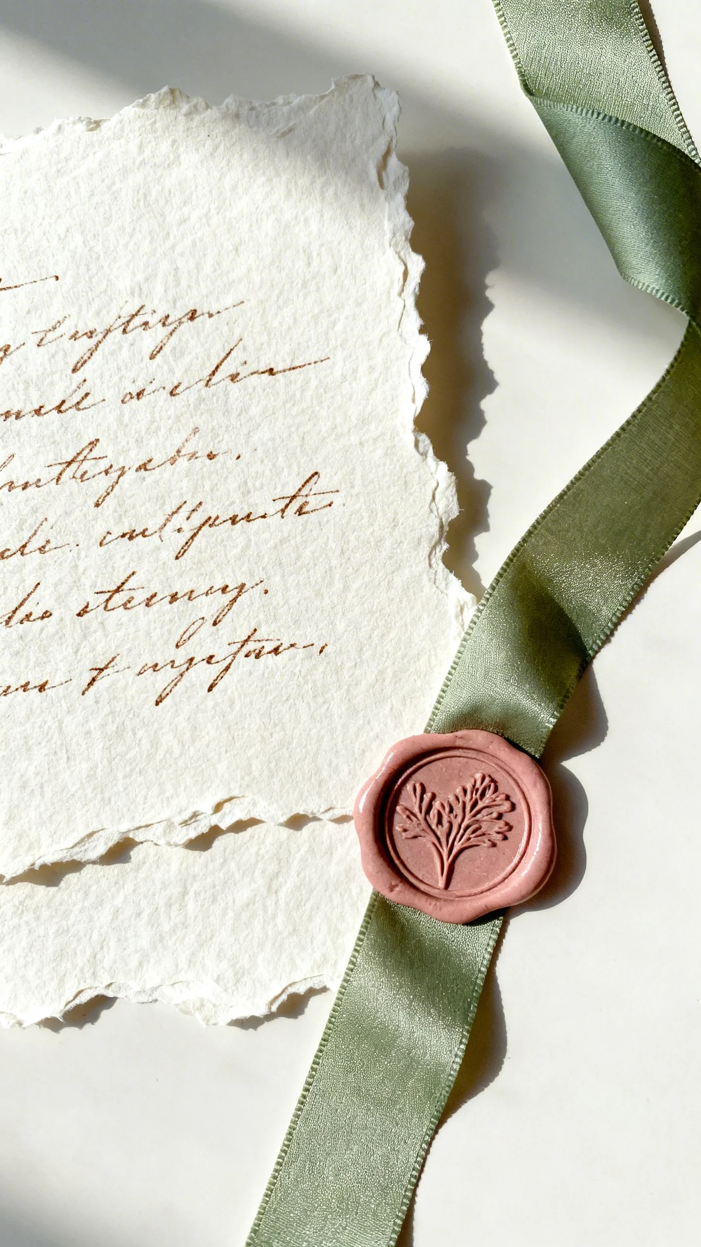
Pick clean typography and plenty of white space, then bring the palette in through paper tone and subtle ink choices. Cream stock with mocha ink feels timeless, while sage or dusty rose details (like a crest, monogram, or border) add personality. For signage, matte finishes look more current than high-gloss. If you love texture, try deckled edges or handmade paper in cream with mocha calligraphy.
Lighting and candle choices that flatter the palette
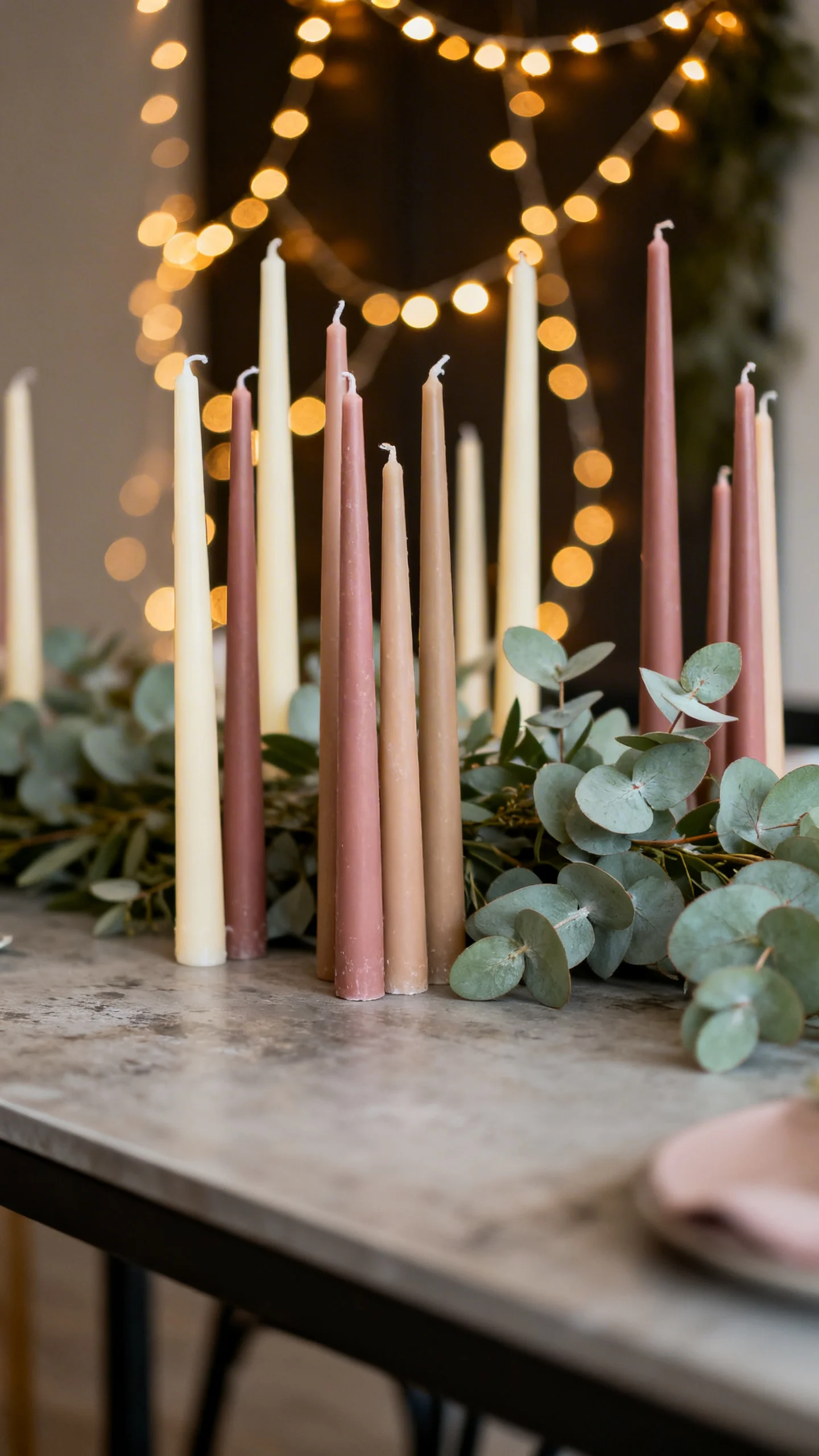
Warm light is your best friend with cream and mocha—avoid cool white bulbs that can make everything look gray. Use taper candles in cream, dusty rose, or even soft mocha to tie into the palette without adding clutter. Sage looks especially pretty under warm string lights, giving greenery a velvety tone. Cluster candles at varying heights for a modern, editorial look.
Finishing touches: desserts, favors, and photo moments
A cream wedding cake with dusty rose florals and a mocha ribbon detail looks rustic-modern immediately. For favors, think mocha-toned packaging, sage satin bows, or cream tags with minimalist printing. Create one photo moment that repeats the palette—like a cream backdrop with sage foliage and dusty rose blooms—so your Pinterest-worthy shots feel intentional. Keep it simple, and let texture do the talking.
FAQ
Will cream look too close to white in photos?
Cream usually photographs beautifully as a soft neutral, especially next to mocha and sage. To make it read intentionally, pair it with warm metals, wood, or mocha accents so it doesn’t blend into traditional white bridal elements. Ask your photographer to keep whites from blowing out by exposing for the dress and letting cream stay warm.
How do I keep dusty rose from feeling too “pink”?
Use dusty rose as an accent rather than the dominant color, and balance it with mocha and cream. Choose muted, slightly mauve-leaning tones over bright blush. Incorporating dusty rose through florals and small details (instead of large linens) keeps it modern.
What venues work best for cream, sage, dusty rose, and mocha?
This palette shines in barns with clean lines, vineyards, garden venues, mountain lodges, and modern farmhouses. It also works indoors when you add warm lighting and textured elements like linen, wood, and ceramics. The key is keeping decor edited so the colors feel intentional.
Can I add a metallic accent, and which one looks best?
Yes—choose one warm metal and repeat it consistently. Brushed gold, champagne, or antique brass pair especially well with cream and mocha. If your venue already has a lot of warm wood, keep metal accents subtle so the look stays modern.
What’s the easiest way to tie the palette together on a budget?
Start with cream basics (linens or paper), then add sage through greenery, which is often cost-effective and impactful. Use dusty rose in a few strategic floral moments and bring mocha in through rentals or attire where it reads clearly. Repeating the same four colors in a few places—stationery, table details, and bouquets—creates a cohesive look without overdecorating.