
Picking your wedding colors can feel like a tiny detail… until you realize it touches literally everything: flowers, invites, bridesmaid dresses, tablescapes, photos, and the overall mood. If you want your palette to feel Christian and faith-inspired without looking themed, the trick is choosing colors with meaning and then styling them in a modern, elevated way.
Below are five Christian wedding color palettes that photograph beautifully, feel intentional, and can be woven into your ceremony details (think: programs, signage, altar florals) in a way that feels natural and you.
Top 5
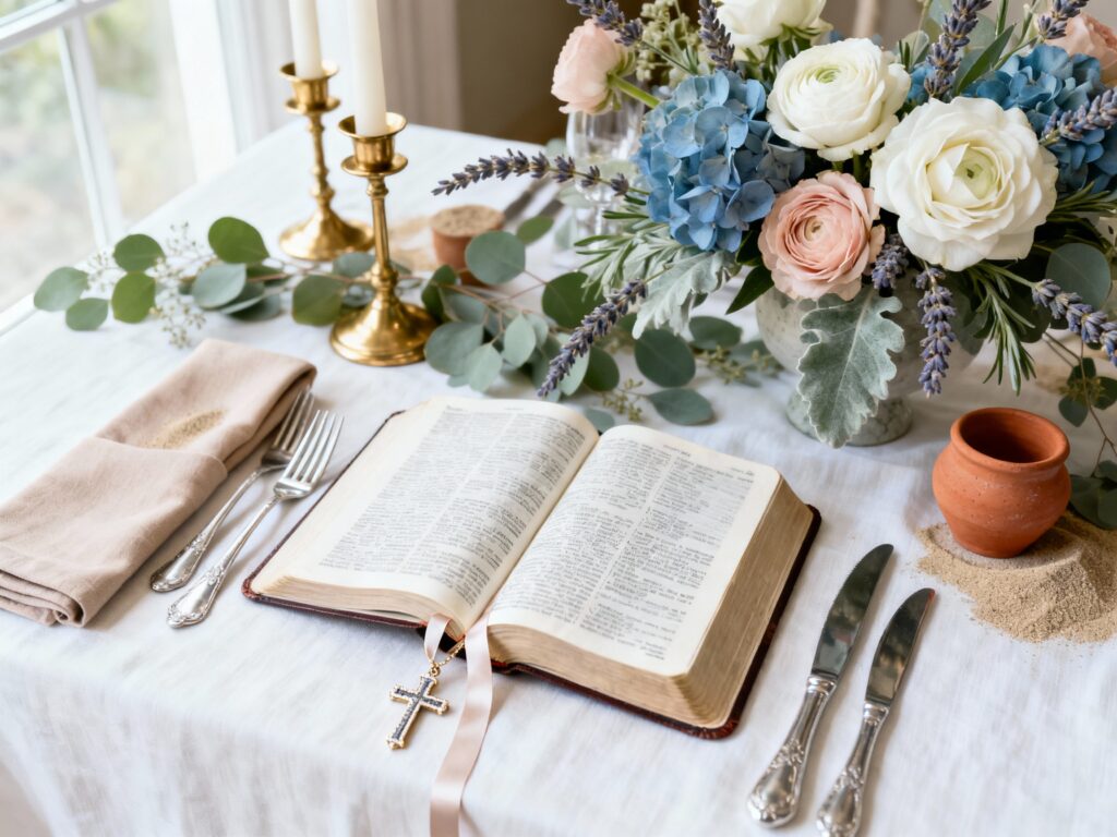
1) Ivory + Gold + Olive (Covenant Classics)
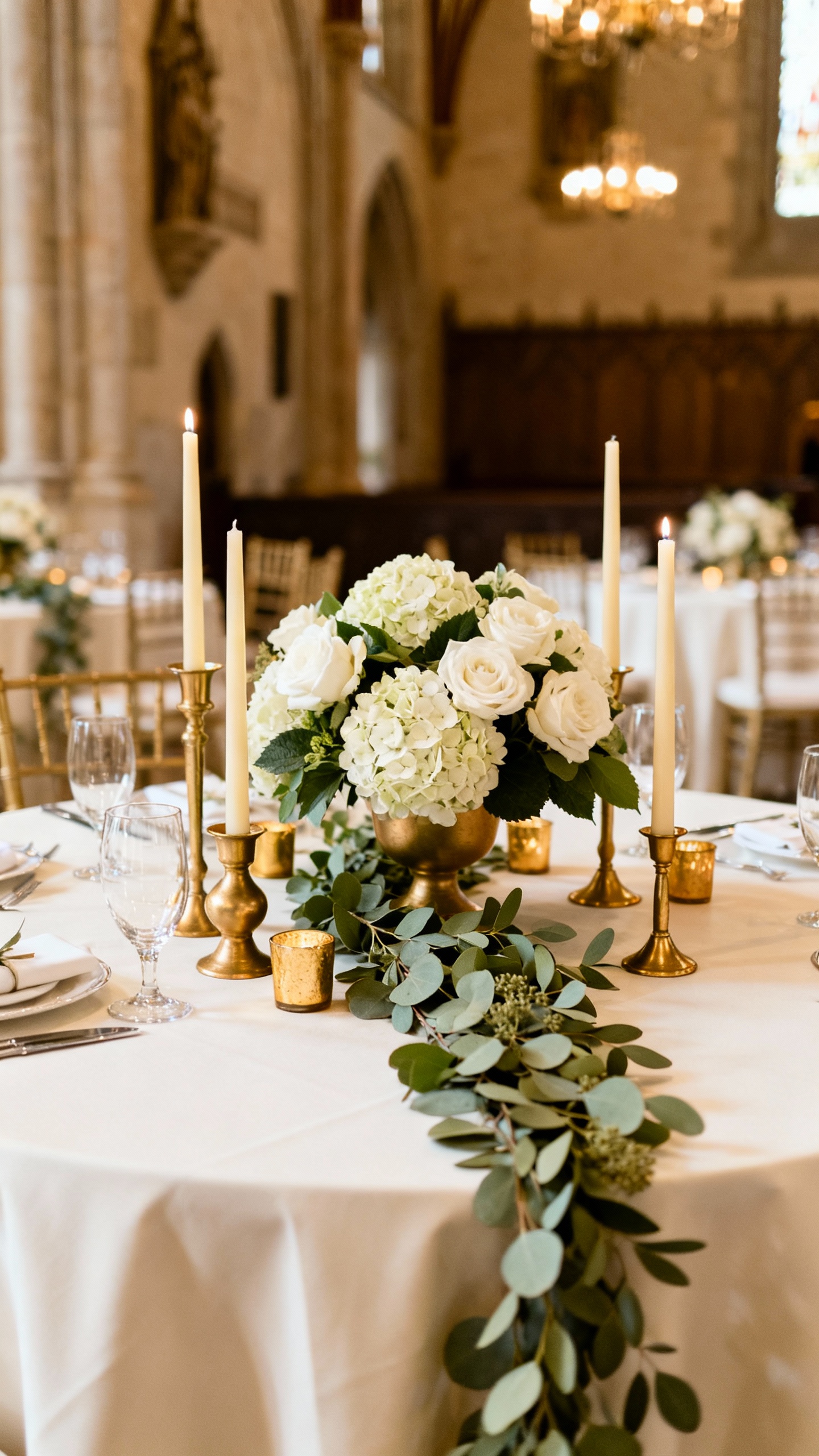
Ivory and gold instantly read “sacred” and timeless, while olive adds an earthy, living touch that feels rooted. Use ivory for linens and stationery, gold for candleholders and invitation foil, and olive in greenery-heavy bouquets and aisle markers. This palette is stunning in churches with warm wood tones and looks especially pretty in candlelight.
2) Dusty Blue + White + Silver (Peaceful & Traditional)
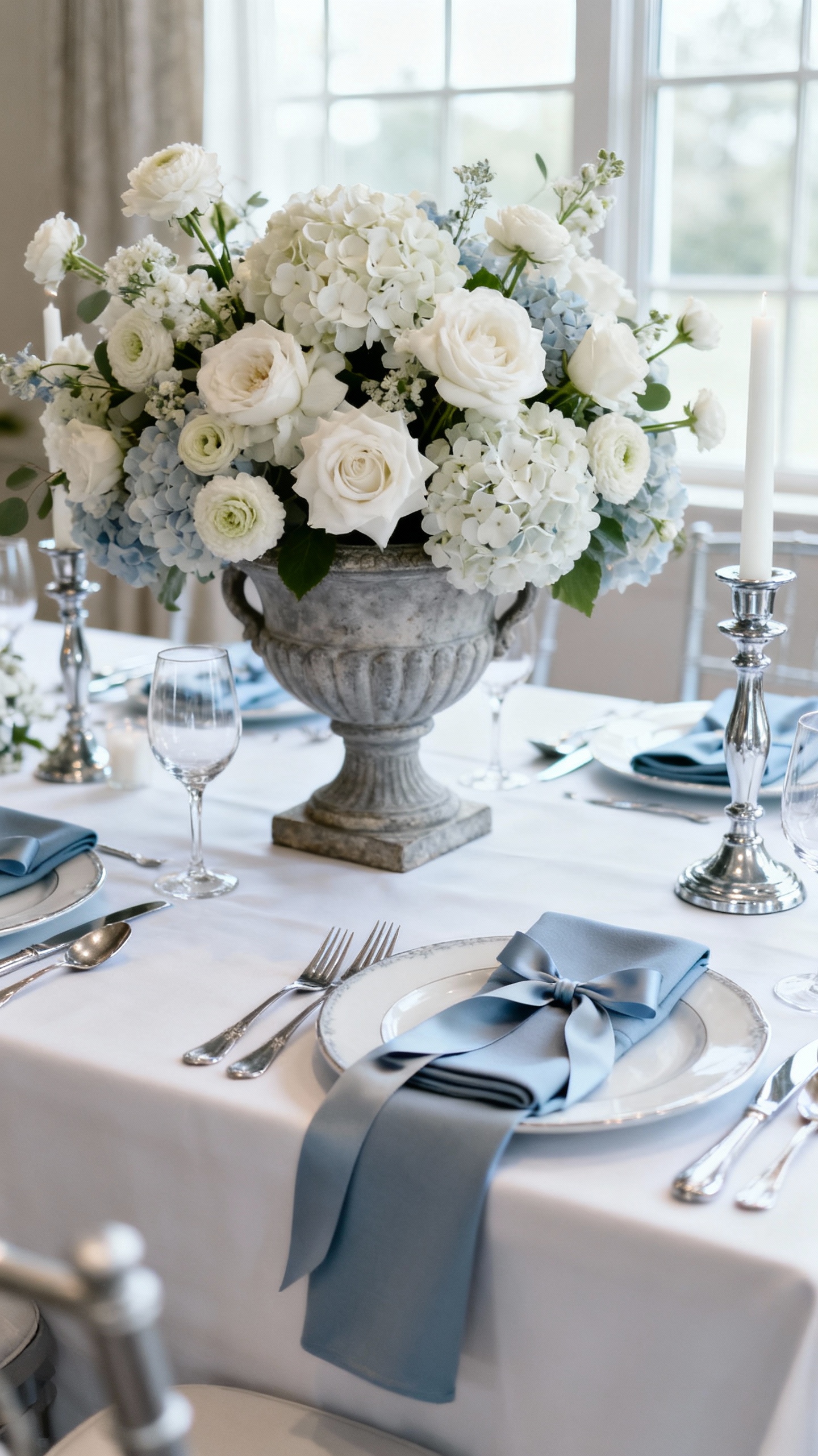
Dusty blue is soft, calming, and quietly elegant—perfect if you want a peaceful, reverent vibe. Keep the base crisp with white florals (roses, ranunculus, hydrangea), then add silver through cutlery, frames, or subtle beading on dresses. Bonus: dusty blue flatters most bridesmaids and looks dreamy against stone chapels and outdoor greenery.
3) Blush + Burgundy + Cream (Love & Sacrifice Romance)
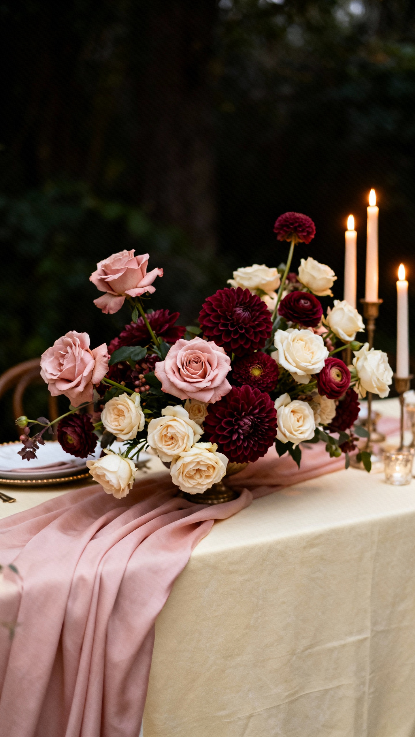
This palette balances gentle romance (blush + cream) with depth (burgundy) so it feels meaningful instead of overly sweet. Try blush bridesmaid dresses, cream table linens, and burgundy in your florals, napkins, or velvet ribbon for bouquets and invitations. It’s a gorgeous choice for fall weddings, but it also works year-round if you keep the burgundy to accents.
4) Sage + Lavender + Pearl (Graceful Garden Worship)
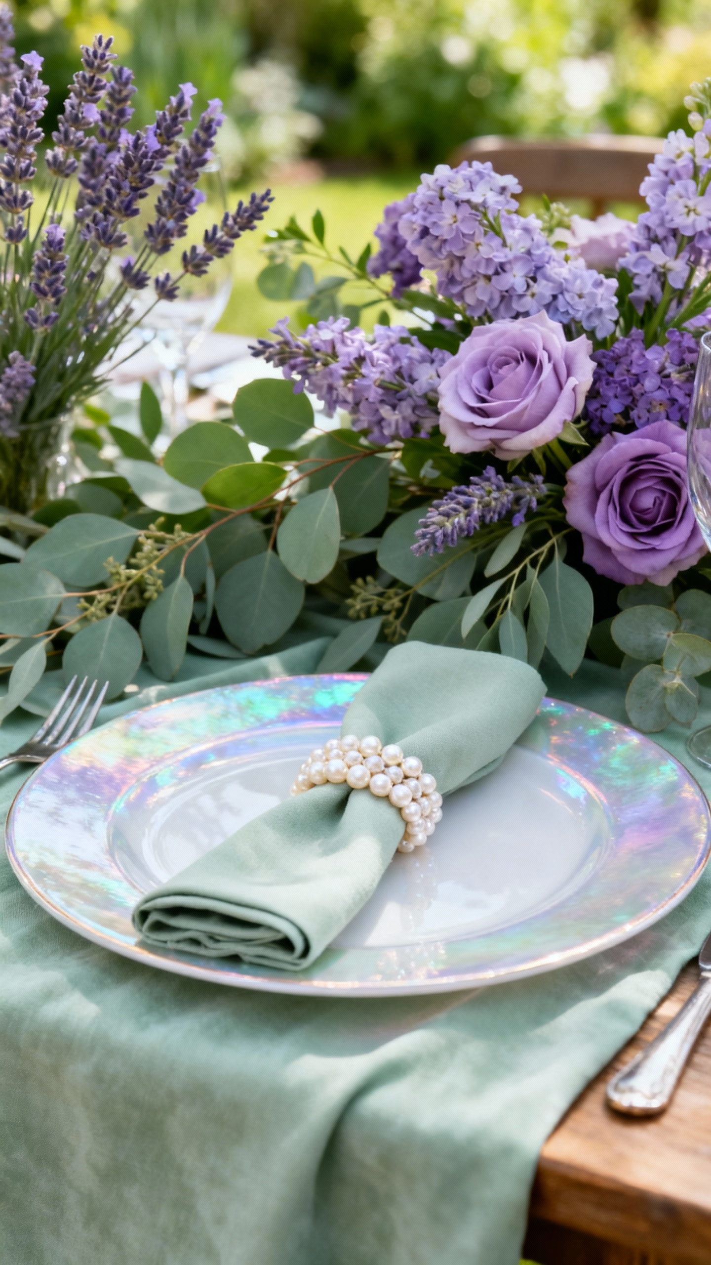
Sage and lavender feel like a soft “garden hymn”—fresh, delicate, and unmistakably wedding. Use sage as the grounding neutral (table runners, greenery, bridesmaid dresses) and lavender for floral pops and signage details, then finish with pearl accents in candles, chargers, or hair accessories. This palette is especially Pinterest-friendly for outdoor ceremonies, spring weddings, or airy chapel receptions.
5) Terracotta + Sand + White (Desert Faith, Modern Minimal)
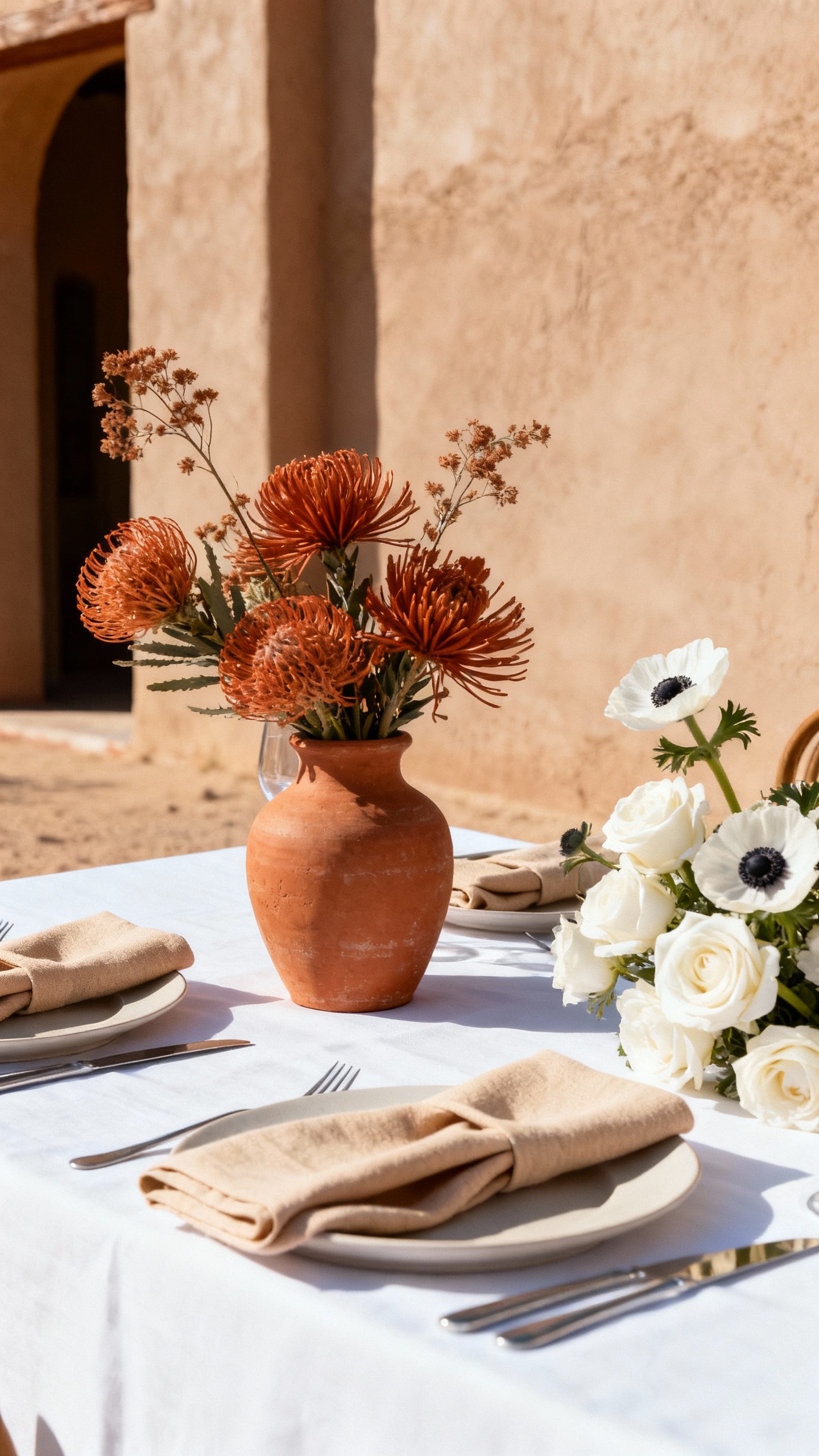
Inspired by desert landscapes and timeless Scripture imagery, terracotta feels warm, modern, and a little unexpected in the best way. Pair it with sand tones for suits, stationery, or linens, then keep flowers bright with clean whites to avoid an overly muted look. Add texture—ceramic bud vases, dried palms, woven chargers—and your photos will look editorial but still wedding-soft.
FAQ
How do I make a Christian wedding color palette feel faith-inspired without looking “theme-y”?
Use symbolism subtly: choose one meaningful color (like gold for glory, white for purity, blue for peace) and weave it into a few key moments—ceremony florals, vow books, invitation details, and reception candles. Avoid adding too many literal motifs everywhere; let the palette and your words (program notes, Scripture reading cards) carry the meaning.
What’s the easiest way to keep my colors cohesive across ceremony and reception?
Pick a “base” (white/ivory/cream), a “main” color (like dusty blue or sage), and one accent (gold, burgundy, lavender). Repeat those three consistently in your biggest visual areas: bridesmaids, flowers, and tables. Even if you change textures or shades slightly, repetition is what makes it feel intentional.
Which palettes work best for a traditional church wedding?
Ivory + gold + olive and dusty blue + white + silver are the most classic and naturally complement stained glass, wood pews, and formal architecture. They also photograph beautifully indoors where lighting can be warmer and slightly dimmer. If your church is very ornate, keep florals cleaner and let the building shine.
How do I choose bridesmaid dresses that match the palette but still feel modern?
Choose one dress color from your palette and let flowers and accessories do the rest. Matte fabrics (chiffon, crepe) in sage, dusty blue, or blush look current and timeless in photos. If you want extra dimension, mix tones within the same family (like light-to-medium dusty blue) rather than mixing totally different colors.
What flowers fit these faith-inspired palettes without being hard to find?
For year-round options, lean on roses, carnations, chrysanthemums, eucalyptus, and seasonal greenery—they come in most of these tones and are easier on the budget. Add a few “wow” blooms (like peonies when in season, garden roses, or ranunculus) for a luxury look. Your florist can also adjust shades with ribbon, candles, and linens if a specific flower color is limited.