
April weddings are that sweet spot: fresh blooms, glowy light, and weather that can go from sunny to softly moody in the same day. The right color palette makes all of that look intentional (and seriously beautiful) in photos.
Below are five April-ready palettes that photograph like a dream—plus simple ways to use each one across florals, attire, stationery, and reception details.
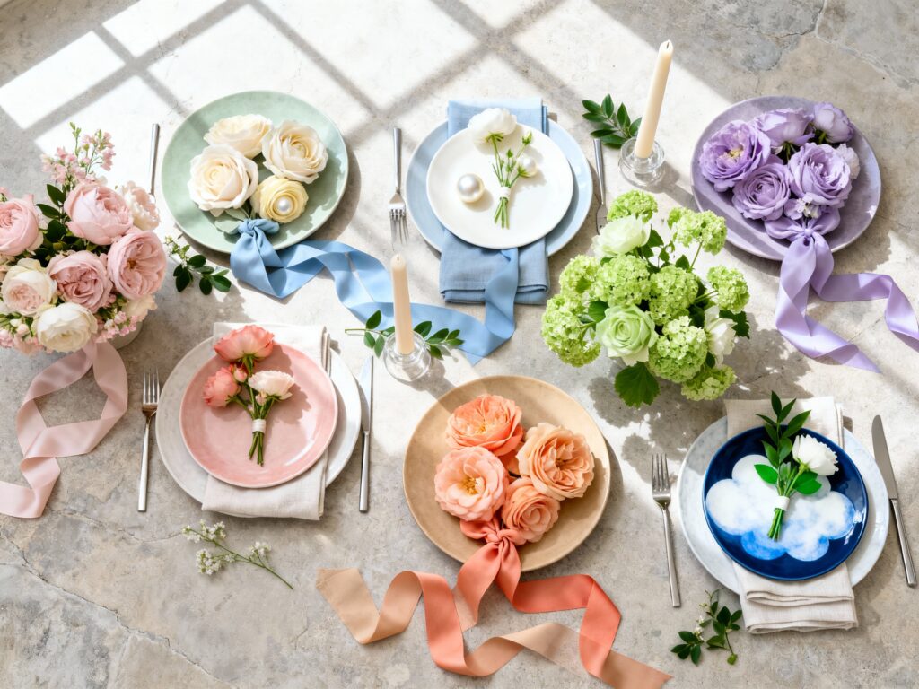
Top 5
1) Blush + Sage + Soft Ivory

This is the ultimate “effortlessly romantic” April palette, and it photographs beautifully in natural light. Blush warms up skin tones, sage plays nicely with spring greenery, and ivory keeps everything bright without looking stark. Try sage bridesmaid dresses with blush-and-ivory florals, and add gold accents for an elevated finish.
2) Dusty Blue + Buttercream + Pearl White

Dusty blue gives you that airy, editorial vibe, while buttercream adds a soft, sunny touch that feels very April. In photos, this palette looks clean and calm—especially with white florals and light linens. Use dusty blue in suits, ties, or invitations, then bring in buttercream through candles, ribbon, or petite accent blooms.
3) Lavender + Lilac + Fresh Green

Lavender tones are made for April: they feel seasonal without being too “theme-y,” and they pop against outdoor greenery. This palette looks amazing in golden hour portraits and garden venues because it reads soft, not neon. Keep it modern with crisp white table settings and let lilac show up in bridesmaid dresses, stationery, or statement florals.
4) Peach + Coral + Warm Sand

If you want your wedding photos to feel warm and glowy, peach and coral are your best friends. They bring life to overcast days and look incredible against neutral backdrops like stone, wood, or a classic ballroom. Balance the brightness with warm sand linens, neutral bridesmaid shoes, and lots of candlelight for that “soft-focus” reception look.
5) Navy + Cloud Blue + White (With a Touch of Green)

This palette is for couples who love timeless style but still want spring freshness. Navy anchors the look (and photographs so sharply), while cloud blue and white keep it light and airy for April. Add greenery—like olive, eucalyptus, or seasonal foliage—to prevent it from feeling too wintery, and consider navy details on signage or napkins for crisp contrast.
FAQ
What colors look best in wedding photos in April?
Soft pastels (blush, dusty blue, lavender), gentle neutrals (ivory, sand), and classic anchors (navy) tend to photograph best in April because they complement spring light and greenery. They also handle mixed weather well—sun, clouds, and shade—without looking harsh.
How do I pick a palette that won’t look washed out outdoors?
Choose at least one deeper “anchor” color (like navy, sage, or dusty blue) to create contrast, then build lighter shades around it. You can also add texture—like satin ribbon, layered linens, or matte ceramics—to help pale colors show up clearly in photos.
Can I mix pastels with a bold color and still keep it springy?
Yes—just keep the bold shade as an accent instead of the whole story. For example, navy with cloud blue and white reads fresh, and coral can work beautifully with warm sand and peach. The key is using the bold color in smaller areas like stationery, napkins, groom details, or signage.
What flowers match these April palettes?
Great April-friendly options include tulips, ranunculus, anemones, sweet peas, hyacinth, lilac (when available), and garden roses. For greenery, eucalyptus, olive, and seasonal foliage photograph well and help connect your palette to the setting.
How many colors should my wedding palette include?
Three to five is the sweet spot: one main color, one or two supporting colors, a neutral (like ivory or white), and optional metallic accents (gold or silver). This keeps your decor cohesive while still giving your florist and planner enough flexibility to make everything look natural and full.