
April weddings are that sweet spot where everything feels freshly alive, but you don’t have to lean on the usual pastel palette to prove it. You can absolutely get “spring” energy with crisp neutrals, juicy greens, and texture-forward details that look elevated in every photo.
Below are five April wedding details that read unmistakably seasonal—without turning your whole design into a pink-and-lavender situation.
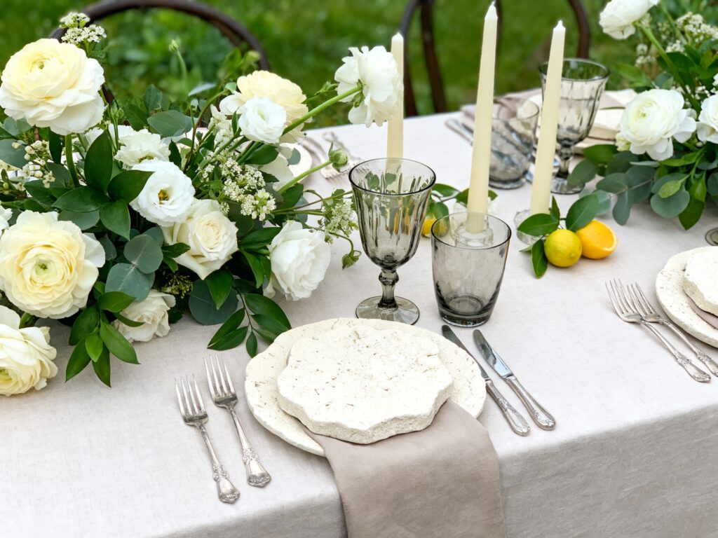
Top 5
1) Garden-Green Florals With White + Butter Accents

Go heavy on greens (think smilax, ruscus, fern, hellebore foliage) and keep blooms mostly white, ivory, or buttercream for a fresh April vibe that isn’t pastel-heavy. Ask your florist for movement: airy branches, budding stems, and a slightly wild shape. It photographs modern, feels seasonal, and still works with black-tie or backyard settings.
2) Citrus + Herb Styling on Bar and Tables

Lemons, kumquats, and oranges instantly scream “spring hosting,” especially paired with herbs like rosemary, mint, or thyme. Use them as bar garnish, escort display styling, or tucked into centerpiece bases for color that’s bright but not pastel. Bonus: it’s budget-friendly and smells amazing in a subtle, grown-up way.
3) Clear + Smoke Glass for a Dewy, April Light Effect

Swap colored goblets for clear, smoke, or soft amber glassware to capture that glowy April daylight without leaning candy-colored. Mix heights with cylinder vases, bud vases, and tapered candleholders for dimension. This detail feels fresh and “new season” on camera—especially during golden hour—while keeping your palette chic and neutral.
4) Textured Linens in Cream, Stone, or Soft Taupe (Not Pink)

Texture is the easiest way to make neutrals feel like spring: think crinkle gauze runners, matte satin napkins, or linen tablecloths with a relaxed weave. Cream, stone, and soft taupe still feel light for April, but they read more editorial than pastel. Add a gentle contrast with espresso or black stationery for a modern finish.
5) Seasonal “April” Moments: Rain Plan Chic + Petal Toss Alternative

April is famous for surprise weather, so make your rain plan part of the aesthetic: clear umbrellas, a covered ceremony spot with greenery, and a cozy welcome sign that feels intentional. For a spring send-off without pastel petals, try dried olive leaves, fresh green foliage confetti, or biodegradable paper in white and kraft tones. It still feels celebratory, it won’t stain outfits, and it looks clean in photos.
FAQ
How do I make an April wedding feel like spring without using pastel colors?
Lean into “spring” through ingredients and texture: lots of greens, budding branches, citrus, herbs, and airy arrangements. Keep your base palette neutral (ivory, stone, white, black) and add pops through natural elements rather than dyed decor. The season will show up in the details and the light, not just the color wheel.
What are the best non-pastel color palettes for an April wedding?
Try white + garden green + black accents for a modern look, or ivory + taupe + espresso for something warm and elevated. Butter yellow as a small accent also reads spring without going full pastel. If you want color, go for saturated touches like marigold, terracotta, or deep olive instead of blush and lilac.
Which flowers look in-season for April but don’t feel “Easter pastel”?
Ask for white tulips, ranunculus in cream, anemones (white with dark centers), hellebores in moody neutrals, and flowering branches. Pair them with abundant greenery to keep the vibe fresh and natural. Your florist can also focus on shape and movement so it feels springy without relying on pink blooms.
How can I keep my April wedding decor from looking too “winter” if I’m using neutrals?
Use lighter textures and airy styling: clear glass, soft candlelight, and linens with movement instead of heavy velvet or dark wood everywhere. Add life with herbs, citrus, and bud vases scattered along the table. Neutrals feel spring-ready when they’re bright, layered, and a little organic.
What’s the easiest spring detail that shows up well in photos?
Citrus and herbs are the quickest visual upgrade because they read fresh instantly and photograph beautifully on bars and tables. Close second: lots of greenery with white blooms, especially in bud vases and loose arrangements. Both look intentional, seasonal, and high-end without needing a big color shift.