
Blue table settings are having a moment, and honestly? They’re the easiest way to make your reception feel elevated without going overboard. The trick is picking one blue “story” (soft and romantic, bold and modern, coastal and airy) and then pairing linens, glass, and candles that support it.
Below are five Pinterest-friendly combos you can mix and match based on your venue, budget, and season.
Top 5
1) Dusty Blue Linen + Clear Ribbed Glass + Champagne Tapers
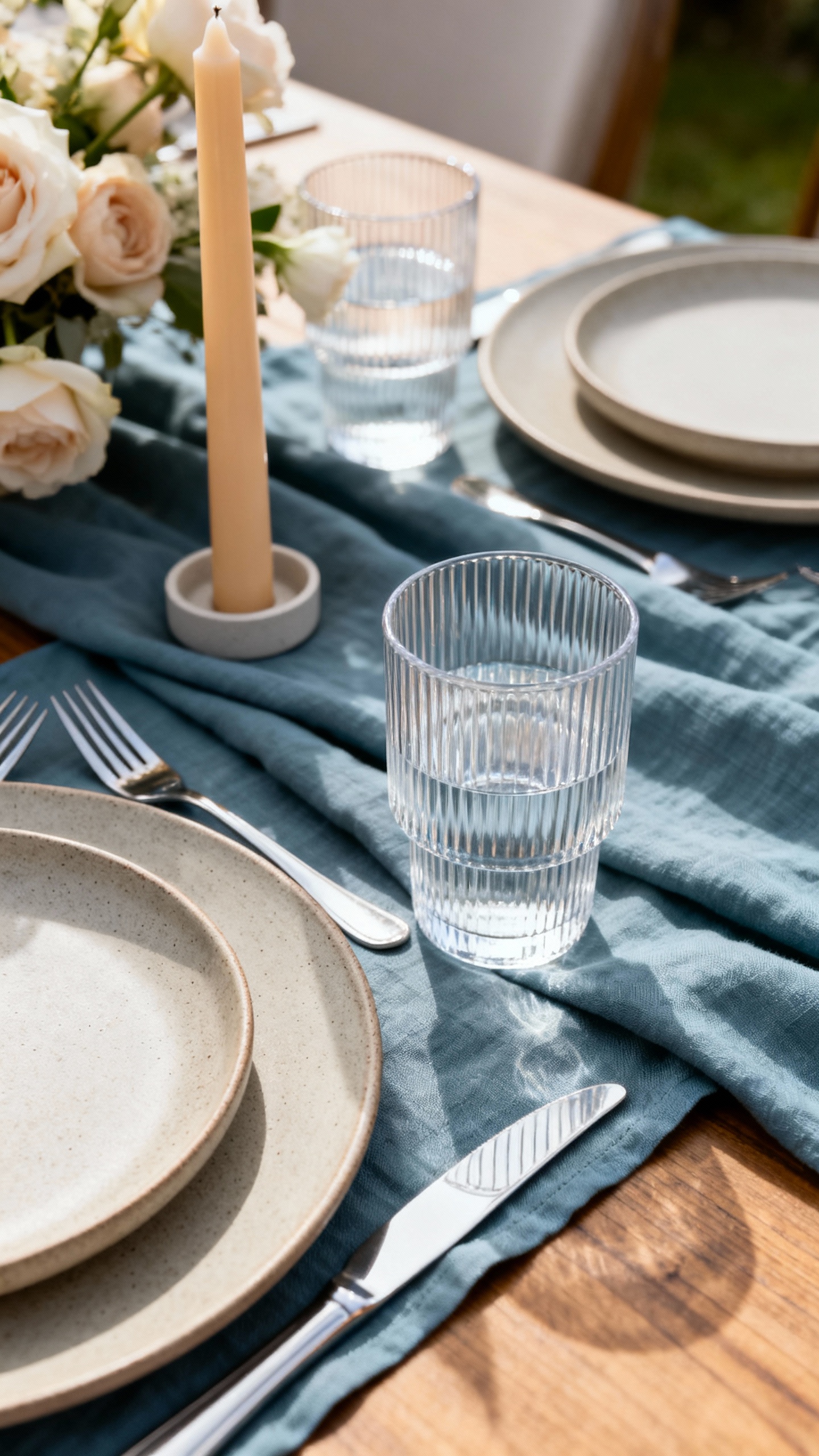
Start with dusty blue napkins or a table runner for that soft, timeless base. Pair it with clear ribbed water goblets to add texture without competing with the color. Finish with champagne tapers in slim holders so the light feels warm (not yellow) and photographs beautifully. This combo is perfect for garden, vineyard, or classic ballroom weddings.
2) Navy Velvet Runner + Smoke Glass + Matte Black Candles
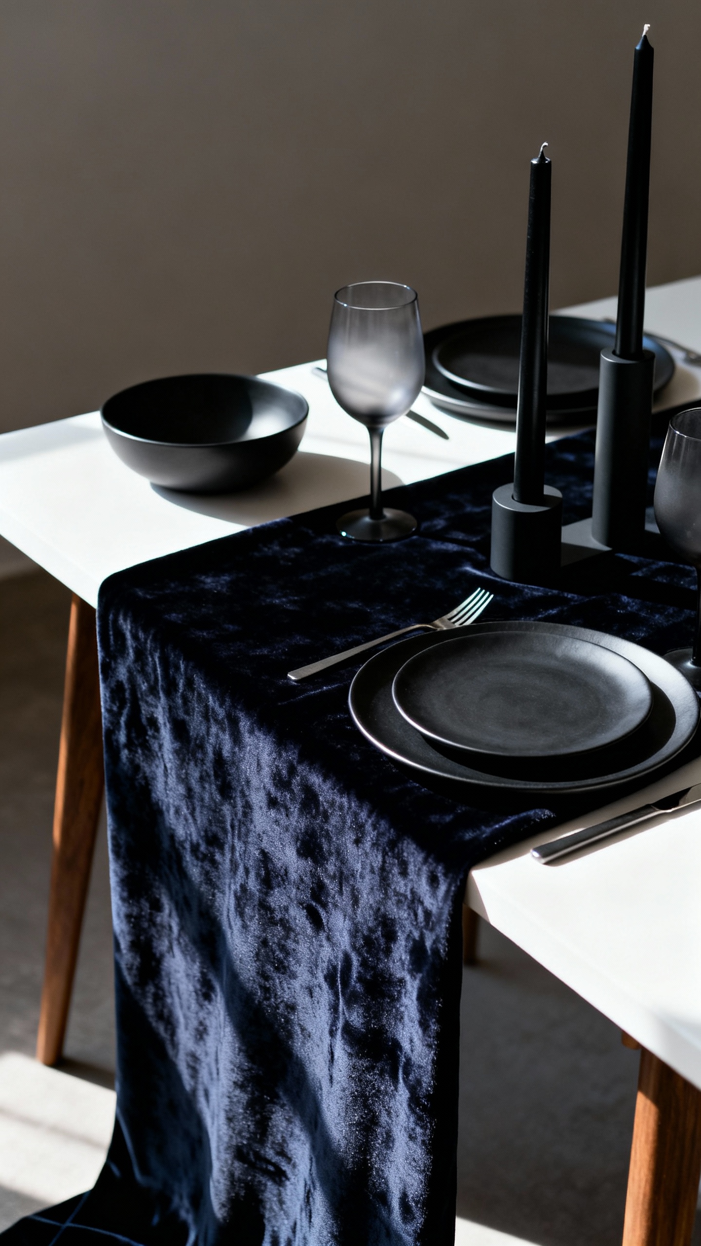
If you want moody-but-modern, go navy on the table with a velvet runner (instant depth and luxe). Add smoke gray wine glasses to keep the palette sleek and a little editorial. Matte black tapers make the whole table feel intentional and high-contrast, especially against white plates. Keep florals simple—think white blooms and greenery—so the table doesn’t get visually heavy.
3) Blue Toile or Floral Linen + Vintage Cut Crystal + Ivory Drip Candles

Blue patterned linens (toile, floral, or block print) give you that romantic “European summer” vibe in one move. Vintage cut crystal glassware adds sparkle and keeps the look heirloom-y rather than themed. Use ivory drip candles for a soft, lived-in glow that feels like a dinner party, not a production. Tip: let the linen be the star and stick to neutral place settings to avoid pattern overload.
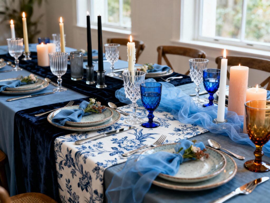
4) Sky Blue Gauze Napkins + Cobalt Water Goblets + White Tapers
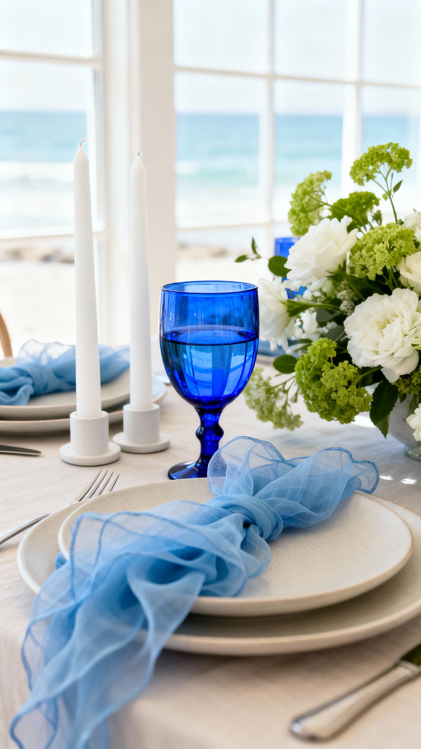
This is the happiest, most photo-friendly blue combo—light linens with a pop of bold glass. Sky blue gauze napkins feel airy and romantic, especially with loose, natural folds (no stiff “hotel” napkin shapes). Cobalt goblets bring the statement color without needing a ton of extra decor. Anchor it all with clean white tapers so the table stays bright and fresh, ideal for coastal or summer weddings.
5) Slate Blue Tablecloth + Amber Glass + Soft Peach Candles

Slate blue reads sophisticated and slightly earthy, making it a great choice for fall, winter, or art-gallery venues. Amber glassware warms up the blue instantly and looks gorgeous in candlelight. Add soft peach or blush tapers for a modern, flattering contrast that still feels wedding-appropriate. This combo is also amazing for photos because it balances cool and warm tones on the table.
FAQ
How do I choose the right “blue” for my wedding tables?
Match your blue to the vibe and lighting of your venue: dusty/sky blues feel airy and romantic, while navy/slate feels formal and dramatic. If your space has warm wood or golden light, deeper blues look especially rich. If your space is bright and white, lighter blues keep everything fresh and clean.
Can I mix multiple blue shades in one table setting?
Yes—just keep one shade dominant and use the others as accents. For example, a dusty blue napkin with a cobalt goblet works because the linen is soft and the glass is the pop. Try to limit it to 2–3 blues total so the table doesn’t start looking like a color sample wall.
What candle colors look best with blue tablescapes?
Champagne, ivory, and white are the safest and most timeless options. Black candles feel modern and dramatic with navy. Peach/blush candles are a great way to soften slate or deeper blues and create a flattering, romantic glow.
Do blue glass goblets photograph well?
They do, especially cobalt and smoky tones—both show up clearly and add instant dimension in photos. Just make sure your plates and linens aren’t competing with the glass color. If you’re using colored glass, keep other reflective elements (like chargers) more minimal so the table doesn’t look too busy.
How can I keep a blue table setting from feeling “nautical”?
Avoid obvious themed cues like anchors, rope details, and stark navy-and-white stripes. Instead, use blue as a fashion color: pair it with champagne, ivory, black, blush, or amber. Texture (velvet runners, gauze napkins, ribbed glass) also helps the look feel elevated rather than themed.