
Digital save the dates can look insanely luxe without the luxe price tag. The secret is choosing one elevated “design language” (type + color + texture) and letting it carry the whole vibe.
Below are five ideas that photograph beautifully for Pinterest, feel intentional, and won’t make your budget cry.
Top 5
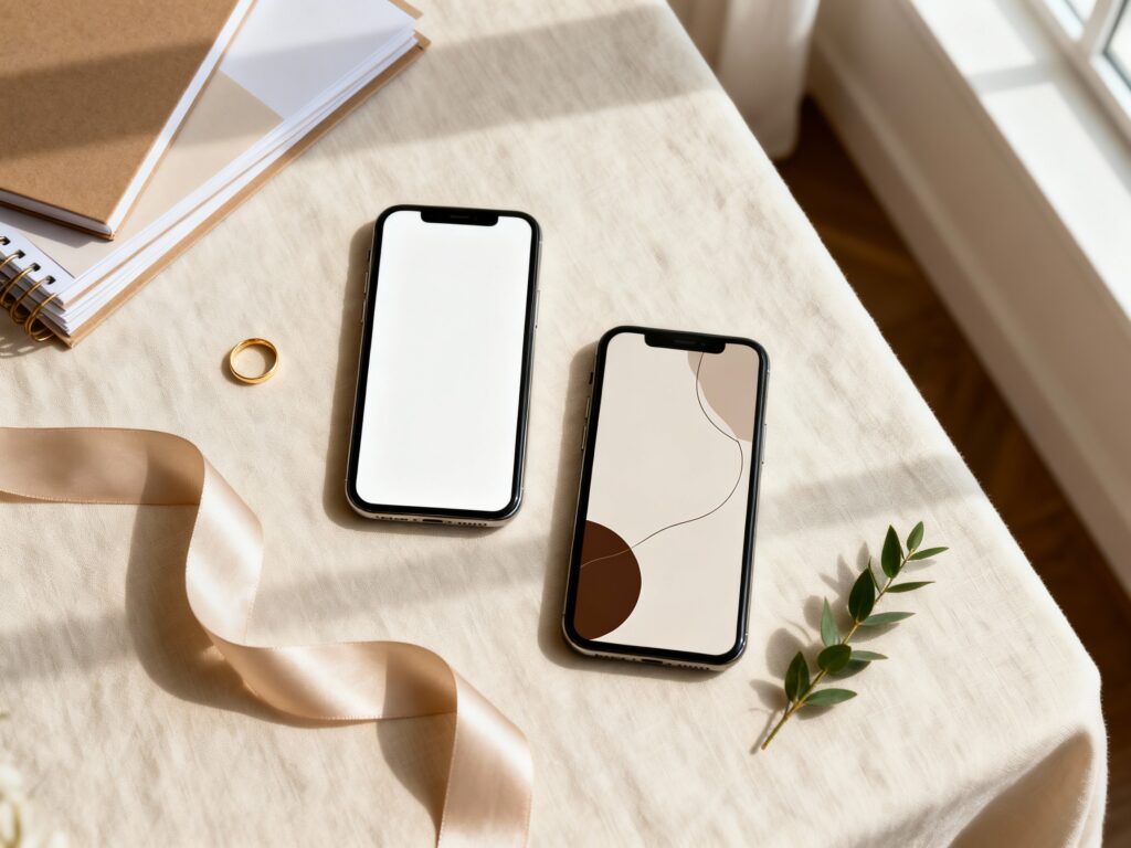
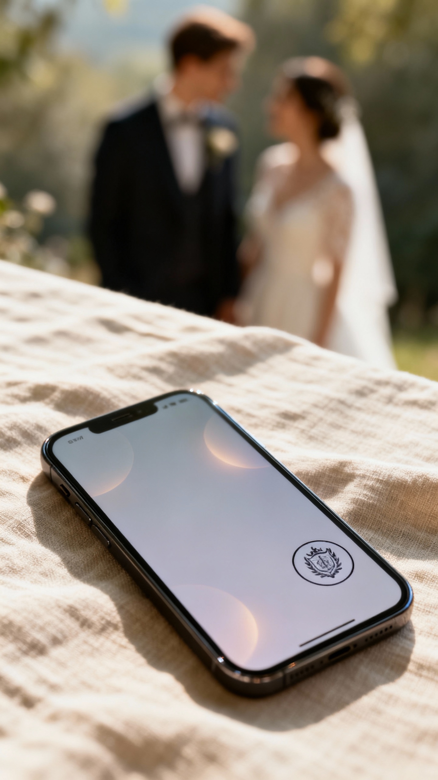
1) Minimal Monogram + Editorial Typography
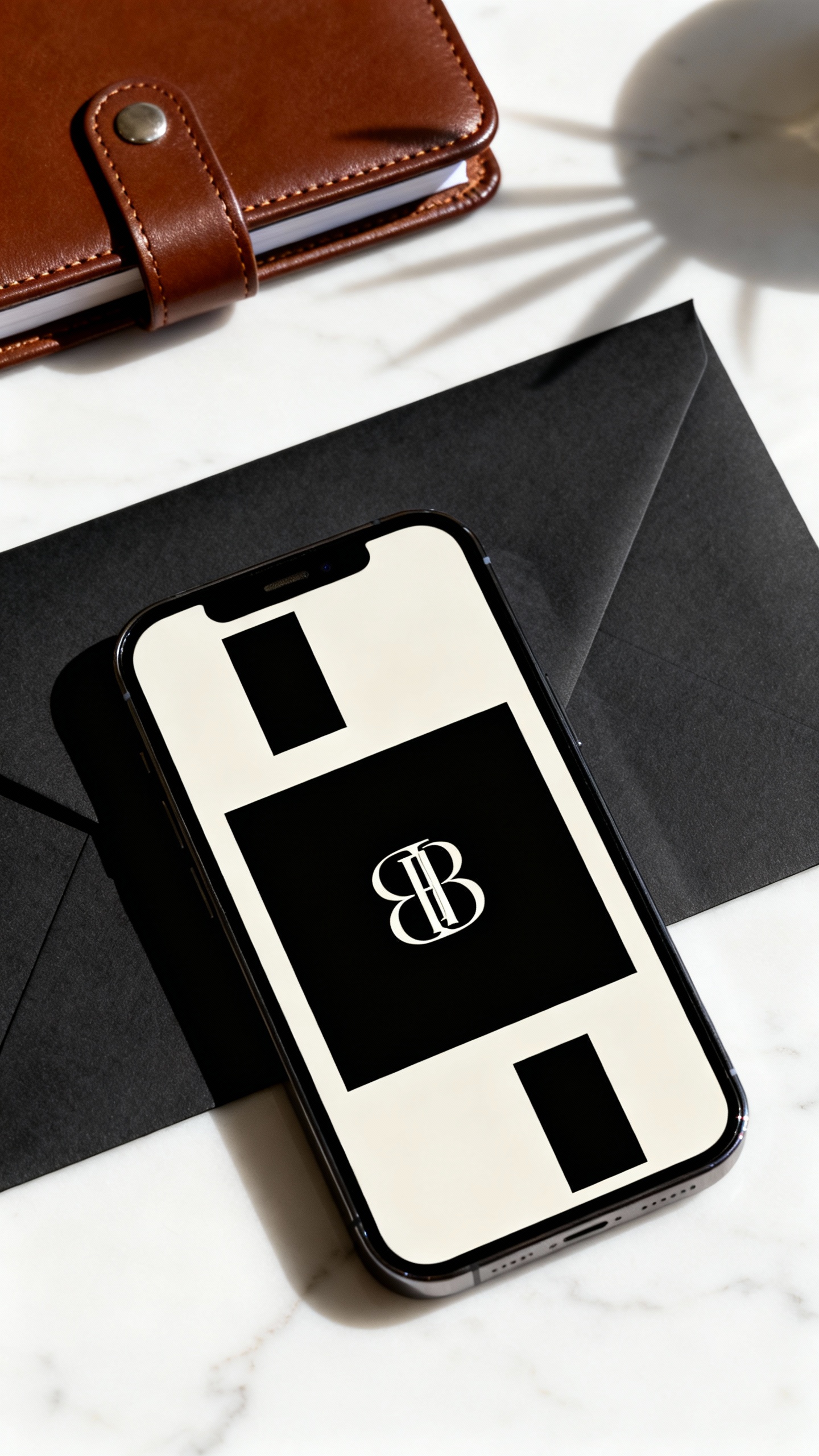
Go for a clean layout with a custom monogram (your initials or a simple crest) and one bold, fashion-magazine style font pairing. Keep the palette to black/ivory or espresso/cream for instant luxury. Add one tiny detail like letter spacing (wide tracking) and you’ll get that “designer” feel fast.
2) Photo-Forward Save the Date with a Film Border
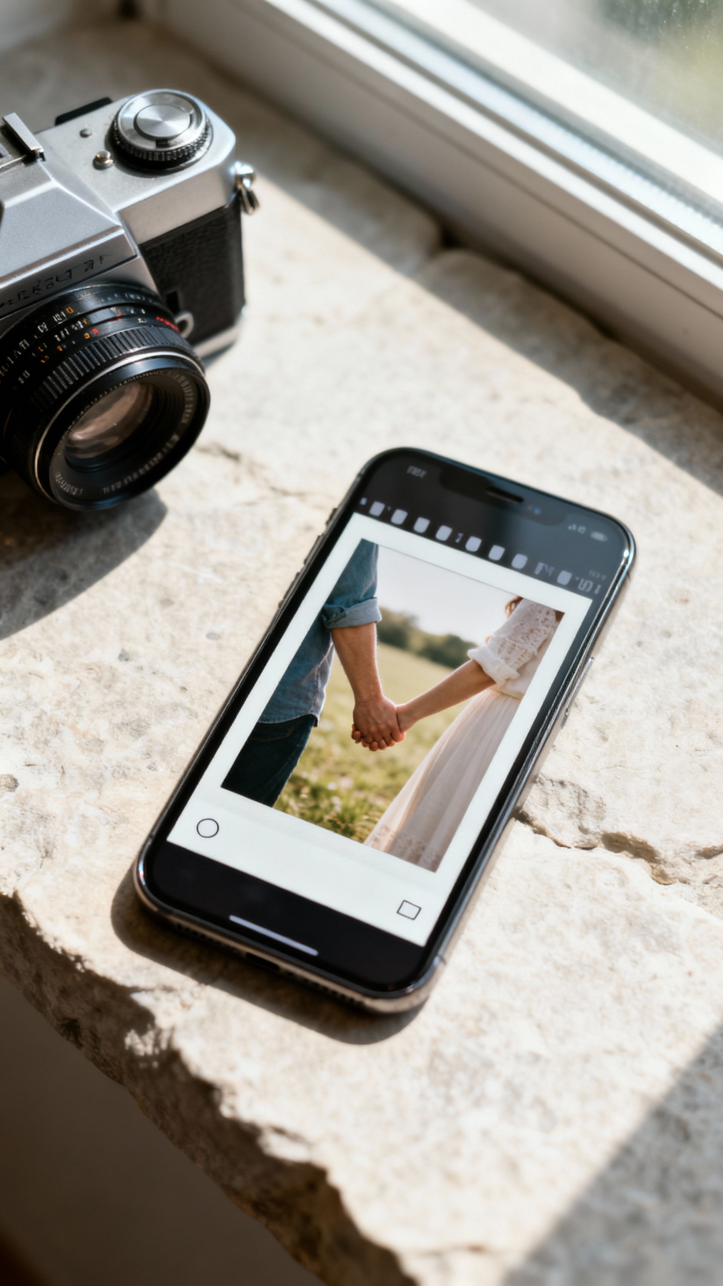
Use one strong engagement photo and frame it with a subtle 35mm film border or Polaroid-style edge for a modern editorial look. The luxury trick: keep the text minimal and let the image breathe, like a high-end brand campaign. Choose a neutral-toned photo (soft greens, stone, beach, city neutrals) so it feels expensive, not busy.
3) Animated Text Reveal (Micro-Motion, Big Impact)
A tiny animation—like your names fading in, the date sliding gently, or a monogram “stamping” on—reads so premium when it’s slow and subtle. Keep motion under 2 seconds and avoid bouncy effects for a more luxury vibe. Export as a lightweight GIF or short video so it texts and emails easily without losing quality.
4) “Digital Letterpress” Texture with Warm Neutrals
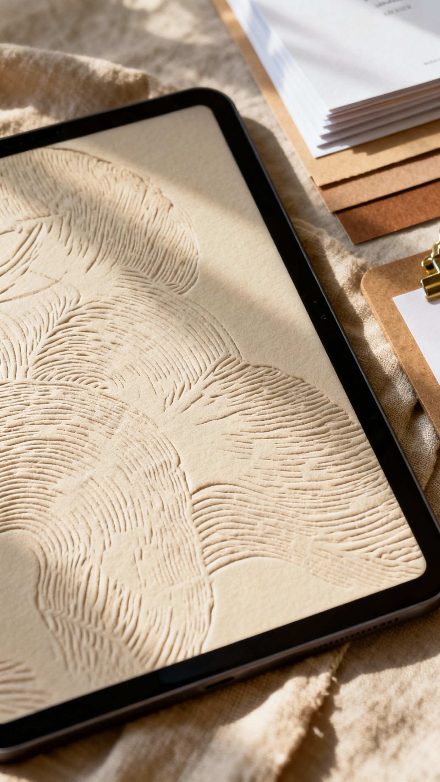
Letterpress is basically the definition of fancy, and you can mimic it digitally with paper grain, embossed effects, or a soft shadow on the type. Stick to warm neutrals like ivory, sand, mushroom, or champagne, and use one accent tone (sage, dusty blue, or terracotta). This is a great option if you want classic elegance without looking too traditional.
5) QR Code Save the Date with a Chic Wedding Website Landing
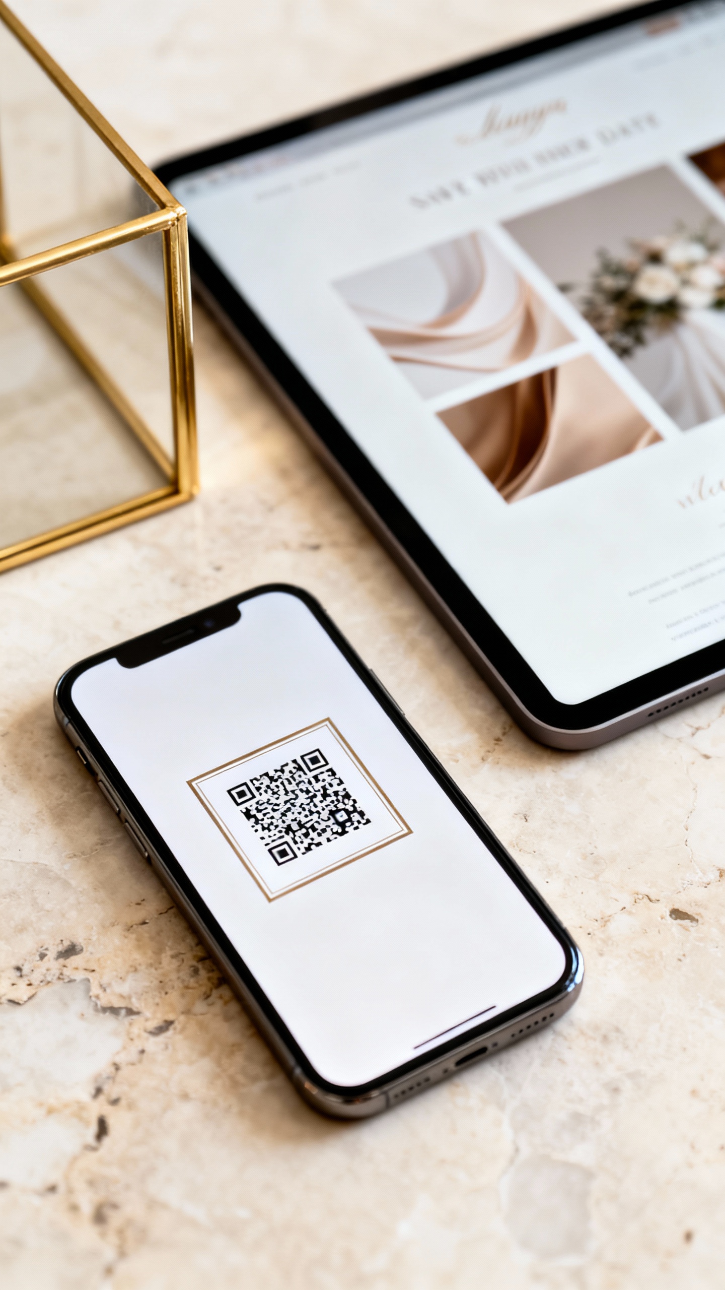
Make the save the date simple and elevated, then link to a gorgeous landing page that does the heavy lifting. Use a framed QR code (thin border, rounded corners) and match the website to your invite vibe with the same fonts and colors. It feels luxury because it’s cohesive—and it makes RSVP and travel info feel effortless for guests.
FAQ
When should we send digital save the dates?
Send them 6–8 months before the wedding for most celebrations, or 9–12 months ahead for destination weddings and peak travel weekends. Digital sends are fast, but guests still need time to plan PTO and book flights. If you’re doing a room block, earlier is always kinder.
Can digital save the dates still feel formal?
Yes—formality comes from design choices and wording, not paper. Use classic typography, restrained colors, and clear hosting language (names, date, city). If you want extra polish, include a formal sign-off like “Invitation to follow” and keep the layout clean.
What’s the best size or format to send?
For texting, a vertical 1080×1920 image or short video works beautifully and fills the screen. For email, a 1080×1350 or 1200×1500 static design is easy to read without feeling tiny. Always test-send to a friend to make sure fonts are legible on phones.
How do we keep it “luxury” and not like a social post?
Limit fonts to two, stick to a tight color palette, and avoid trendy clip art that doesn’t match your overall aesthetic. Use high-resolution photos and give your design lots of whitespace. Small details—like consistent spacing and a refined monogram—are what make it feel high-end.
Should we also mail paper save the dates?
You don’t have to. If your guest list includes older relatives or anyone who prefers physical mail, you can do a small batch of printed cards just for them and send digital to everyone else. The most important thing is consistency: match your digital save the date vibe to your invitation suite so everything feels intentionally curated.