
If you’re craving a wedding aesthetic that feels romantic, artful, and a little bit extra (in the best way), Rococo is your girl. Think ornate frames, painted ceilings, soft pastels, and candlelit sparkle—light, playful luxury that still feels approachable.
Color is what makes Rococo sing, so here are five Pinterest-friendly palettes that give you that gilded, dreamy vibe without looking like a costume party.
Top 5
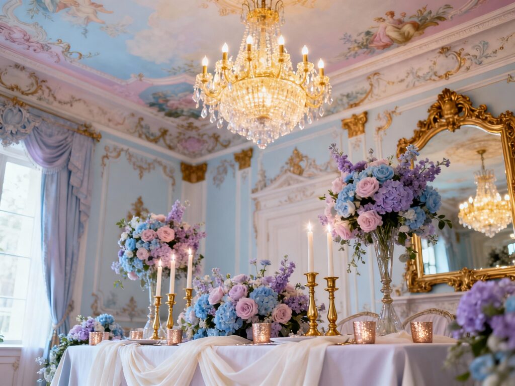
1) Blush Pink + Antique Gold + Ivory
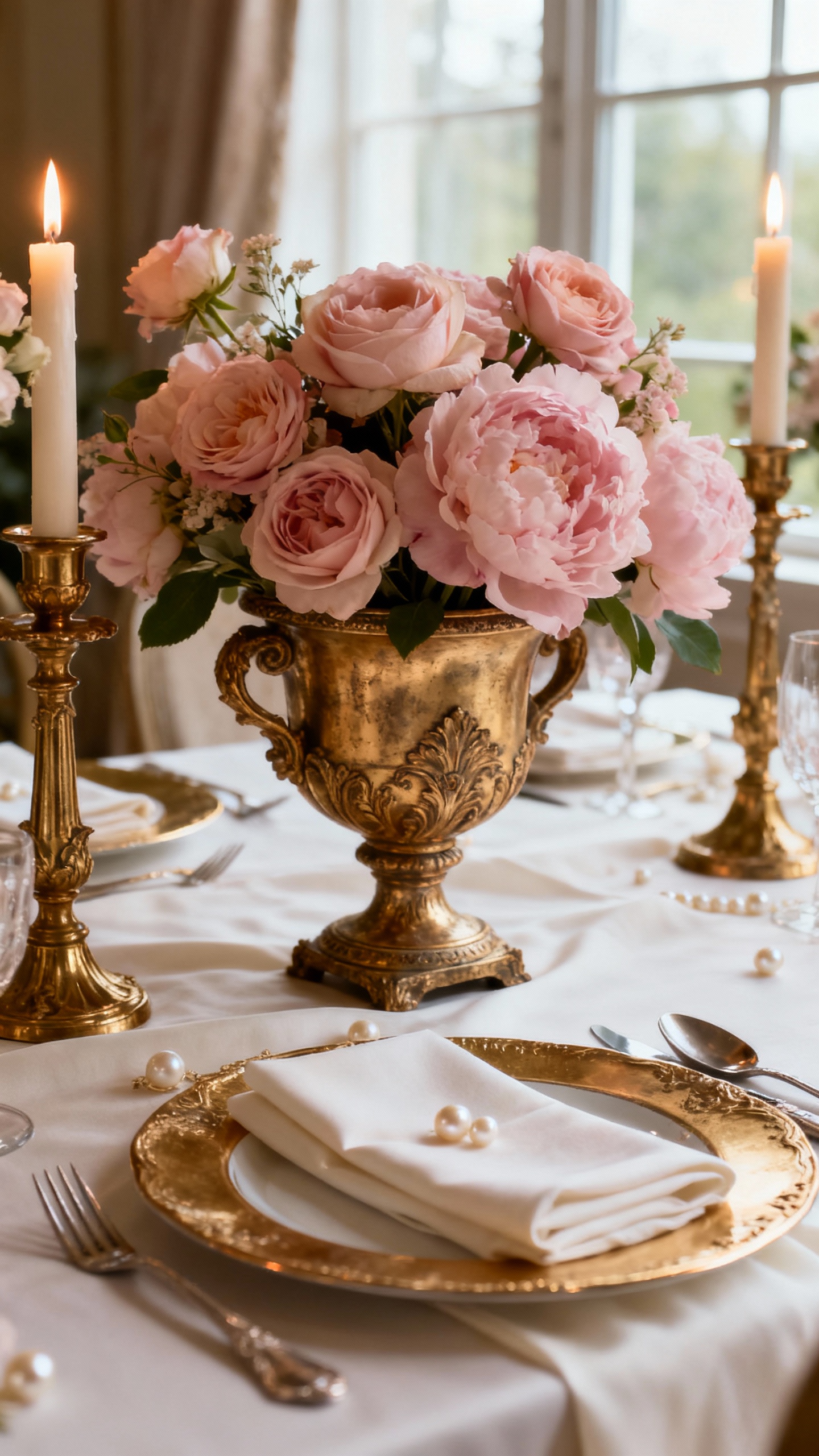
This is the classic Rococo trio: soft romance with a gilded finish. Use blush in bridesmaid dresses or florals, ivory for linens and signage, and antique gold for frames, chargers, and candlesticks. Add tiny pearls or ribbon details to your stationery for that painted-portrait energy.
2) Powder Blue + Cream + Champagne
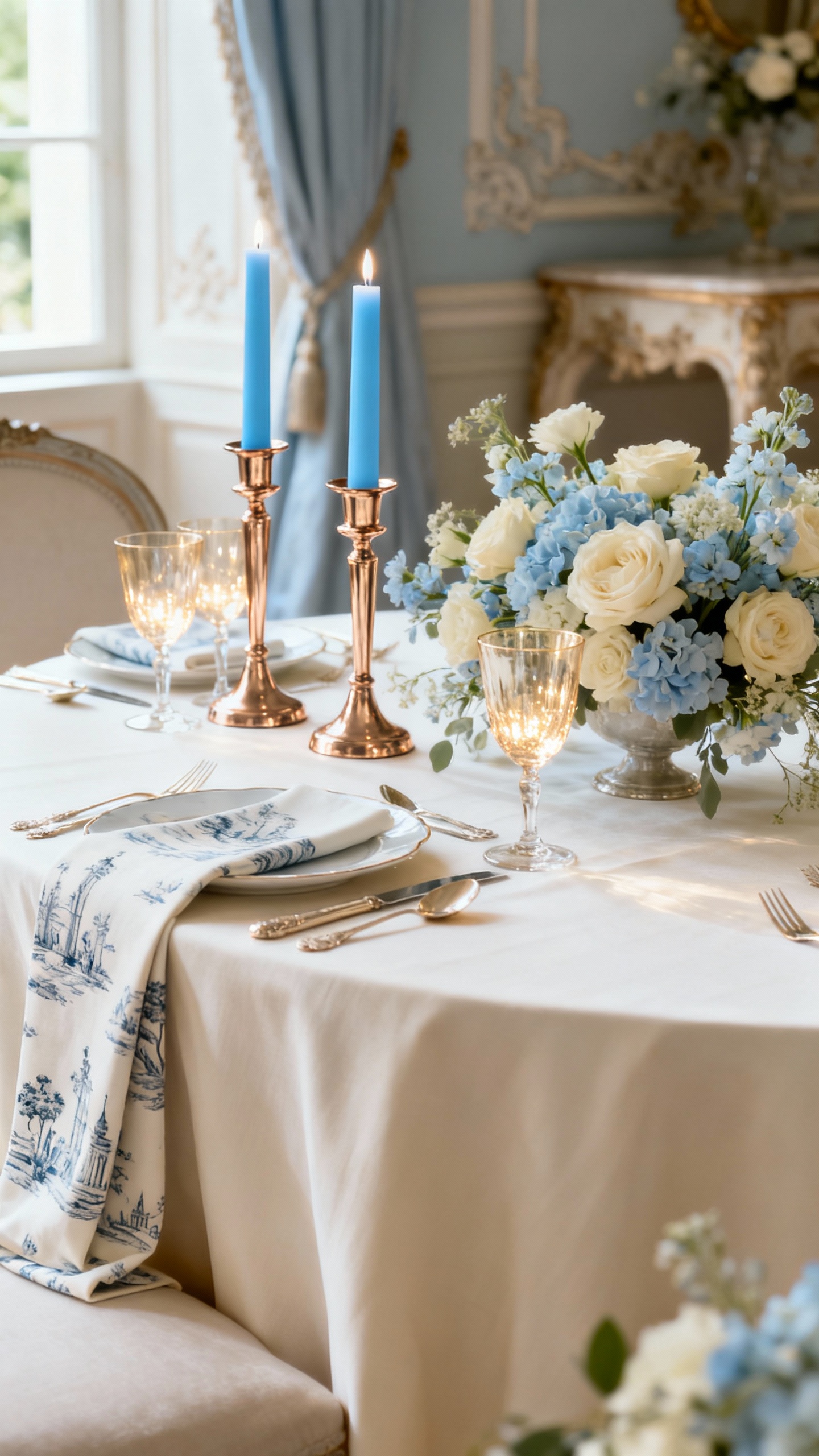
Powder blue instantly reads “French salon,” especially paired with creamy neutrals and warm champagne metallics. Try blue in taper candles, napkins, or a subtle toile pattern, then keep florals mostly cream with a few pale blue accents. Champagne works beautifully for chairs, cutlery, and lighting—soft sparkle, not harsh shine.
3) Sage Green + Dusty Rose + Warm Gold
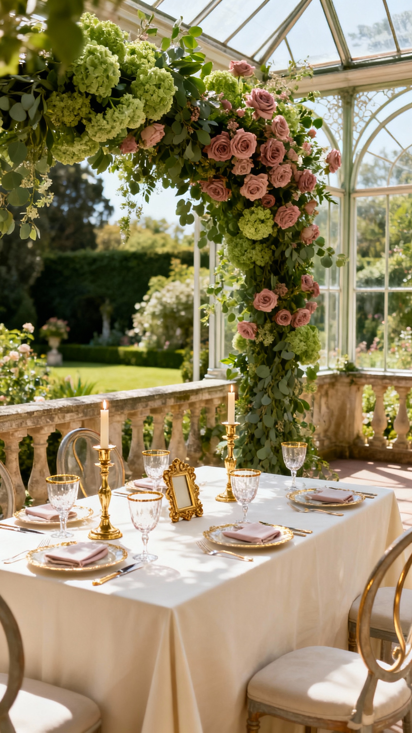
This palette is Rococo’s garden-party cousin: airy, romantic, and slightly grounded. Sage is perfect for greenery-forward installations and invitation envelopes, while dusty rose brings the softness in bouquets and bridesmaid looks. Warm gold ties it together through mirror signage, bar accents, and those swoony candelabras.
4) Lavender + Peach + Pearl White
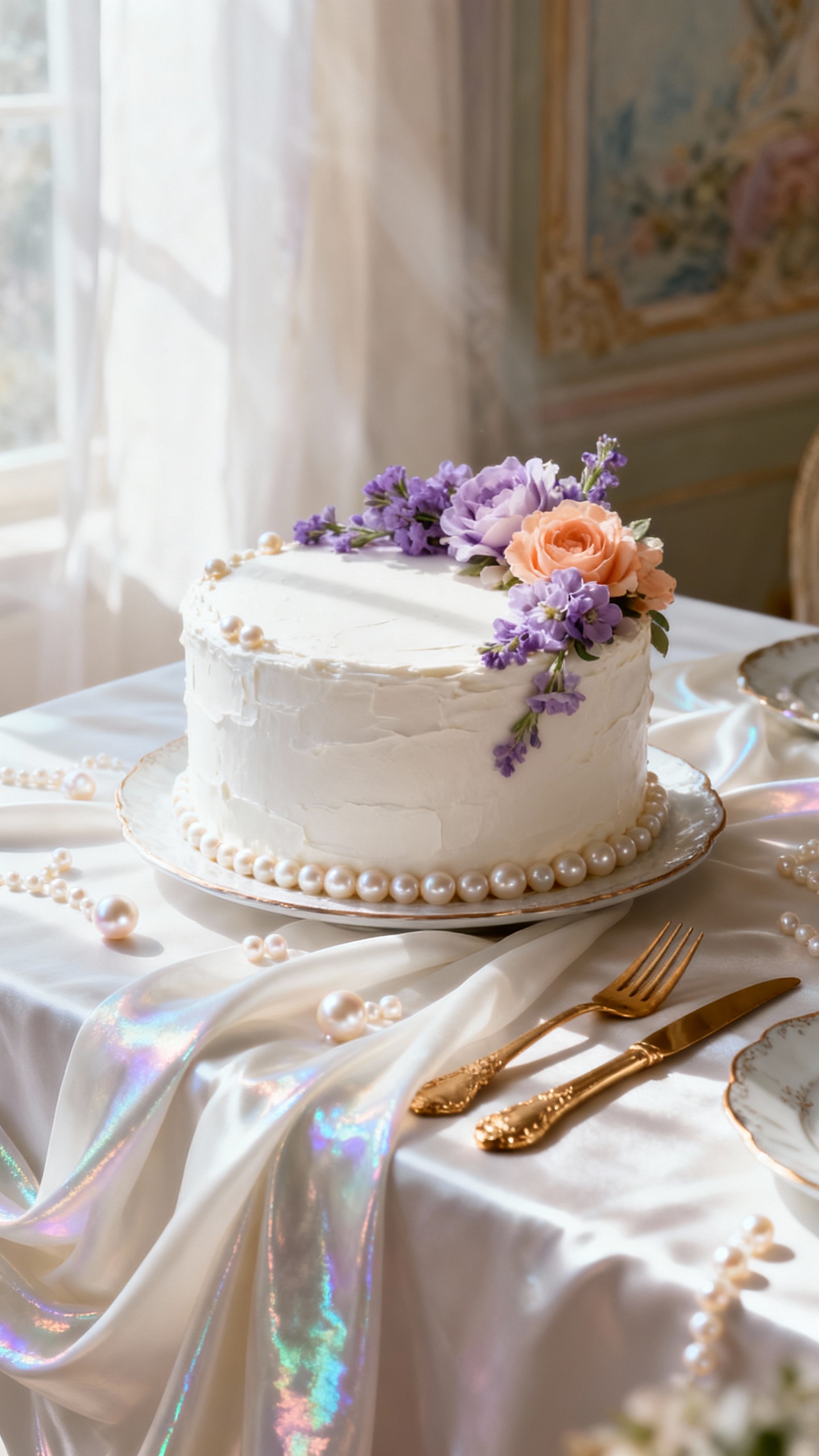
Lavender and peach feel like a painted fresco—sweet, bright, and surprisingly chic when kept light. Use pearl white as your base (think linens, draping, cake frosting) so the pastels feel elevated instead of loud. Finish with crystal details, iridescent menus, or pearl beading for a glow that photographs beautifully.
5) Buttercream Yellow + Soft Gray + Gilded Bronze
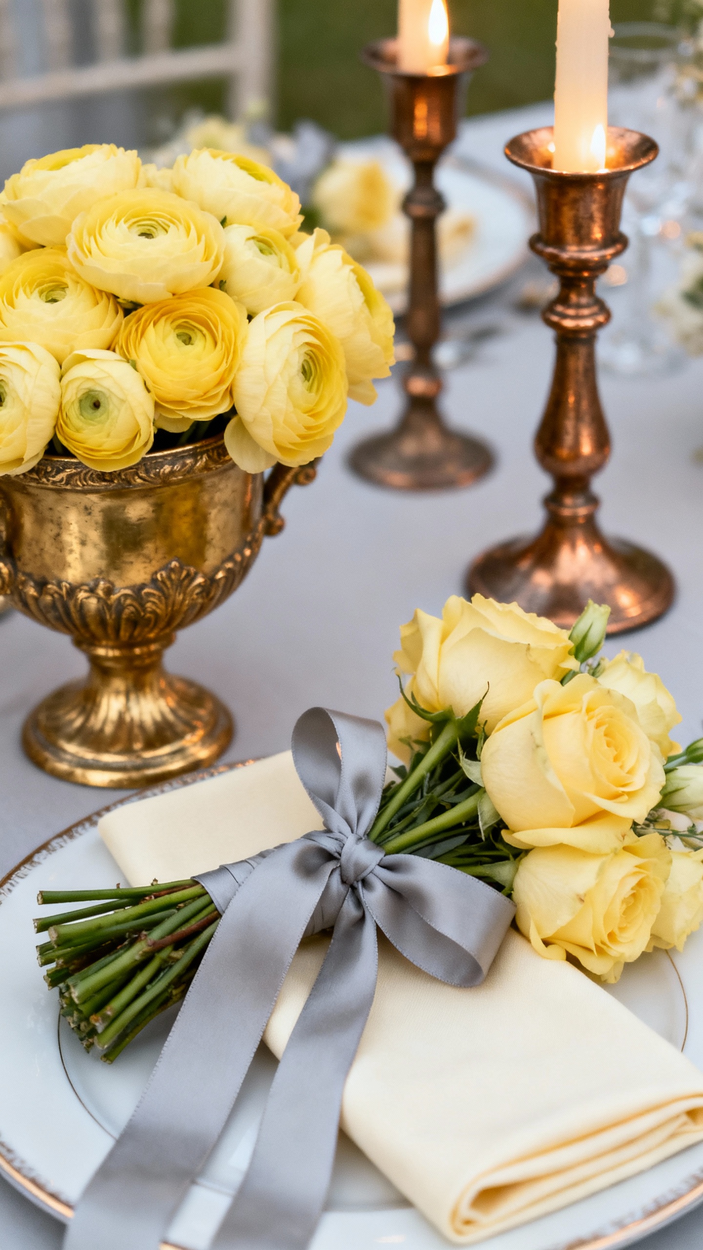
If you want Rococo but not “pink,” buttercream is your secret weapon: sunny, romantic, and totally timeless. Soft gray adds balance in suits, ribbons, or typography, while gilded bronze brings depth in vintage frames, tabletop accents, and candleholders. This palette is especially pretty for late-spring venues with natural light and stone architecture.
FAQ
How do I make a Rococo palette feel wedding-appropriate, not theatrical?
Pick one main pastel, one neutral, and one metallic, then repeat them consistently. Keep the “ornate” elements in accessories—frames, candlesticks, ribbon, and stationery—so the vibe feels intentional and refined. The goal is elegant detail, not clutter.
What metallic works best for Rococo: gold, champagne, or bronze?
Gold is the most traditional and instantly Rococo, especially antique or brushed finishes. Champagne feels softer and modern, perfect with blues and creams. Bronze is amazing if you want warmth and depth without the bright shine of classic gold.
What flowers match Rococo color palettes?
Go for fluffy, romantic shapes: garden roses, ranunculus, peonies, lisianthus, and hydrangea. Add delicate accents like sweet peas, jasmine vine, or spray roses to keep it airy. For extra Rococo drama, mix in trailing greenery and lots of taper candles nearby.
What’s the easiest way to bring Rococo color into the reception?
Start with linens and candles—those two things change a room fast and photograph even faster. Then add layered details like vintage-style place cards, ribbon-tied menus, and gold or champagne chargers. A framed seating chart or mirror sign instantly sells the aesthetic.
Can I do Rococo colors for a more modern venue?
Yes—Rococo looks incredible in clean spaces because the contrast feels intentional. Use the venue’s minimal backdrop as your “gallery wall,” then bring in ornate touches through furniture rentals, candlelight, and floral compotes. Keep your palette tight so it reads curated, not busy.