
Choosing your wedding flowers doesn’t have to be a spiral. If you pick a clear color palette first, the “what flowers do we even use?” question gets so much easier (and usually more budget-friendly).
Below are five simple, classic-meets-modern flower combos organized by color palette. They’re designed to look elevated in photos, work across seasons with a few swaps, and stay easy to communicate to your florist.
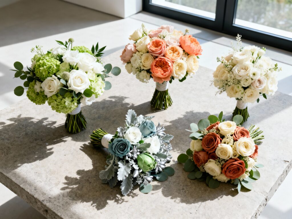
Top 5
1) Soft White + Green (Modern Minimal)
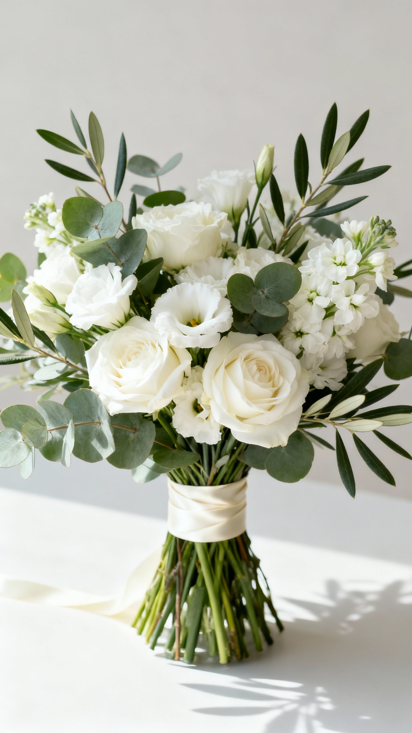
This is the clean-girl of wedding florals: crisp whites plus layered greenery for texture. Use white roses or garden roses with lisianthus, then add eucalyptus, Italian ruscus, or olive branches for movement. It photographs beautifully in any venue and feels instantly polished without needing a million blooms. Ask for varied greens so it looks intentional, not “leftover filler.”
2) Blush + Ivory (Romantic Neutral)
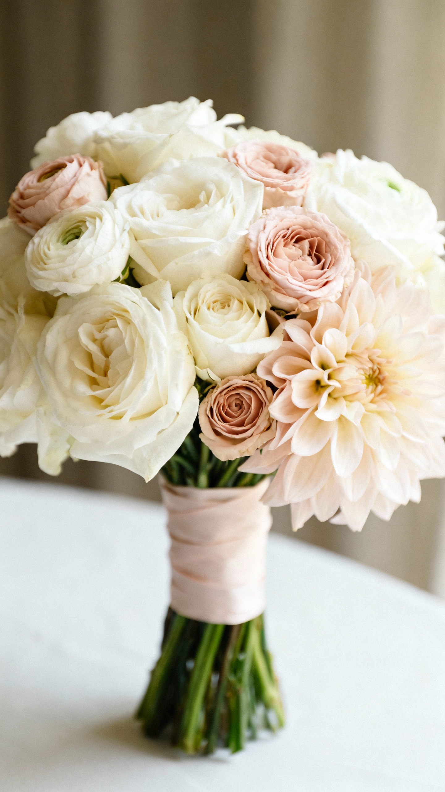
Blush and ivory is timeless, but still feels fresh when you mix flower shapes. Pair ivory roses with blush spray roses, ranunculus, or dahlias (in season) for that soft, layered look. Add a touch of champagne-toned foliage or dried accents (like bleached ruscus) if you want it extra Pinterest-y. This palette is especially flattering for bridal party photos and doesn’t fight any dress color.
3) Peach + Coral + Cream (Sunset Warmth)
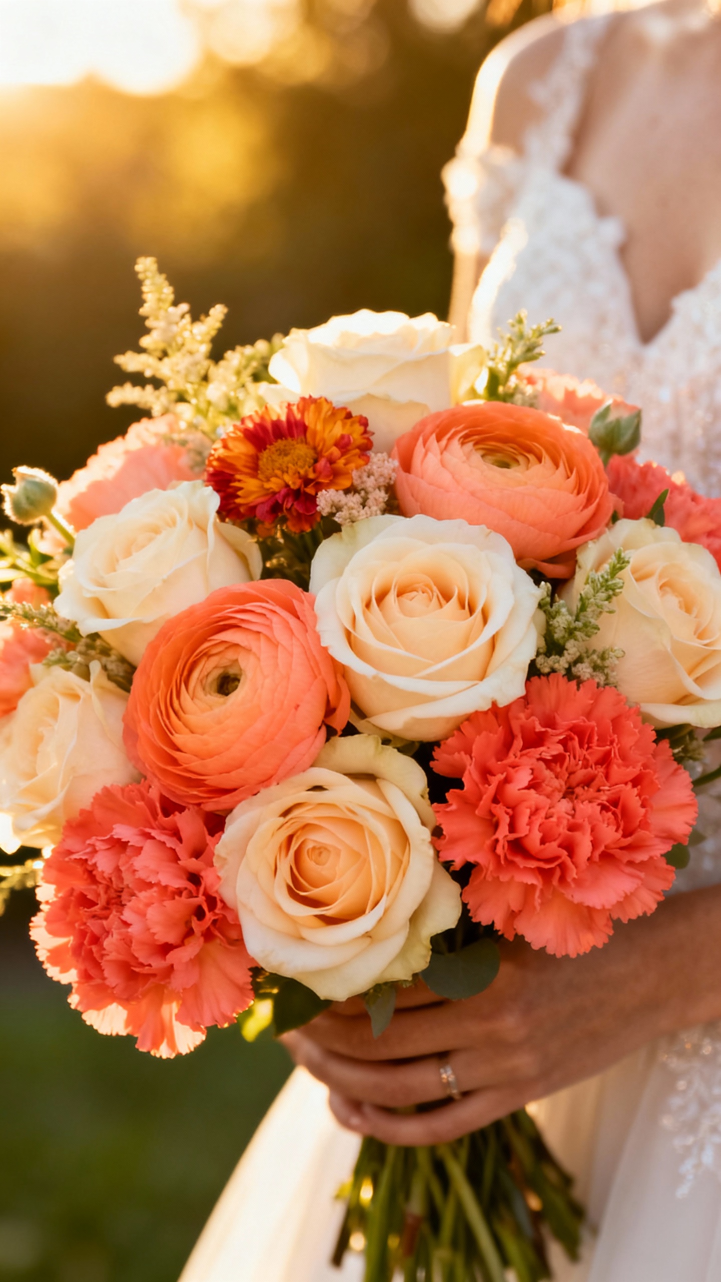
If you want cheerful without going neon, peach/coral/cream is your sweet spot. Think cream roses, peach ranunculus, and coral carnations (yes, carnations can be chic when used intentionally). Add a pop of apricot stock or tulips for height and softness. This palette is perfect for garden venues and summer weddings, and it gives skin tones a warm glow in photos.
4) Dusty Blue + White + Silver Green (Cool & Airy)
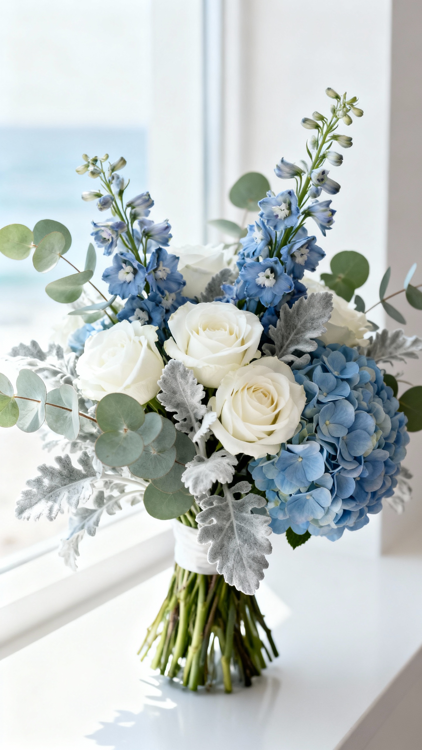
This palette feels calm, editorial, and a little bit coastal—without being themed. Use white roses with dusty blue delphinium or tweedia (or blue-toned hydrangea if you want bigger, cloud-like volume). Silver dollar eucalyptus or brunia adds that frosty, modern edge. It’s a great option if your decor is neutral but you want one noticeable color moment.
5) Terracotta + Cream + Olive (Earthy Modern)
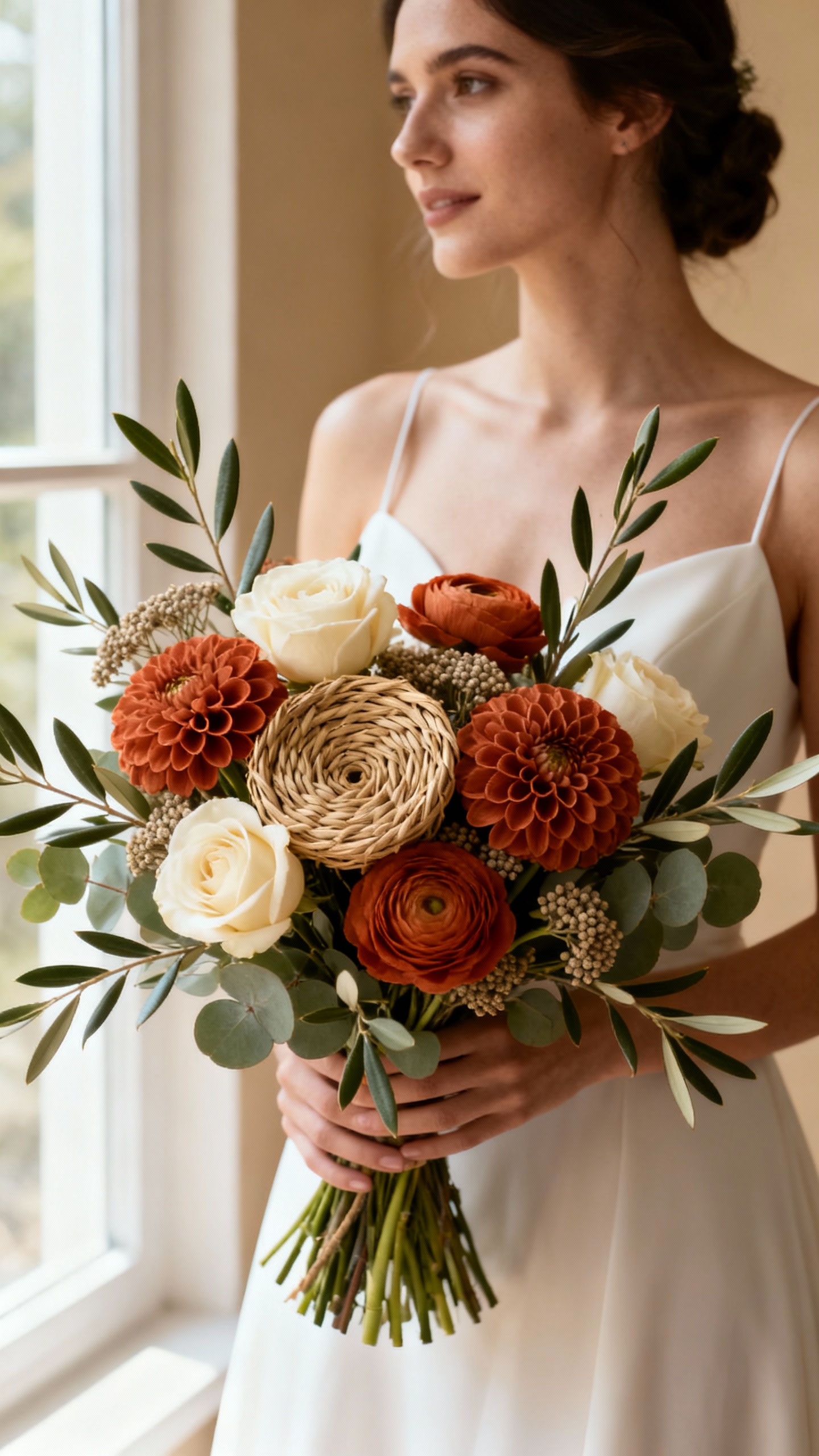
Terracotta is still having a moment because it looks luxe and grounded at the same time. Combine cream roses with terracotta-toned dahlias, ranunculus, or roses, then weave in olive branches or seeded eucalyptus for an organic shape. Keep the palette tight (no bright reds) so it reads elevated, not fall festival. Bonus: it pairs beautifully with candles, wood tables, and neutral bridesmaid dresses.
FAQ
How do I describe these palettes to a florist without overexplaining?
Lead with the palette name and 2–3 must-have flowers, then share 3–5 reference photos that match the vibe (airy vs. tight, minimal vs. lush). Ask for “similar seasonal substitutions” so they can stay on budget while keeping the look consistent. Also mention your venue lighting (outdoor sun, indoor warm bulbs) because it affects how colors read.
What’s the simplest way to keep costs down while staying on-palette?
Put your premium blooms in the personal flowers (bridal bouquet, ceremony pieces you’ll repurpose) and let reception tables lean on greenery, bud vases, or candles. Choose a palette that works with readily available flowers (white/green and blush/ivory are typically easiest). Staying within 2–3 main colors helps avoid pricey “custom” sourcing.
Can I use these combos for every season?
Yes—just swap the exact stems, not the color story. For example, ranunculus is great in cooler months, while dahlias shine late summer/fall; roses and lisianthus are flexible year-round. Your florist can keep the palette identical even if the flower varieties shift with availability.
How do I make a simple palette look more “designer” in photos?
Ask for variety in bloom size and texture (one hero flower, one soft filler, one airy element, plus intentional greenery). A slightly asymmetrical, garden-style shape often photographs more expensive than a tight ball. Also, repeating the same palette in small moments—like boutonnières, bud vases, and aisle markers—makes everything feel cohesive.
What if my bridesmaids’ dresses don’t match the floral palette exactly?
That’s totally fine—matching perfectly can actually look less modern. Aim for harmony: warm florals (peach/terracotta) pair best with warm neutrals, gold accents, and earthy tones, while cool florals (dusty blue/white) love grays, navy, and silver. If you’re unsure, keep bouquets more neutral (cream/white/green) and add your accent color in smaller hits.