
Rainy and overcast spring weddings are actually a vibe—soft light, fewer harsh shadows, and that romantic “movie scene” atmosphere. The only trick is choosing colors that don’t look flat in photos, especially against gray skies and damp greenery.
These palettes are designed to stay bright, flattering, and glowy even when the forecast is doing the most.
Top 5
1) Blush, Buttercream, and Soft Sage

This palette is basically built for misty spring days: warm blush and buttercream keep everything luminous, while sage ties into the season without turning muddy. Use blush for bridesmaid dresses, buttercream for florals (ranunculus, roses), and sage in linens or stationery. Add gold accents to reflect light and make the whole look feel candlelit and cozy.
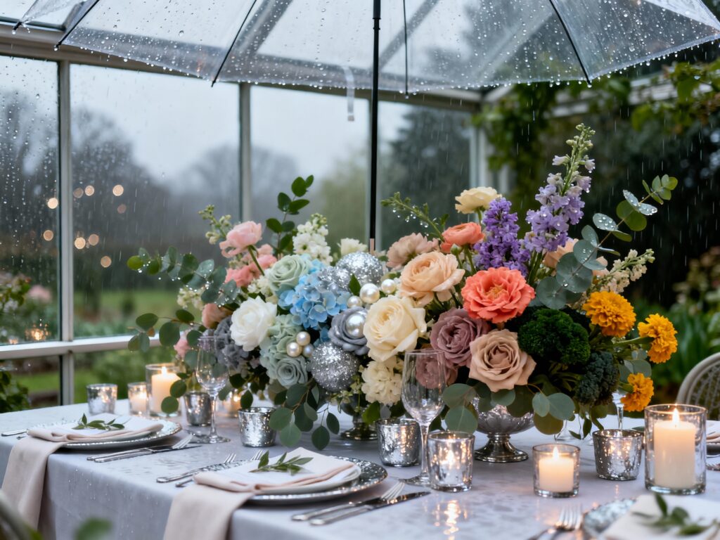
2) Powder Blue, Pearl White, and Silver Gray
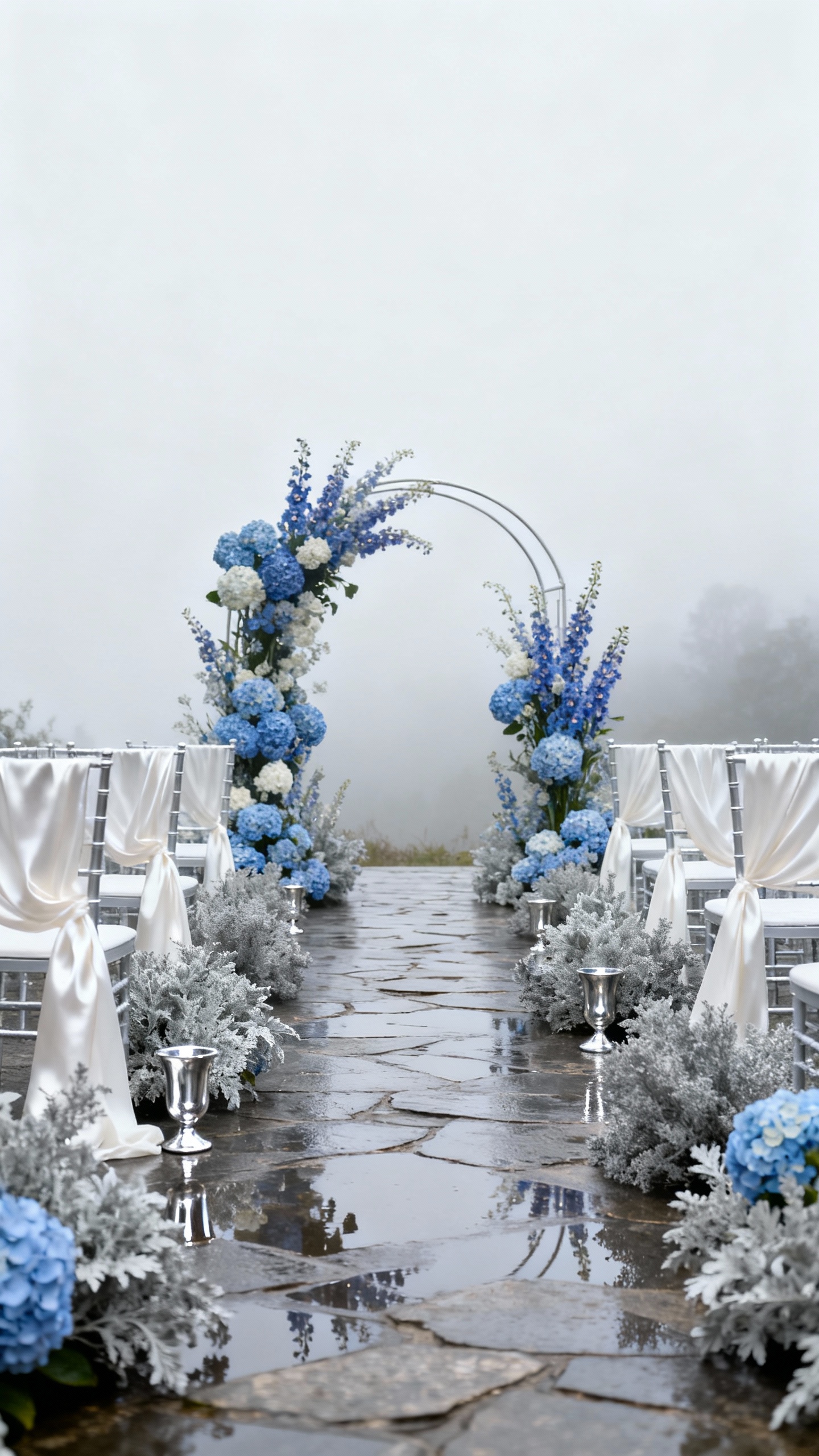
If the sky is gray, lean into it—then brighten it. Powder blue photographs like a dream in overcast light, pearl white keeps things crisp, and silver gray adds polish without darkening the palette. Try blue in napkins or bridal party attire, pearl in draping and florals, and silver in flatware or votives for that “glow from within” effect.
3) Peach, Coral, and Eucalyptus Green
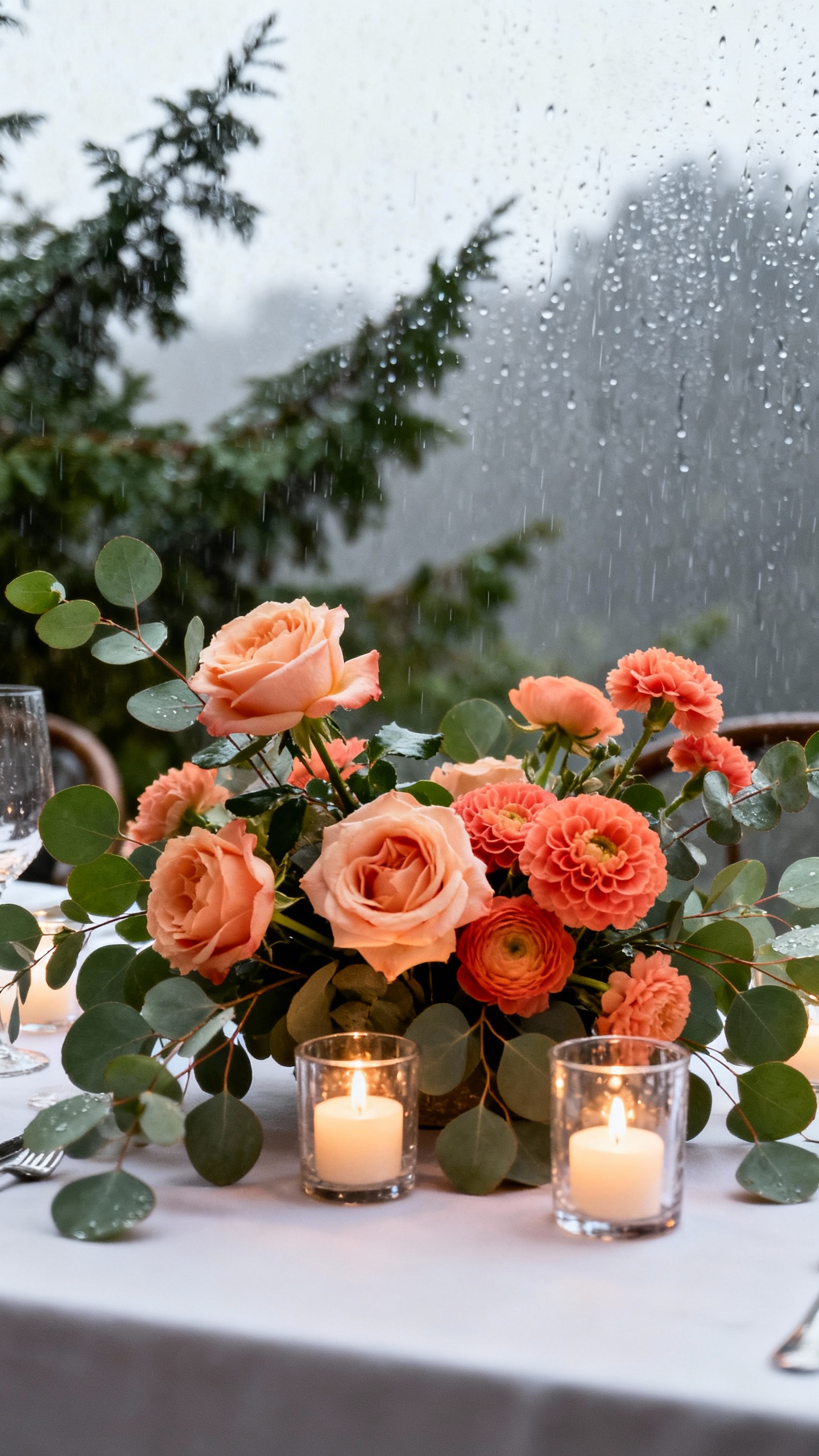
Peach and coral are your best friends when you want warmth on a rainy day—they bring instant life to photos and flatter a wide range of skin tones. Pair them with eucalyptus for a fresh, clean contrast that still feels springy. Keep coral as an accent (bouquets, escort cards, signature drink garnish) and let peach be the softer base so it doesn’t overwhelm.
4) Lavender, Dusty Rose, and Champagne
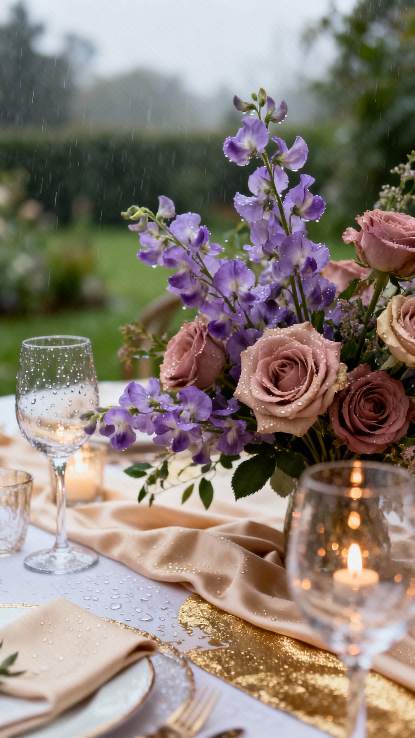
Lavender loves overcast lighting because it stays soft and dimensional instead of neon. Dusty rose adds romance, and champagne (think: warm beige-gold) stops the palette from feeling too cool. Use champagne in linens or bridesmaid mix-and-match (one person in champagne satin looks so good), then bring in lavender through florals like lilac, sweet peas, or dyed ribbon.
5) Ivory, Marigold, and Deep Forest Green
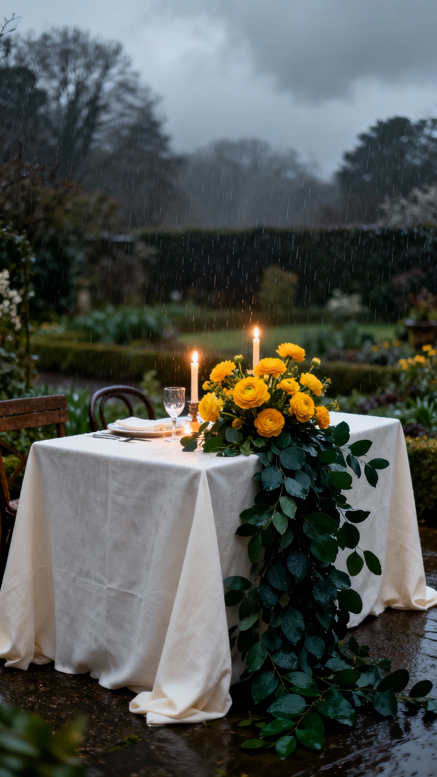
When the weather is gloomy, a little strategic contrast goes a long way. Ivory keeps everything bright, marigold adds sunshine energy, and deep forest green grounds the look so it still feels elevated. Keep marigold in small but powerful moments—boutonnières, bouquet accents, taper candles—while ivory and green do the heavy lifting in linens and greenery-forward installations.
FAQ
What colors photograph best on overcast or rainy wedding days?
Soft warm tones (blush, peach, buttercream, champagne) and gentle pastels (powder blue, lavender) tend to photograph beautifully because they don’t get washed out by gray light. Adding a reflective accent like gold, silver, or pearls helps bounce light back into details. Avoid relying only on very pale grays or beiges, which can blend into the sky and feel flat.
How do I keep my palette from looking “muddy” in rain?
Use at least one brighter or warmer shade as a highlight color, even if it’s just in small accents. Balance cool tones with a warm neutral (champagne, ivory) and choose fabrics with texture or sheen like satin ribbon, velvet, or gloss signage. Also, aim for clean whites (ivory/pearl) instead of gray-white so your photos stay crisp.
Should I change my bouquet colors if it might rain?
You don’t need to change everything, but it helps to add one “glow” element—like buttercream roses, peach ranunculus, or marigold accents—to keep the bouquet vibrant. Ask your florist for rain-friendly blooms and sturdy greens (eucalyptus is great) and consider ribbon that won’t bleed if it gets damp. A clear umbrella can also keep colors looking saturated without hiding the look.
What linen and candle colors work best for cloudy spring receptions?
Ivory, champagne, and soft blush linens reflect light and make the room feel warmer, especially in tented or indoor spaces. For candles, mix ivory tapers with gold or silver holders, plus a few deeper tones (like forest green) for contrast. Glass hurricanes and votives add extra sparkle in low-light situations.
How can I tie in rain/overcast vibes without making it feel gloomy?
Go romantic instead of dark: think pearl details, soft blues, misty lavender, and metallic accents that feel like raindrops. Add cozy lighting—lots of votives, warm string lights, and uplighting—so the scene still feels glowy. If you want a theme moment, use clear umbrellas, watercolor stationery, and reflective textures rather than heavy, moody colors.