
Spring sun is gorgeous… and also a little ruthless. Bright midday light can wash out soft colors, turn some shades neon on camera, and make everyone squint if you’re not careful.
The secret is picking a palette with enough contrast (so it reads clearly) and the right undertones (so it stays flattering). Here are five spring wedding color palettes that consistently photograph beautifully in bright sun.
Top 5
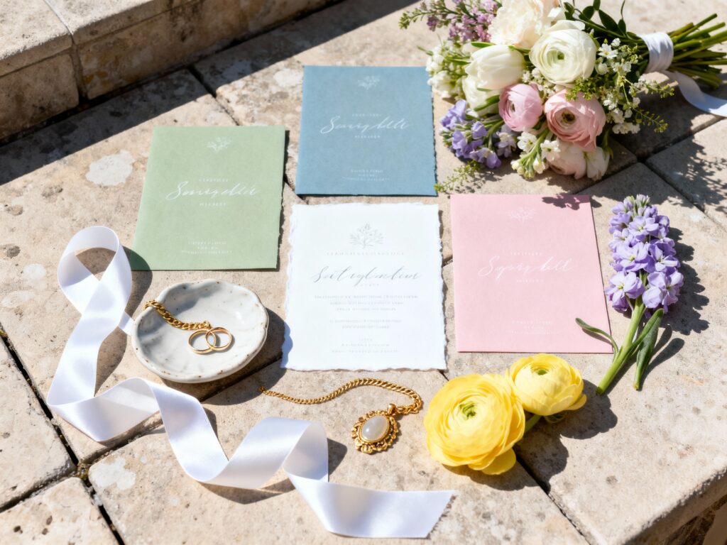
1) Sage Green + Crisp White + Warm Gold
This palette is a bright-sun favorite because sage stays soft without fading out, and crisp white keeps everything clean and elevated. Warm gold adds a light-catching accent that reads “special” in photos without overpowering. It’s especially stunning for garden venues, outdoor ceremonies, and tented receptions.
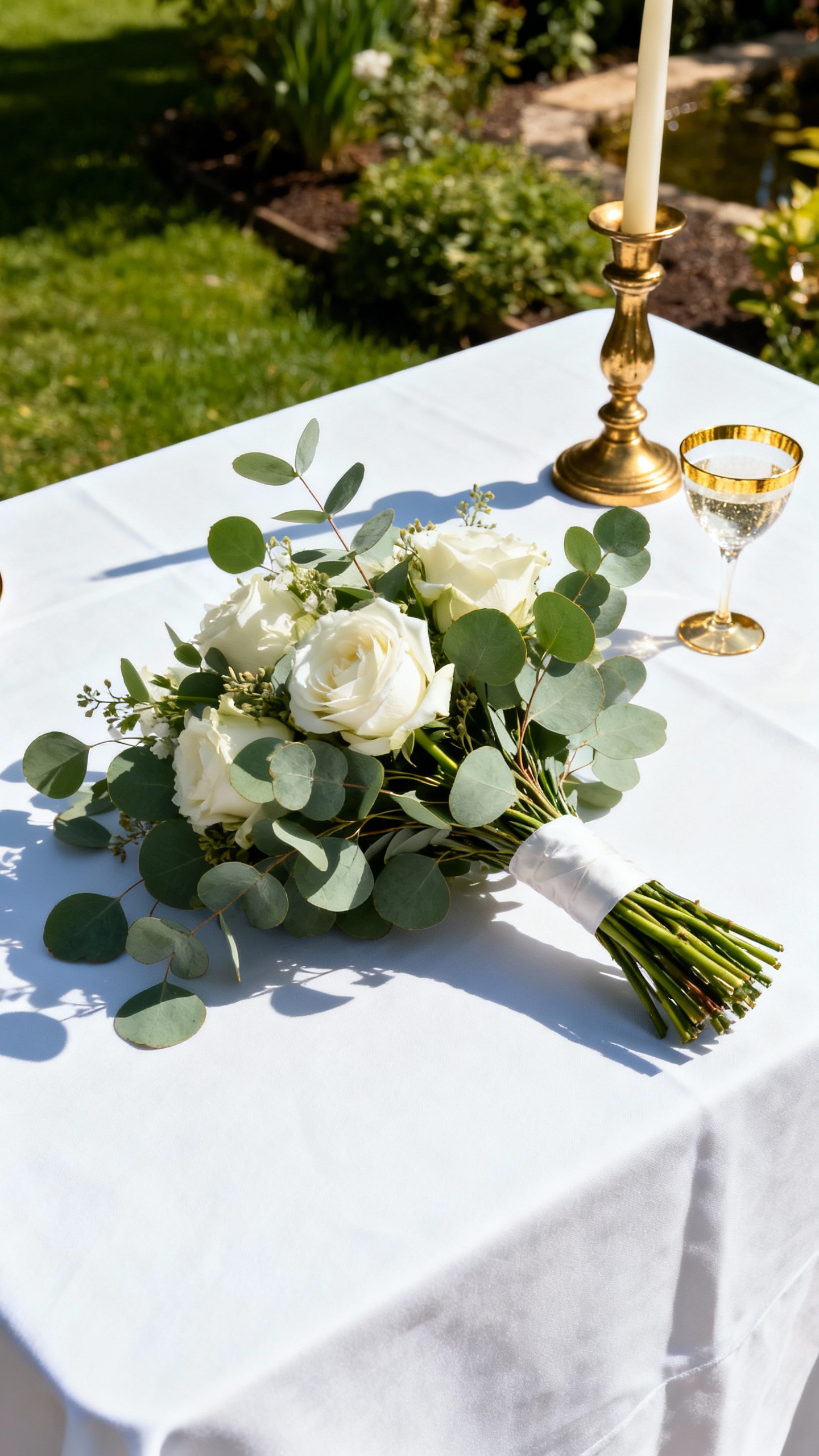
2) Dusty Blue + Soft Ivory + Taupe
Dusty blue is basically the cheat code for harsh sunlight: it holds color, photographs calm, and complements most skin tones. Soft ivory keeps it romantic (not stark), while taupe adds grounding contrast so details don’t disappear in bright exposure. Use it for bridesmaid dresses, suits, and linens for an effortlessly cohesive look.
3) Blush Pink + Terracotta + Cream

If you love pink but worry about it turning too bright in direct sun, blush + terracotta is the perfect balance. Terracotta deepens the palette so blush doesn’t wash out, and cream keeps everything airy and spring-appropriate. This combo photographs gorgeous in golden-hour portraits and still holds up at noon.
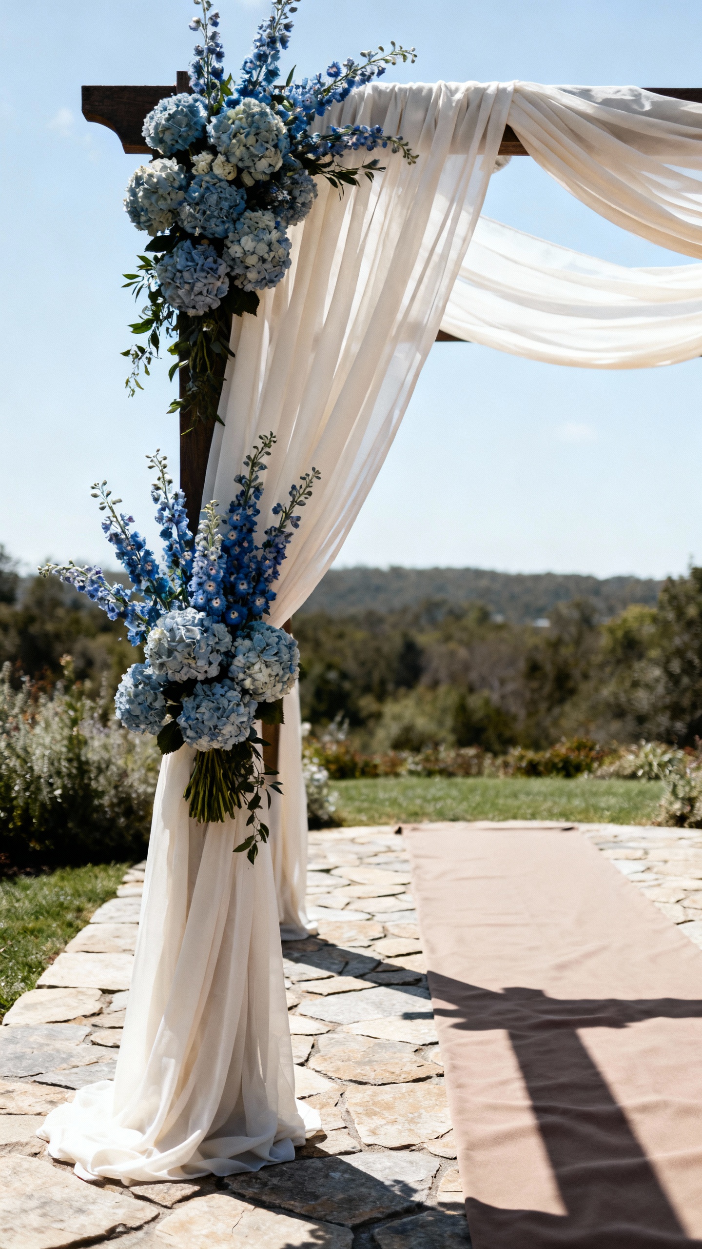
4) Lavender + Periwinkle + Soft Gray

Lavender is a spring classic, but pairing it with periwinkle gives it extra “camera presence” in bright light. Soft gray acts like a neutral buffer that keeps the purples looking modern and polished (not overly sweet). Try it in florals, stationery, and bridesmaid dresses for a fresh, editorial vibe.
5) Butter Yellow + Eucalyptus + White
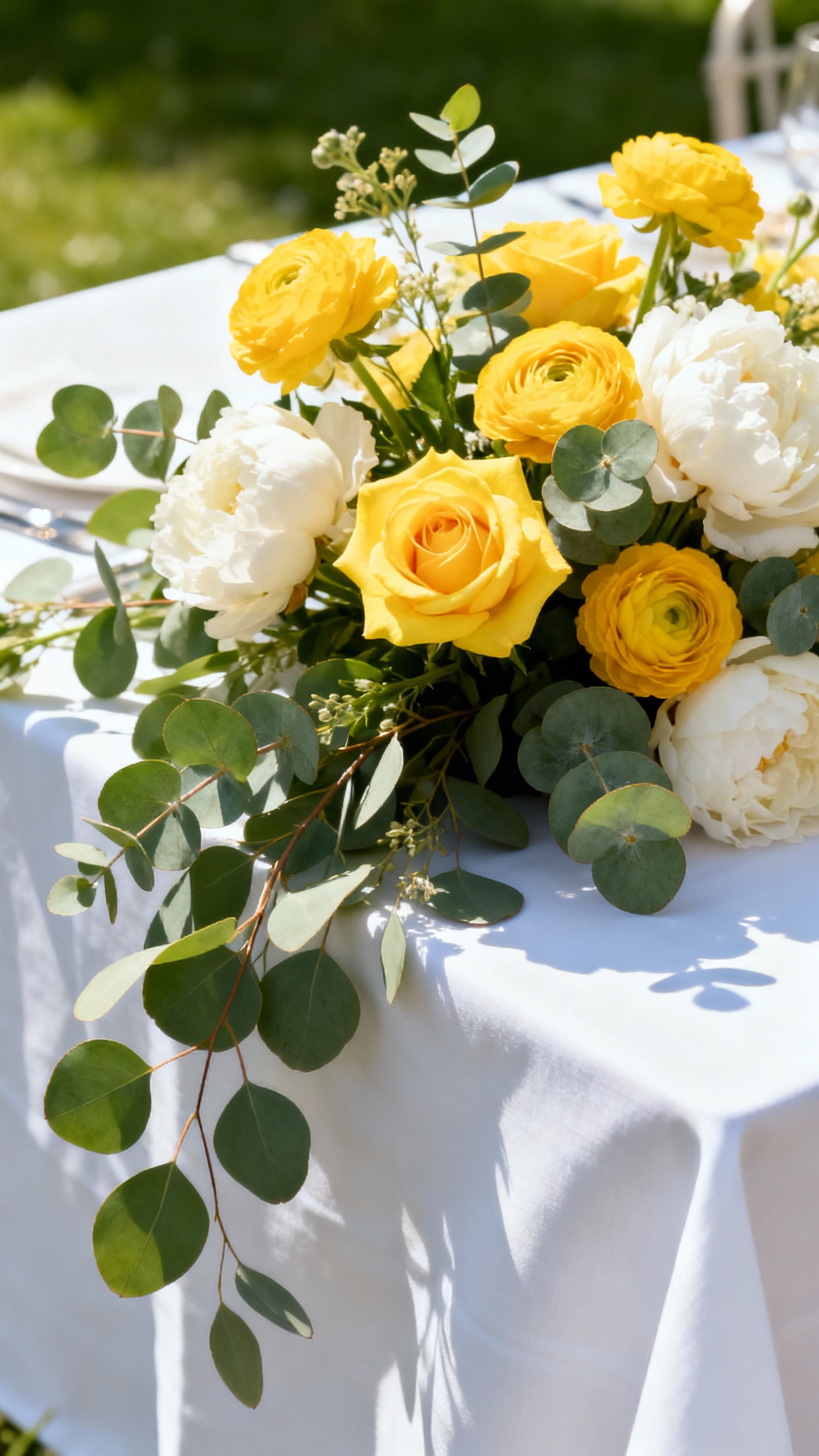
Butter yellow photographs better than super-bright lemon shades because it stays creamy and flattering in sun. Eucalyptus green adds contrast and a natural, airy feel, while white keeps the whole look crisp for photos. This palette is perfection for daytime ceremonies, brunch receptions, and spring backyard weddings.
FAQ
How do I keep my colors from looking washed out in midday sun?
Build in contrast. Pair at least one mid-tone or deeper shade (like terracotta, dusty blue, or periwinkle) with your light neutrals so your palette still reads clearly when the camera exposure brightens the scene.
Are bright colors a bad idea for sunny outdoor weddings?
Not always, but neon-leaning brights can look extra intense in harsh light. If you love bold color, choose slightly muted versions (dusty, soft, or warm-toned) and balance them with neutrals like ivory, cream, or soft gray.
What neutrals photograph best in bright sun: white, ivory, or cream?
Ivory and cream are typically the most forgiving because they’re softer than pure white and help avoid a blown-out look in photos. Crisp white can still be stunning—just use it intentionally and add a mid-tone color so it doesn’t disappear in super bright conditions.
What’s the easiest way to make a palette look cohesive in photos?
Repeat your main color in at least three places: bridesmaid dresses, florals, and linens (or signage). Then keep your metals consistent (all warm gold or all silver) so the details don’t compete in bright light.
What flower colors hold up best for outdoor spring weddings?
Soft but saturated tones tend to photograph beautifully: dusty blues, lavenders, sage greens, blush with a deeper accent (like terracotta), and buttery yellows. Ask your florist for blooms with dimension (multiple tones in one flower) so arrangements still look rich in full sun.