
If you love a classic wedding vibe but still want your photos to feel fresh in 10 years, your color palette is the move. The secret is choosing “unexpected” pairings that read elevated (not trendy-for-trendy’s-sake).
Below are five surprising wedding theme color combos that still photograph timelessly—plus easy ways to weave them into your florals, linens, stationery, and bridesmaid looks.
Top 5
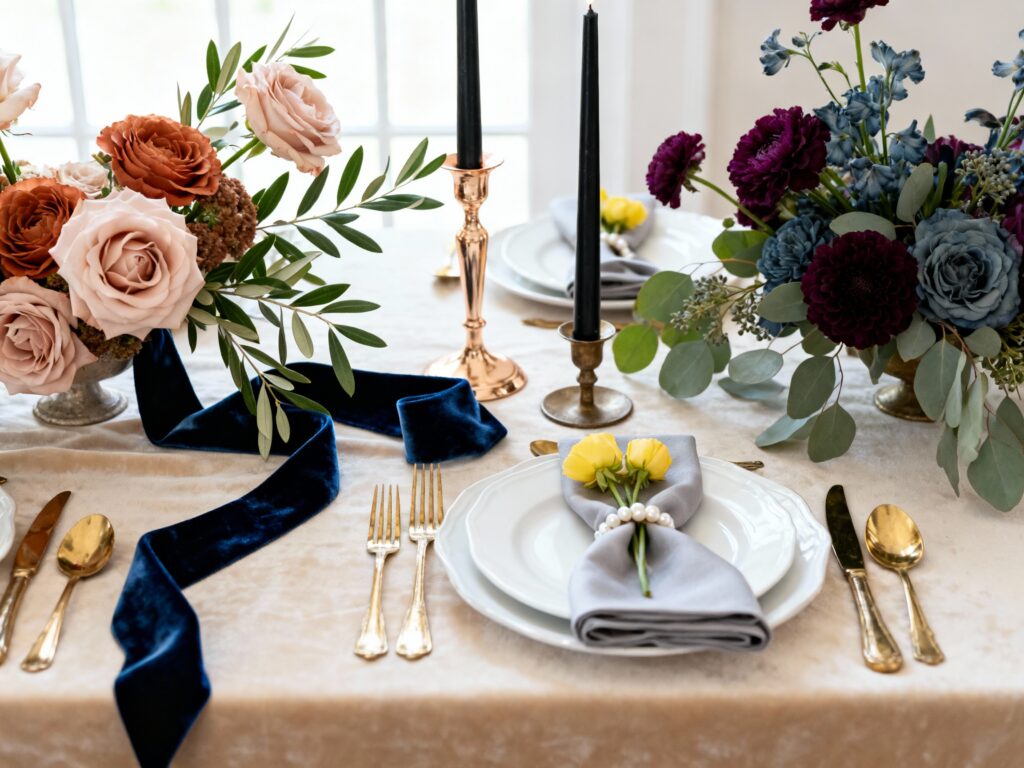
1) Ink Blue + Soft Blush + Warm Ivory

This combo is basically “modern romance” with structure: ink blue grounds everything, blush keeps it soft, and warm ivory makes it wedding-classic. Use ink blue for suits, velvet ribbons, or a statement escort display, then bring blush in through blooms like garden roses and ranunculus. Keep the ivory on big surfaces (tablecloths, draping, invitations) so the whole look stays airy and timeless.
2) Olive Green + Champagne + Black Accents

Olive is neutral-adjacent, which is why it feels calm and elevated instead of “theme-y.” Pair it with champagne linens or metallic touches (candleholders, flatware, stationery foil) and add black in tiny doses for contrast—think taper candles, calligraphy, or sleek signage stands. It works year-round, but it’s especially gorgeous for garden venues, wineries, and modern spaces with lots of glass.
3) Terracotta + Dusty Blue + Cream
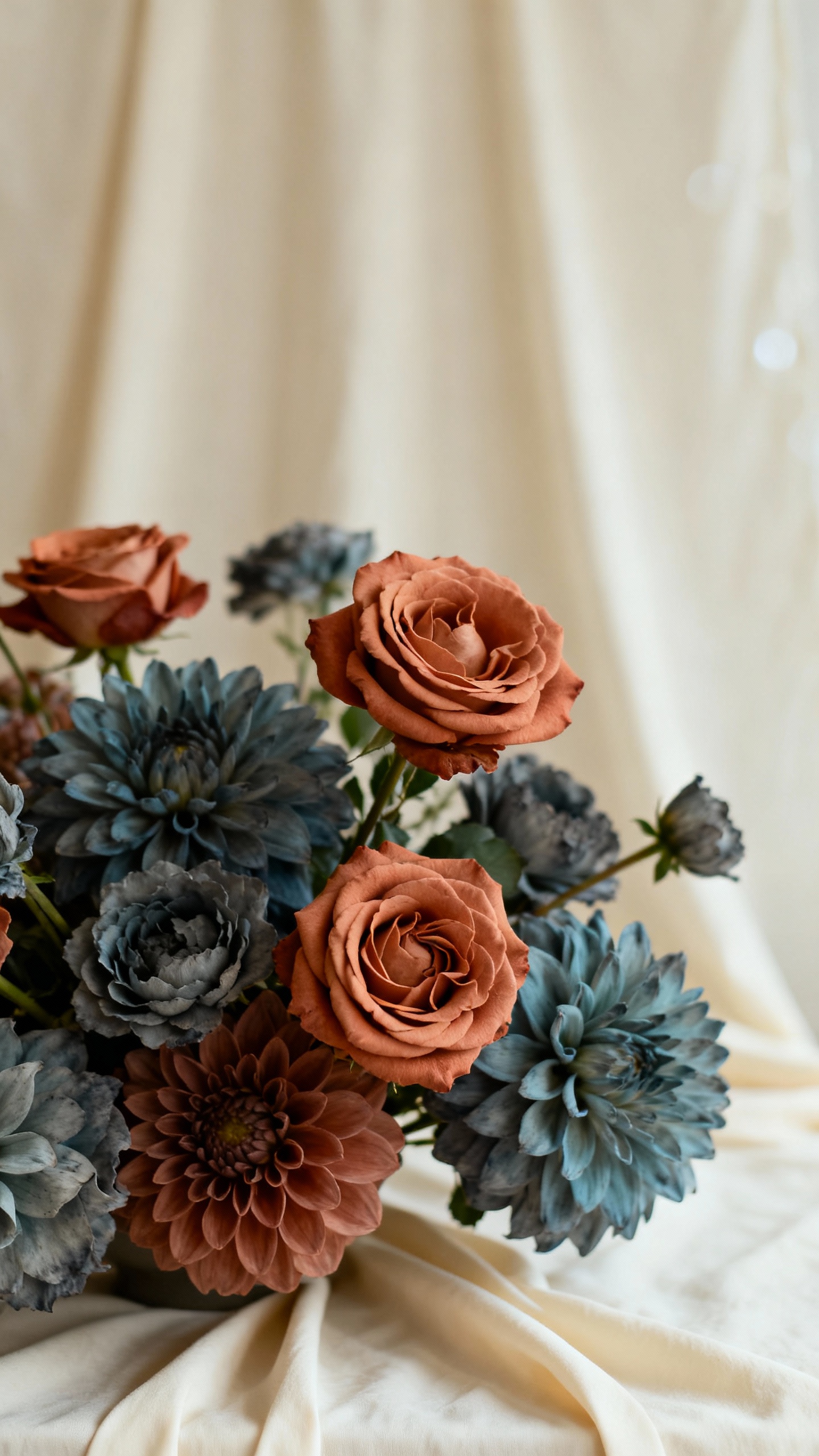
Terracotta brings warmth, dusty blue cools it down, and cream keeps the palette wedding-soft. The trick is choosing muted versions: think clay tones and stormy, gray-leaning blues rather than bright teal or orange. Translate it into florals (rust roses, delphinium, dried elements), then repeat cream through paper goods and napkins so your photos feel cohesive and not overly rustic.
4) Deep Plum + Sage + Antique Gold

Plum is dramatic in the best way, but sage keeps it grounded and fresh—perfect if you want moody without going full gothic. Antique gold (not super shiny yellow-gold) ties it together and reads vintage-timeless in candlelight. Try plum in bridesmaid dresses or a velvet table runner, sage in greenery and place cards, and antique gold in frames, chargers, or subtle typography on menus.
5) Butter Yellow + Pearl Gray + Crisp White

Butter yellow is the “unexpected” part, but paired with pearl gray and crisp white, it turns into a clean, editorial look. Keep yellow as a highlight color—buds in the bouquet, a floral moment on the cake, or a fun signature drink garnish—while gray shows up in suits, napkins, or ribbons. This palette is especially stunning for spring and summer weddings because it feels bright without looking neon.
FAQ
How do I make an unexpected color combo feel timeless in photos?
Choose at least one true neutral (ivory, cream, white, champagne, gray) and let it take up the most visual space. Then add one deeper anchor color (navy, plum, black) and use the “unexpected” shade as an accent. Repeating the colors in 3–4 places (florals, linens, stationery, attire) keeps it intentional.
How many colors should a wedding palette have?
A sweet spot is 3 main colors plus 1–2 neutrals. If you go beyond that, it can start to look busy unless everything is very muted. Neutrals also help vendors match items more easily (linens, rentals, paper, and florals).
What if my venue already has strong colors (like red brick or dark wood)?
Treat the venue color like part of your palette and work with it, not against it. For red brick, creamy neutrals and olive tones look natural, while black accents add polish. For dark wood, lighter linens and soft tones (blush, champagne, sage) brighten the room and keep it feeling wedding-forward.
Do bridesmaids need to match the wedding palette exactly?
No—matching perfectly can look a little forced. Aim for coordination: put bridesmaids in one anchor shade (ink blue, sage, plum, pearl gray) and bring the accent colors into bouquets, ties, pocket squares, or getting-ready details. Mismatched dresses in the same color family can also feel very modern and timeless.
How do I incorporate these colors without changing everything I’ve already booked?
Start with easy swaps: napkins, candles, ribbon, signage backgrounds, and bar menus make a big impact fast. Florals are another high-visibility place to add your accent tones without redoing the whole design. If your big-ticket items are locked (like linens), use the unexpected color in smaller moments—cake flowers, escort cards, and ceremony aisle clusters.