
Picking wedding theme colors by season is basically your easiest shortcut to a celebration that feels “right” in photos, in the room, and on your Pinterest board. The goal isn’t to follow rules—it’s to choose colors that look amazing in your lighting, venue, and weather.
Below are five seasonal color directions that consistently work, plus quick notes on what to avoid so your palette stays intentional (not accidental).
Top 5
1) Spring: Soft Pastels + Fresh Greenery

Blush, pale blue, lavender, butter yellow, and sage look effortless in spring because they match the natural bloom happening outside. Pair them with crisp neutrals (white, ivory) so your details photograph clean and airy. What to avoid: super-neon brights and heavy black accents—spring light can make them look harsh instead of chic.
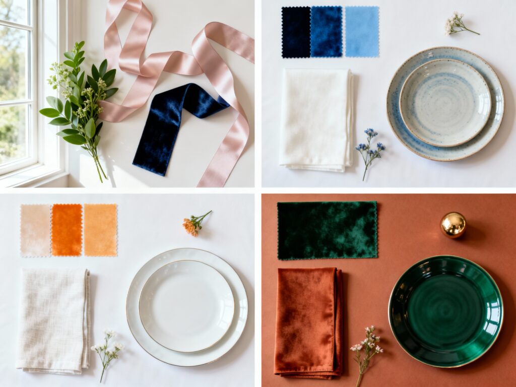
2) Summer: Clean Neutrals with Coastal Blues

Think ivory, sand, and champagne with dusty blue, cornflower, or ocean tones for a fresh summer feel that doesn’t melt into “too much.” This palette shines for outdoor ceremonies and waterfront venues because it stays cool and photo-friendly in bright sunlight. What to avoid: super dark palettes at midday (they can feel visually heavy) and too many competing brights that turn décor into a color fight.
3) Late Summer: Citrus + Warm Whites (Modern, Not Tropical)

Apricot, peach, marigold, and soft coral paired with warm white and light tan look glowy during golden hour and make florals pop. Keep it modern by using one citrus shade as the lead and letting the rest be neutrals and greenery. What to avoid: going full rainbow or adding too much hot pink—late summer can tip from elevated to “theme party” fast if everything is loud.
4) Fall: Earthy Terracotta + Deep Green

Terracotta, rust, cinnamon, and caramel with deep olive or forest green is basically fall’s power couple—cozy, rich, and flattering in candlelight. It works beautifully with wood, stone, and outdoor foliage without looking overly “Halloween.” What to avoid: pairing these tones with stark white (it can feel jarring) or using too much bright orange—keep it grounded with creamy neutrals instead.
5) Winter: Moody Jewel Tones + Metallics

Emerald, burgundy, navy, and plum with gold or silver accents looks luxe in dimmer winter light and instantly upgrades a ballroom or cozy lodge. Use metallics as highlights (flatware, frames, signage) so the palette feels expensive, not busy. What to avoid: too much cool gray with icy blue if your venue lighting is warm—it can read dull; also skip overloading on glitter and let one metallic do the work.
FAQ
How do I choose wedding colors that look good in photos?
Start with your venue’s existing colors (carpet, wood tone, wall color) and choose a palette that complements them. Aim for one main color, one supporting color, and 1–2 neutrals so your photos have contrast without chaos. If you can, test your palette by looking at fabric swatches in the same lighting as your ceremony and reception.
What’s the biggest mistake couples make with seasonal color palettes?
Forcing a color story that fights the season or the venue—like super dark tones in harsh midday sun, or icy pastels in a candlelit, wood-heavy space. Another common issue is using too many “main” colors; it makes décor look scattered instead of styled. Keep the palette tight and repeat it across bridesmaids, florals, paper goods, and tables.
Can I wear white flowers with bold seasonal colors?
Yes, and it’s often the secret to making bold palettes feel elevated. White blooms add breathing room and help bright or deep colors look intentional, especially in centerpieces and bouquets. If you want even more depth, mix white with one tinted neutral like blush, cream, or mocha.
How do I make my wedding colors feel timeless, not trendy?
Choose classic base neutrals (ivory, champagne, taupe) and keep trendy shades as accents in areas that are easy to swap—napkins, ribbons, signage, or bridesmaid dresses. Focus on texture (linen, velvet, stone, ceramic) because it photographs timelessly even when colors are modern. Repeating a small palette consistently will always look more refined than chasing every trend at once.
What if my favorite colors “don’t match” my season?
You can still use them—just adjust the shade and styling. For example, love pink for fall? Choose dusty rose or mauve instead of bubblegum, and pair it with warm neutrals and greenery. The season doesn’t have to control you; it just helps you pick tones that look natural in that season’s light.