
Your venue is already doing a lot of the heavy lifting (hello, chandeliers, garden views, or those perfect brick walls). The right theme colors just turn the volume up—instantly making the space feel more intentional, elevated, and “this was 100% the plan.”
These five color palettes are the quickest way to make almost any venue look better on camera and in real life, without needing a massive decor budget.
Top 5
1) Soft Sage + Cream + Warm Wood

This palette makes venues feel airy, calm, and expensive in the most effortless way. Sage plays nicely with greenery and neutral backdrops, while cream keeps everything bright and photo-friendly. Add warm wood (chairs, signage, chargers) to keep it from feeling too “all white everything.”
2) Classic Black + White + Champagne
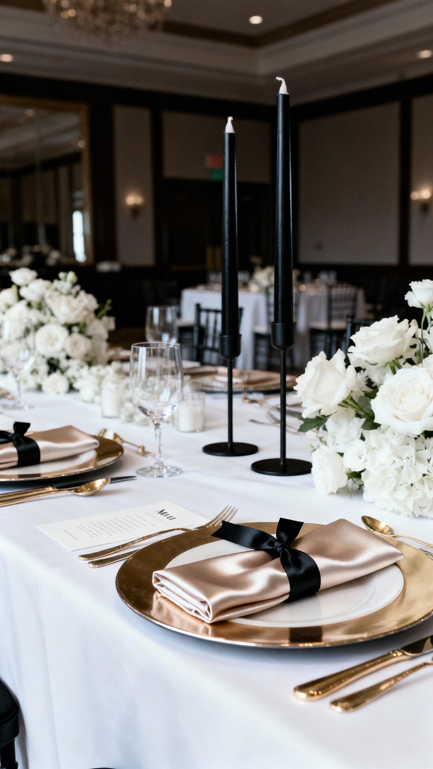
If you want your venue to look instantly more formal, this is the cheat code. Black details (menus, taper candles, ribbon, tuxes) create contrast that photographs beautifully against white linens. Champagne softens the vibe so it reads romantic instead of corporate.
3) Dusty Blue + Ivory + Silver
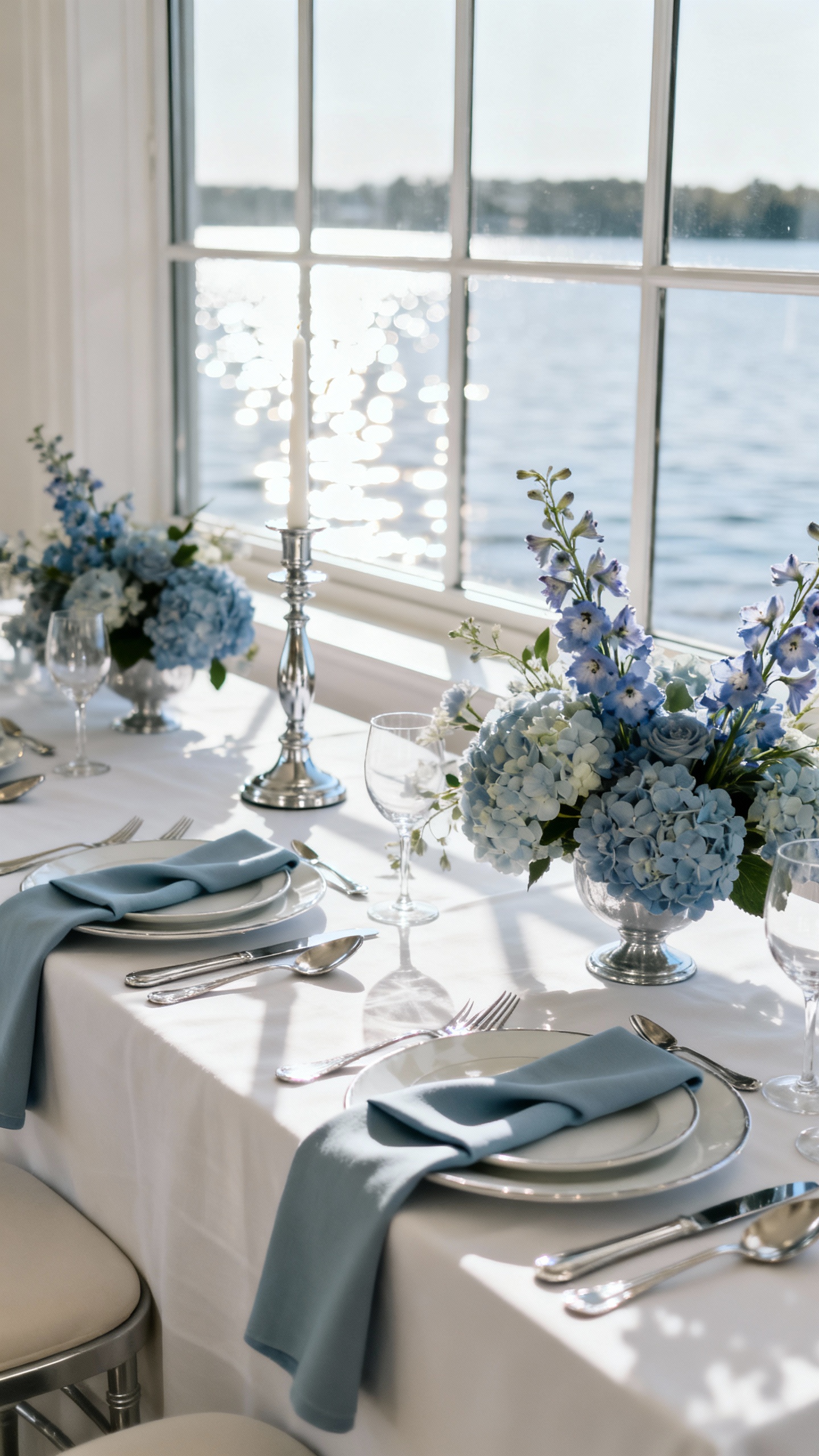
Dusty blue is basically a flattering filter for traditional ballrooms and waterside venues. It cools down warm lighting and makes white elements look crisp, not yellow. Silver accents (flatware, frames, candleholders) bounce light around the room and make your tablescape feel polished.
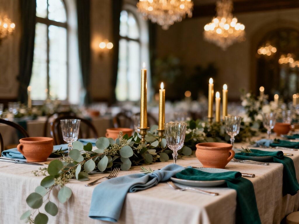
4) Terracotta + Blush + Olive
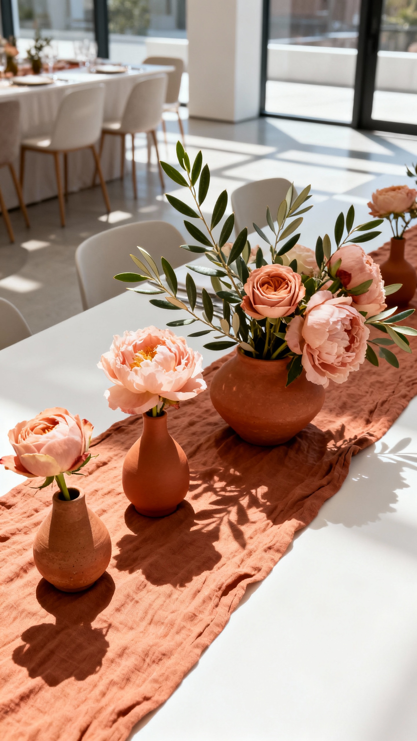
This combo instantly warms up blank spaces and makes even simple venues feel styled. Terracotta brings depth and richness (think linens, ceramics, or escort cards), while blush keeps it soft and wedding-appropriate. Olive ties it all together and looks amazing with candles, rattan, and textured florals.
5) Moody Emerald + Gold + Black
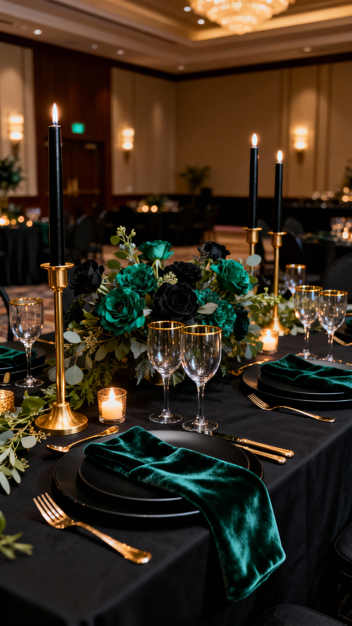
Want drama without going full gothic? Emerald adds luxe depth, gold brings glow, and black makes everything look sharp and intentional. This palette is especially venue-upgrading for hotel ballrooms, industrial spaces, and winter weddings where you want the room to feel cozy but elevated.
FAQ
How do I choose theme colors that “match” my venue?
Start with what you can’t change: wall color, flooring, lighting, and the vibe (modern, rustic, historic). Then pick one main color that complements those tones, plus 1–2 neutrals that will look clean in photos. If your venue has bold features (like red brick or dark wood), choose a palette that either harmonizes (warm with warm) or intentionally contrasts (black/white for crispness).
What wedding colors photograph best indoors?
High-contrast palettes (black/white/champagne) and soft neutrals (sage/cream) tend to photograph the cleanest. Dusty tones also do well because they’re less likely to look neon or harsh under uplighting. If your venue has warm lights, lean into ivory, champagne, terracotta, and greenery instead of stark bright white.
How many colors should a wedding palette have?
For a cohesive look, aim for 3–5 total: one main color, one secondary color, and 1–3 supporting neutrals/metallics. More than that can start to look busy unless you’re very consistent with where each color shows up. Repeating the same colors across florals, paper goods, linens, and attire is what makes it feel “designed.”
Do I need to match my bridesmaids to my decor?
No—coordinate, don’t copy. Bridesmaid dresses can be a softer or deeper shade of your main color, or even a complementary neutral (like champagne with sage). What matters most is that the dresses don’t clash with your flowers and linens, especially in group photos and at the ceremony backdrop.
What’s the easiest, most budget-friendly way to make the colors feel intentional?
Pick two “hero moments” to focus on: ceremony backdrop and reception tables. Use your palette there with linens or runners, candles, and a few repeated details like napkin color, menus, and ribbon. Keeping your metals consistent (all gold or all silver) also makes everything look instantly more elevated without adding more stuff.