

Trends are fun, but your wedding photos? They’re forever. If you want a palette that still feels chic when you’re flipping through albums years later (and posting anniversaries on Pinterest), timeless color choices are the move.
Below are five wedding theme colors that photograph beautifully in different seasons, play nicely with most venues, and won’t scream “that was so 2019” down the road.
Top 5
1) Classic Black & White
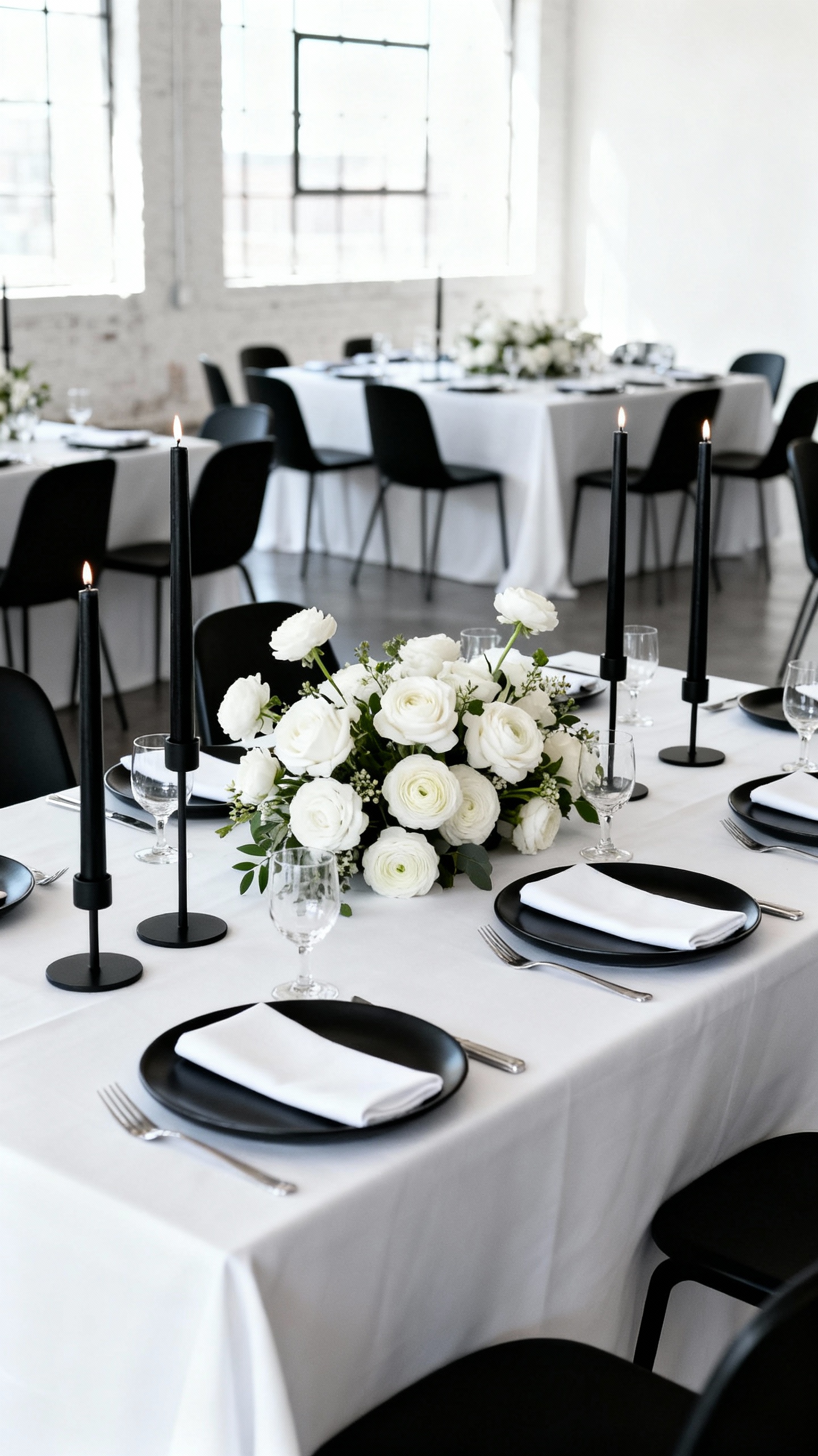
Black and white is the ultimate “never dated” combo because it’s already a design classic. It reads editorial in photos, makes details look intentional, and works for anything from a modern loft to a ballroom. Add texture (matte black signage, crisp linens, glossy glassware) to keep it from feeling flat.
2) Soft Ivory & Champagne Neutrals
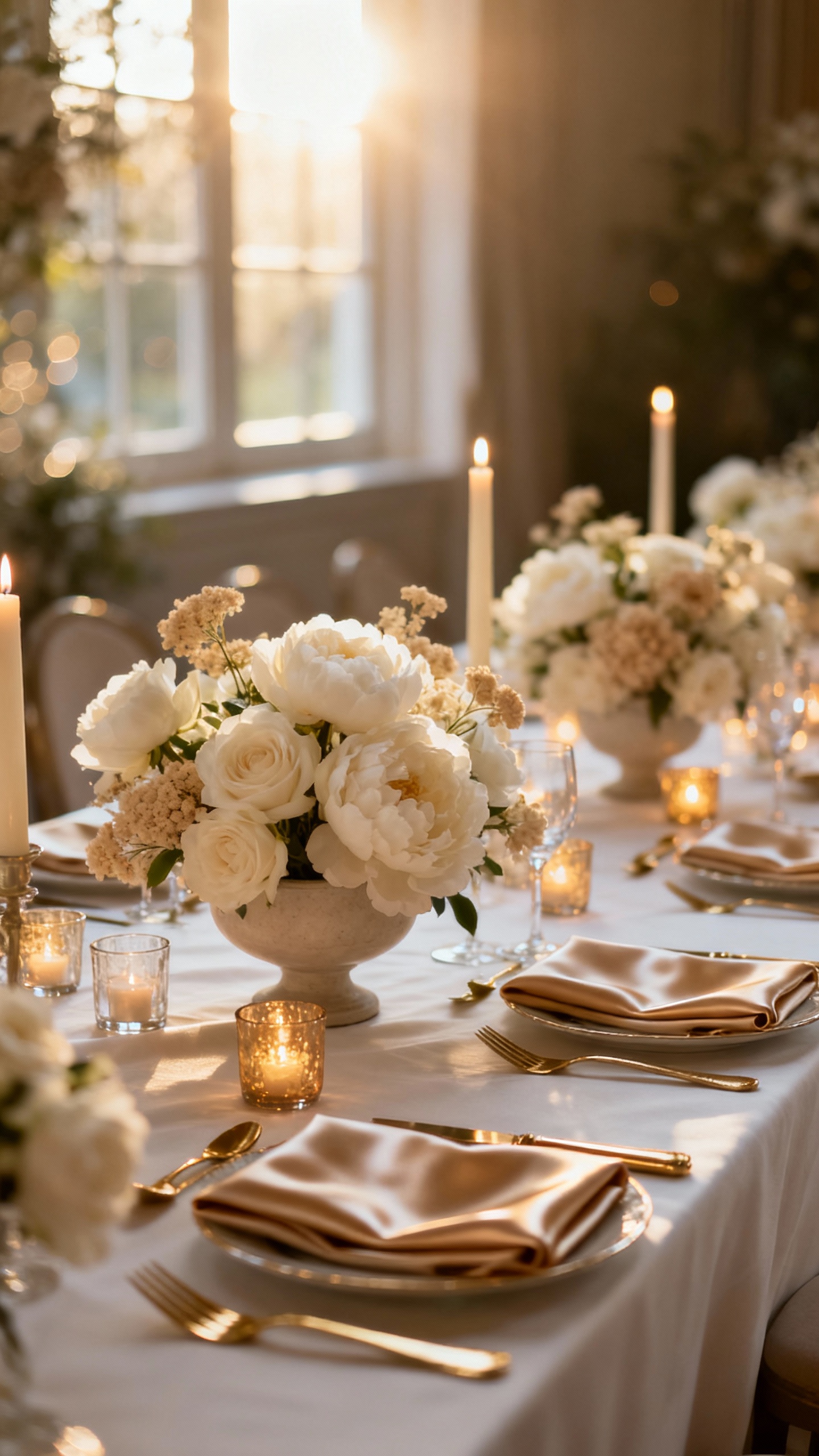
Ivory and champagne create that glowy, romantic look that always feels elevated and expensive in pictures. This palette is perfect if you want your florals, dress, and candlelight to be the main character. Mix in warm metals (gold, brass) and layered neutrals (oatmeal, sand, latte) for depth.
3) Navy & Cream
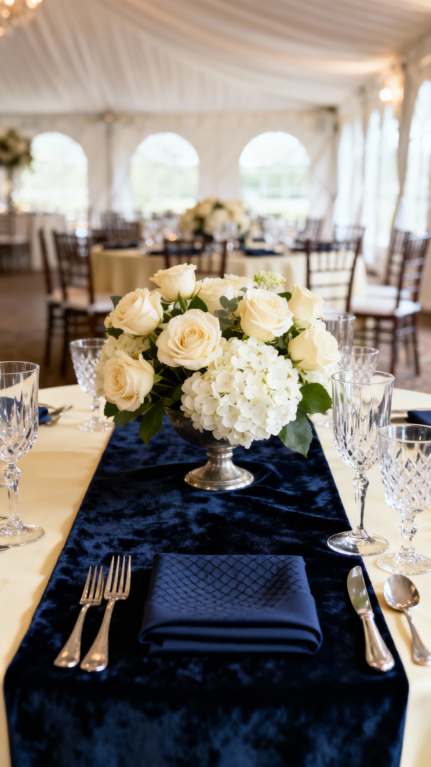
Navy is basically black’s softer cousin—still formal, but slightly more approachable and dreamy on camera. Pair it with cream to keep things light, especially for stationery, linens, and bridesmaid dresses. It’s also a lifesaver for mixed lighting (indoor receptions + flash photos) because navy stays rich instead of washing out.
4) Sage Green & White
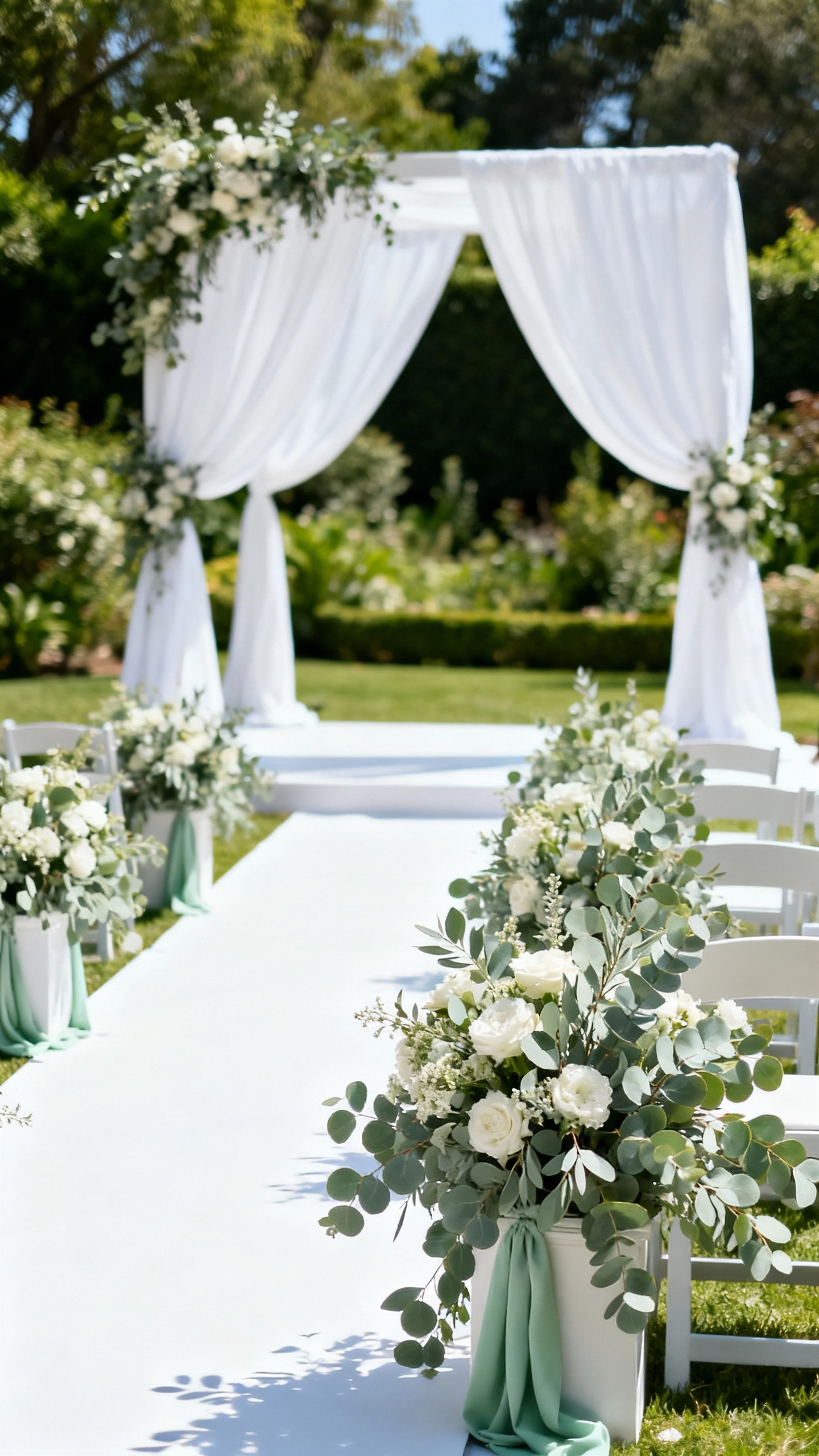
Sage gives you that fresh, natural look without being overly trendy when you keep the rest of the palette clean. It photographs beautifully outdoors, complements most skin tones, and works year-round with the right florals. Stick to true sage (not neon green), and pair with crisp whites and soft greenery to keep it timeless.
5) Dusty Blue & Soft Gray
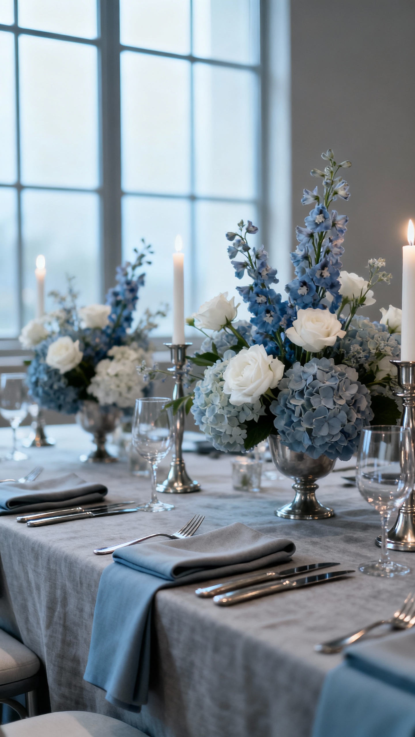
Dusty blue and soft gray are romantic, calm, and quietly modern—like a color palette that knows how to behave in every venue. These shades hold up in bright daylight and low-light receptions, and they look especially pretty in bridesmaid dresses and table linens. Add a gentle accent (white, silver, or muted taupe) to keep everything airy instead of cold.
FAQ
How do I choose a “timeless” wedding color that still feels like me?
Start with one classic base (black, navy, ivory, white, gray) and add one softer supporting shade (sage, dusty blue, champagne). Then bring in personality through textures and details—like velvet ribbons, patterned napkins, or a statement escort display—without changing the core palette.
Which colors look best in photos across different lighting?
Navy, black, and soft neutrals typically photograph consistently in both natural light and indoor reception lighting. Super bright shades can shift under flash, while very pale pastels can disappear against white dresses and linens, so balance light tones with one deeper anchor color.
Can I still use trendy accents without dating my wedding?
Yes—just keep trends to small, swappable places: cocktail napkins, welcome sign styling, mini florals, or lounge pillows. If you love a trendy shade (like terracotta or hot pink), use it as an accent rather than your main bridesmaid dress or full-table linen color.
What’s the easiest way to make a neutral palette look intentional?
Layer tones and textures: think ivory linens, champagne candles, matte signage, and mixed metals. Add dimension with florals in varying shades of white/cream plus greenery, and make sure at least one element has contrast (like black calligraphy or deep navy menus).
Do I need to match my wedding colors to my venue?
You don’t have to match, but you should coordinate. Look at your venue’s permanent colors (carpet, walls, wood tones, landscape) and choose a palette that won’t clash. Timeless colors work because they’re flexible—if your venue is warm-toned, lean champagne and cream; if it’s cool-toned, lean dusty blue and soft gray.