
Picking a wedding color palette can feel like the biggest decision (right after the person you’re marrying, obviously). The trick is to let the season do some of the heavy lifting—then customize with your vibe, venue, and a few intentional accent colors.
Below are five season-friendly palettes that photograph beautifully and work across invitations, florals, attire, and tablescapes. Save your favorite, then build from there.
Top 5
1) Spring: Blush, Sage, and Soft Gold
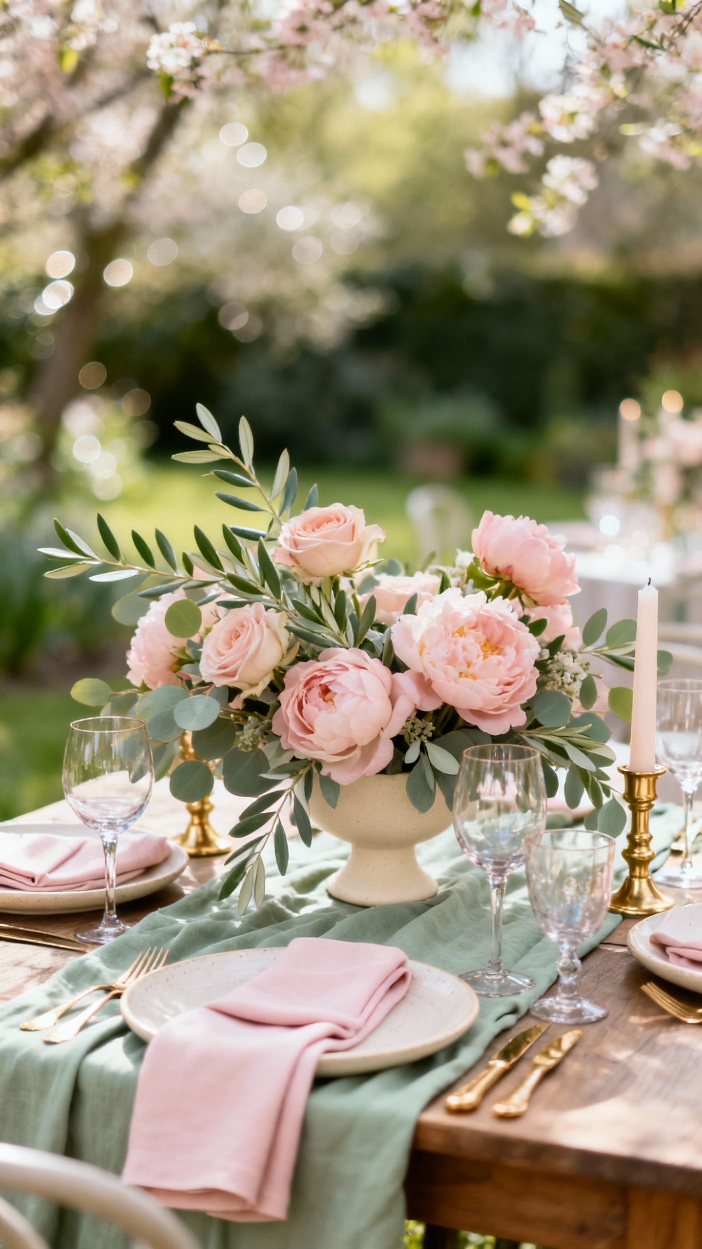
This palette is timeless, romantic, and basically made for garden venues. Use blush for bridesmaid dresses or stationery, sage for linens or greenery-forward florals, and soft gold in candlesticks or flatware. It also plays nicely with neutrals, so you can keep it airy instead of overly “pink.”
2) Summer: Coastal Blue, White, and Sand
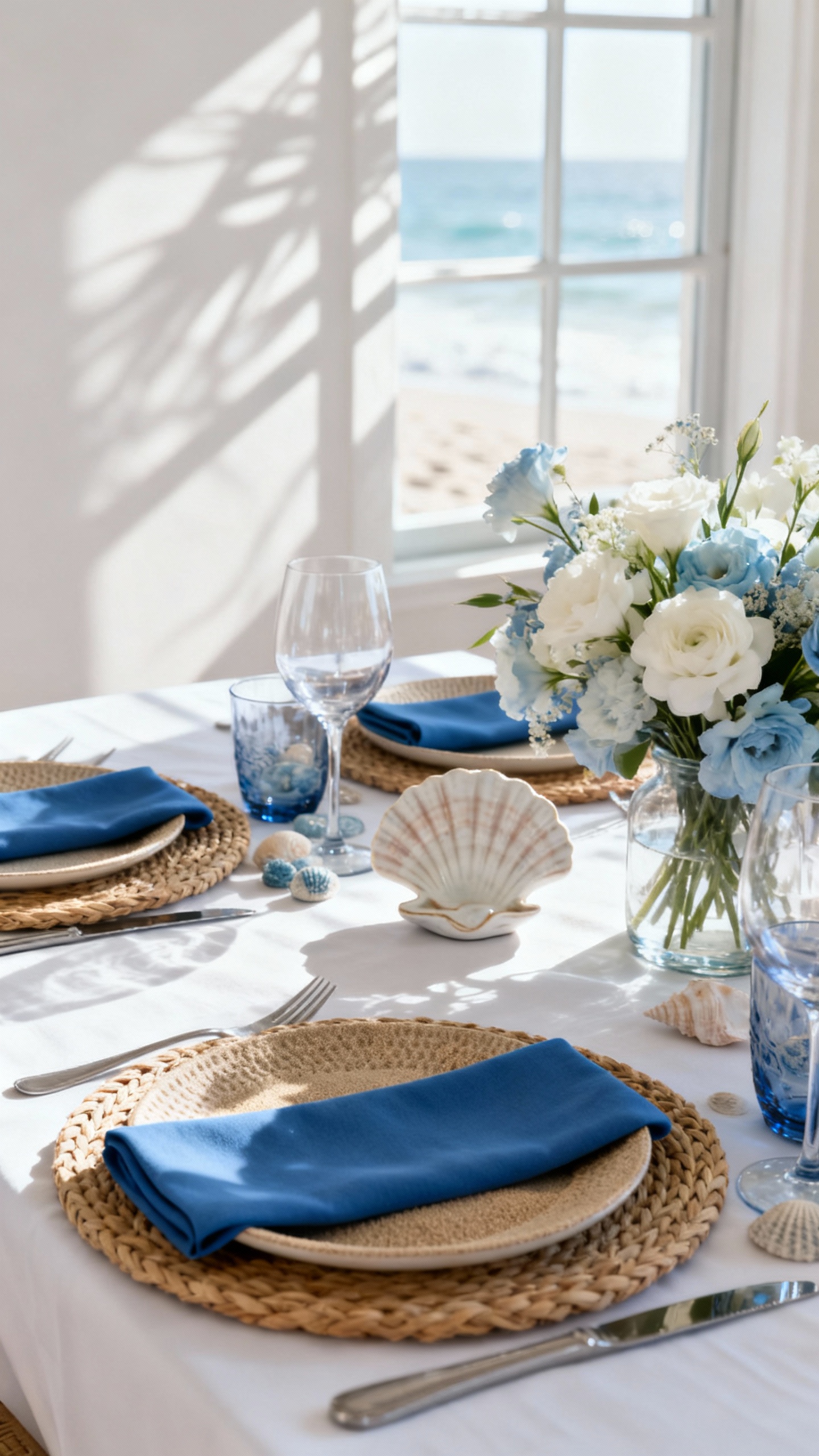
If you want fresh, clean, and elevated—this is it. Coastal blue looks amazing in oceanfront settings, but it also works in ballrooms when paired with crisp white and warm sand tones. Add texture with rattan details, linen napkins, or beachy-inspired escort cards (without going full theme party).
3) Fall: Terracotta, Cream, and Olive
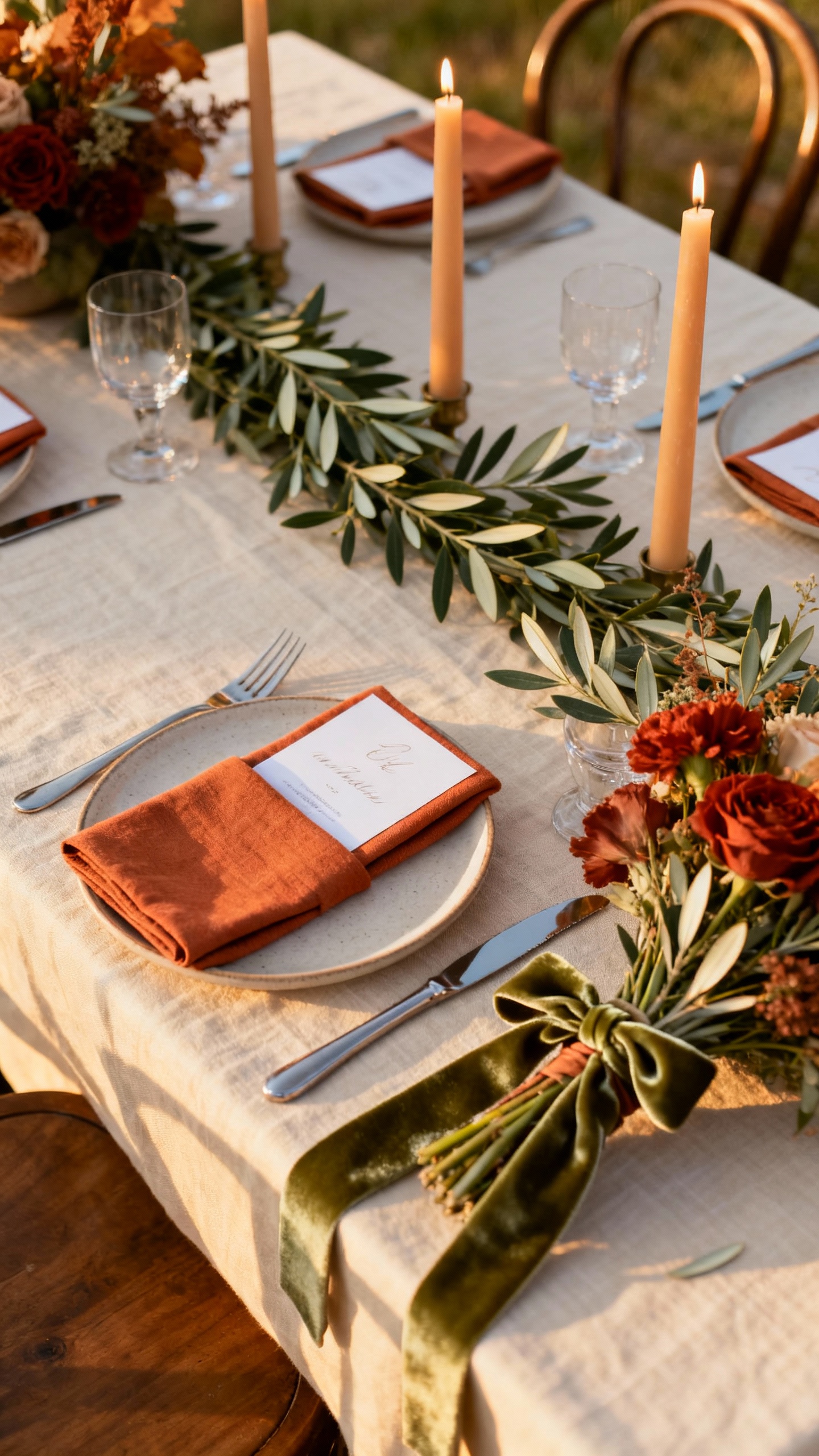
Fall colors don’t have to be dark to feel seasonal, and terracotta is the perfect warm anchor. Pair it with creamy whites for balance, then bring in olive through foliage, velvet ribbons, or bridesmaid mix-and-match dresses. This palette is especially pretty with wood tables, candlelight, and stone venues.
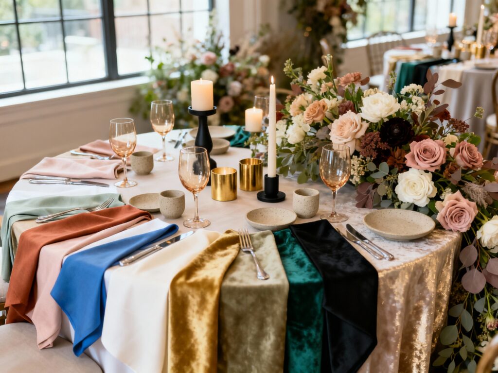
4) Winter: Emerald, Black, and Champagne
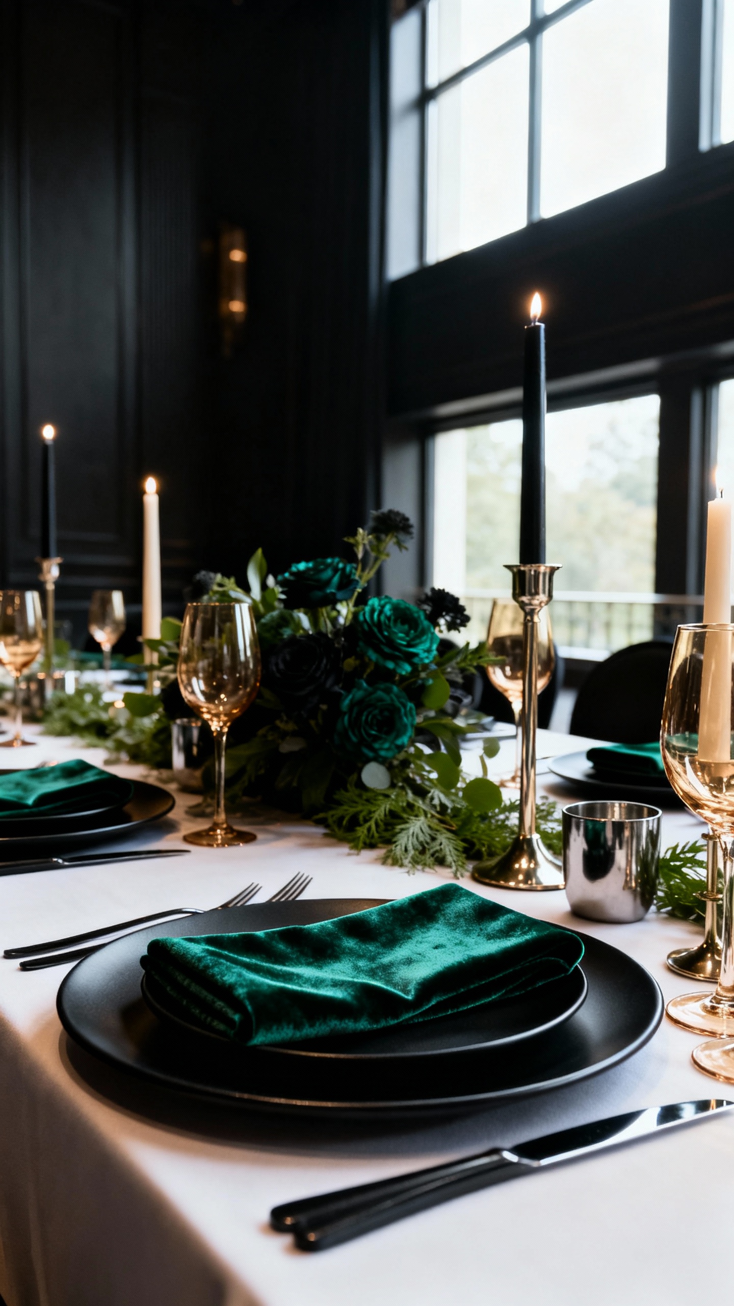
For a winter wedding that feels modern and luxe, emerald is your statement color. Black adds instant polish (think tuxes, signage, or matte black frames), and champagne warms everything up with a soft glow. Keep florals simple—white blooms with evergreen accents—and let lighting do the romantic work.
5) Year-Round Neutral: Ivory, Taupe, and Dusty Rose
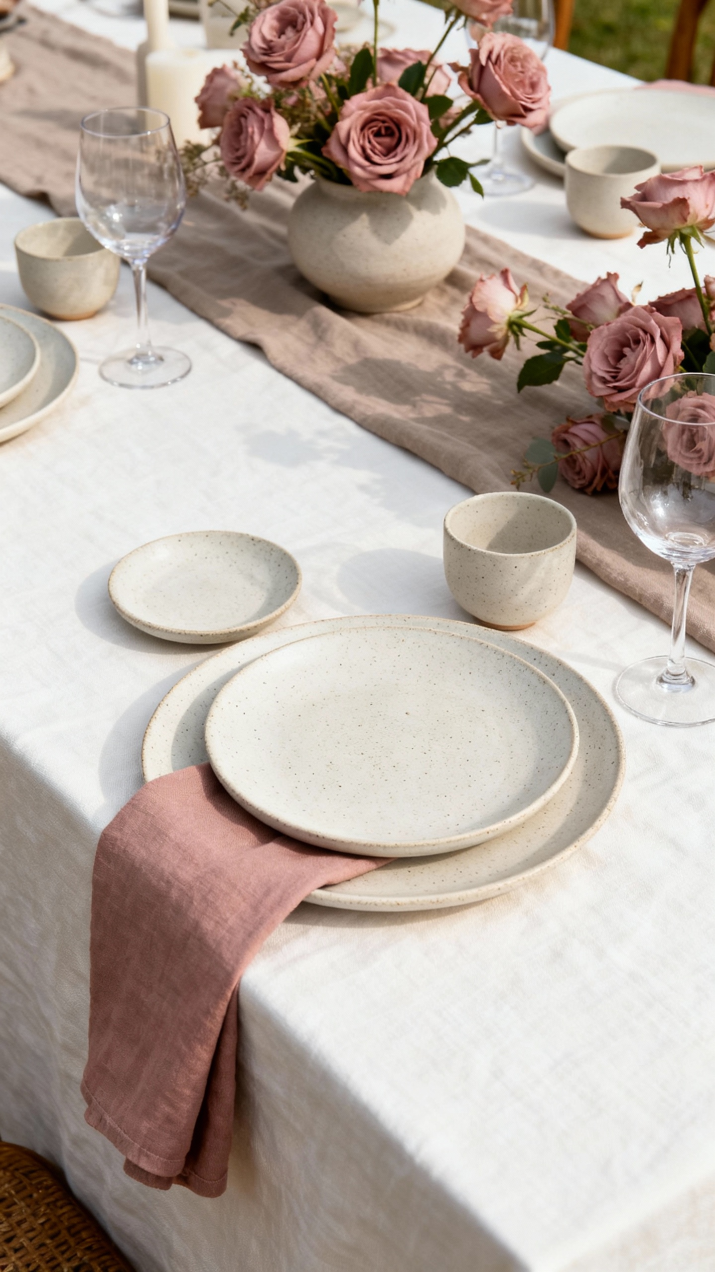
This one is for the minimalists who still want a little softness. Ivory and taupe create a calm base that works in any season, while dusty rose adds just enough color to feel special in photos. It’s also super flexible: you can lean warmer with caramel accents or cooler with silvery glassware, depending on your venue.
FAQ
How do I choose a wedding color palette that matches my venue?
Start with what’s already there: wall color, flooring, greenery, and overall lighting. If your venue is busy (patterns, bold carpeting, dark wood), choose a simpler palette with one main color and softer neutrals. If the space is minimal, you can go bolder with contrast or a deeper statement shade.
How many colors should I include in my palette?
A practical sweet spot is 3–5: one main color, one secondary, one neutral, and 1–2 accent metals or “pop” shades. This keeps your details cohesive without forcing everything to match perfectly. When in doubt, repeat your main color in at least three places (like florals, paper goods, and attire).
Can I mix metals like gold and silver in my wedding decor?
Yes—just do it intentionally. Pick one “lead” metal (like champagne gold) and one supporting metal (like brushed silver), then keep finishes consistent. Mixing works best when the rest of your palette is fairly calm, so the metals feel layered rather than chaotic.
How do I make seasonal colors look modern instead of themed?
Use seasonal shades as accents rather than covering everything in them. For example, a fall palette can be terracotta napkins with cream florals, not pumpkin everything. Modern vibes come from clean typography, thoughtful negative space, and texture (linen, velvet, ceramics) instead of novelty decor.
What if my partner and I like totally different colors?
Choose a neutral base you both love (ivory, taupe, black, or soft gray), then give each person one color moment—like your favorite shade in florals and theirs in attire details or bar styling. You can also compromise by picking tones from the same family (dusty versions, deeper versions) so it feels cohesive. The goal is a palette that feels like both of you, not just one side’s Pinterest board.