
Matching wedding bouquets to bridesmaid dresses is one of those details that makes photos feel instantly cohesive—without looking too “done.” The trick is choosing a color approach on purpose (match, complement, or softly contrast), then repeating that choice across your florals in a consistent way.
This guide breaks down practical color rules, bouquet ideas, and small styling tweaks that help your wedding party look coordinated, modern, and totally you.
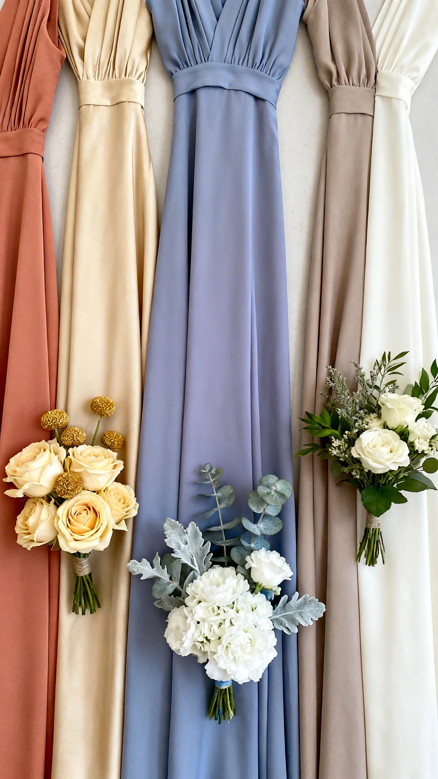
Start with your bridesmaid dress undertone
Before you choose flowers, identify whether the dress color reads warm, cool, or neutral. Warm tones (terracotta, champagne, peach) look best with golden centers, creamy whites, and sunset accents. Cool tones (dusty blue, lavender, emerald) love crisp whites, silvery greens, and jewel-toned blooms. Neutral dresses (black, taupe, ivory) can go nearly any direction, so decide based on your overall vibe.
Pick one “anchor flower color” and repeat it
Choose one main flower color that connects directly to the dresses, then repeat it in every bouquet. This doesn’t mean everything matches exactly; it means the bouquets share a consistent thread. If dresses are dusty rose, an anchor could be blush roses or mauve dahlias. Repetition is what makes the wedding party look intentional in group photos.
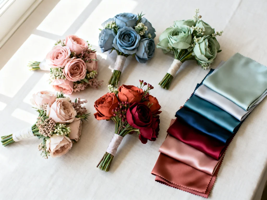
Use the 60-30-10 color formula for bouquets
A simple way to build bouquet color is 60% base, 30% supporting, 10% accent. Your base is often white/ivory or greenery, the supporting shade echoes the dress family, and the accent adds personality (like berry, rust, or bright pink). This keeps bouquets from competing with the dresses while still feeling special. Ask your florist to show a quick “recipe” for each bouquet using this ratio.
Match saturation, not just color names
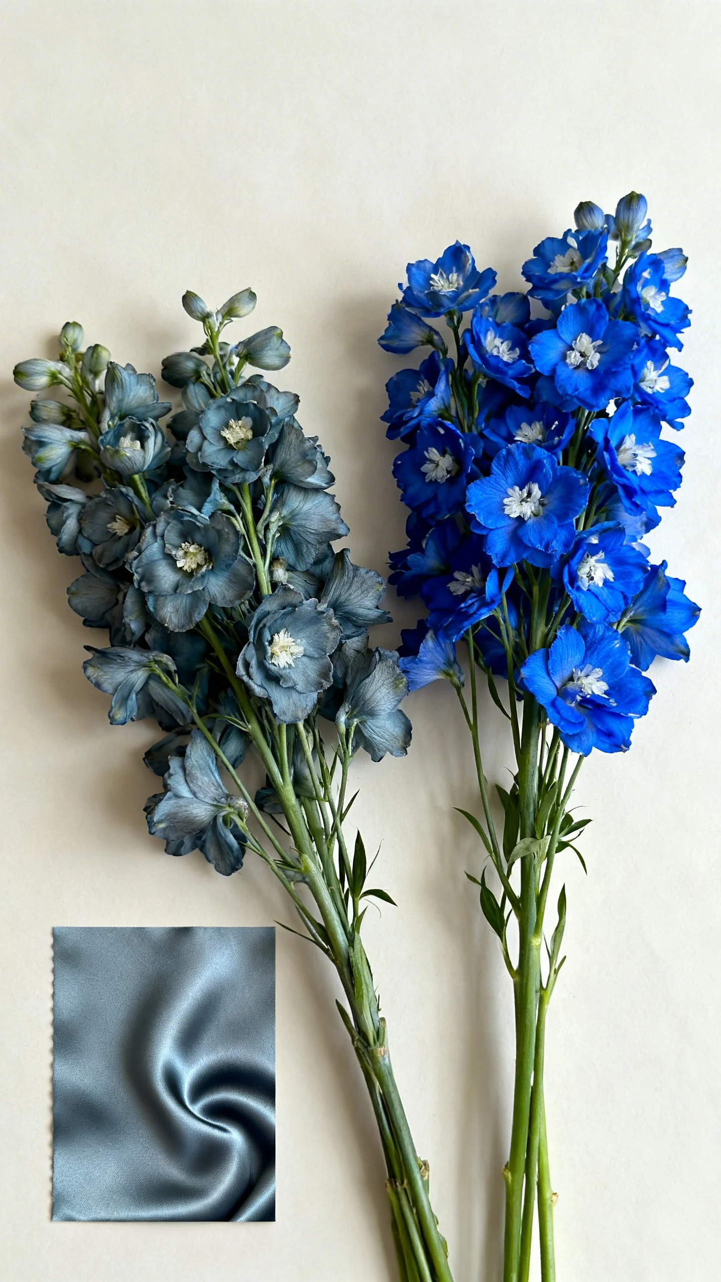
“Blue” can mean pastel, dusty, or bold—and flowers will look off if the intensity doesn’t align. If your dresses are muted, choose dusty, smoky, or antique flower tones rather than neon brights. If dresses are vibrant, avoid overly pale blooms that can look washed out next to them. Saturation matching is the secret to bouquets photographing beautifully together.
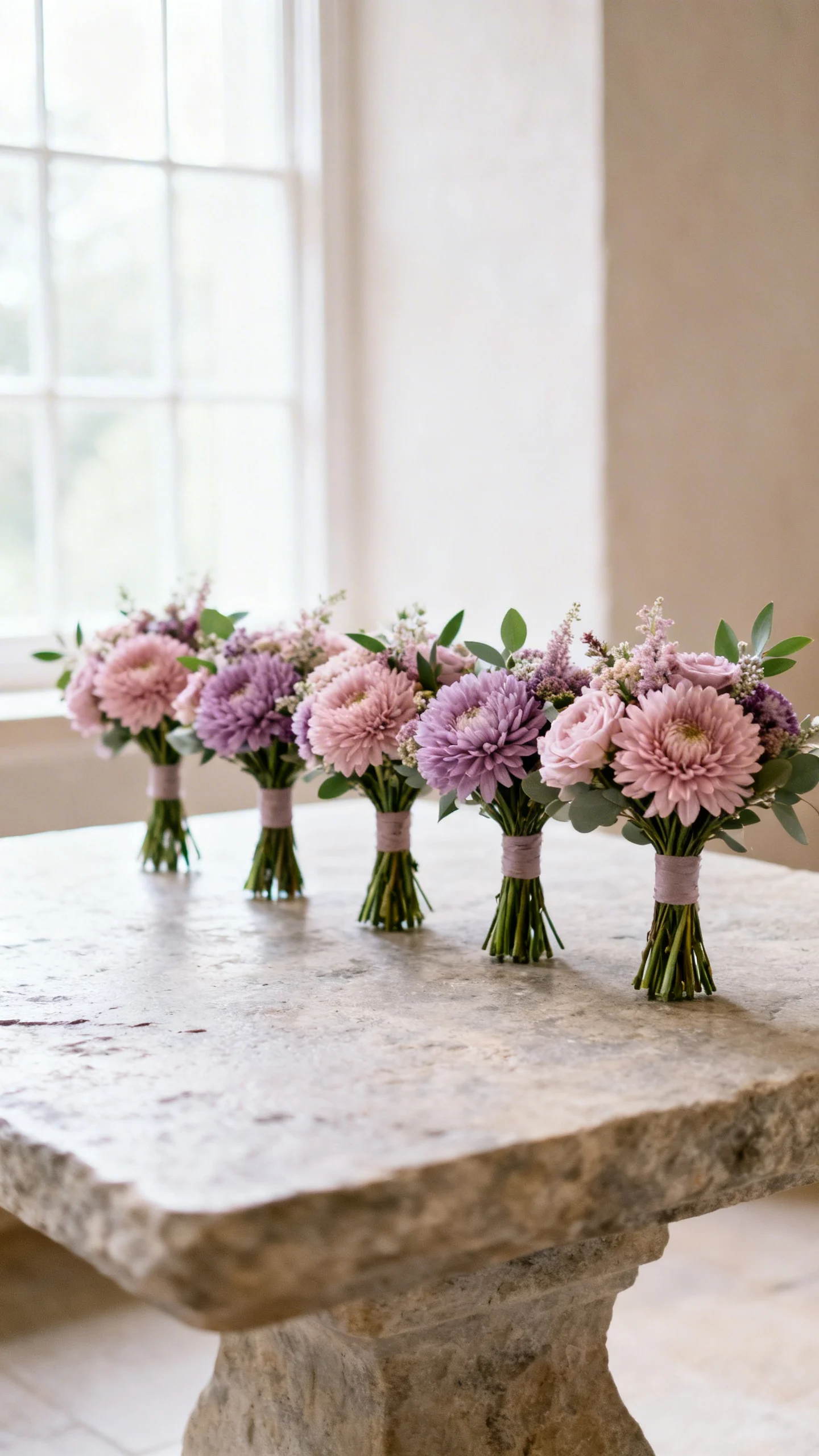
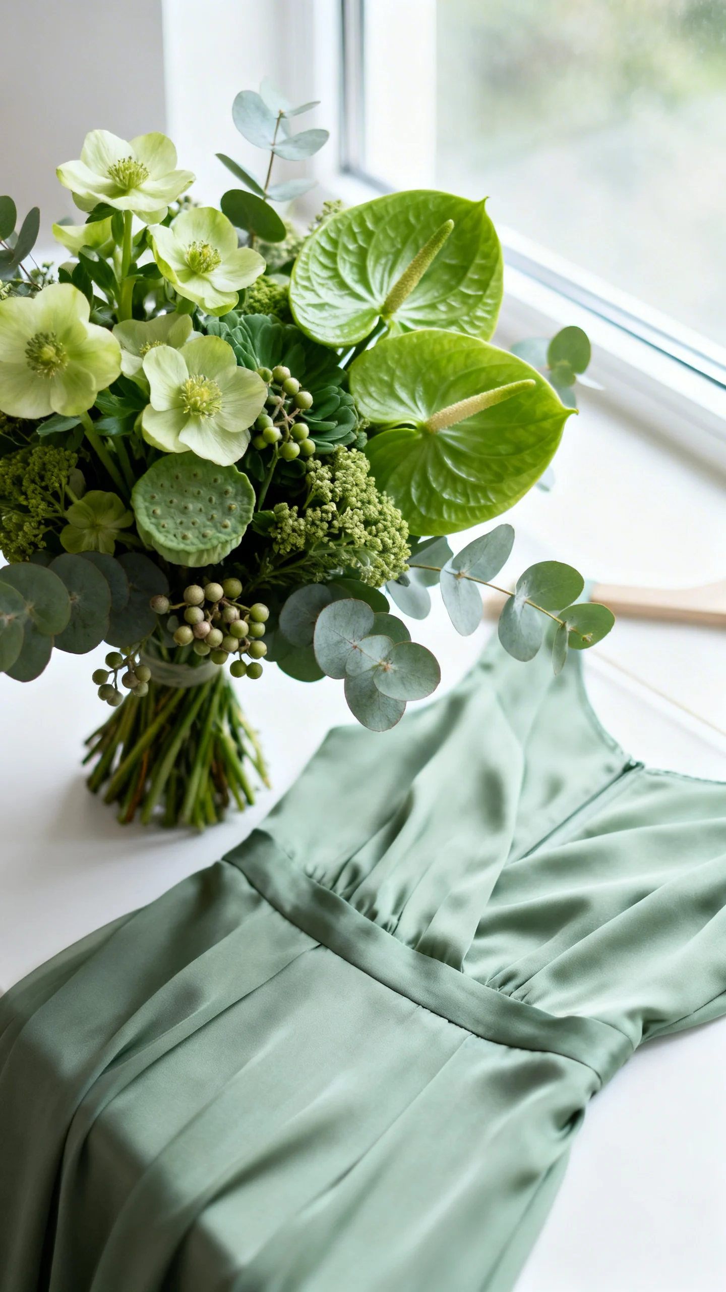
Go monochrome for a sleek, modern look
Monochrome bouquets use several shades of the same color family as the dresses for a polished, editorial feel. Think sage dresses with pale green hellebores, deeper green anthurium, and textured eucalyptus. This approach is especially stunning when your bridesmaids all wear the same dress color. Add texture (berries, pods, interesting greenery) so it doesn’t feel flat.
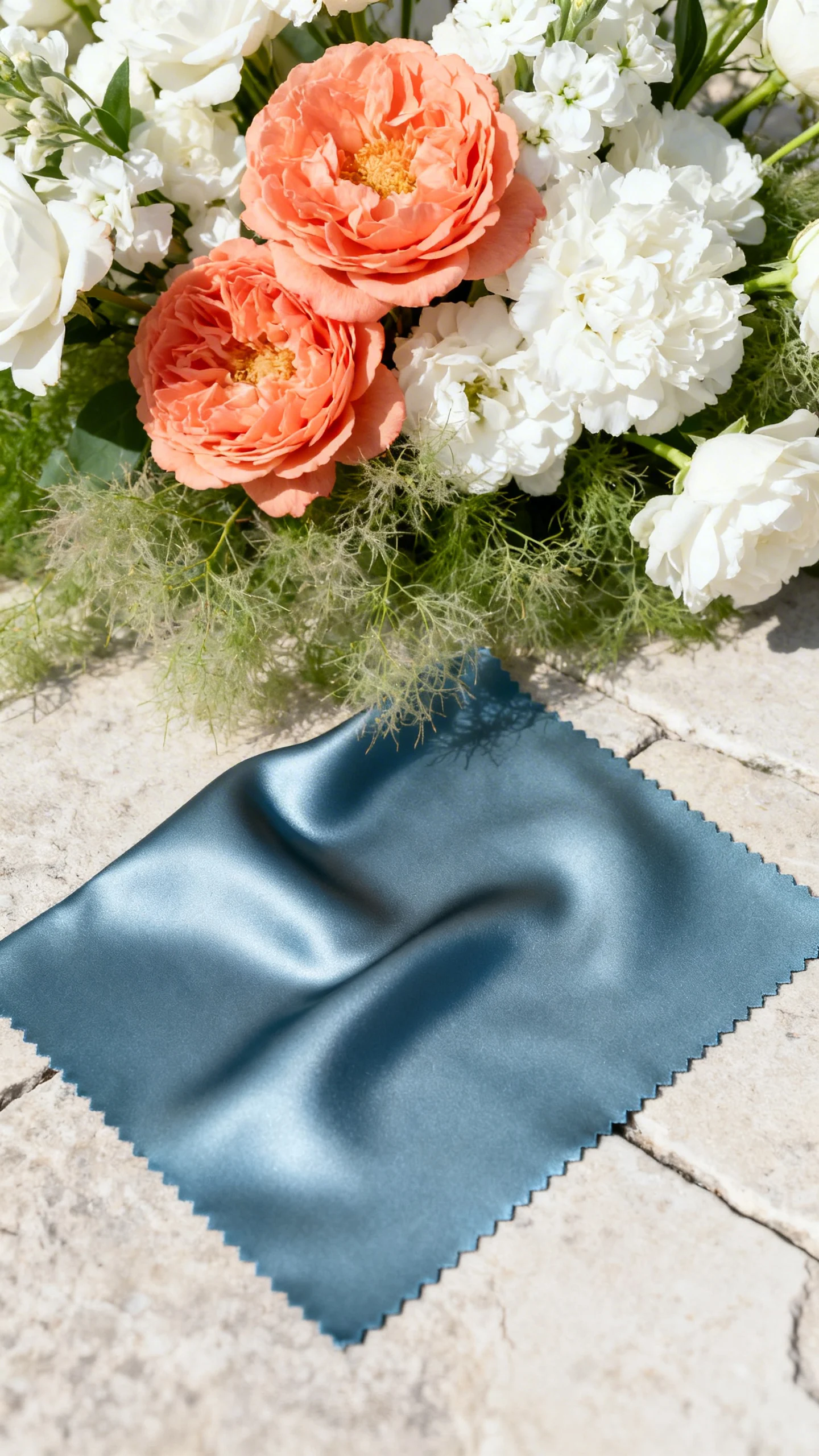
Try complementary contrast for extra pop
Complementary colors sit opposite each other on the color wheel and create a lively, photo-friendly contrast. Examples: dusty blue dresses with peach/coral florals, or burgundy dresses with soft blush and warm neutrals. Keep the contrast controlled by using plenty of white or greenery as a buffer. This gives “wow” without turning the bouquet into a distraction.
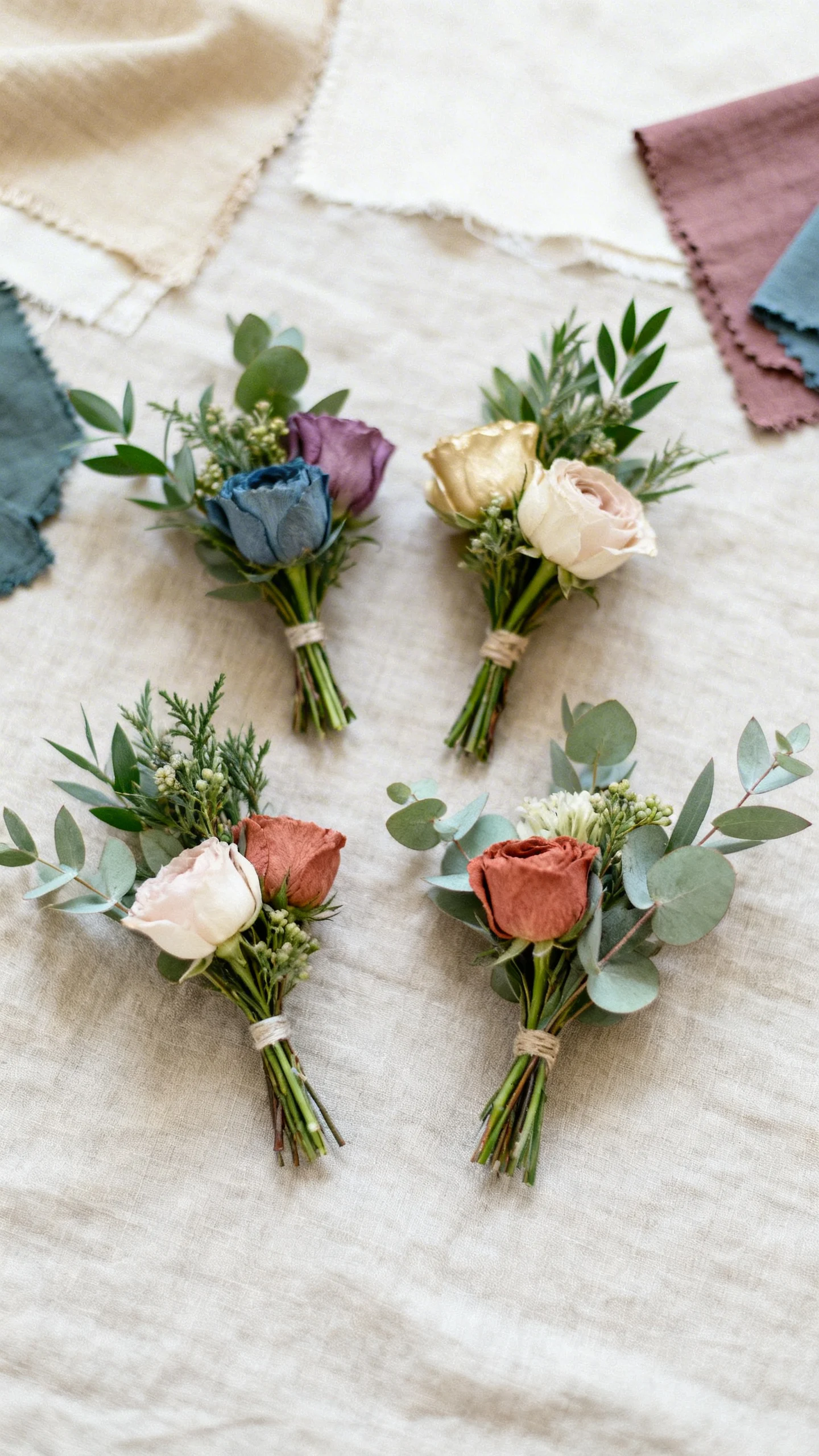
Use neutrals to bridge mixed dress colors
If your bridesmaids are in mismatched colors, neutrals are your best friend for cohesive bouquets. Build bouquets with ivory, champagne, soft blush, and consistent greenery, then add small color nods to each dress shade. This keeps every bouquet looking like it belongs to the same wedding. It also makes the bride’s bouquet easy to elevate with one extra statement bloom.
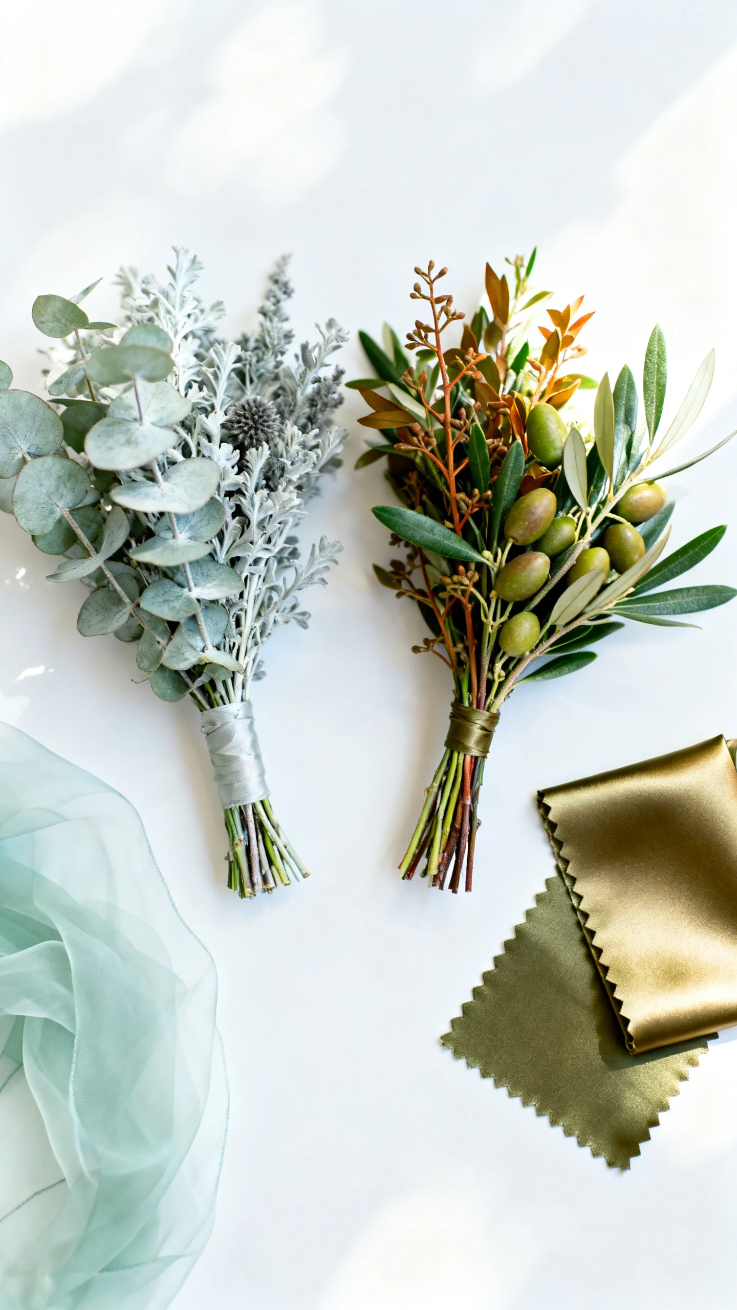
Coordinate greenery with the dress fabric and season
Greenery affects the “temperature” of the bouquet just as much as flowers do. Silvery eucalyptus and dusty miller feel cool and airy, while olive, salal, and ruscus read warmer and richer. Match lighter, floaty fabrics (like chiffon) with softer, more delicate greenery, and match structured fabrics (like satin) with cleaner, bolder greens. Seasonal greenery also makes the palette feel natural instead of forced.
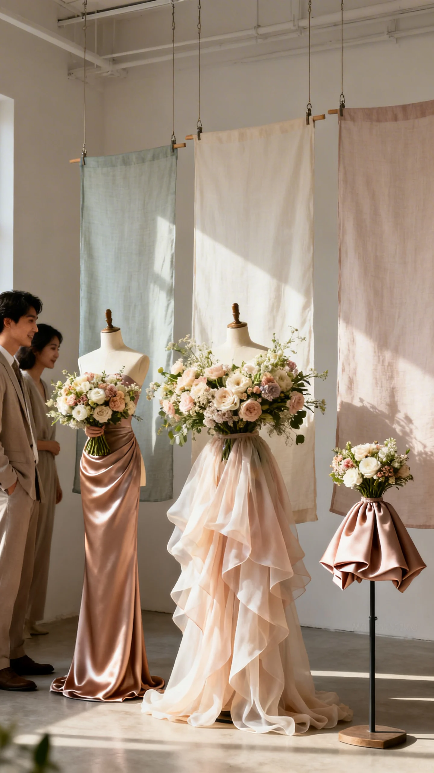
Balance bouquet scale with dress silhouettes
Color matching works best when the bouquet size and shape feel proportionate to the dress style. Sleek dresses pair beautifully with a slightly structured bouquet, while romantic or flowy dresses can handle airy, garden-style shapes. For petite bridesmaids or shorter hemlines, keep bouquets a touch smaller so the look stays balanced. When in doubt, ask for a consistent bouquet “profile” across the wedding party.
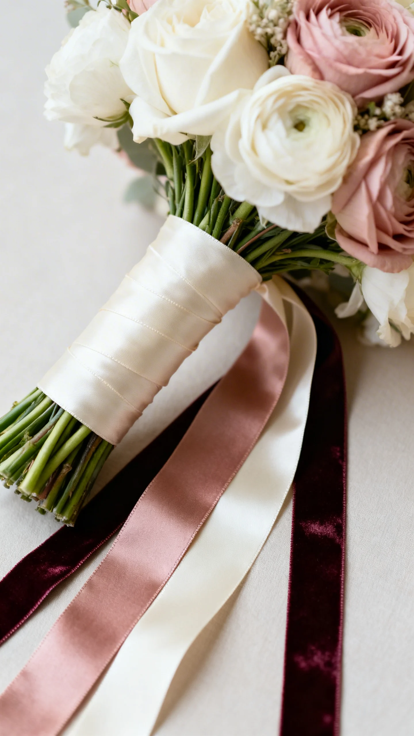
Don’t forget ribbons, wraps, and small finishing details
Ribbons are a simple way to tie dresses and bouquets together, especially in photos. Choose ribbon shades that either match the dresses, echo the accent color, or stay neutral in ivory or champagne. The wrap material matters too: satin feels formal, raw silk feels romantic, velvet feels rich. These details are small but they make the entire palette feel styled.
FAQ
Should bridesmaid bouquets match the dresses exactly?
Not necessarily. Exact matching can look flat, especially if the dress color is very specific. A better approach is to match the color family or undertone and repeat that shade consistently across bouquets.
What bouquet colors work with black bridesmaid dresses?
Black is a neutral, so you can go classic (white and greenery), romantic (blush and mauve), or bold (red, fuchsia, or jewel tones). The key is choosing a palette that fits the overall wedding style and season.
How do I match bouquets to dusty blue bridesmaid dresses?
Dusty blue pairs well with ivory, blush, peach, and soft lavender. For a cooler look, add silvery greenery and white blooms. For warmer contrast, use peach or terracotta accents with plenty of neutrals.
What if my bridesmaids are wearing mismatched colors?
Use a consistent neutral base (ivory blooms and repeat greenery), then add small touches that nod to each dress color. Keeping bouquet shape and texture consistent also helps the group look cohesive.
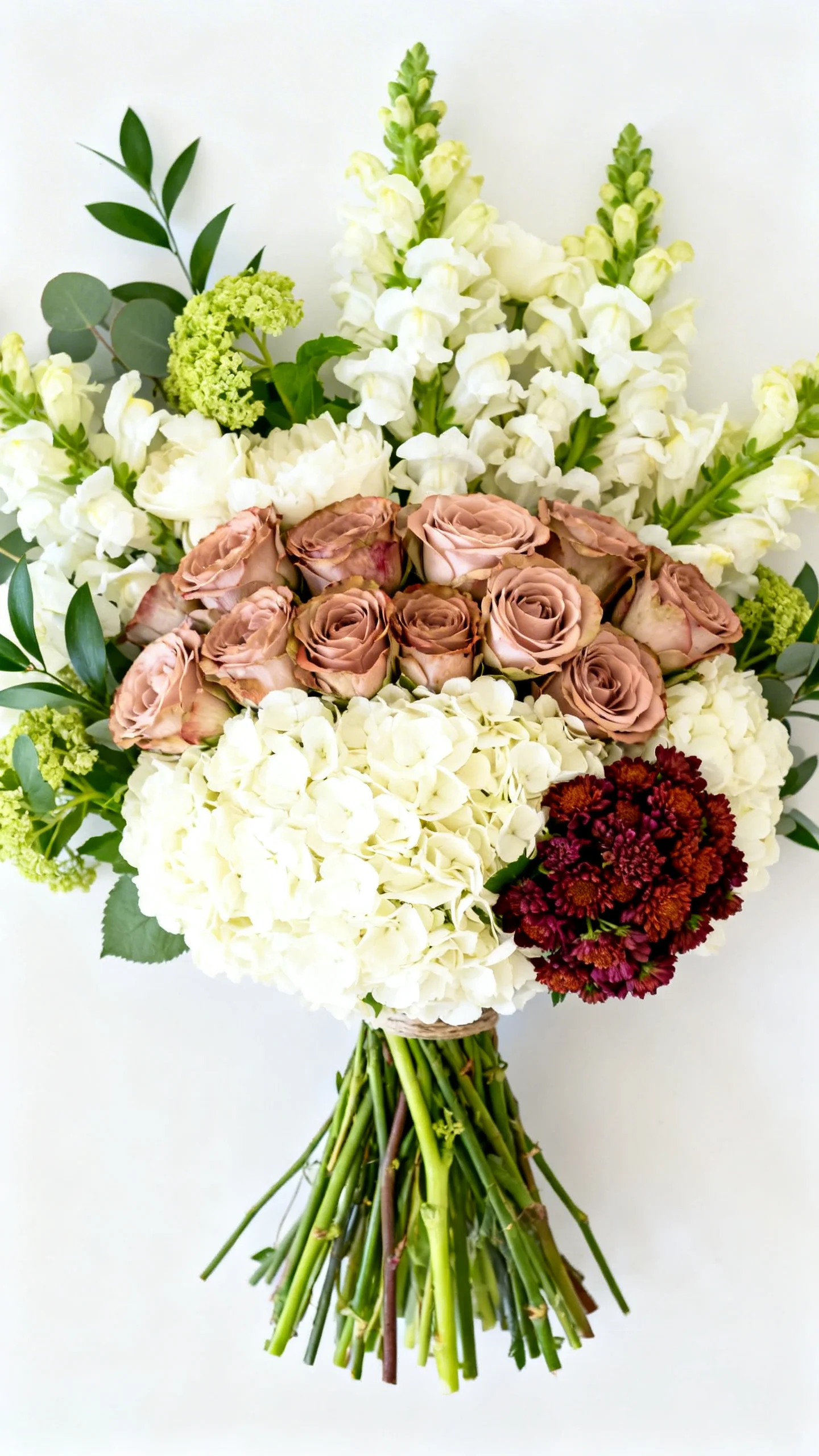
How can I make the bride’s bouquet stand out while still matching?
Keep the same palette as the bridesmaids, then add one statement element: a larger scale, a unique focal bloom, or an extra accent color. You’ll look elevated and coordinated without breaking the overall color story.