
Your invitations set the tone before anyone sees the venue, the dress, or the tablescape. If you want something that feels modern and luxe (without looking like everyone else’s), the details matter: paper, texture, typography, and a little unexpected design magic.
Below are unique, cool invitation ideas that look elevated, photograph beautifully, and still feel practical to send, assemble, and keep as a forever memento.
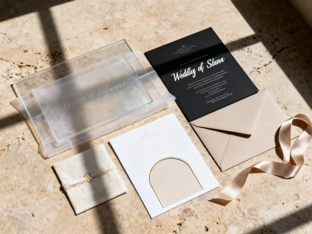
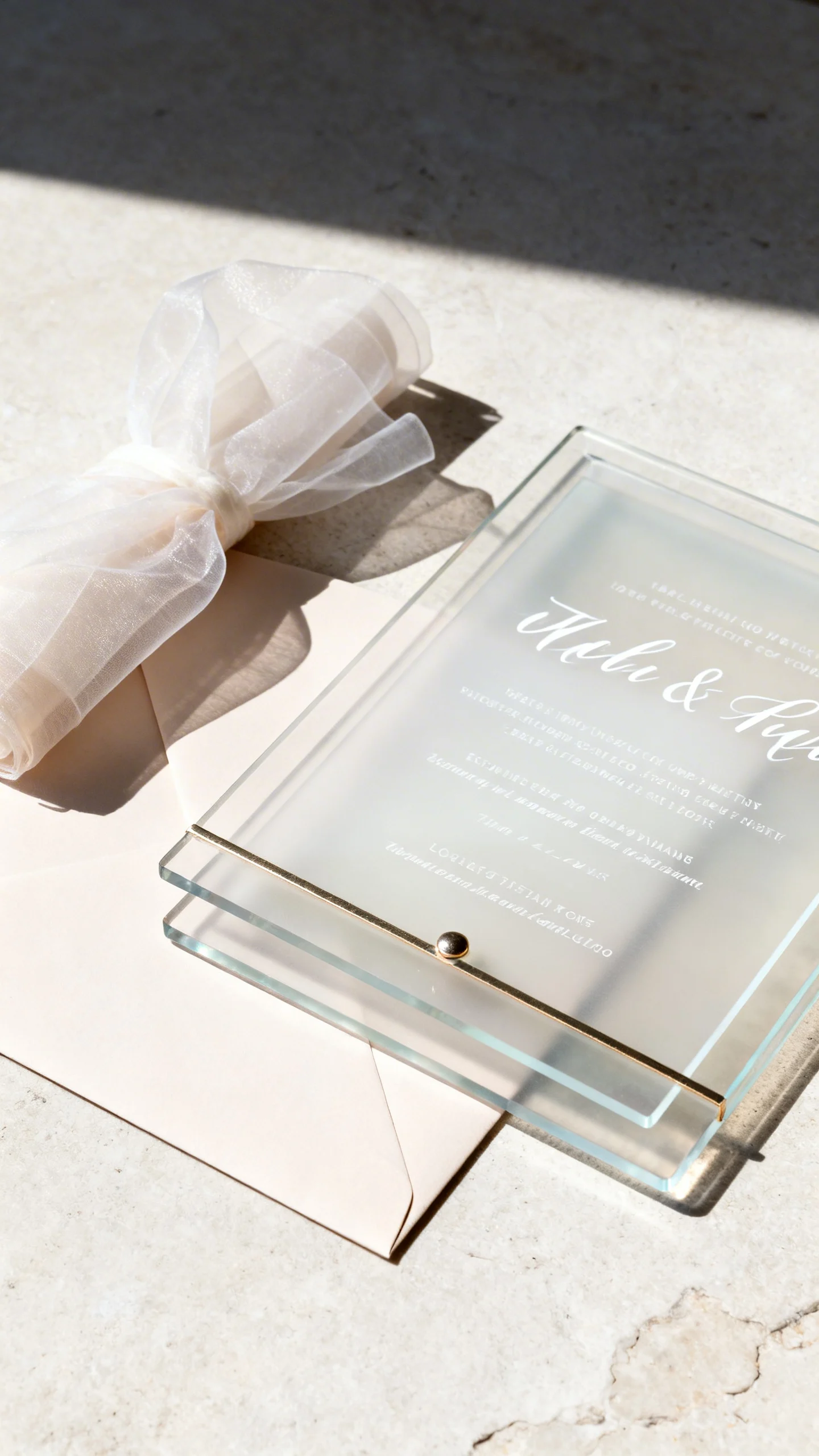
Acrylic Invitations with Frosted, Layered Type
Acrylic invitations feel instantly high-end, especially when you choose a frosted finish and crisp, modern typography. Keep the layout minimal with generous spacing and one standout detail like white ink or a subtle metallic accent. Pair with a soft-touch envelope or vellum wrap to balance the sleekness. For mailing, use a rigid mailer and include a printed insert card for easy reading.
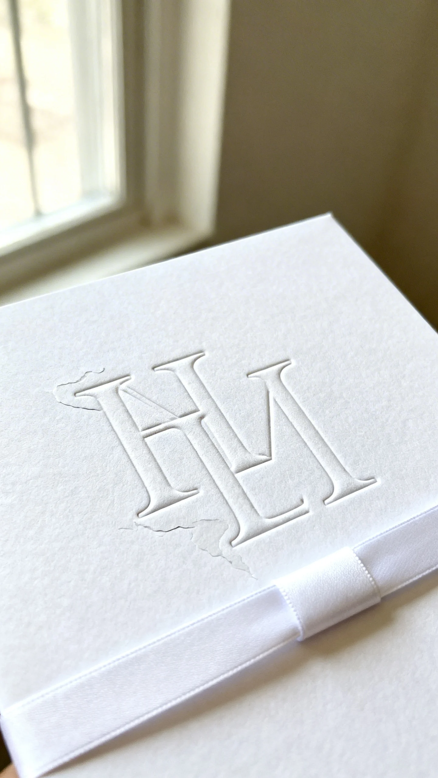
Letterpress with a Bold, Oversized Monogram
Letterpress adds depth you can literally feel, which reads as luxe even in a simple color palette. Go modern by using an oversized monogram or initials that bleed off the edges, paired with clean sans-serif text. Choose thick cotton paper in bright white, ivory, or a warm stone tone for a contemporary look. Finish with a minimal belly band or a thin ribbon rather than a busy embellishment.
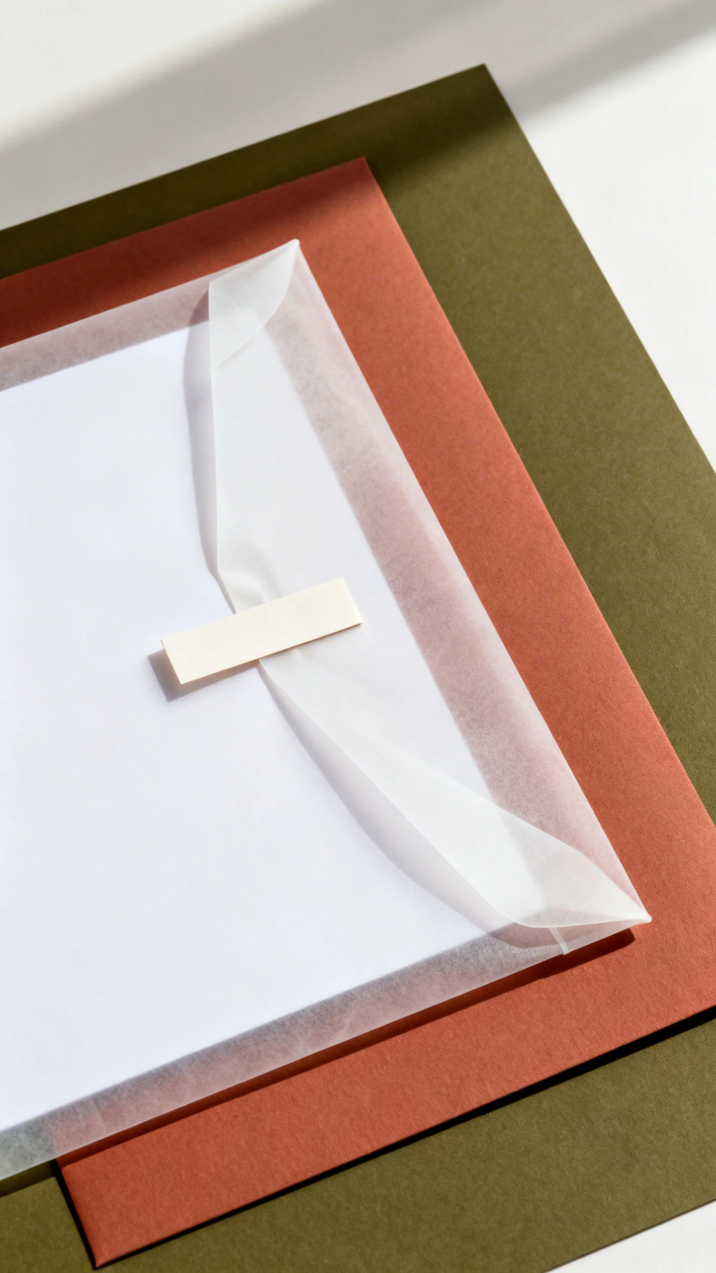
Vellum Jackets with Hidden Color Underlays
Vellum is airy and modern, and it creates that “unwrapping” moment guests love. Slide a bold color underlay (deep olive, ink black, muted terracotta, or champagne) behind translucent vellum for a layered, designer feel. Keep the main invite text on the underlay for readability, then add a minimalist vellum overlay for names or the monogram. Use a wax seal or slim paper tab to keep everything tidy.
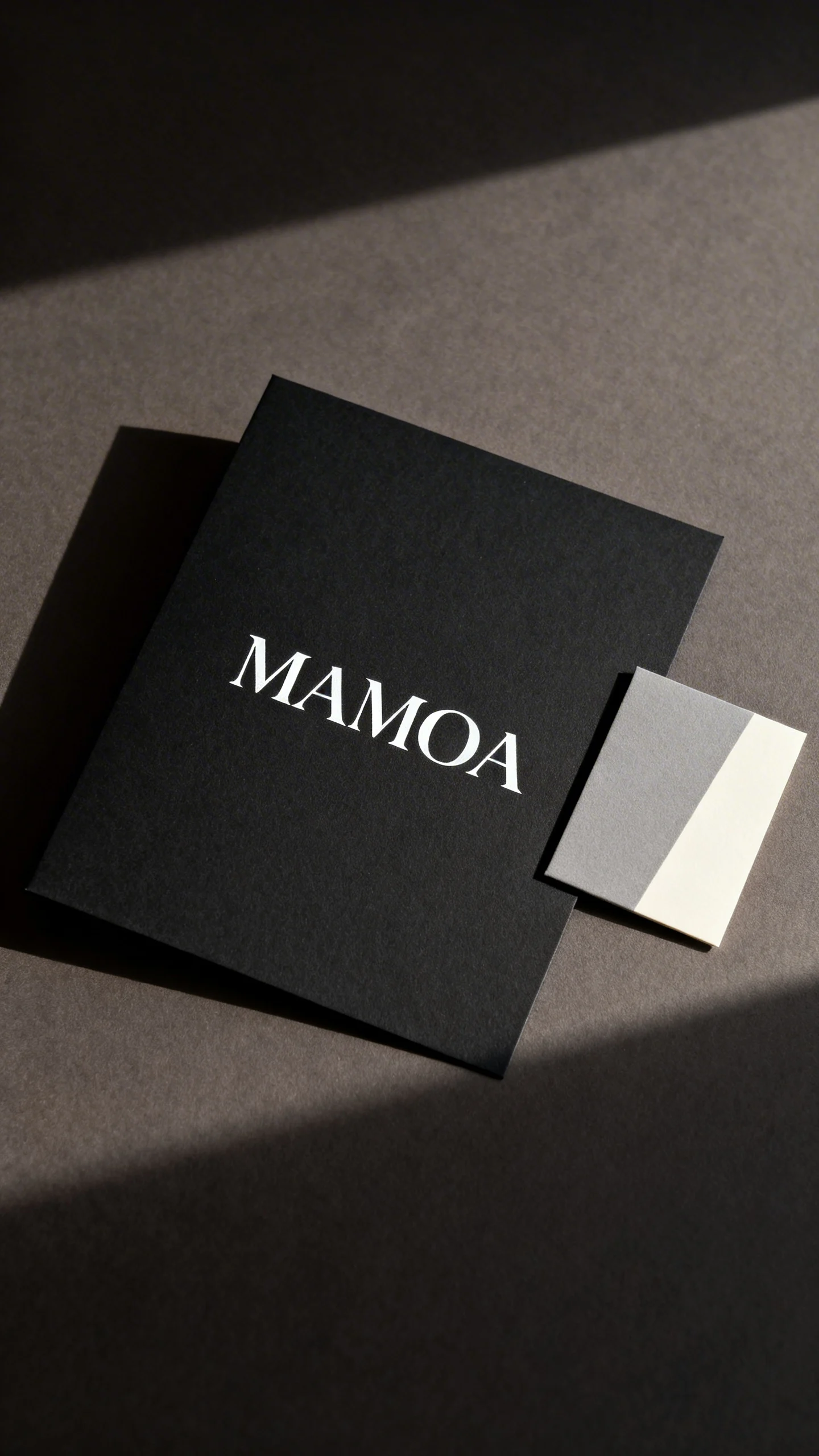
Black Tie Minimal: Matte Black Paper with White Ink
Matte black paper looks editorial and sleek, especially with sharp white ink and modern spacing. Choose one type family and let contrast do the heavy lifting—no extra flourishes needed. Add a small detail card in soft gray or cream to soften the suite and provide a place for schedule details. If you’re worried about scuffs, select a premium cardstock and skip glittery coatings.
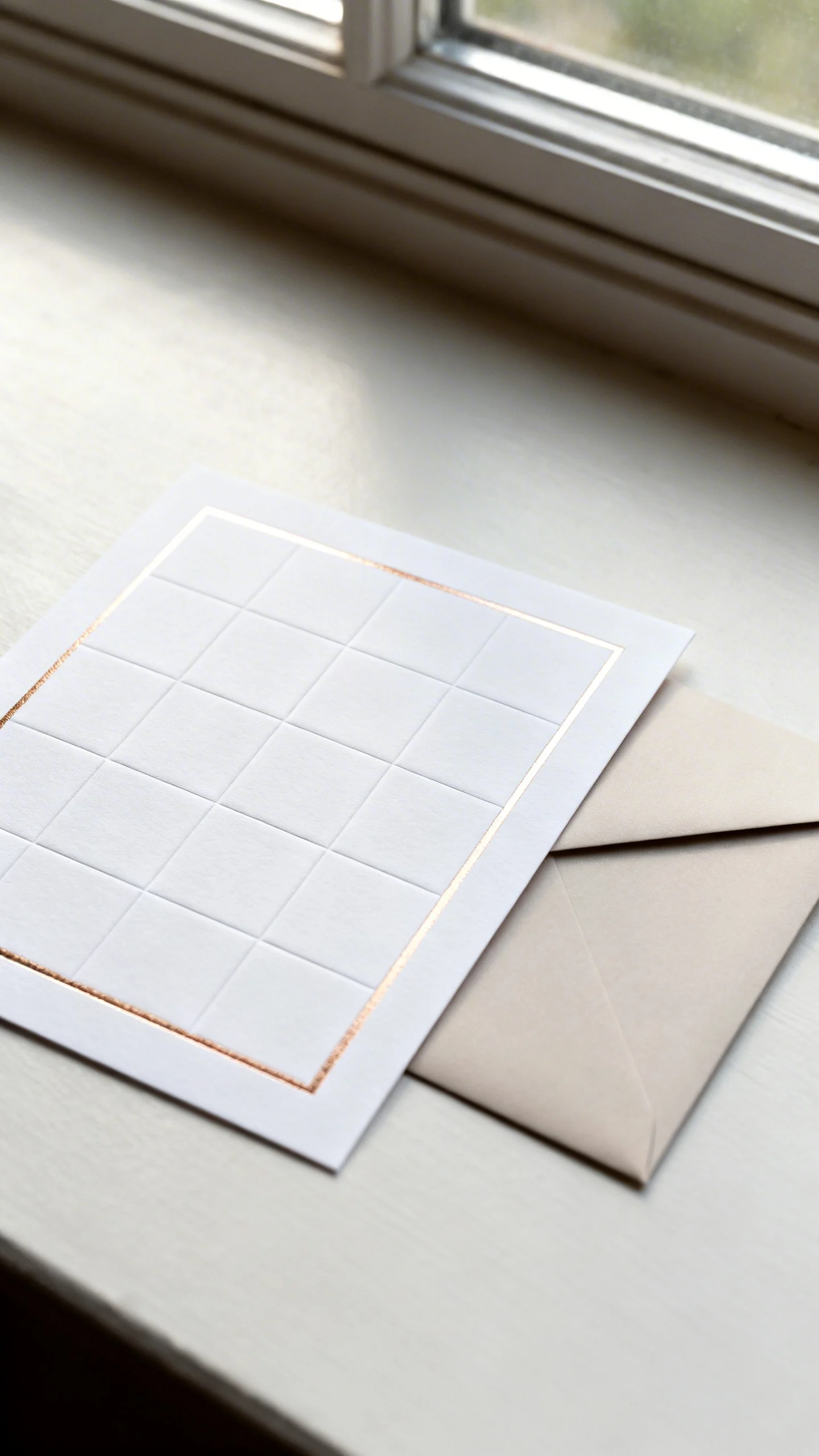
Foil-Stamped Details with a Clean Grid Layout
Foil can feel current when it’s used sparingly and paired with a structured, modern layout. Think a clean grid, crisp margins, and a single foil moment like your names or a thin border line. Champagne, pale gold, and rose-gold foils read luxe without shouting. Match with a heavyweight envelope and a sharp, simple return address to keep the suite polished.
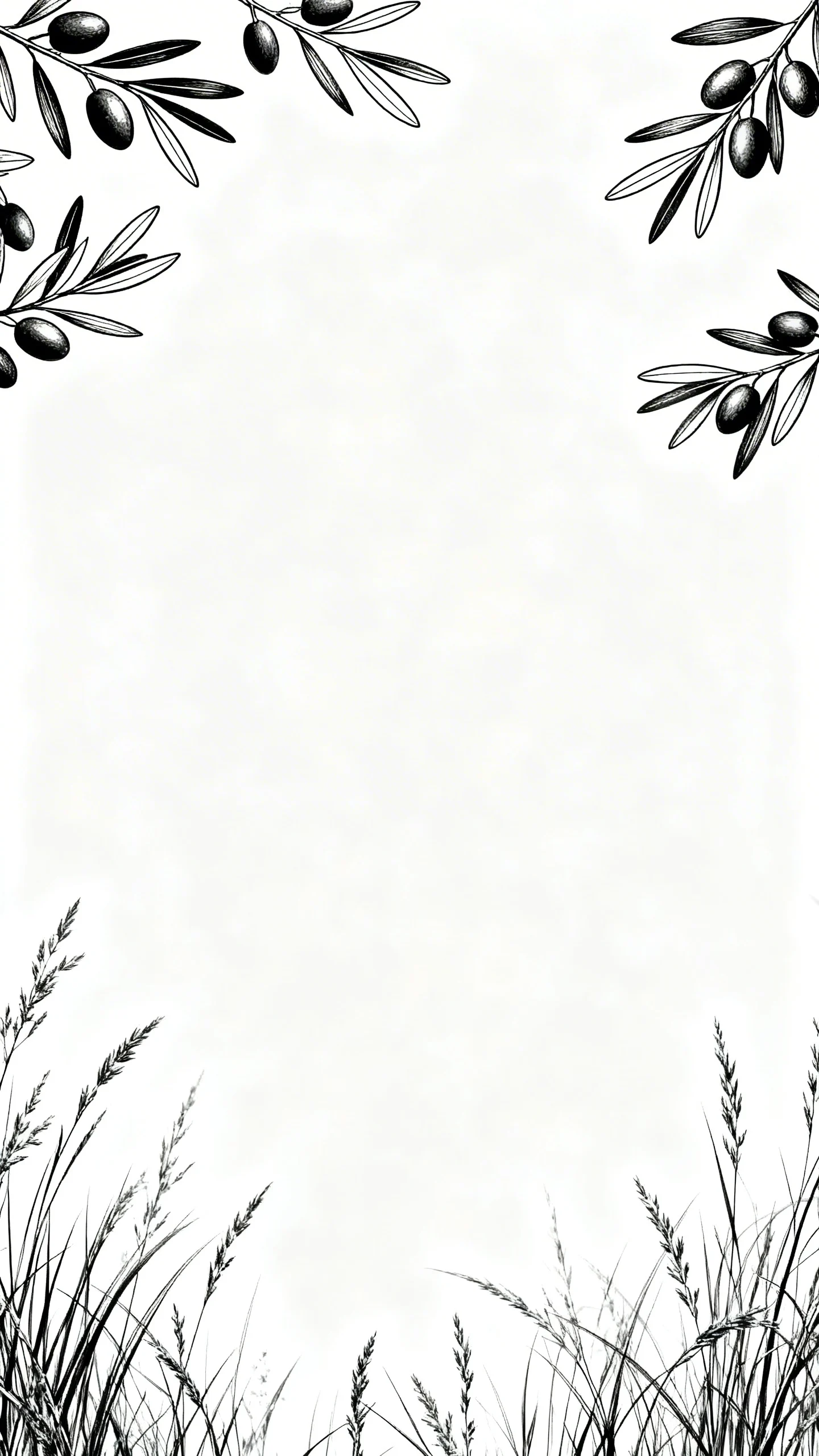
Modern Botanical Line Art (Not Watercolor)
Botanicals can look fresh and cool when they’re done as fine line art instead of traditional watercolor florals. Choose one statement motif (like olive branches, anthuriums, or wild grasses) and let it frame the text lightly. Keep colors minimal—black ink on white, or tone-on-tone neutrals for a refined vibe. This style also translates beautifully to day-of pieces like menus and place cards.
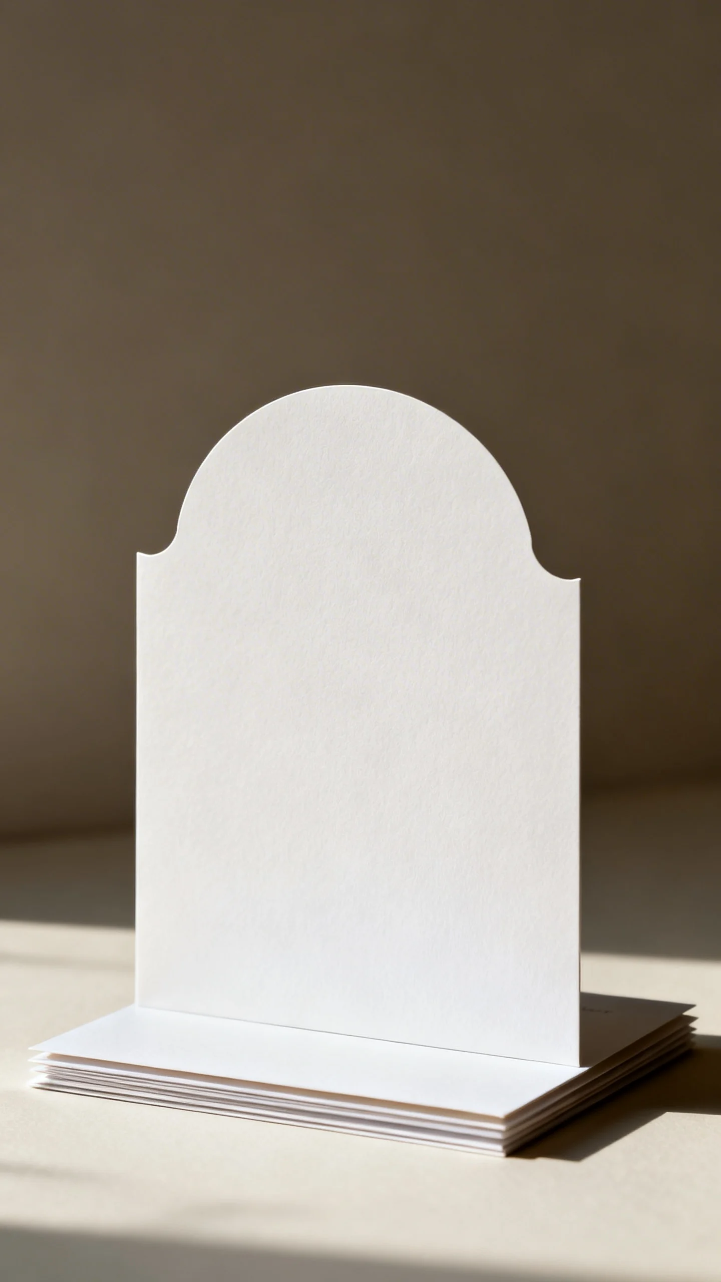
Die-Cut Shapes for a Gallery-Style Look
A die-cut invitation instantly feels custom because the shape is part of the design. Try a rounded arch, a modern wave edge, or a clean rectangle with one clipped corner for something subtle but different. Keep typography simple so the silhouette stands out without looking busy. Die-cuts often cost more, so consider using the shape on the main card only and keep inserts standard.
Textured Papers: Handmade, Deckled, or Linen Finish
Texture is the shortcut to “luxe,” especially in neutral palettes where the paper has room to shine. Handmade or deckled edges feel romantic, while a linen finish reads classic and tailored—both can be modern when paired with minimal typography. Choose warm whites, sand, or soft gray to keep it elevated and versatile. For clean assembly, use a printed detail card rather than squeezing too much onto one sheet.
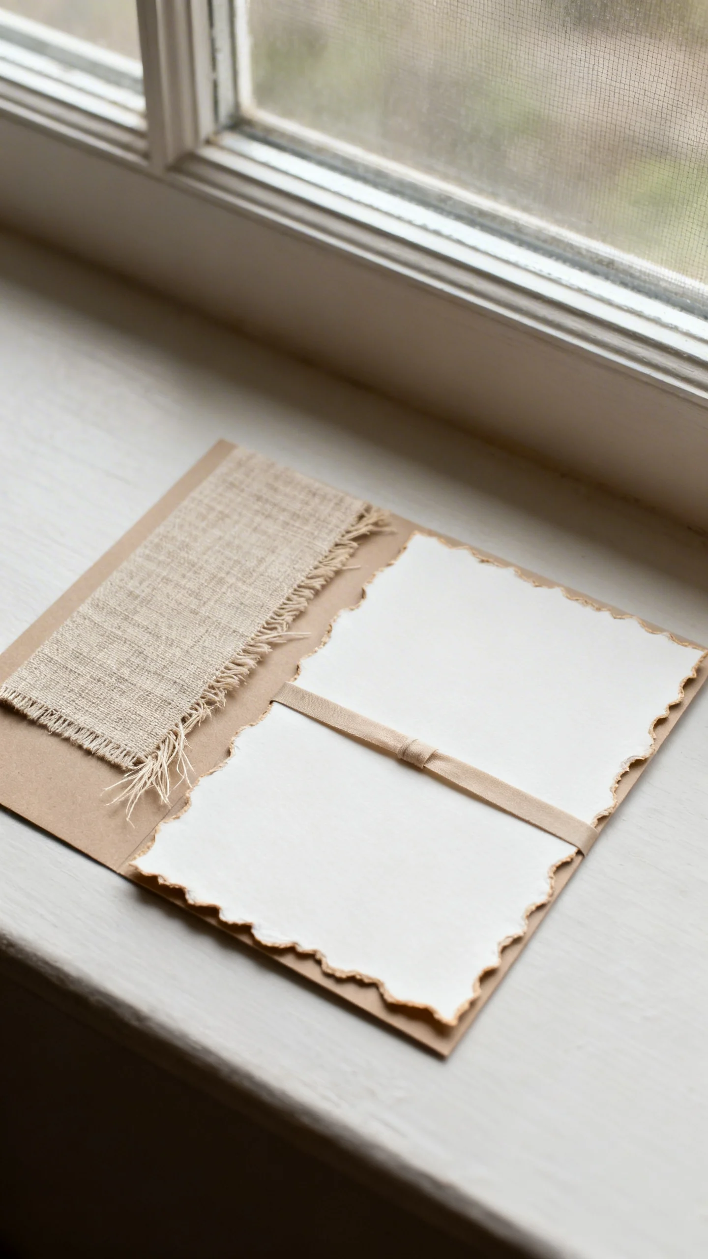
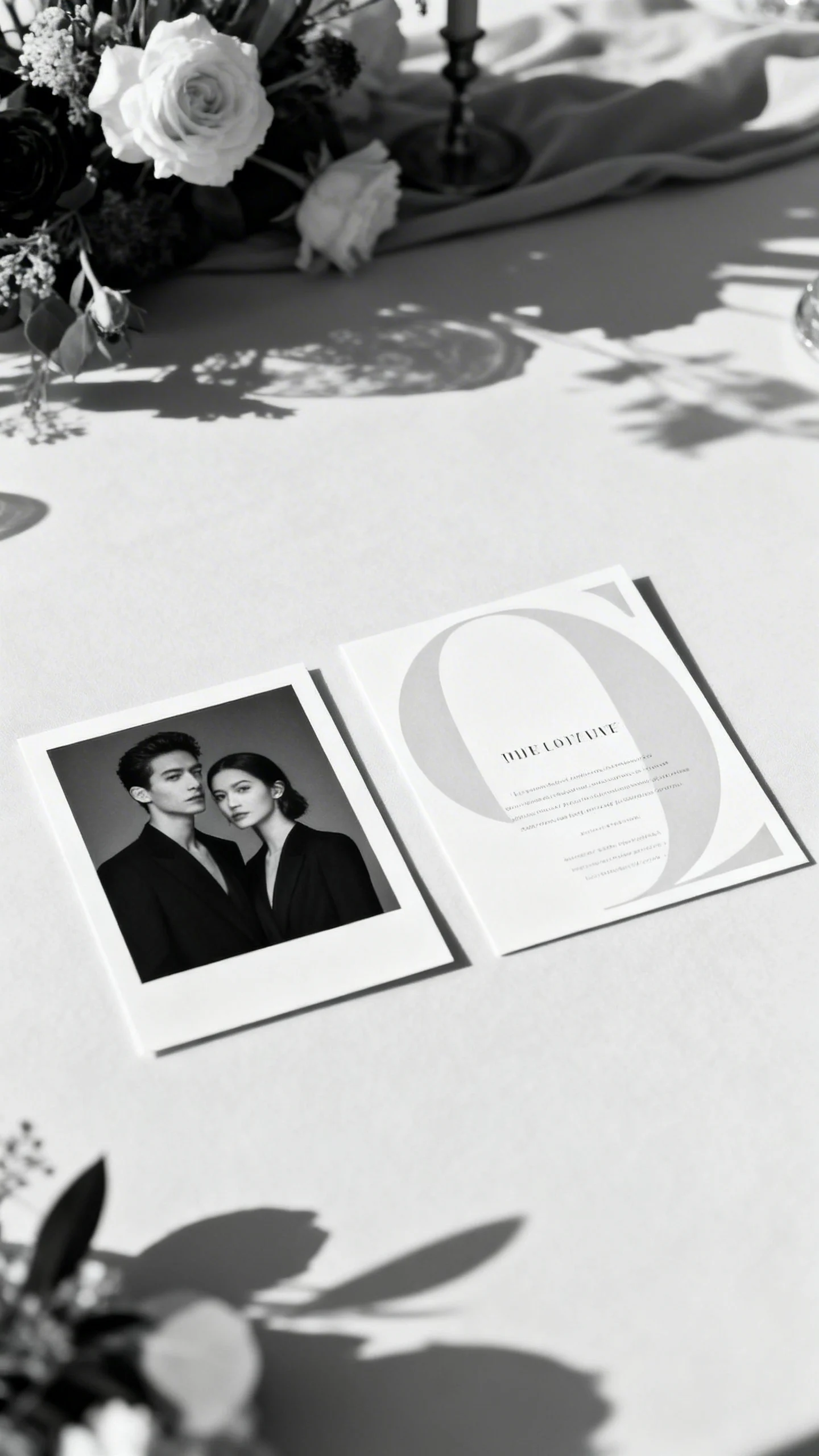
Photo-Modern Editorial Invitations (Subtle, Not Cheesy)
Photo invitations can feel high-end when the image is treated like a fashion editorial, not a collage. Use one striking, well-lit photo—black-and-white works especially well—and pair it with modern type and lots of negative space. Keep the photo on a separate card or the back of the invite for a clean front layout. This is a great choice if you want your suite to feel personal while staying design-forward.
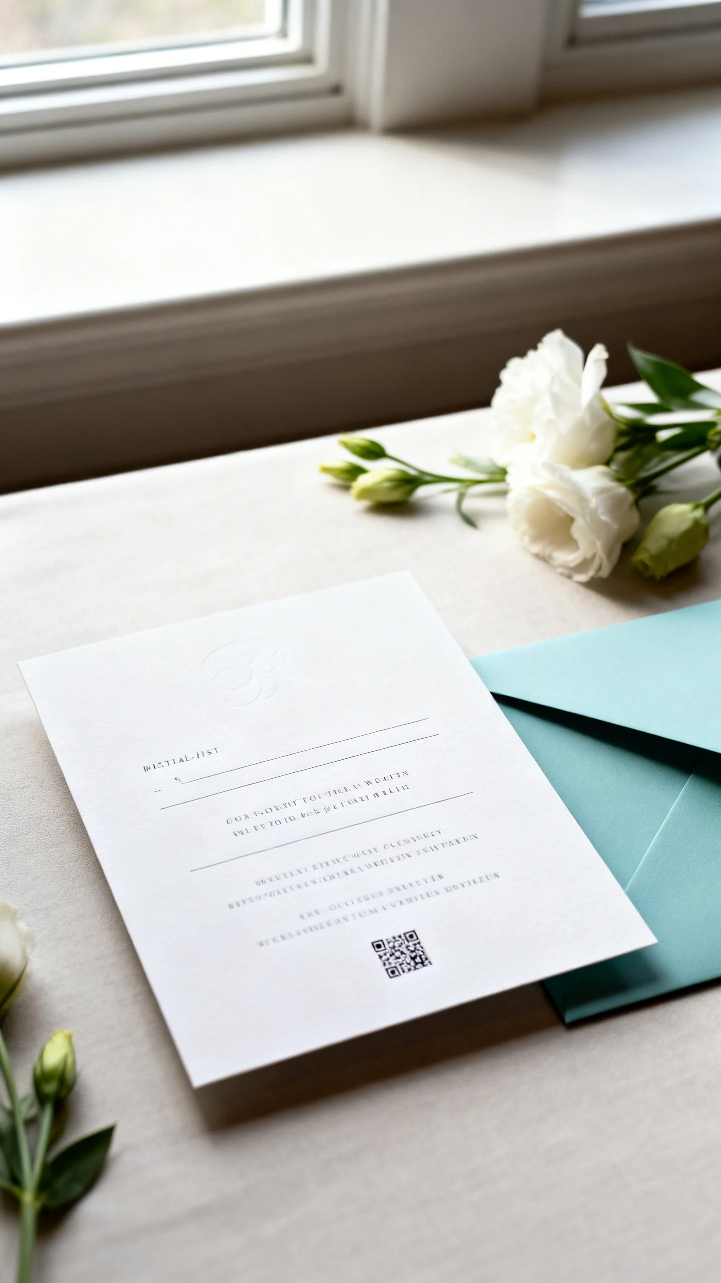
Digital-First Luxe: QR Codes with a Minimal Printed Suite
A streamlined printed suite can still feel luxurious when it’s intentional and beautifully designed. Print the essentials (names, date, location) and add a small, discreet QR code for RSVP, travel, and registry details. Guests get the convenience, and you get a suite that looks clean and expensive. Choose a premium paper and a modern envelope color to keep the tactile experience elevated.
FAQ
How early should we send modern, luxe wedding invitations?
Mail invitations about 8–10 weeks before the wedding (earlier if many guests are traveling). If you’re doing a destination wedding, 10–12 weeks is safer. Send save-the-dates well ahead so the invitation can stay clean and minimal without cramming in extra planning details.
What invitation details make a suite feel more luxurious?
Paper quality, print method (letterpress or foil), generous spacing, and a cohesive color palette do the most work. Small upgrades like a vellum wrap, a minimalist belly band, or a structured envelope elevate the experience without adding clutter. Consistency across your insert cards and envelopes is what reads “designer.”
Are acrylic or die-cut invitations difficult to mail?
They’re totally doable, but they need the right packaging. Use a rigid mailer or extra-sturdy envelope, and consider including a standard paper insert for easy reading. Always order samples and do a test mail to confirm postage and protection.
How can we keep our invitation suite modern without feeling cold?
Balance clean typography with one warm element: a textured paper, a soft neutral envelope, or subtle organic line art. Use friendly, concise wording and include thoughtful details like a short dress code line or a warm hosting line. Modern can still feel welcoming when the materials and tone are intentional.
What’s the best way to match invitations to our wedding aesthetic?
Start with your venue and overall vibe (black-tie, garden minimal, city chic, coastal neutral), then choose two to three core design elements: color palette, typography style, and one special finish. Pull those through to day-of stationery for a cohesive look. If you’re unsure, pick one hero detail—like foil, texture, or a unique shape—and keep the rest restrained.