
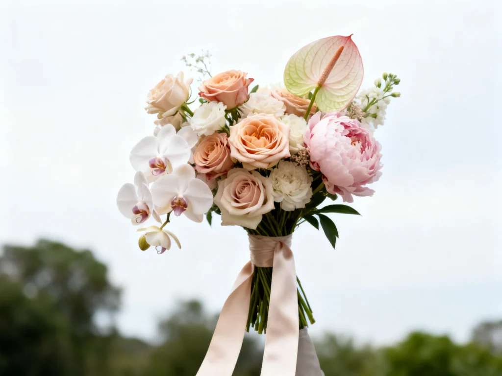
Want your wedding bouquet to look less “pretty prop” and more like it belongs in the pages of a fashion magazine? The secret is treating your flowers like a styling element with intention—light, angles, hands, textures, and a little negative space go a long way.
Below are bouquet photography ideas that help your gallery feel editorial without needing a huge floral budget. Share these with your photographer and planner, then practice a couple poses so the blooms look effortless (not accidental) in every frame.
1) The bouquet “hero close-up” with clean negative space
Ask for a tight crop of the bouquet with a simple background—sky, a blank wall, a veil, or a softly blurred hedge—so the flowers read like a still-life cover shot. This works because negative space makes color and shape feel intentional, not busy, and it immediately elevates the image to editorial territory. Styling tip: rotate the bouquet so the best blooms face the lens and the stems align cleanly; a slightly asymmetrical angle looks modern. It’s best for couples who chose statement blooms (garden roses, orchids, anthurium, peonies) or have interesting mechanics like trailing ribbon. One mistake to avoid: letting the bouquet sit too low in the frame with distracting grass or chairs behind it—background clutter steals the “magazine” effect.
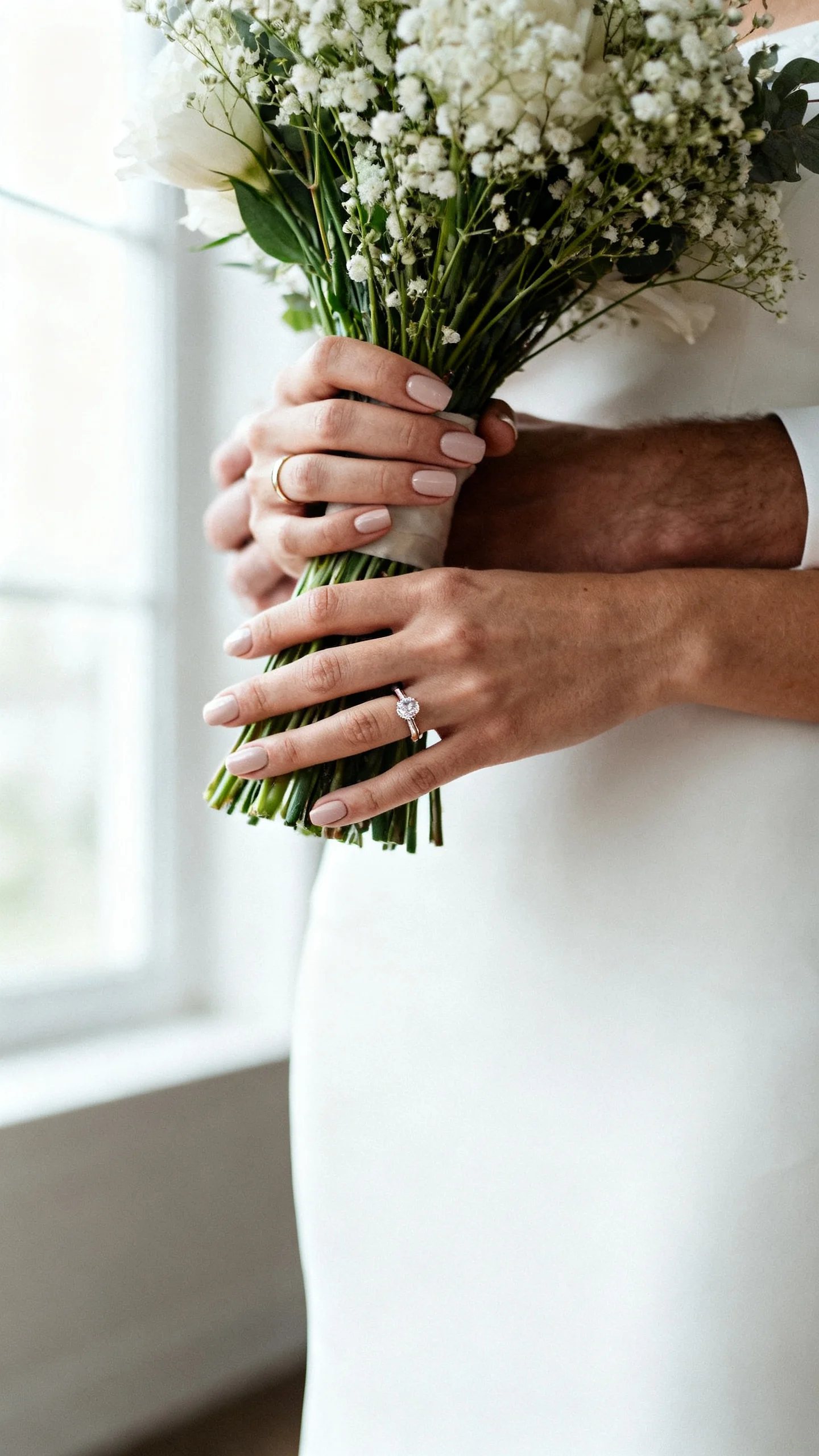
2) Hands-only bouquet detail with fresh manicure and jewelry
Have your photographer frame just your hands holding the bouquet at mid-torso, letting rings, nails, and any heirloom bracelet quietly shine. It works because editorial photos often focus on styling details—hands and texture read intimate, refined, and timeless. Choose a manicure that complements the bouquet (milky neutrals, sheer pinks, or a soft tonal shade) and keep hand placement relaxed with slightly bent elbows. This is perfect for brides who want to feature their rings without a full face photo or who love detail-driven flat-lay vibes but want them on-body. Mistake to avoid: gripping too tightly—white knuckles and flattened petals look tense on camera.
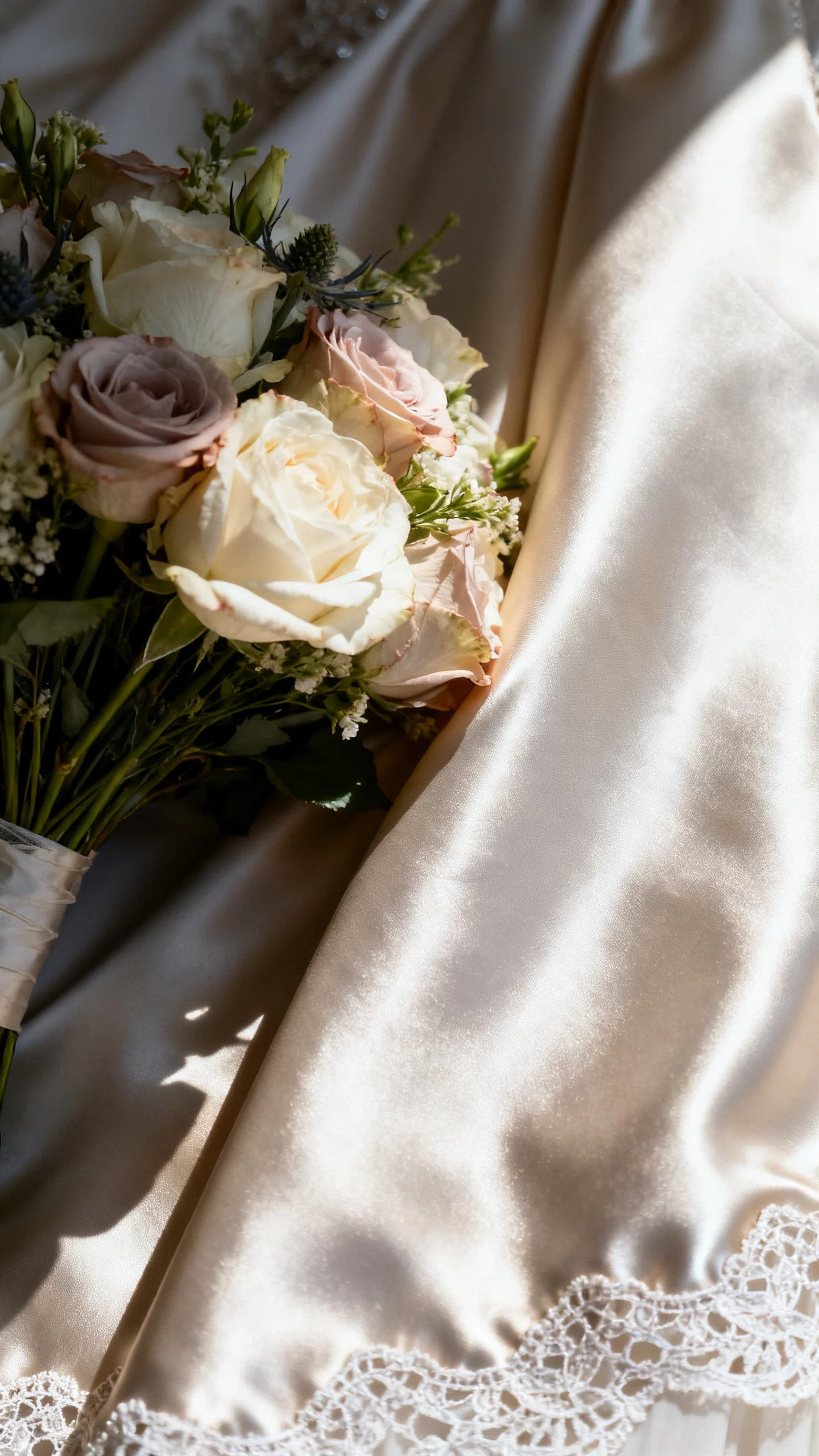
3) Bouquet against the dress fabric for texture-on-texture
Press the bouquet gently near your gown—lace, mikado, satin, beading, or tulle—so the frame captures floral texture next to your dress texture. The contrast (soft petals vs. structured fabric) reads very editorial, especially in side light or open shade. Styling advice: angle your body slightly so the dress catches light and the bouquet sits where the fabric is smooth, not wrinkled. This idea is best for brides with gowns that have a distinct material story (heavy satin, intricate lace, dimensional appliqué). One mistake to avoid: placing the bouquet directly over busy beading or heavy embellishment—too much detail competing can make the photo feel chaotic.
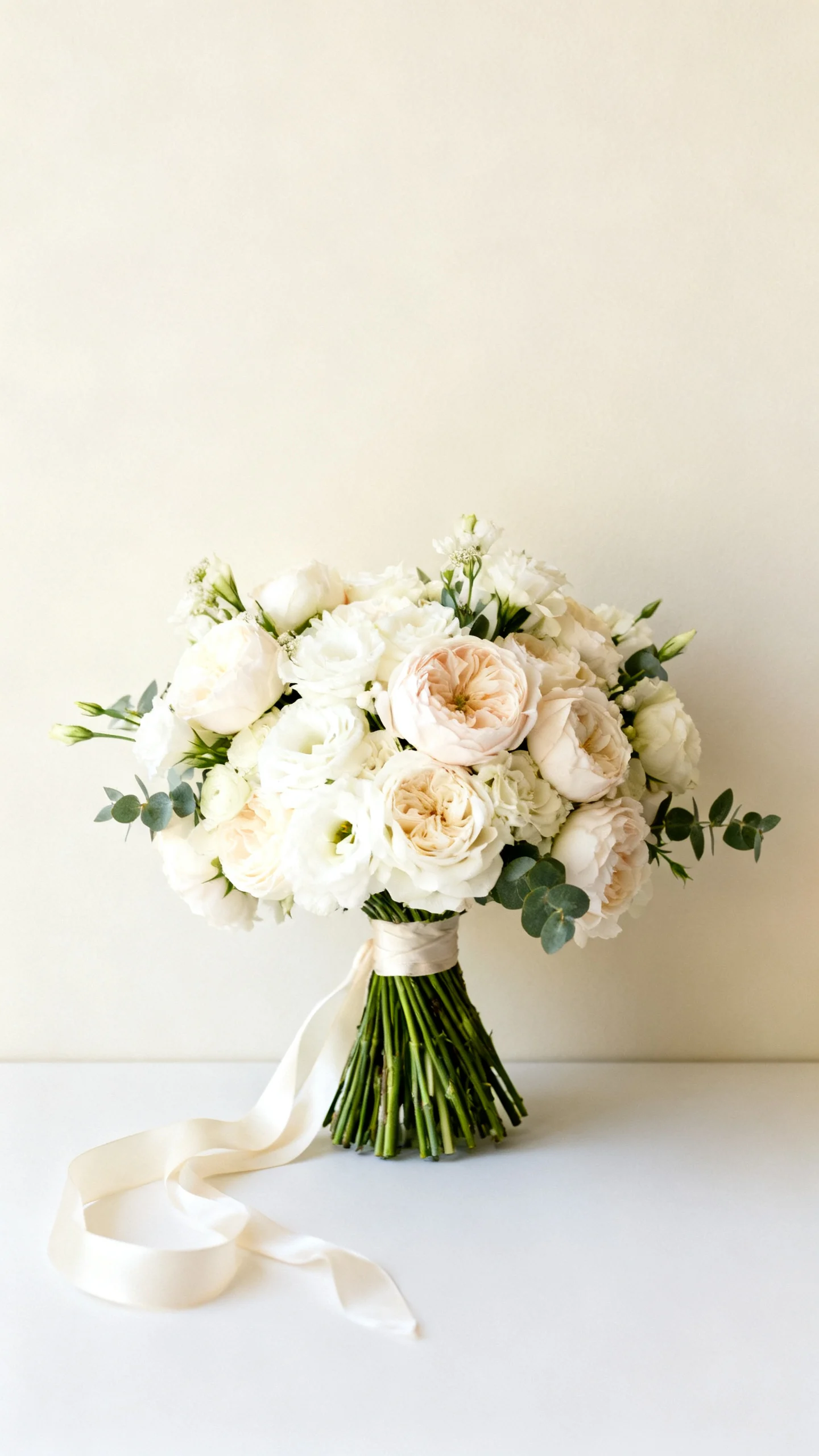
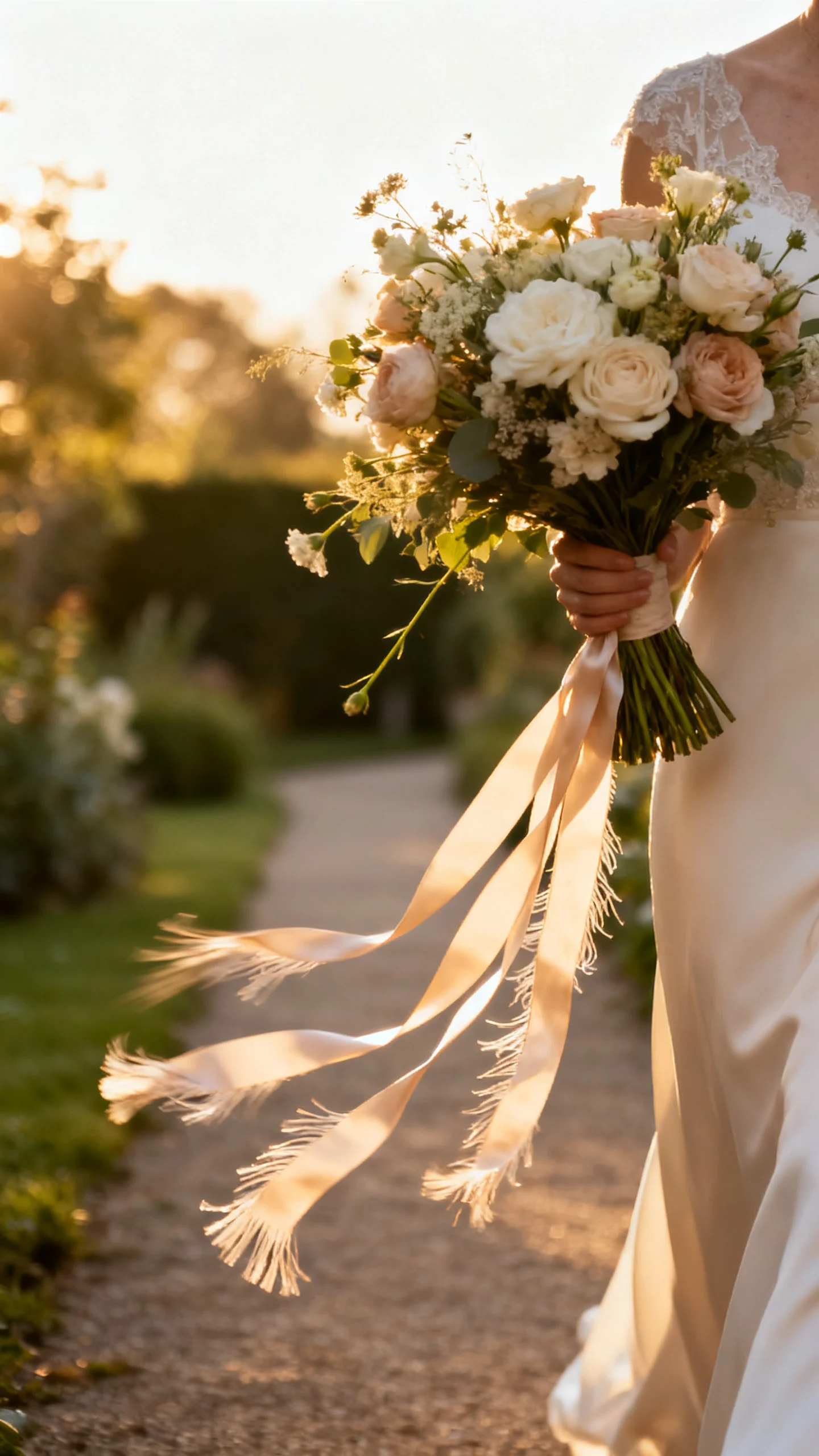
4) Movement shot with ribbon, trailing stems, or a gentle “swish”
Ask for a photo where you take a slow step and let the bouquet move naturally so ribbon tails, trailing greenery, or long stems create motion. Editorial images love movement because it feels candid but polished, and it adds energy even in a simple location. Use long silk ribbon (frayed edges photograph beautifully) and keep the bouquet slightly lower than your waist so the movement reads in the ribbon rather than in awkward arm swings. This is ideal for outdoor ceremonies, fashion-forward brides, or anyone wearing a sleek dress that benefits from a little softness. Mistake to avoid: fast movement—quick steps can blur the bouquet and make ribbon look messy instead of romantic.
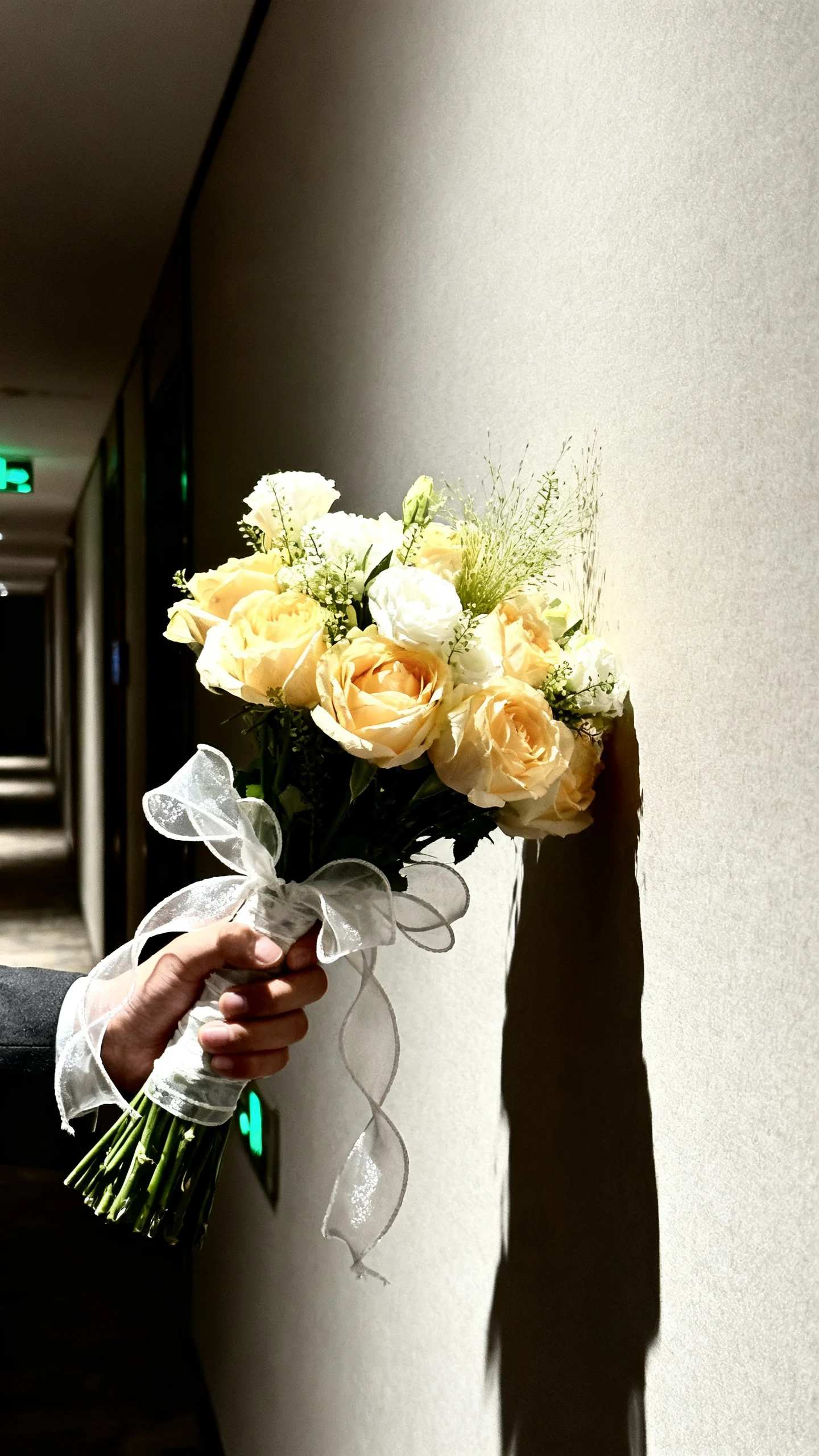
5) Direct flash bouquet moment for a modern “after-party” vibe
For a cool editorial twist, request a few bouquet shots with direct flash—especially at the reception, in a hallway, or near a clean wall. The pop of flash creates crisp texture and high-contrast color that feels fashion-y and current, even with classic blooms. Styling advice: hold the bouquet slightly off-center and keep your shoulders relaxed; a confident posture helps direct flash look intentional, not accidental. This is best for couples who want a mix of timeless and trendy, or who are planning a city wedding, rooftop, or modern venue. Mistake to avoid: busy backgrounds with exit signs, cluttered tables, or random guests—direct flash makes distractions even more noticeable.
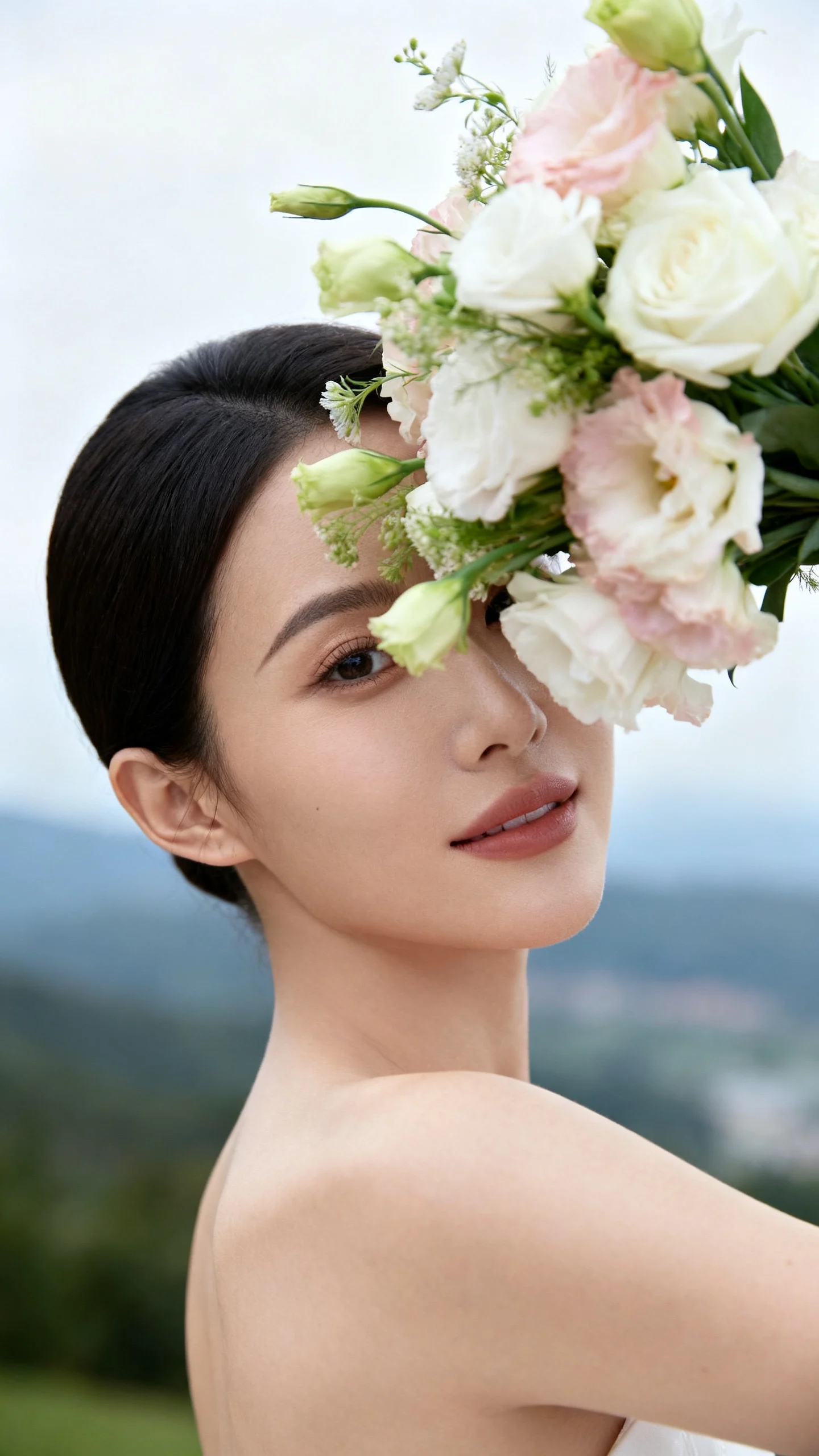
6) The “over-the-shoulder” bouquet reveal
Turn your body away from the camera and glance back while holding the bouquet near your shoulder, so the blooms frame your face like a styling accessory. It works because it creates depth—foreground flowers, midground face, background scenery—just like editorial portraits. Keep the bouquet angled slightly forward so the camera sees the flower heads, not just greenery and stems. This is especially flattering for brides who want a confident portrait without feeling overly posed, and it’s great for showcasing earrings or a low-back dress. Mistake to avoid: hiding your jawline behind the bouquet—ask for a micro-adjustment so your face stays clean and defined.
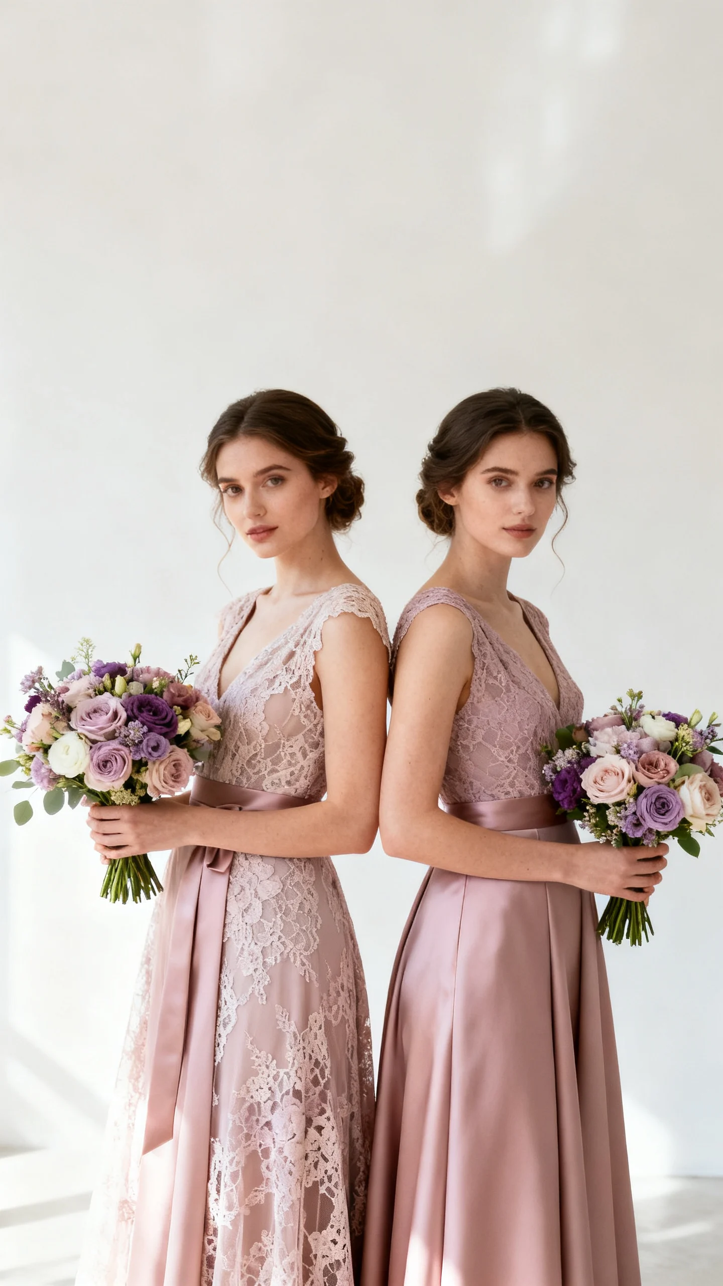
7) Bridesmaids bouquets styled as a color story (not identical clones)
Photograph bridesmaids holding bouquets at slightly different heights with a consistent color palette, letting each arrangement feel complementary rather than copy-paste. This reads editorial because it looks curated—like a fashion spread where every element is coordinated but not matchy-matchy. Styling advice: keep dresses in the same tonal family and vary textures (satin, chiffon) so the bouquets feel like part of a larger design story. This is best for bridal parties that love modern styling, mismatched dresses, or garden-inspired florals with lots of movement. Mistake to avoid: uneven spacing and crooked wrist angles—have everyone relax their elbows and angle the bouquet faces toward the camera for a cleaner line.
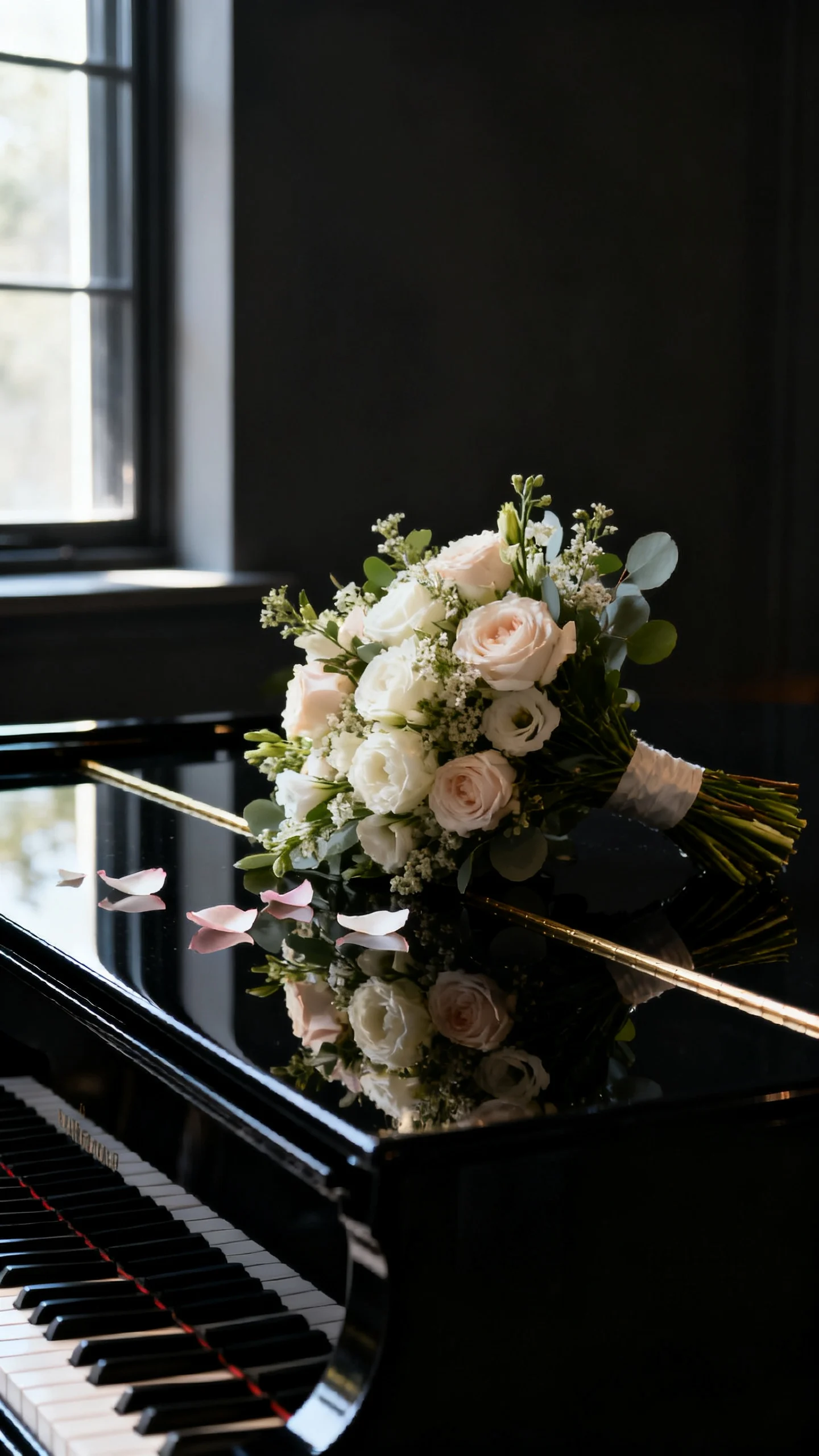
8) Bouquet on a reflective surface for a sleek, editorial still life
Place the bouquet on a glossy surface—mirrored tray, polished stone, a clean glass tabletop, even a dark piano—so you capture a subtle reflection. Reflections create instant “magazine” drama and make colors look richer, especially with moody palettes or white blooms against black. Styling advice: remove random items (water glasses, napkins, signage) and ask for side lighting that skims across petals for dimension. This is perfect for modern venues, museum weddings, black-tie looks, and anyone who loves minimal, high-impact styling. Mistake to avoid: harsh overhead light that creates unflattering glare; soft window light or shaded outdoor light is more forgiving.
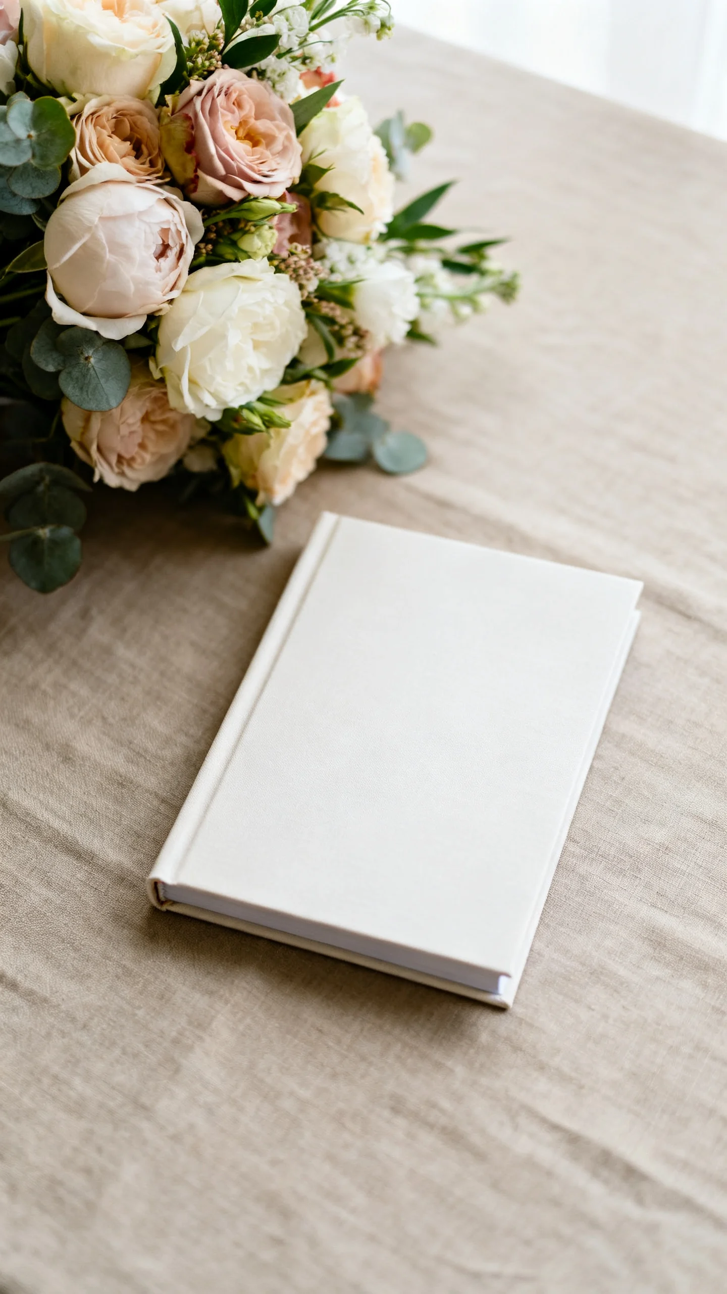
9) Bouquet paired with stationery or vow book for a styled mini-story
Have your photographer capture the bouquet alongside your invitation suite, vow books, or a single meaningful detail (like a perfume bottle or heirloom locket). It works because editorial galleries tell a story through objects, and tying florals to paper goods makes your design feel cohesive. Styling advice: keep the color palette tight—if your invitations are creamy and minimal, choose a calm background (linen, stone, neutral silk) so the bouquet doesn’t overwhelm. This is best for couples who invested in stationery, custom monograms, or want their design choices to feel intentional from start to finish. Mistake to avoid: including too many items at once—one bouquet plus one supporting detail looks curated; five extras looks like clutter.
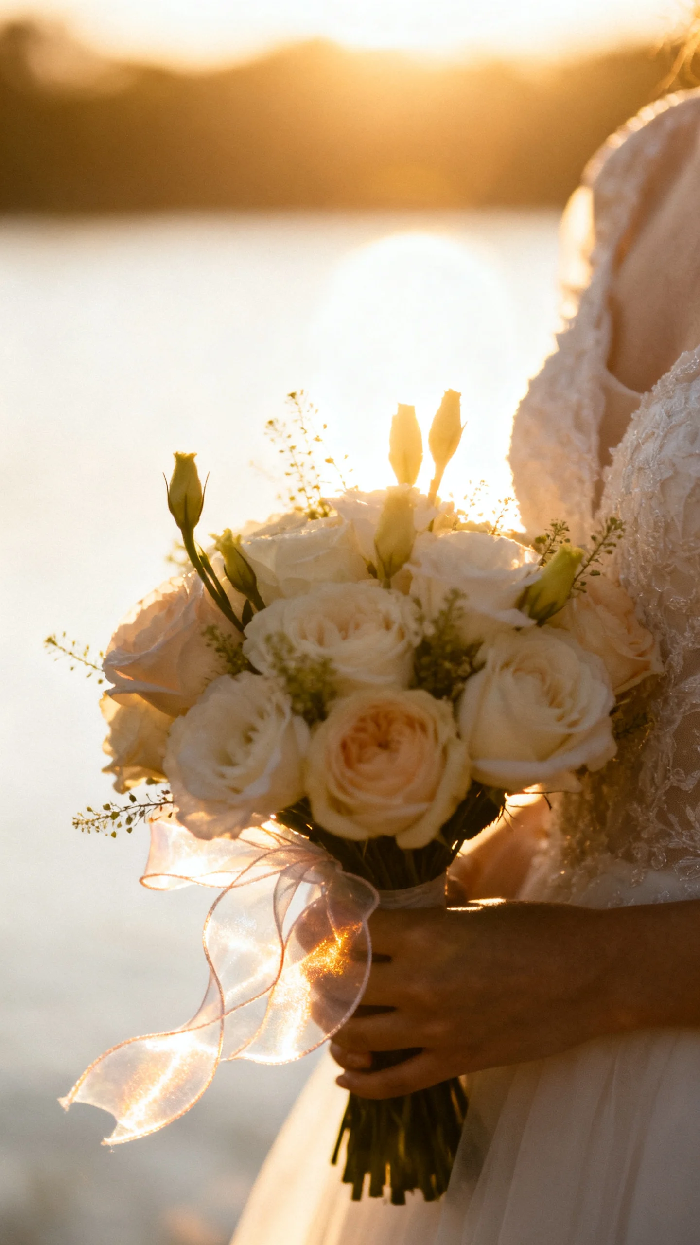
10) Golden hour bouquet portraits with backlight and a soft silhouette
Schedule a few minutes at golden hour to photograph the bouquet with backlight, letting petals glow and creating a gentle halo around the arrangement. This works because backlit translucence is inherently editorial—soft, luminous, and romantic without being overly sweet. Styling advice: hold the bouquet slightly away from your body so light can pass through the edges, and ask your photographer to expose for highlights to keep the look airy. It’s best for outdoor ceremonies, vineyard weddings, beach celebrations, and couples who want warm, film-like tones. Mistake to avoid: standing in harsh direct sun at midday—if golden hour isn’t possible, look for open shade and let the background be bright for a similar effect.
Final Planning Notes
To get editorial bouquet photos, treat your bouquet like a styled accessory: talk with your florist about shape (tight and structured vs. airy and asymmetrical), add intentional ribbon, and consider a few “hero” blooms that read clearly on camera. Share a short inspiration set with your photographer and note which moments matter most to you—close-ups, movement, bridesmaids color story, or dramatic flash—so they can plan lenses and timing.
On the wedding day, designate one person (planner, maid of honor, or detail-obsessed sibling) to keep the bouquet photo-ready: blot moisture from stems, fluff ribbon tails, and remove bruised petals before portraits. If you’re doing multiple bouquets (ceremony and toss), label them so the right one shows up in your portraits. And when in doubt, step into cleaner light and simplify the background—the fastest way to make flowers look editorial is to give them space to shine.
FAQ
How do I make my bouquet look bigger in photos without spending more?
Ask your florist for more airy shape and intentional negative space using lighter elements like sweet pea, cosmos, or trailing greenery, which adds volume without heavy cost. Hold the bouquet slightly forward from your body and angle the blooms toward the camera so the flower faces read full. A longer ribbon tail can also add visual size and movement.
What color bouquets photograph most “editorial”?
Monochrome or tonal palettes (all-white, blush-on-blush, rust-to-burgundy) read especially editorial because they look deliberate and modern. High-contrast palettes can also feel fashion-forward when styled simply, like white flowers with deep greenery or black accents. The key is cohesion with your venue, dress, and bridesmaid colors.
Should I keep the bouquet in water before photos?
Yes—hydration keeps petals crisp and prevents wilting, especially in warm weather. Store the bouquet in a clean vase with a small amount of water and keep it out of direct sun until needed. Just dry the stems before photos to avoid water spots on your dress and hands.
How do I hold my bouquet for the most flattering photos?
Hold it around hip to belly-button height, with elbows slightly bent and shoulders relaxed. Angle the bouquet so the flower heads face outward toward the camera rather than straight up. If you’re unsure, do one quick practice pose in a mirror and adjust until your waistline looks clean and your arms look soft.
What’s the biggest thing that ruins bouquet photos?
Background clutter—chairs, bags, exit signs, half-eaten plates—can make even gorgeous florals look less elevated. Ask for a quick location check before close-ups and detail shots, and don’t be afraid to move two steps to a cleaner wall or better light. A tidy frame is what turns “pretty” into “editorial.”