
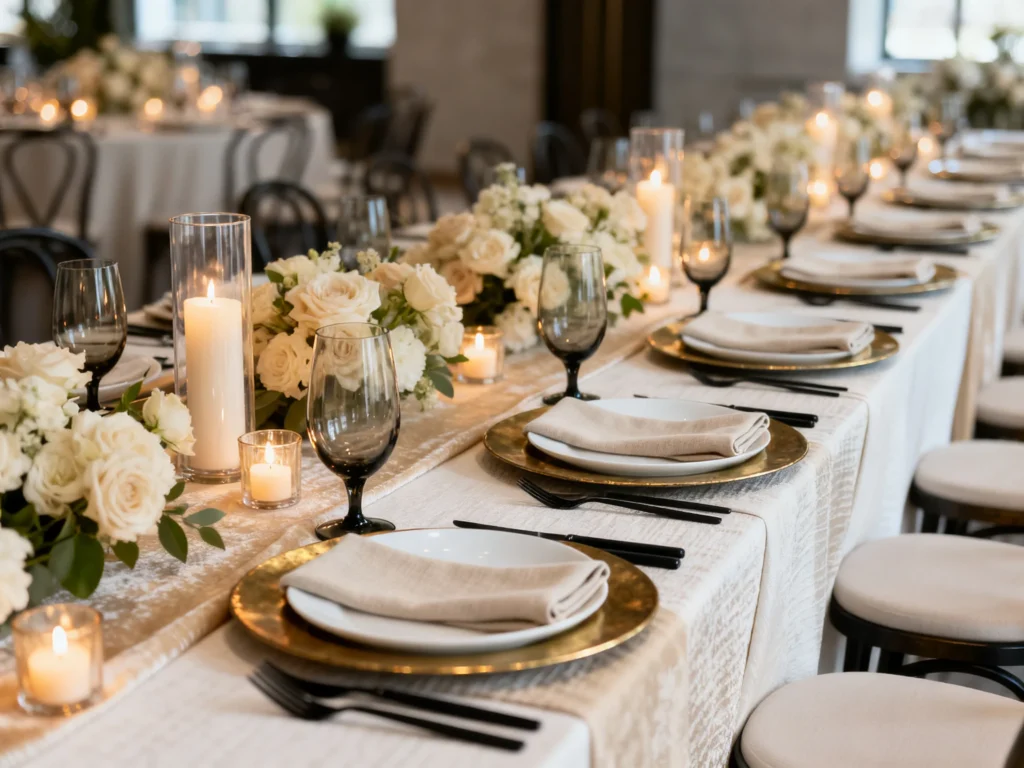
Neutral table settings are the secret shortcut to a wedding reception that feels elevated, intentional, and quietly luxe. When you keep the palette calm, every material choice looks more expensive—and your guests notice the details because nothing is visually fighting for attention.
Below are polished, practical neutral table-setting ideas that work across venues and budgets, with simple styling moves that read like high-end design (without needing high-end price tags).
Start with layered linens in tonal neutrals
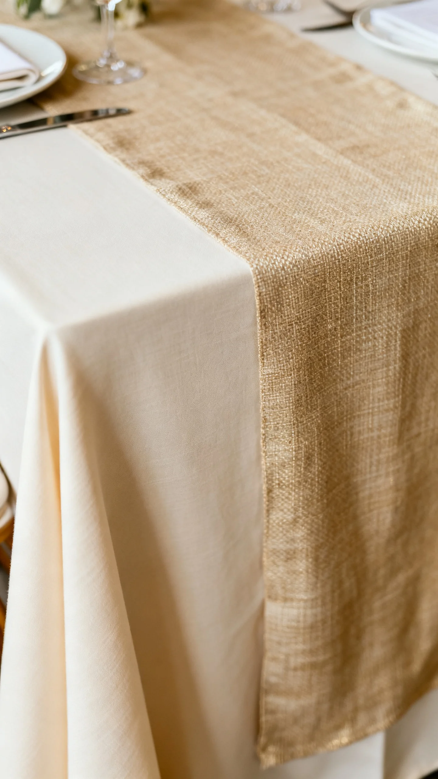
Layering linens is one of the fastest ways to make a neutral table feel rich instead of flat. Pair a matte base (ivory, sand, or soft stone) with a second layer in a nearby tone—like a champagne runner over a warm white cloth—for depth that photographs beautifully. This works especially well for couples who want a refined look but still want tables to feel welcoming, not stark. Choose fabrics with subtle texture (cotton, linen, or a soft slub) rather than shiny satins, which can read dated under reception lighting. The “expensive” effect comes from dimension: two neutrals together look curated, like a designer planned it. Mistake to avoid: mixing too many different whites at random (cool white with warm ivory can look accidental), so pick one undertone and stay consistent.
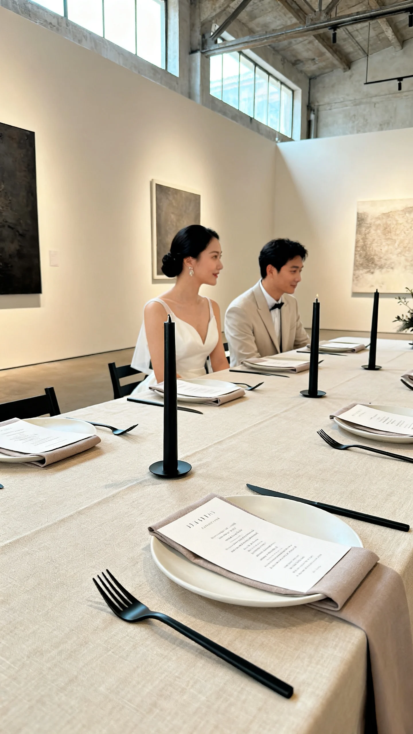
Choose a tight color story: ivory, taupe, and black accents
A tight neutral palette instantly feels upscale because it looks intentional from every angle. Ivory and taupe create a soft foundation, while small black touches—menu text, taper candles, or slim flatware—add definition that makes everything look sharper. This is best for modern venues, city lofts, galleries, and couples who want “minimal but not boring.” The black accent acts like eyeliner for your tablescape: it frames the look and elevates even simple pieces. Keep the black to 10–15% of what’s on the table so it reads as a detail, not a theme. Mistake to avoid: using multiple bold accent colors “just for fun,” which can dilute the expensive neutral mood.
Upgrade the place setting with a charger (even a subtle one)
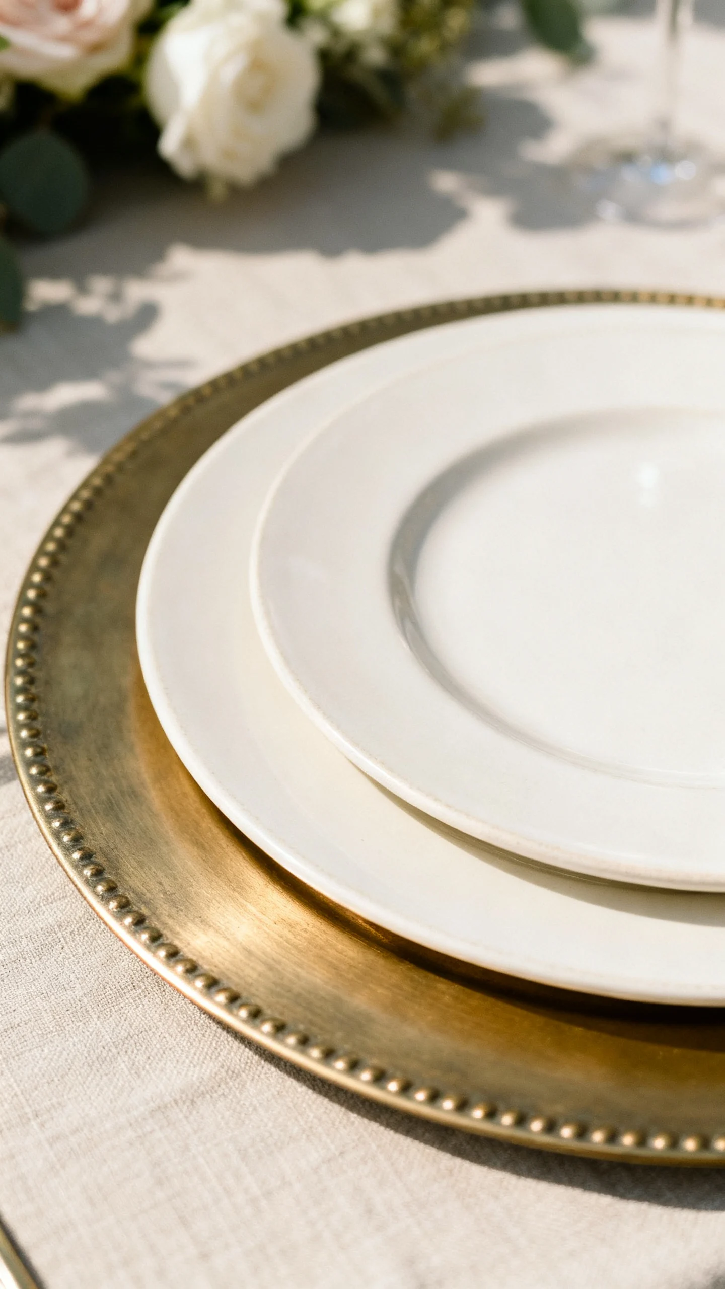
A charger makes each place setting feel substantial, which is a hallmark of a luxury reception. In a neutral scheme, choose a charger in brushed gold, antique brass, matte black, natural rattan, or a tone-on-tone ceramic that blends with the plates. This works for nearly every wedding style—classic, coastal, modern, even rustic—because the charger can be tailored to the vibe without introducing new colors. If your dinnerware is simple, a charger adds that “layered” look you’d expect at a high-end event. Keep plate sizes proportional so the charger shows as a clean border rather than a sliver. Mistake to avoid: shiny, overly bright gold chargers under harsh light; brushed and aged finishes look more expensive in photos.
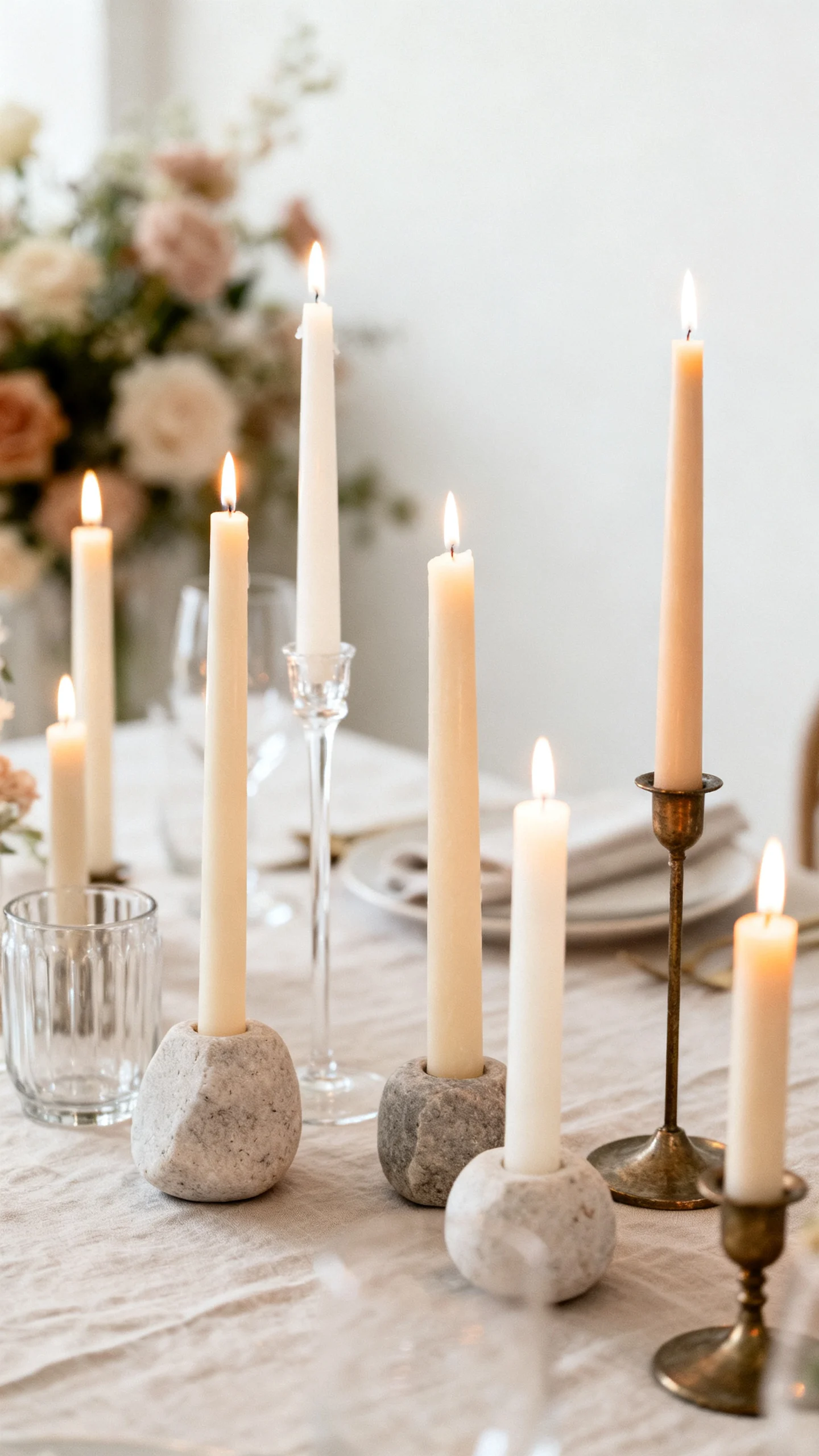
Use tapered candles for height and instant ambience
Tapered candles create vertical lines that make tables feel designed, not decorated. In neutrals, choose ivory, warm white, sand, or even a soft greige; then use holders in clear glass, stone, or mixed metals for a collected look. This is best for couples who want a romantic reception without relying on colorful florals, because candlelight does a lot of the heavy lifting. Vary heights slightly (short and tall holders) to build dimension while keeping the palette calm. The glow also flatters linens, glassware, and skin tones—an underrated “expensive” benefit. Mistake to avoid: packing candles too tightly; give each candle space so the arrangement reads airy and intentional.
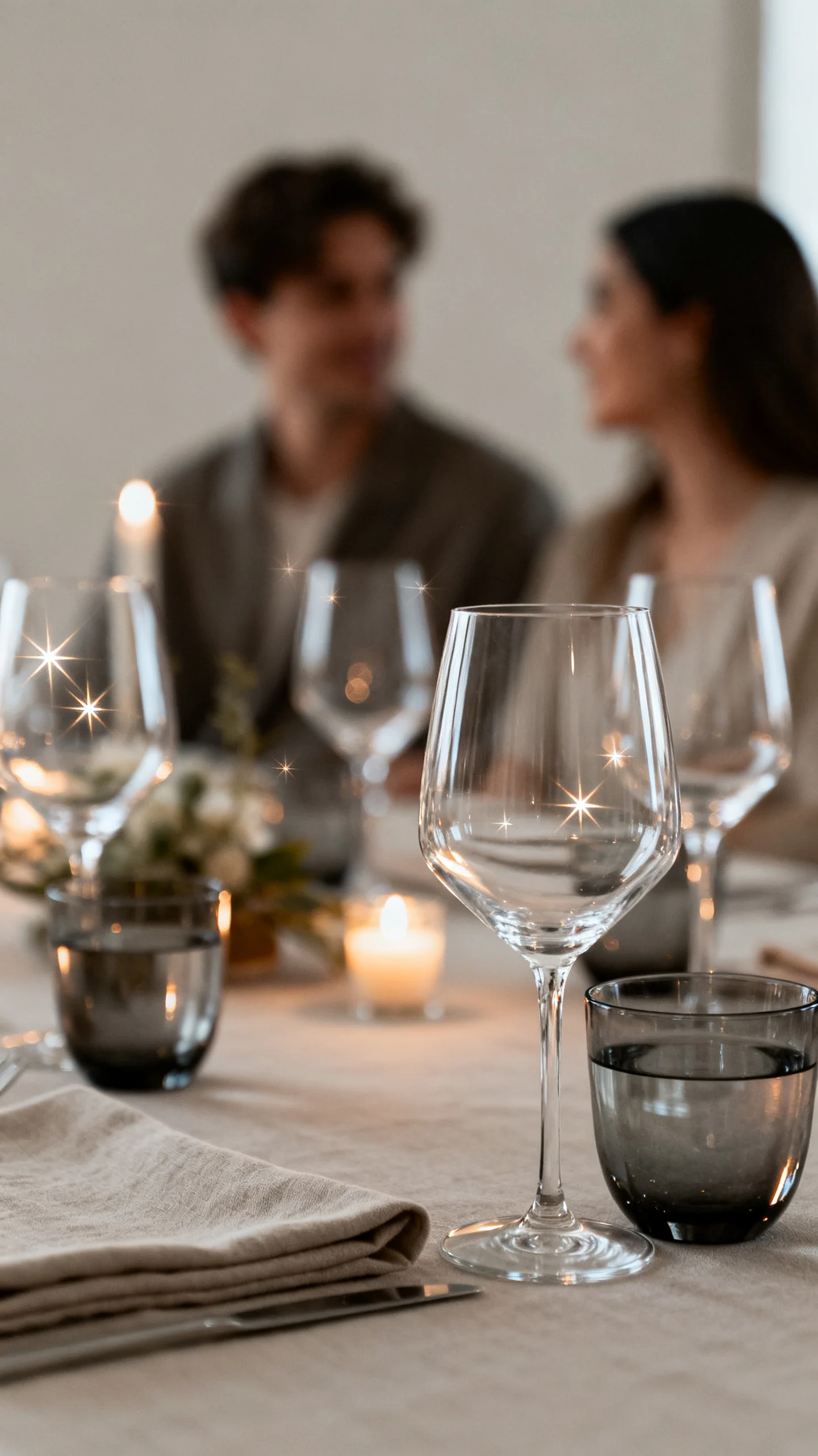
Mix clear glass and smoky glass for a designer feel
Neutral doesn’t mean everything has to be clear—adding a hint of smoky or tinted glass brings depth without adding color chaos. Combine classic clear wine glasses with a smoky water goblet, or use a single tinted flute to create an elevated, editorial look. This is perfect for couples who want a modern-luxe feel and love the idea of neutrals with a twist. Glass is reflective, so it catches candlelight and creates that sparkling, expensive atmosphere guests associate with fine dining. Keep the silhouettes consistent (similar rim shapes and stem styles) so it feels curated rather than mismatched. Mistake to avoid: mixing too many different glass styles at one table; limit it to two coordinated looks max.
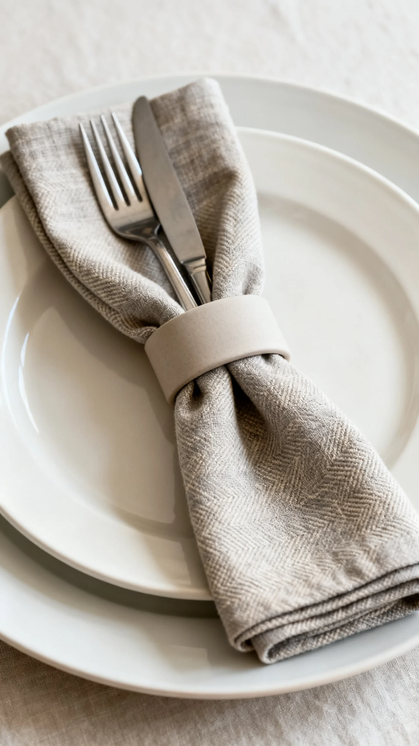
Choose napkins with texture and a tailored fold
Napkins are a small detail that reads surprisingly high-end when done thoughtfully. In a neutral tablescape, pick napkins in soft linen, gauze, or a subtle weave in shades like oatmeal, stone, or ivory to add texture against smooth plates. A tailored fold—like a simple rectangle under the flatware or a relaxed tuck through a napkin ring—looks polished in photos and easy for a venue team to replicate. This idea is best for couples who want elegance without extra décor, because the napkin becomes part of the styling. Consider a small detail like a menu card or name tag layered on top to create a boutique place-setting moment. Mistake to avoid: stiff polyester napkins that shine under lighting; matte textures look more expensive.
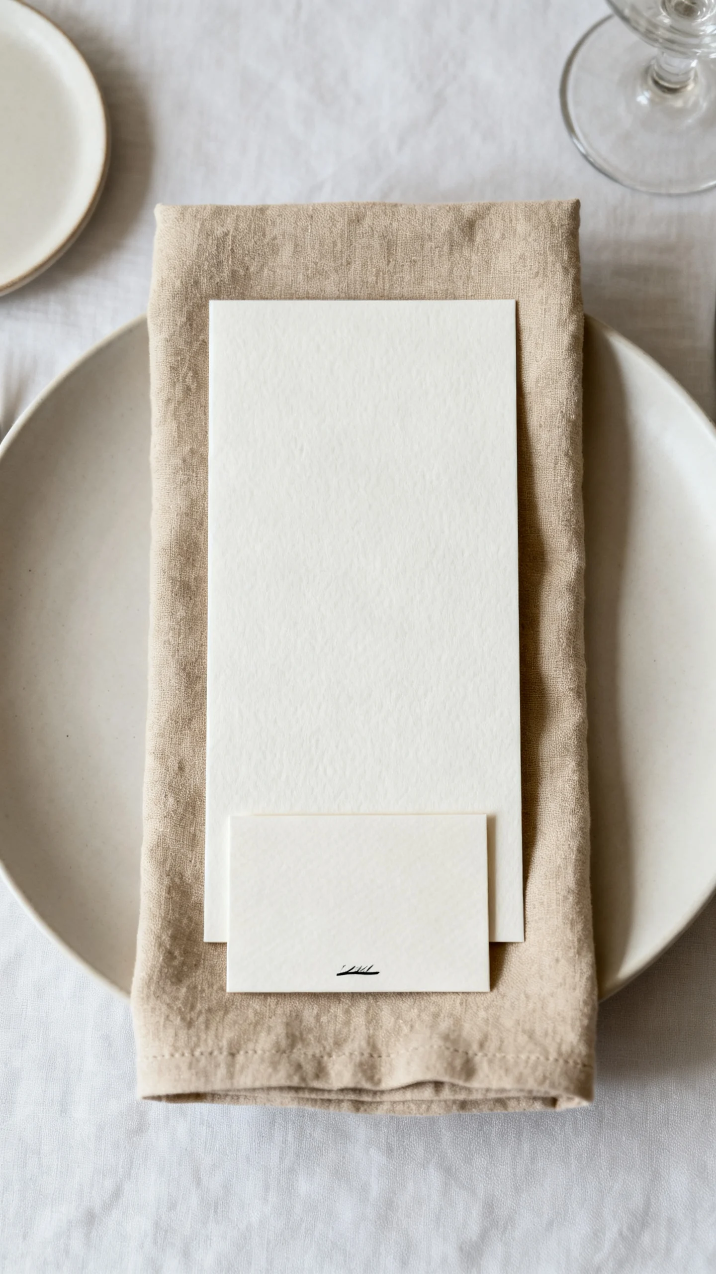
Add a “menu moment” with minimalist paper goods
Neutral tables look expensive when the typography and paper feel intentional, like a luxury brand. Use menus and place cards in warm white or cream cardstock with black ink, or try letterpress for subtle dimension if it’s in budget. This works especially well for couples who want a refined look without adding more flowers, because paper goods add structure and style at every seat. Keep wording minimal and spacing generous—white space is what makes it feel upscale. If you want a soft accent, add a thin border line or a tiny monogram rather than a big graphic. Mistake to avoid: using overly decorative fonts that feel hard to read; clean type always looks more premium.
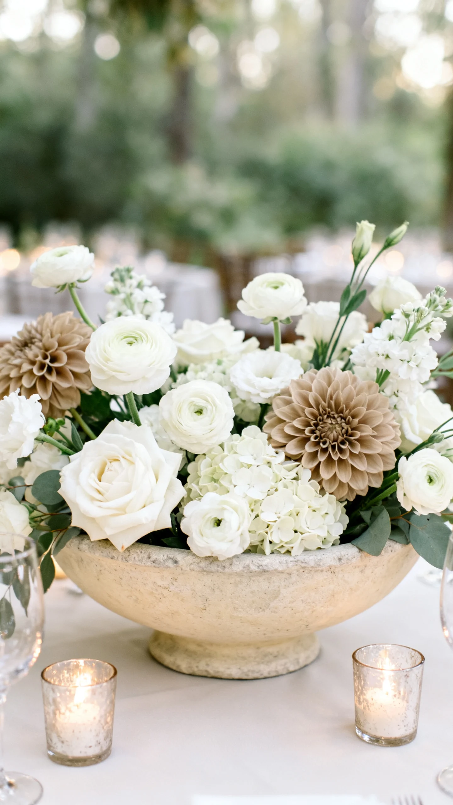
Anchor the centerpiece with low, wide florals in creamy tones
For a neutral reception, creamy florals look lavish because they read as abundant, not loud. Ask for low, wide arrangements using blooms like white roses, ranunculus, lisianthus, hydrangea, or café-au-lait dahlias, with layered greenery kept minimal and refined. This style is best for guest-friendly tables, because it allows conversation across the centerpiece while still feeling full and elevated. Keep the palette within whites, creams, and warm blush-beige tones so it stays cohesive with linens and candles. Choose a vessel that looks intentional—stone, ceramic, or ribbed glass—rather than a basic plastic liner. Mistake to avoid: adding too many different flower colors “for contrast,” which can make neutral tables look busy.
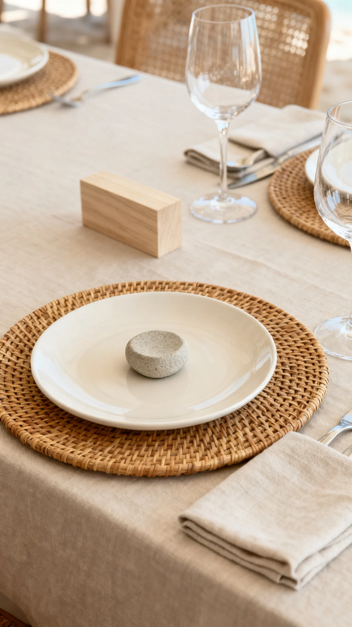
Bring in natural materials: stone, rattan, and wood (sparingly)
Natural materials make neutral tables feel expensive because they signal quality and tactile design. A rattan charger, a stone place card holder, or a pale wood table number can add warmth and a curated, coastal-meets-luxe vibe. This is best for outdoor weddings, tents, gardens, wineries, and couples who want neutrals that feel organic instead of ultra-formal. The key is restraint—one or two natural touches per table is plenty, especially when paired with crisp paper and glass. When done well, the mix feels like a boutique hotel restaurant: calm, layered, and chic. Mistake to avoid: adding too many rustic elements (burlap, rough twine, dark wood) that can shift the look away from “expensive” and into “DIY.”
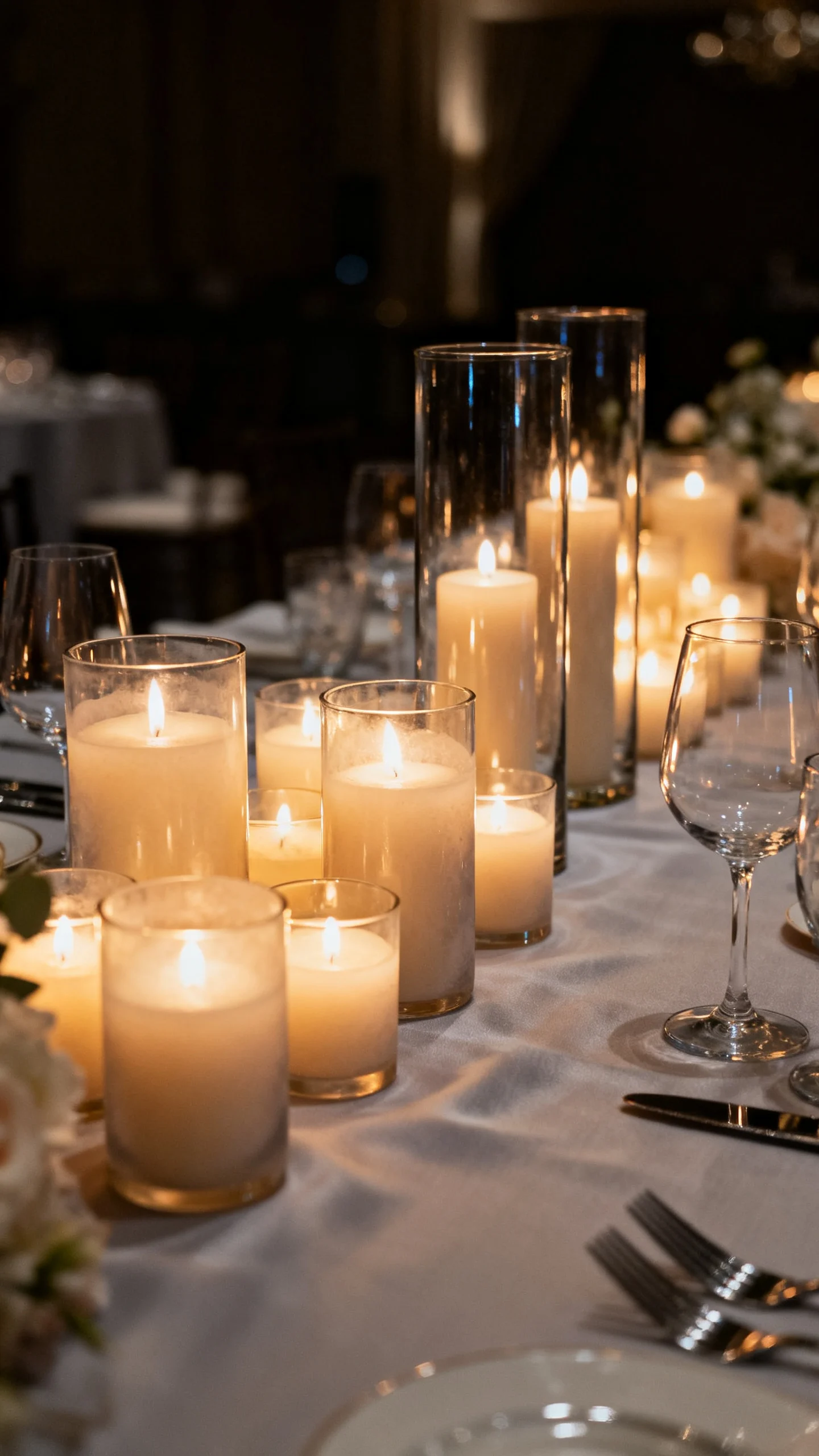
Use lighting as décor: votives, hurricanes, and soft glow
Great lighting can make modest décor look luxurious, and neutrals are the perfect canvas for it. Cluster votives in clear or slightly frosted glass, and add a few hurricanes to protect flames and create a high-end glow line down the table. This is best for evening receptions, tents, and dim venues where candlelight can do what bright colors usually do: create mood. Keep the glass shapes consistent for a clean look, then vary sizes to add rhythm. The warm flicker reflects off flatware and glassware, giving the table that “expensive restaurant” finish. Mistake to avoid: using cool-toned LED candles that look bluish; opt for warm, realistic flicker if open flames aren’t allowed.
Finish with one statement detail per table
A neutral table looks most expensive when there’s a single, intentional “signature” detail that feels custom. It could be sleek black flatware, a sculptural ceramic bud vase at each place setting, a monogrammed menu, or a refined table number in acrylic or stone. This approach is best for couples who want a clean aesthetic but still want guests to feel the personality and planning behind it. One statement element gives the table a focal point while letting neutrals stay calm and elevated. Keep the statement consistent across all tables so the room looks cohesive in wide shots. Mistake to avoid: adding multiple statement pieces at once; too many focal points can make the design feel cluttered instead of couture.
Final Planning Notes
When you’re building a neutral tablescape, prioritize materials over more items. Linen texture, glass shape, metal finish, and paper quality will read “expensive” long before extra décor does, especially in photos and candlelight. If you’re renting, ask to see everything together (linen + plates + flatware) before you commit, because undertones matter: warm ivory, creamy white, and cool bright white all behave differently under venue lighting.
On setup day, aim for consistency and breathing room. Leave negative space so every piece feels intentional, and keep your palette tight so the reception looks cohesive from the entrance to the head table. If you’re delegating, create a quick table-setting guide with one reference photo and a short checklist (charger placement, napkin fold, candle spacing) to keep the look polished across the room.
FAQ
How do I keep neutral tables from looking bland?
Add dimension instead of color: layered linens, mixed glass finishes, textured napkins, and candlelight create depth while staying neutral. A small high-contrast accent (like black ink on menus or matte black flatware) also sharpens the whole look.
What neutral colors photograph most “expensive”?
Warm whites (ivory, cream), soft taupe, champagne, and stone tend to photograph rich and flattering, especially in candlelight. Stick to one undertone family so the table reads cohesive rather than accidentally mismatched.
Is it okay to mix metals in a neutral tablescape?
Yes—mixing metals can look very high-end if you keep it controlled. Choose one dominant metal (like brushed gold) and one supporting metal (like matte black or silver), and repeat them consistently across candles, flatware, and small details.
What’s the easiest “luxury” upgrade if I’m on a budget?
Prioritize tapered candles and upgraded napkins. Candlelight changes the entire room’s mood, and linen-look napkins (matte, textured) instantly make place settings feel more refined than basic polyester.
How do I make neutral tables work in a colorful venue?
Let the venue be the color and keep the tabletop calm. Use warm whites and taupes to complement wood, brick, or garden greens, then repeat one strong neutral accent (like black text or brass) to keep the design feeling intentional rather than washed out.